by abduzeedo
Inspired by an interview with Bruce Lee, where he refers to an aspect of Taoist philosophy, that water can teach us “the way,” the graphic designer, creative activist, lecturer, author, and founder of the eponymous studio for branding communication Rafael Bernardo started to wonder whether he “was water” in his creative workflow. Now, five years later, he wrote and designed a book with 224 pages, which is divided 50/50 into the parts Roots and Wings.
Wings presents the graphic journey. Eleven of Bernardo’s favorite personal projects and collaborative works he did for example with Viva con Agua, the Forward Festival, or the porcelain factory Rosenthal. And then, there is a selection of eighty Be Water My Friend posters, created to practice and explore his visual voice. Clear compositions in black and white within a spectrum of typography, illustration, and infographics.
Part two, Roots, outlines the theoretic foundation of Rafael Bernardo’s experience. The introduction of the Be Water My Friend methodology. An analytic system that he developed after he found out that water behaves like creativity works.
It describes the progress of development as a clockwork, divided into three levels. Context in the outside, motivation in the center, and process as the connecting part in-between. It is a tool to connect the way we think with the way we feel by examining how we shape and navigate our processes, projects, and routines.
Bernardo believes that everybody experiences creativity in a different way but that its structures and functionalities work similarly for all of us. The first question is always whether you know what you want, if you love doing it, and if you are good at it. The second question is whether you know how to find the little hidden mistakes that hold you back from getting better. This book wants to inspire creative performers to see mindset and intuition as team-players and shows how to connect and tune them to each other by reflecting on time, dreams, and potentials.
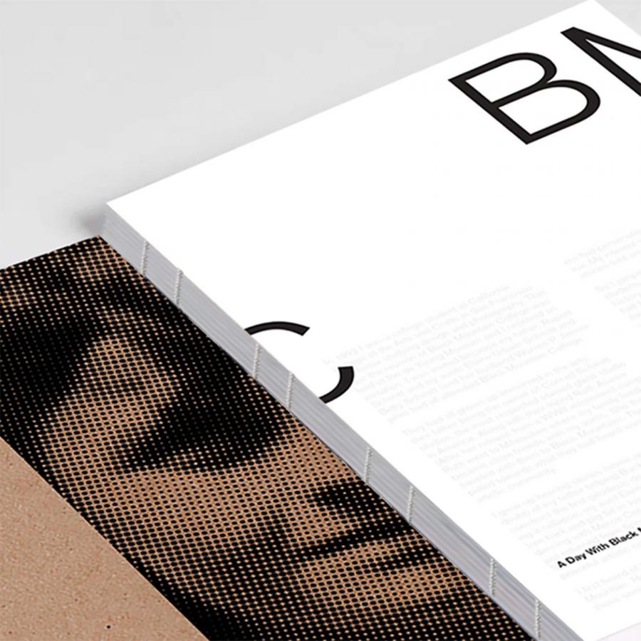
Since water runs in cycles and “nomen est omen,” the book will be printed on three different kinds of 100% recycled paper, used water-based colors, and chosen by a printer that compensates for its carbon-footprint. The format is 16 × 24 cm, the spot color is Pantone 032U, all fonts in the layout except from one that Bernardo made himself are designed by newglyph.
Credits and more info
- Publisher: Slanted Publishers
- Concept & Design: Rafael Bernardo
- Release: January 2022
- Format: 16 × 24 cm
- Volume: 224 pages
- Language: English
- Colors: Black (water based) and spot color Pantone 032U
- Workmanship: Triptychon soft-cover, swiss brochure with an open spine, stitched with red thread
- Printing: Stober
- Paper: Cover: Kingdom XT-S Recy White; Roots: Circle Volume White; Wings: Circle Offset Premium White, IGEPA
- Typefaces: Antarctica Bold, Atacama Condensed, and Africa Rainfall by newglyph
- ISBN: 978-3-948440-33-6
- Price: 34.– Euro
