by abduzeedo
Explore the development of Buft, an app blending branding, UI/UX, and SwiftUI. Gain insights into the design process and challenges in app creation.
Leading a design team full-time, I immerse myself in the entire design process, translating ideas into products. This journey involves numerous challenges, from conceptualizing an idea to creating a working product and promoting it. In larger companies, having experts in each domain allows for specialization, but I believe understanding the broader product lifecycle is key to effective collaboration and efficiency.
This belief drives my engagement in side projects, addressing personal needs and expanding my expertise. Among these are Calmaria, a breathing app for anxiety, Tacoball, a game demonstrating the capabilities of generative AI with ChatGPT, and Terral, a perfume brand co-created with my wife, which introduced me to packaging design and logistics challenges. Additionally, running the Abduzeedo blog daily enhances my inspiration and broadens my skill set in app development and server management.
Buft, my latest project, was conceived during a holiday break. The app is inspired by Warren Buffet's insightful anecdote about the $300,000 haircut, as detailed in his biography "Snowball". This anecdote illustrates the concept of opportunity cost and compound interest, where Buffet humorously calculates the long-term cost of a haircut, considering potential investment returns. Buft aims to simplify the understanding of compound interest, reflecting Buffet and Charlie Munger's "sit-on-your-ass" investment strategy, which advocates for investing in great companies and allowing time to do its work.
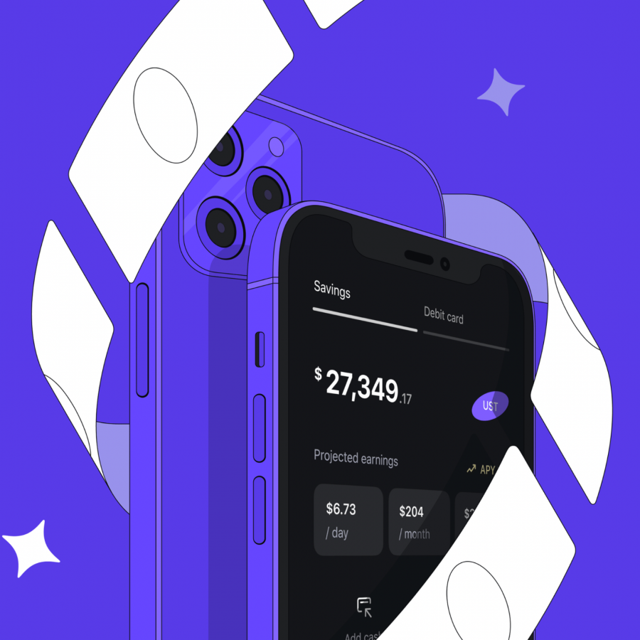
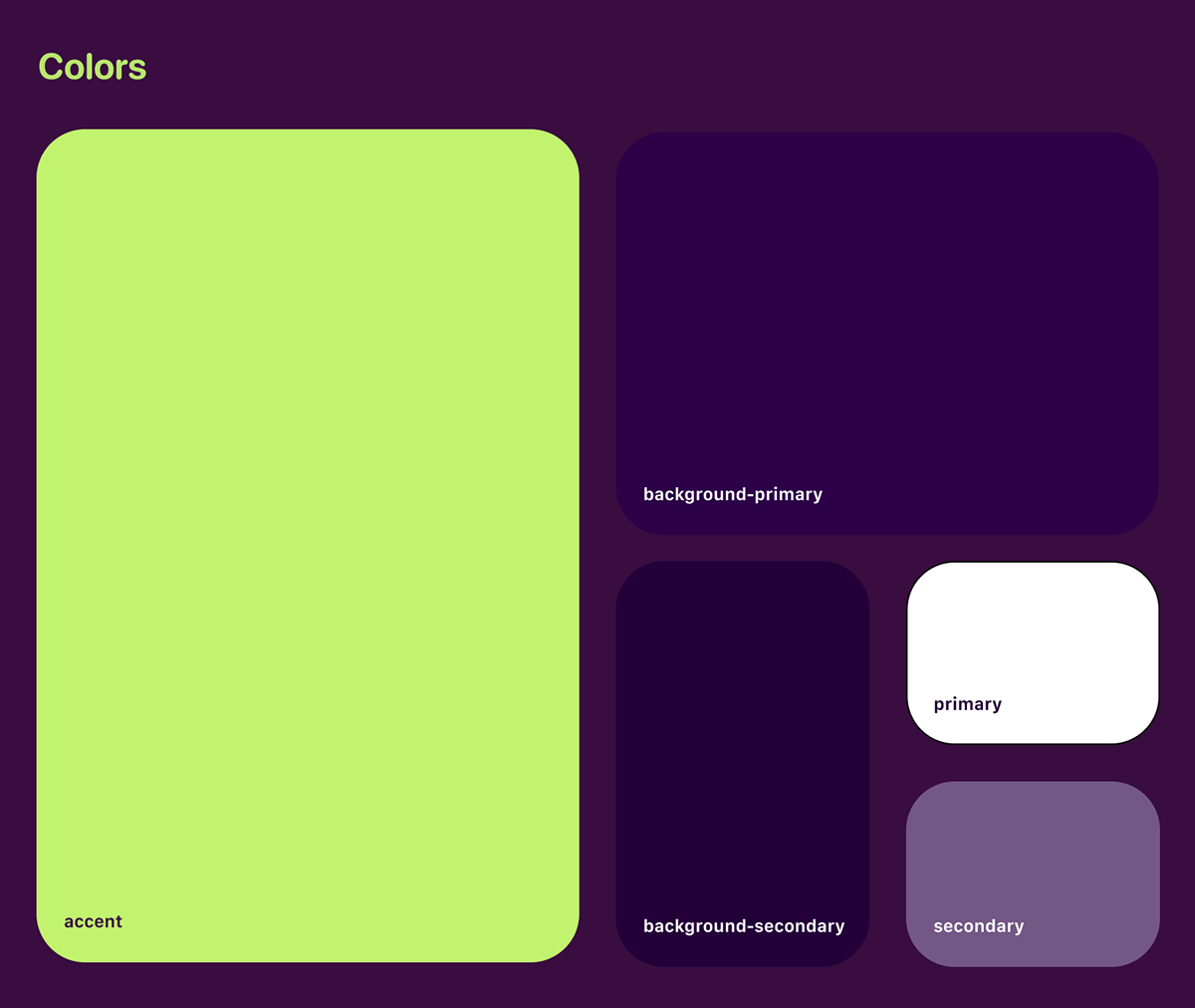
Developing Buft's functional aspects using ChatGPT and SwiftUI was a streamlined process, showcasing the user-friendly and visually appealing nature of iOS development, a stark contrast to Android. The design phase, my forte, was both exhilarating and demanding. It began with creating a unique branding and visual identity, choosing a script-type, rounded font to give Buft a personal, signature-like appearance. The color palette evolved from standard black and white to a more lively lime green against a purple/violet background, offering a fresh, modern look.
I believe understanding the broader product lifecycle is key to effective collaboration and efficiency.
The transition from Figma design to SwiftUI code presented challenges like form customization and keyboard interaction management. These design aspects required several updates post-launch, emphasizing the iterative nature of app design.
To share the design process in detail, I chronicled Buft's journey on Behance, offering insights into the intricacies of melding branding, UI/UX, and SwiftUI in product design.
Through Buft's development, from ideation to a functional app, the importance of understanding and navigating the intricacies of product development, branding, and design becomes evident. It's a journey of continuous learning and refining, mirroring the ever-evolving landscape of design and technology.
Branding, product design and UI/X
Try the app now from the App Store
