by abduzeedo
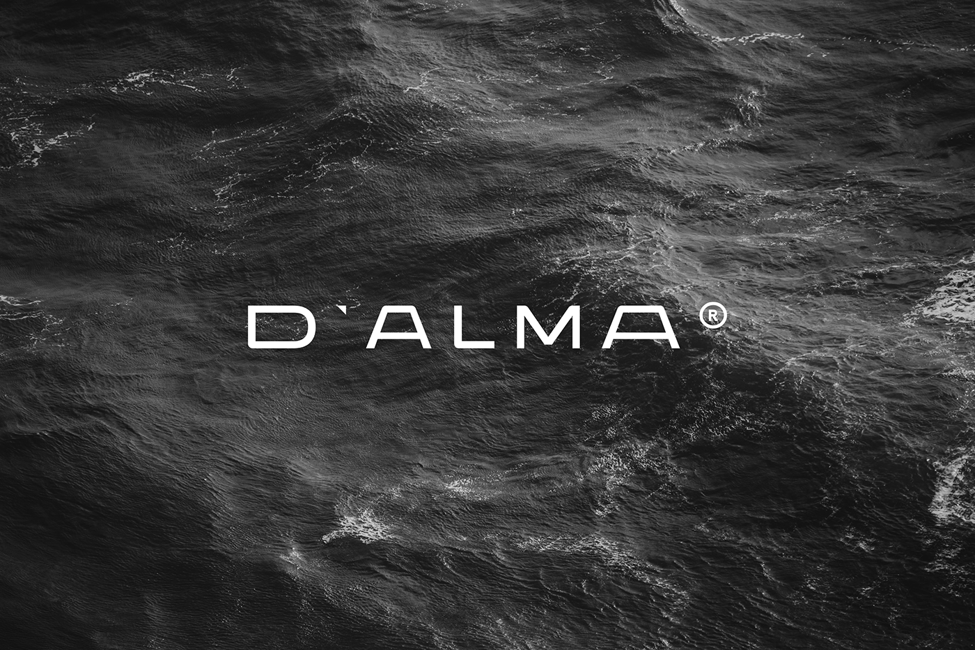
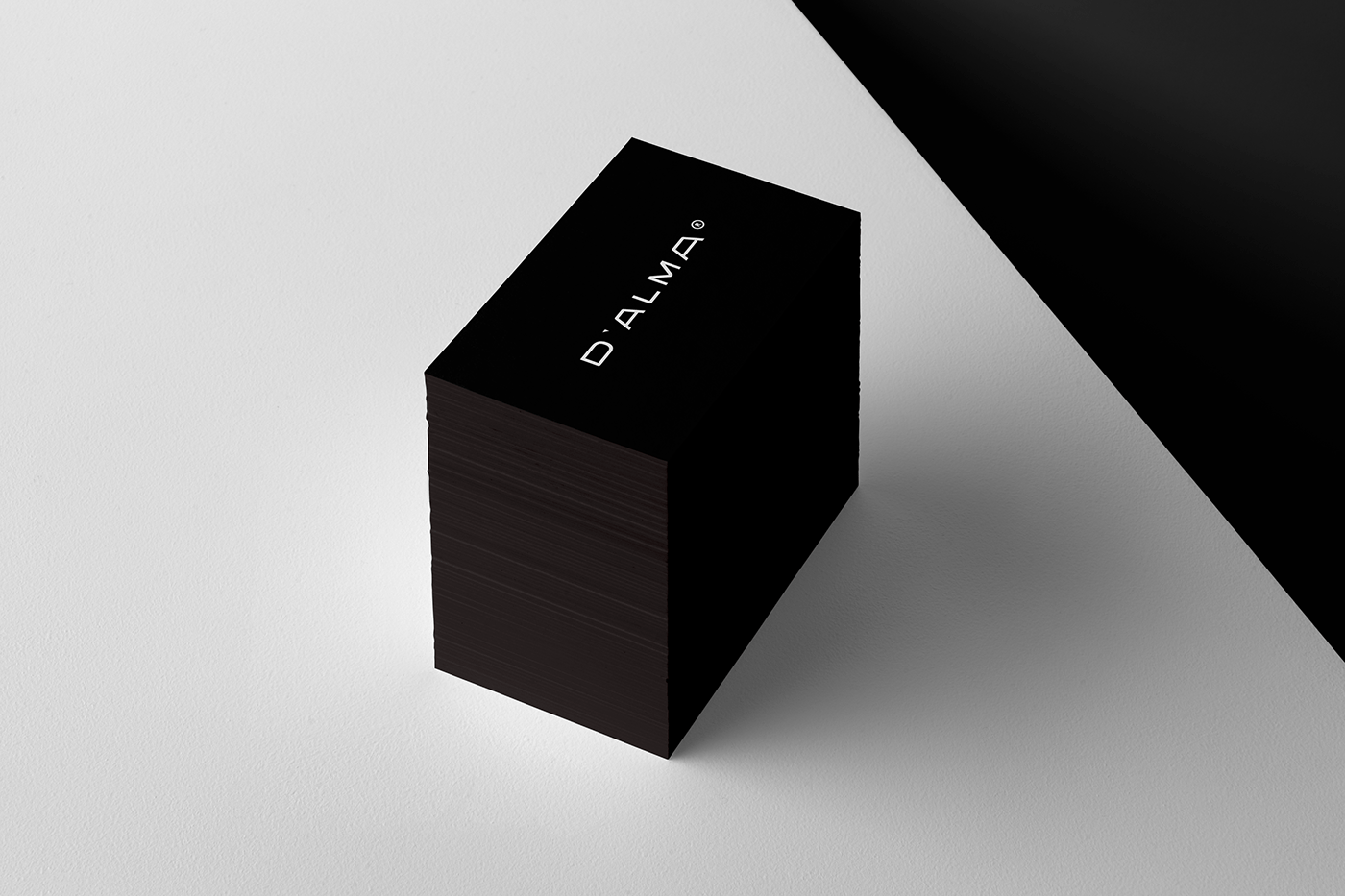
David Carranca shared a branding and visual identity project for D`ALMA, a fashion clothing brand focused on street wear pieces. The brand name is the essential focal point on the concept “Alma” in Portuguese means “Soul” and the letter “D” means “to” so the brand name together in meaning is “Soul to Soul” or “D` Alma para Alma” is the brand new slogan developed as the naming stage of the process.
Soul is a term that means “being”, “life” or “Creature”.It derives from the Latin term animu (or anima), which means “what animates”. Being the life of each organism, not being eternal.
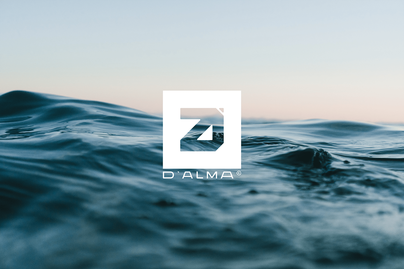
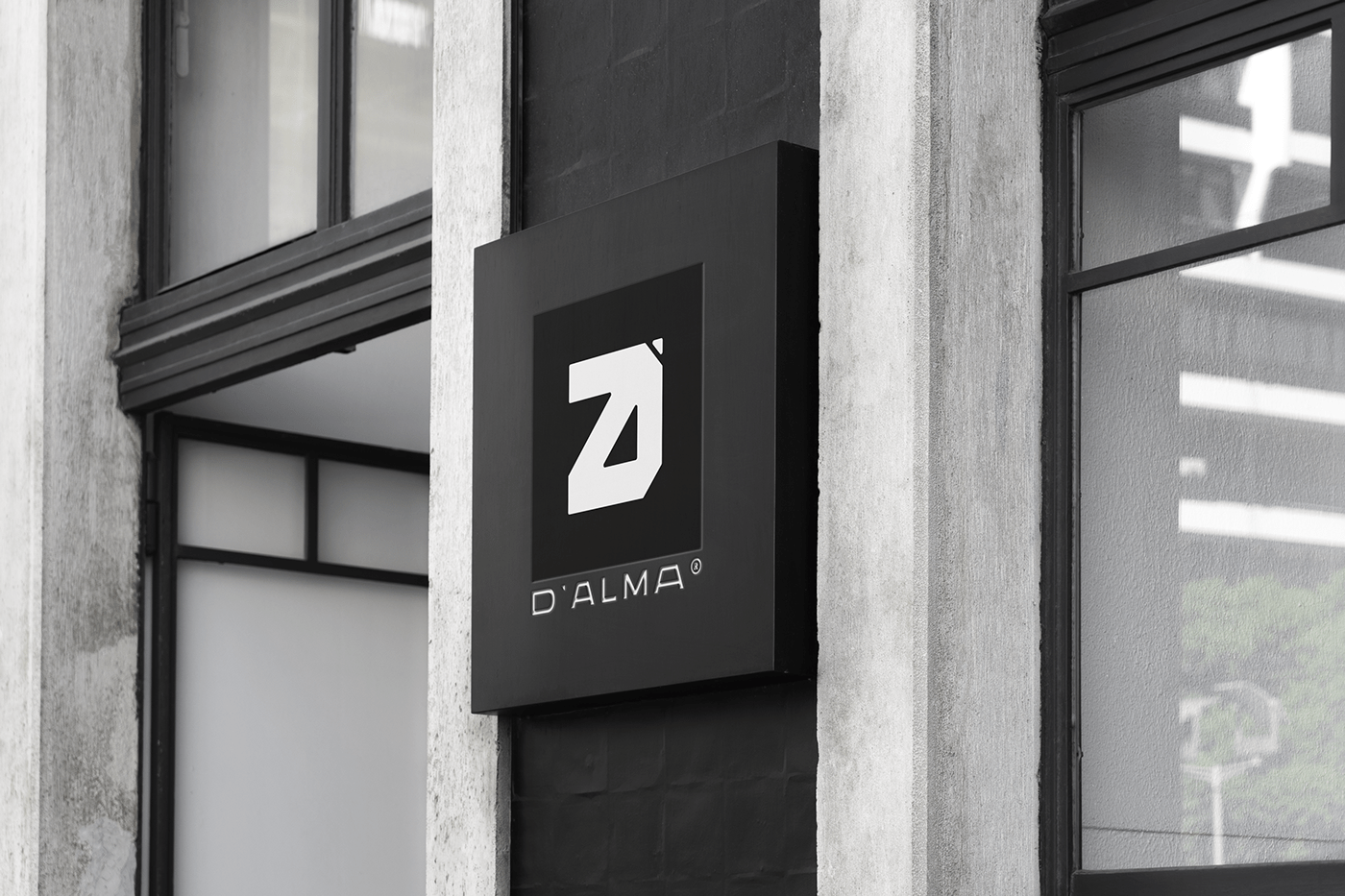
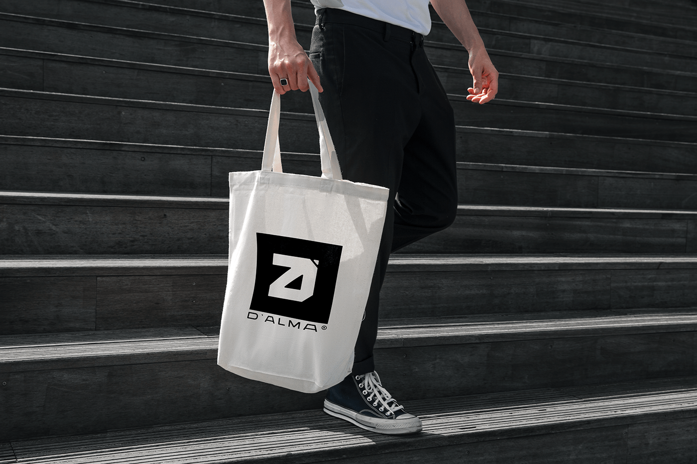
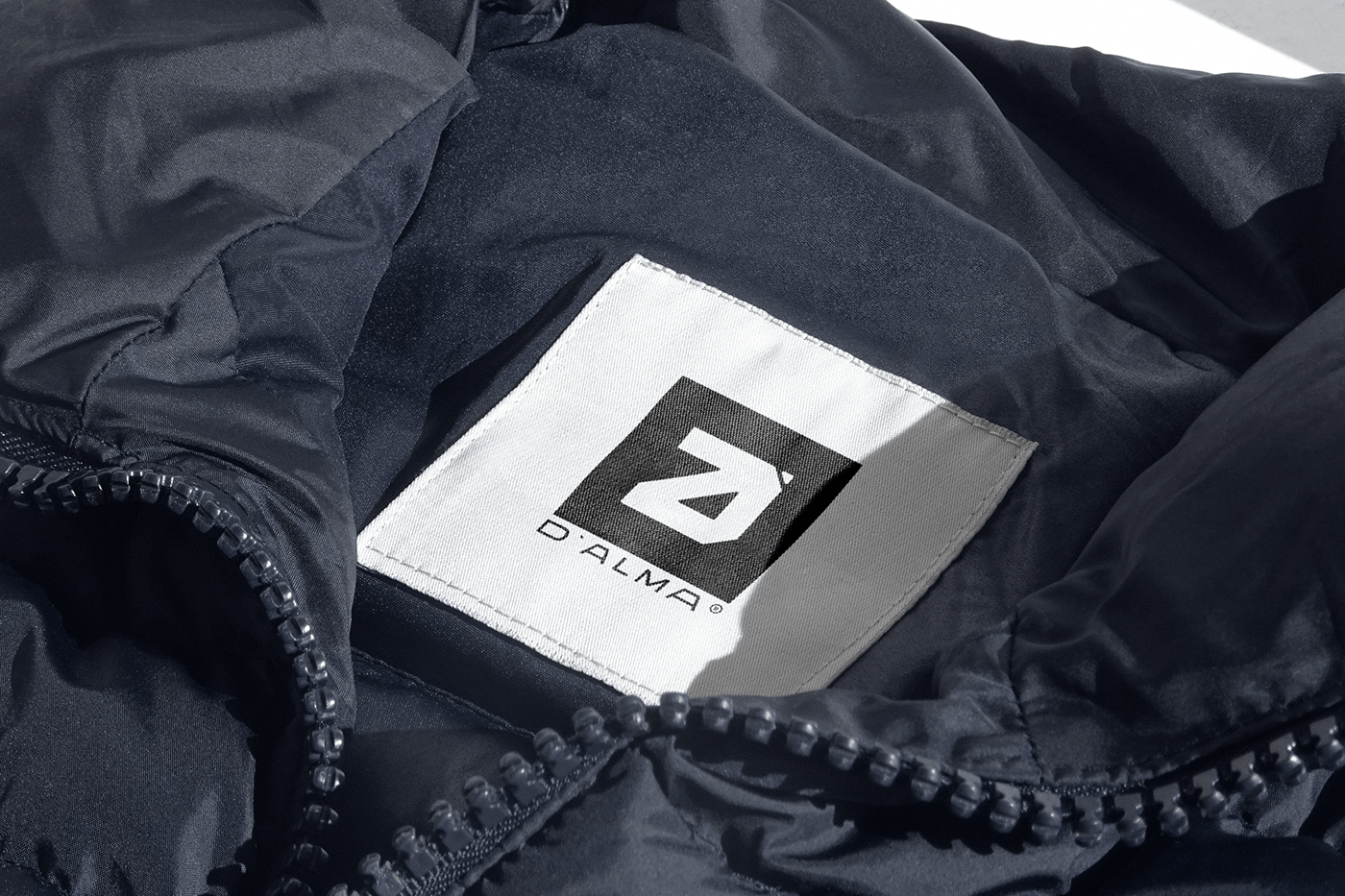
The logo process was made in two phases: icon development and typography.
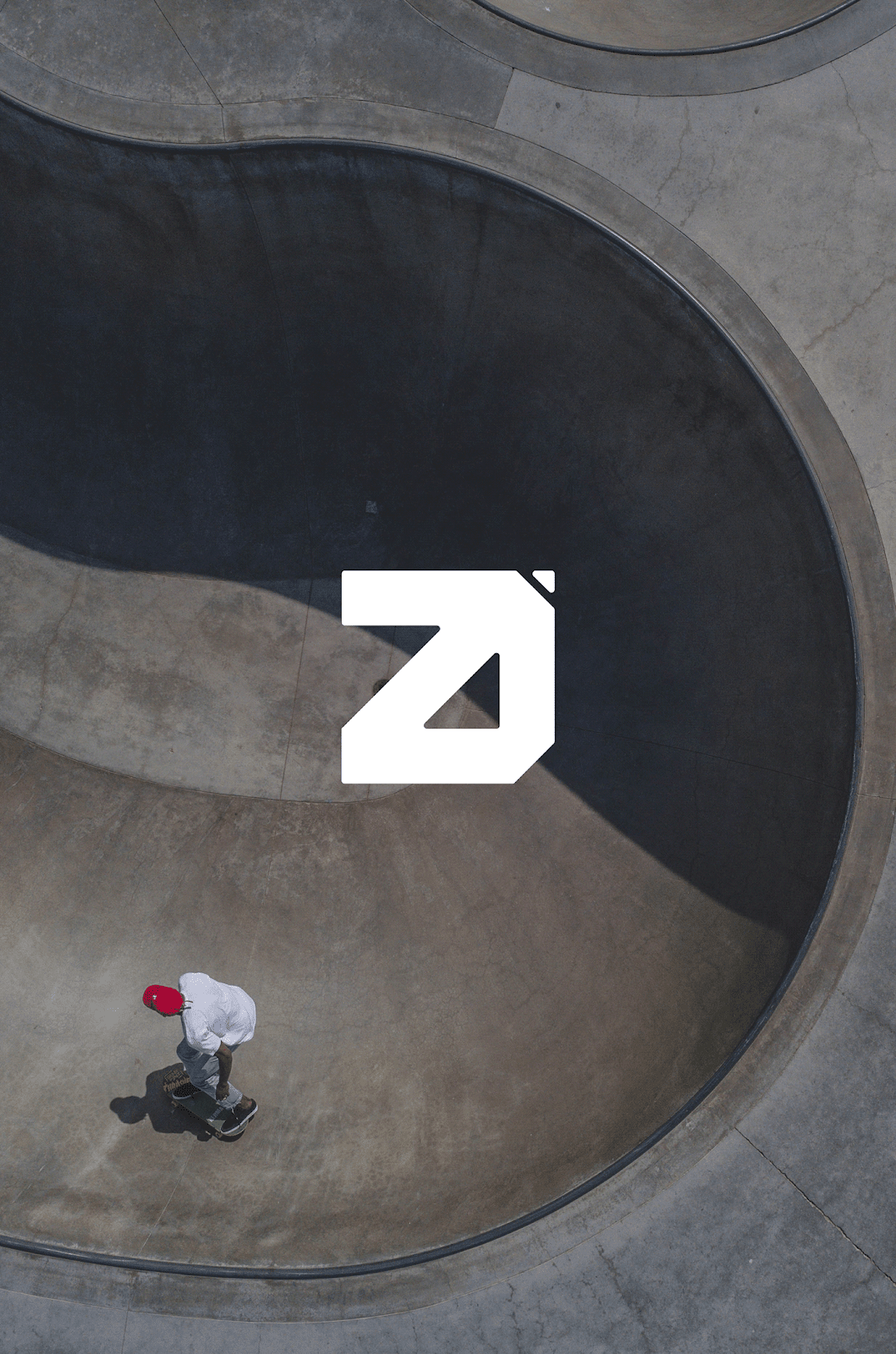
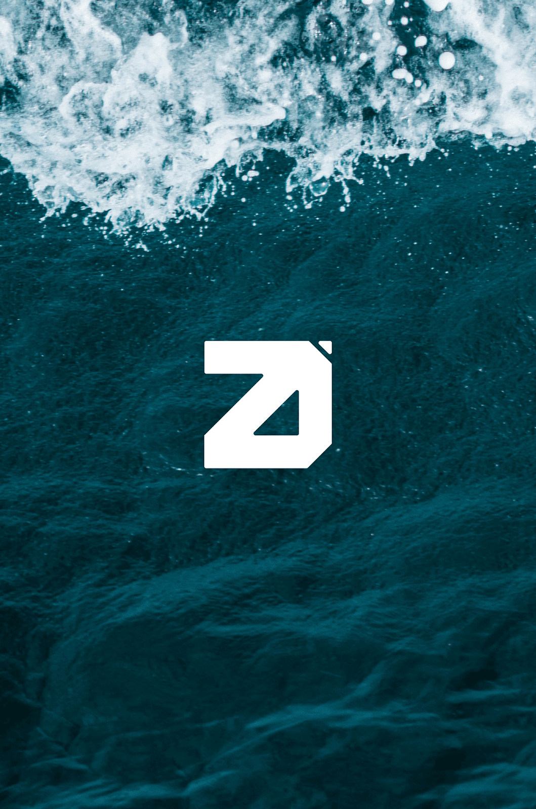
- The icon was made to be bold and brave, inspired by brutalism design , architecture and photography that resembles the logo by the hard shapes and marks on the D icon letter.
- The typography was made to be Clean, Sharp and recognizable.

Credits
- Client: João Cláudio Neto
- Work: Brand identity
- Year: 2021
For more information make sure to check out:


