by abduzeedo
Discover how editorial design shapes the Glosario Gráfico, blending typography and layout for an engaging experience.
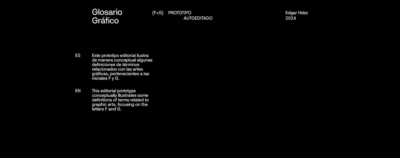
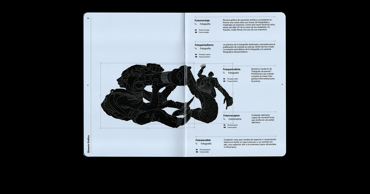
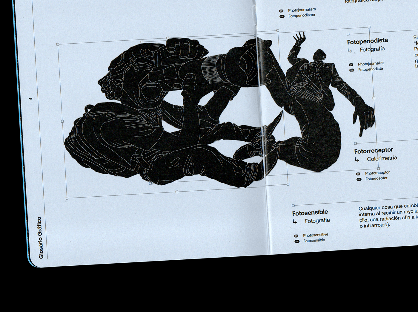
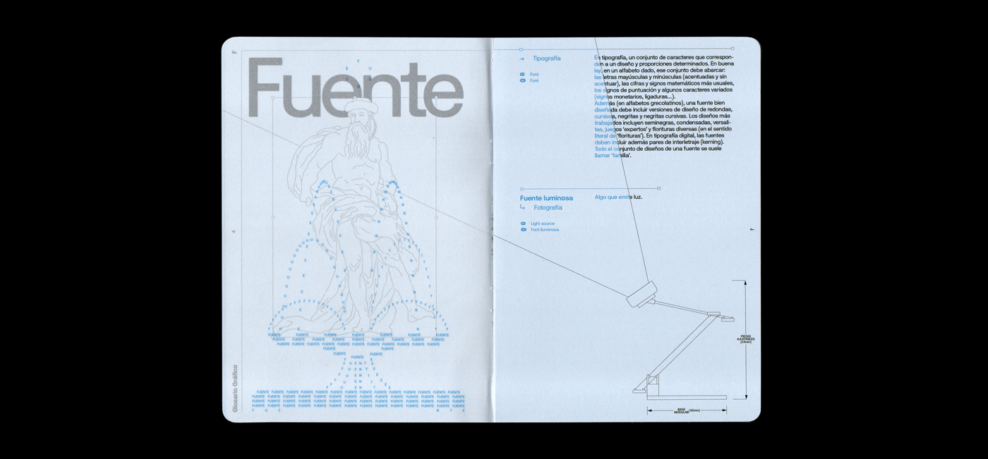
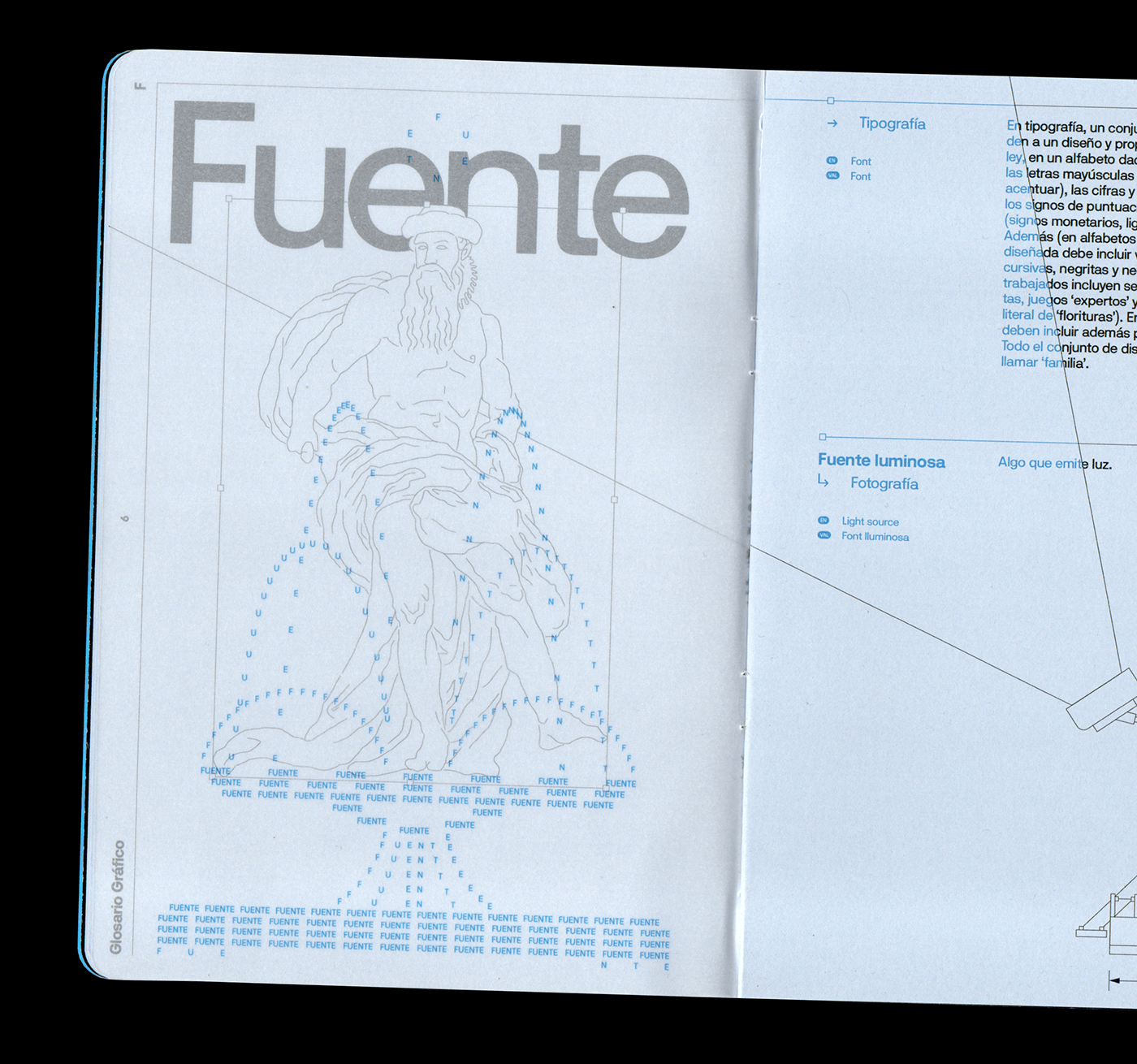
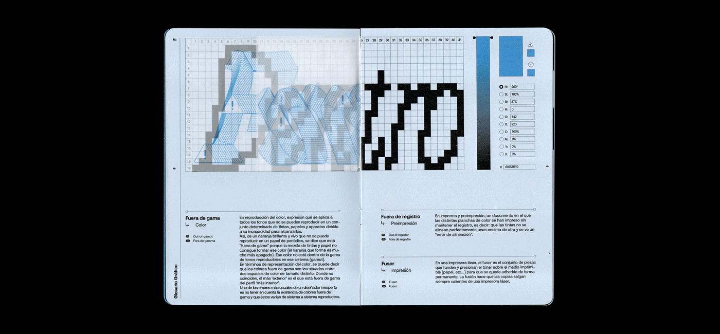
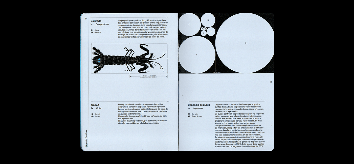
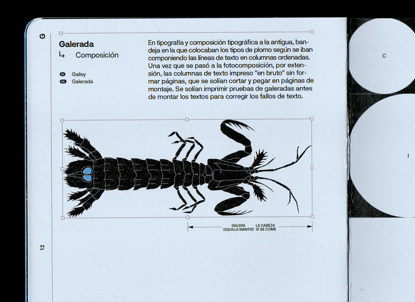
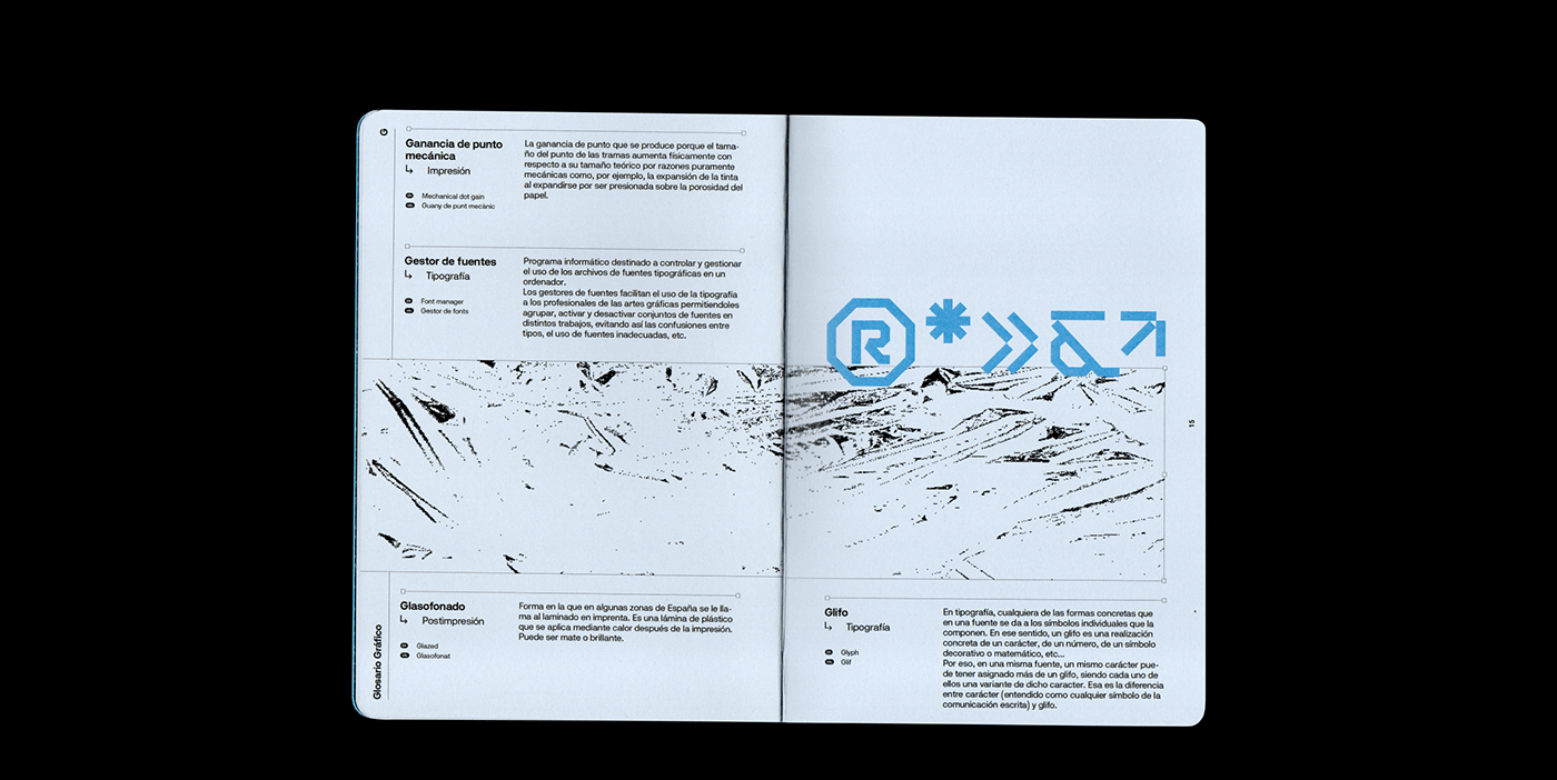
Editorial design is a field where typography, layout, and visual storytelling converge to produce memorable publications. A striking example of editorial design excellence is the Glosario Gráfico, a project by Estudi Zeta™. This concept book highlights graphic art terms, focusing on the letters F and G. It merges function with visual appeal, offering a blend of clarity and creativity.
At its core, the Glosario Gráfico is an editorial prototype that redefines how information can be both informative and visually stimulating. Designed by Estudi Zeta™, a renowned studio, the book presents a collection of editorial artifacts that break the mold of traditional glossary design. Its purpose is to create an artistic journey, making the reading experience engaging for those interested in graphic design and typography.
Instead of presenting definitions in a typical academic format, the project uses creative typography, custom layouts, and striking imagery to bring life to otherwise static content. The focus on just two letters, F and G, may seem minimal, but this concentration allows for an in-depth exploration of design elements and their meanings. For readers, especially graphic designers, it provides an intimate look at how editorial design can elevate content.
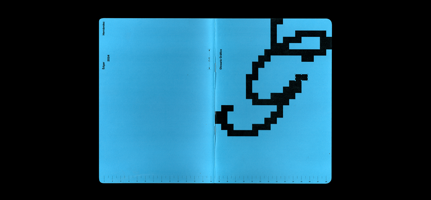
Typography plays a starring role in any editorial design, and the Glosario Gráfico is no exception. It skillfully uses fonts to enhance the user experience, drawing attention to each word’s meaning and importance. Estudi Zeta™ doesn’t just select fonts for aesthetic reasons—they choose them to reinforce the definitions presented. The contrast between bold headlines and minimalist body text helps guide the reader’s eye, ensuring that the information flows naturally.
This is an essential principle in editorial design—typography isn’t just about picking a visually appealing font. It must enhance the reading experience and align with the content’s message. In Glosario Gráfico, the use of typefaces, kerning, and white space creates a balance that allows for readability while keeping the design dynamic.
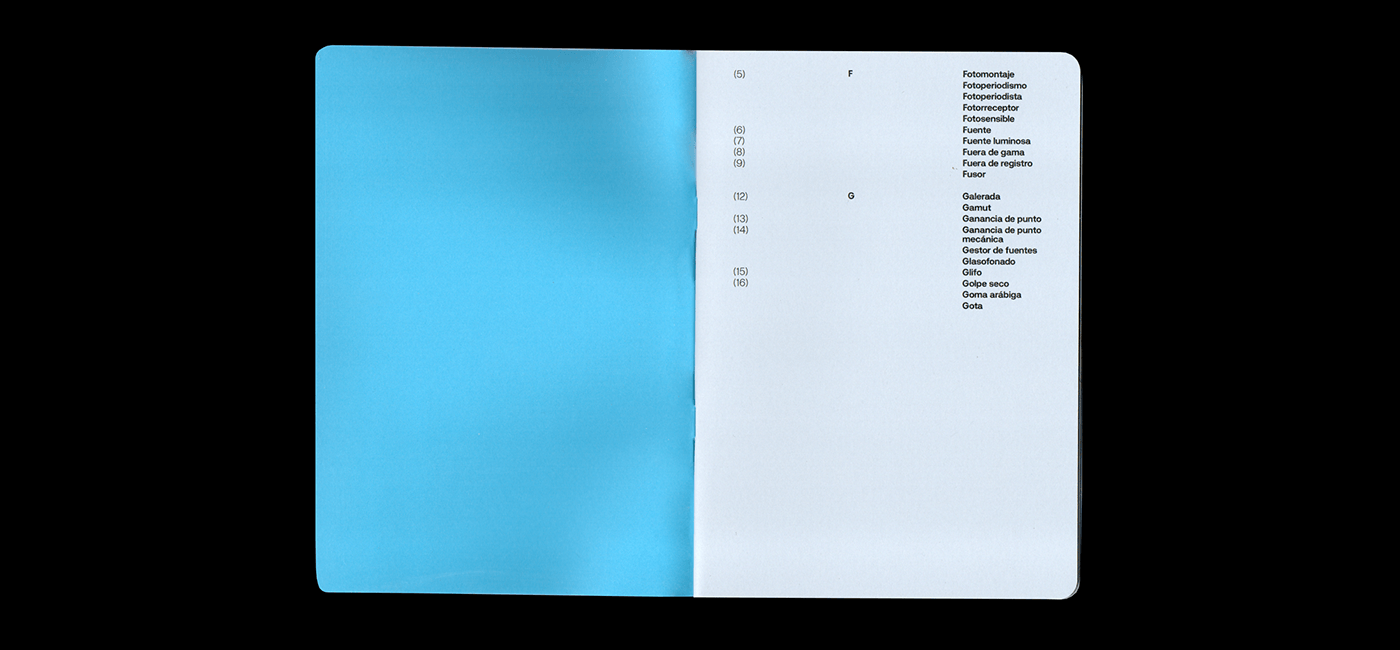
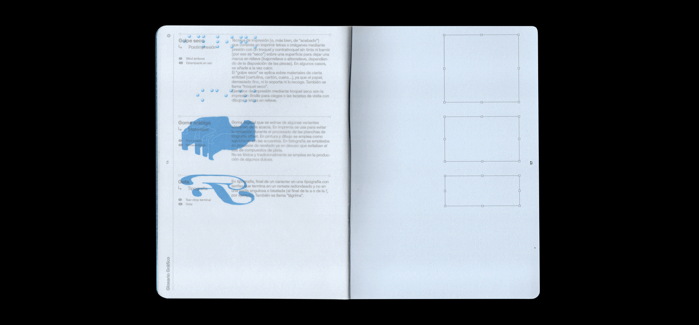
A significant challenge in editorial design is maintaining a balance between aesthetics and functionality. Estudi Zeta™ masters this through the careful use of visual hierarchy. The way content is arranged on the page—whether it’s through grid layouts, alignment, or use of negative space—guides the reader’s attention where it needs to be. In Glosario Gráfico, no page feels cluttered, even though each one is packed with visual and textual information.
This balance is crucial, as one of the main objectives of editorial design is to organize information in a way that keeps readers engaged. By using grid systems, Estudi Zeta™ ensures that content remains visually cohesive while also allowing for creative freedom. This is an essential takeaway for designers: editorial layouts should always prioritize user experience without sacrificing artistic expression.
Another key element of Glosario Gráfico is its minimalist approach. The design doesn’t overwhelm the reader with excessive visuals or text. Instead, it uses white space effectively to allow the content to breathe. Each definition and accompanying image is given room to be appreciated, demonstrating that minimalism, when done right, can lead to a more profound impact on the reader.
In editorial design, minimalism isn’t just about reducing content—it’s about refining it. The fewer distractions there are on the page, the more attention readers will pay to what’s important. Glosario Gráfico teaches a valuable lesson in this regard: editorial design doesn’t need to be complicated to be effective.
The Glosario Gráfico by Estudi Zeta™ is a masterclass in how editorial design can turn something as simple as a glossary into a visual experience. By focusing on typography, layout, and minimalism, this project exemplifies how design can elevate content in creative and innovative ways.
Whether you’re an aspiring designer or a seasoned professional, there’s plenty to learn from Glosario Gráfico. It reminds us that editorial design is not just about making things look pretty—it’s about creating a cohesive experience that communicates effectively and captivates readers.
Editorial design artifacts


 — Editorial Design")


