by abduzeedo
Discover Wojciech Interior’s branding by Alee Hyder, featuring a circle-centric symbol and a striking color palette with minimalist design.
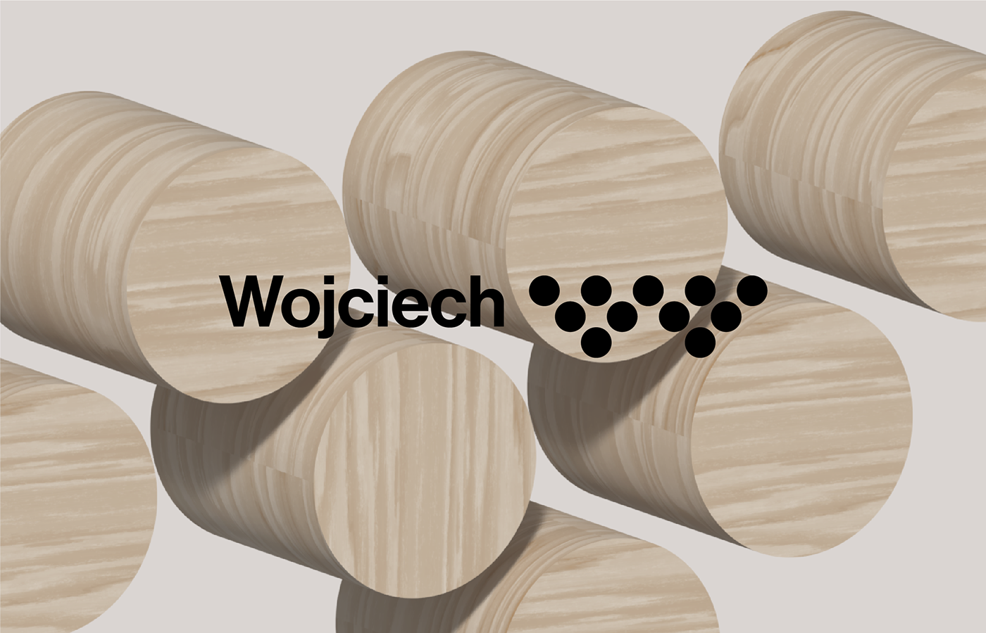
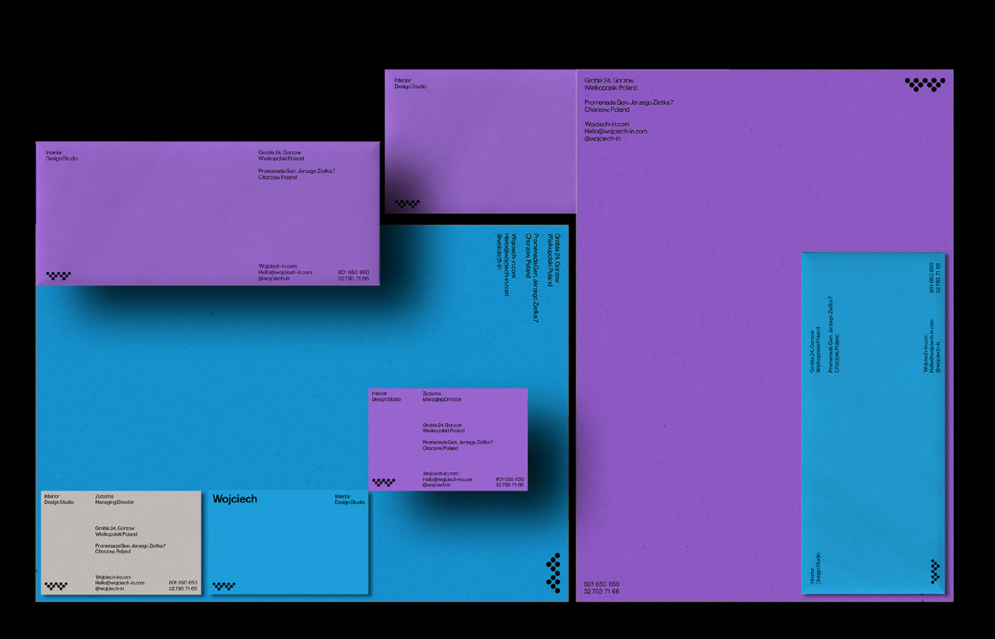
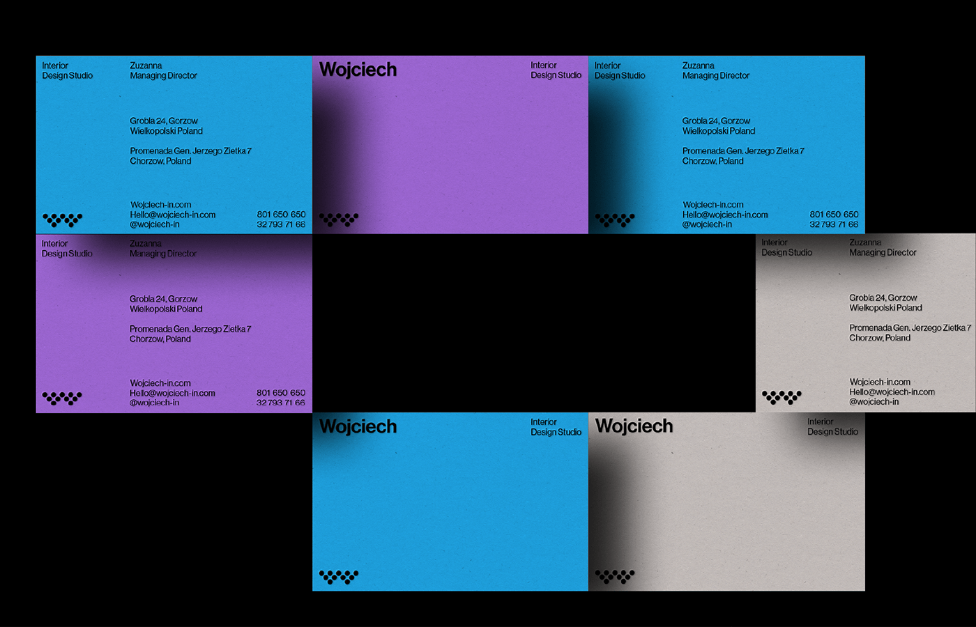
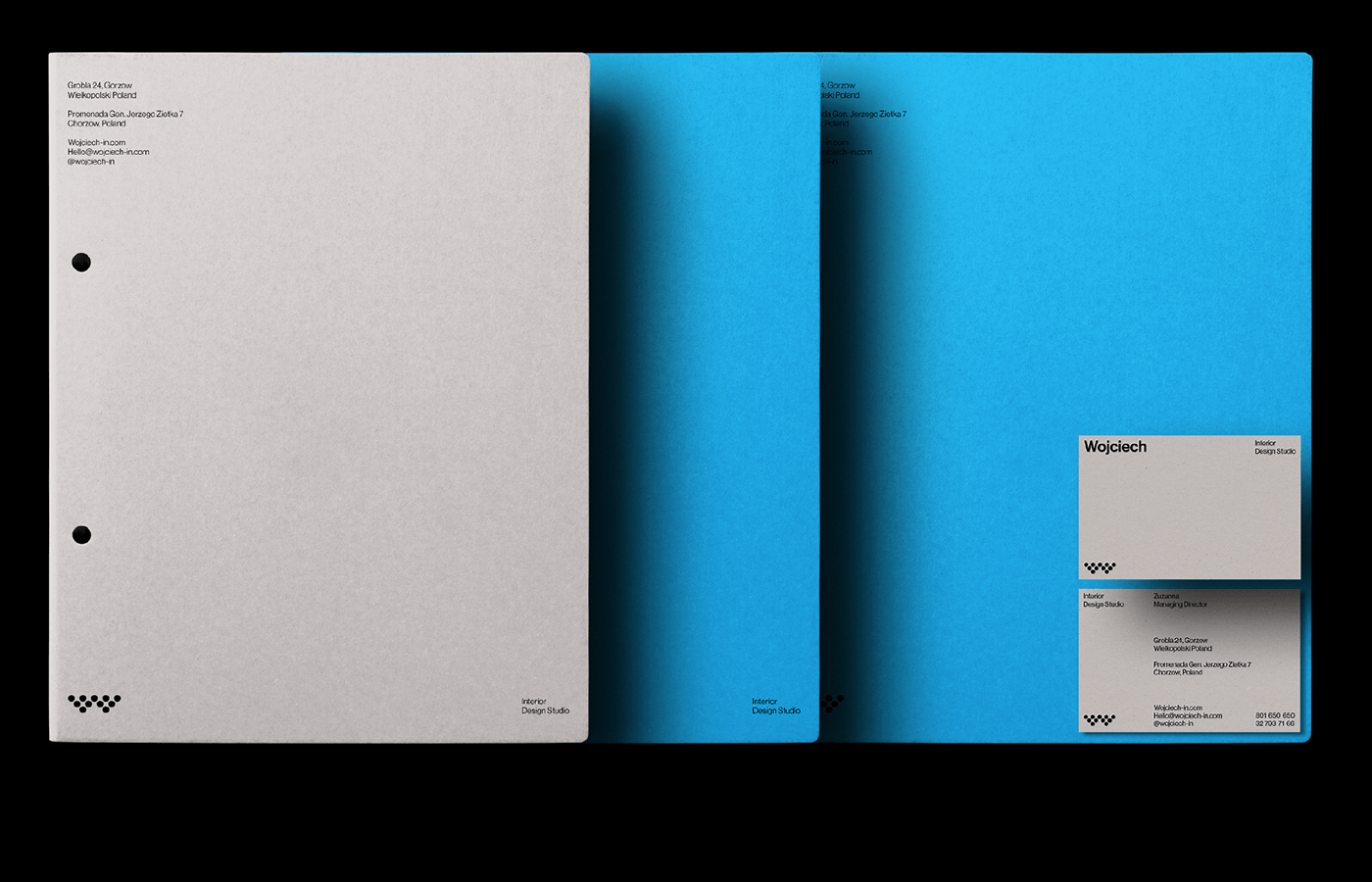
Wojciech Interior, an interior design studio, has unveiled a compelling brand identity crafted by designer Alee Hyder. This design project, showcased on Behance, emphasizes the strategic use of circles in its symbolism, creating a visually appealing and cohesive brand identity.
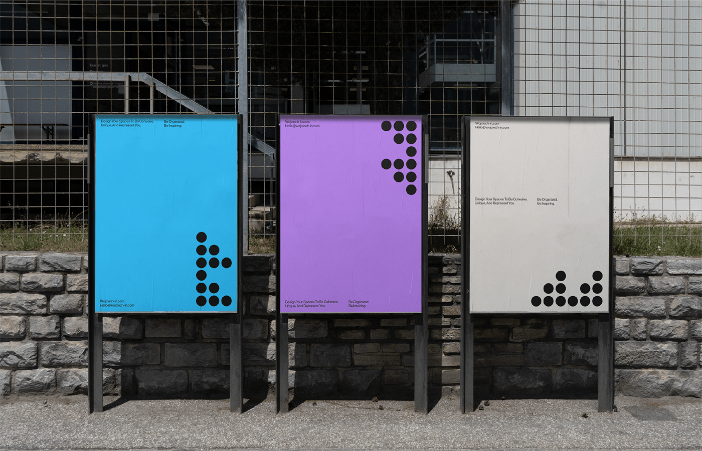
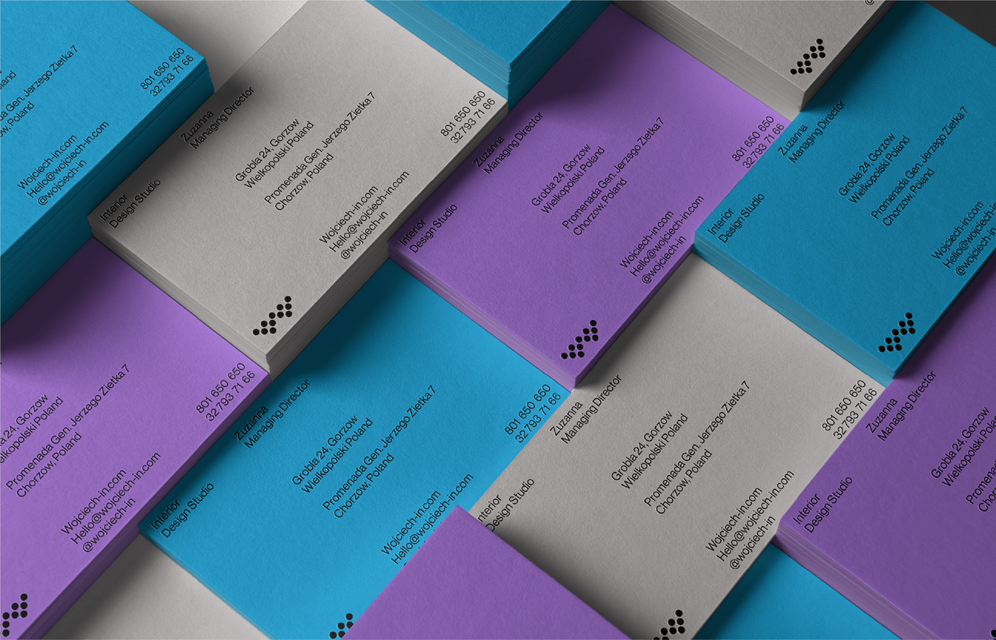
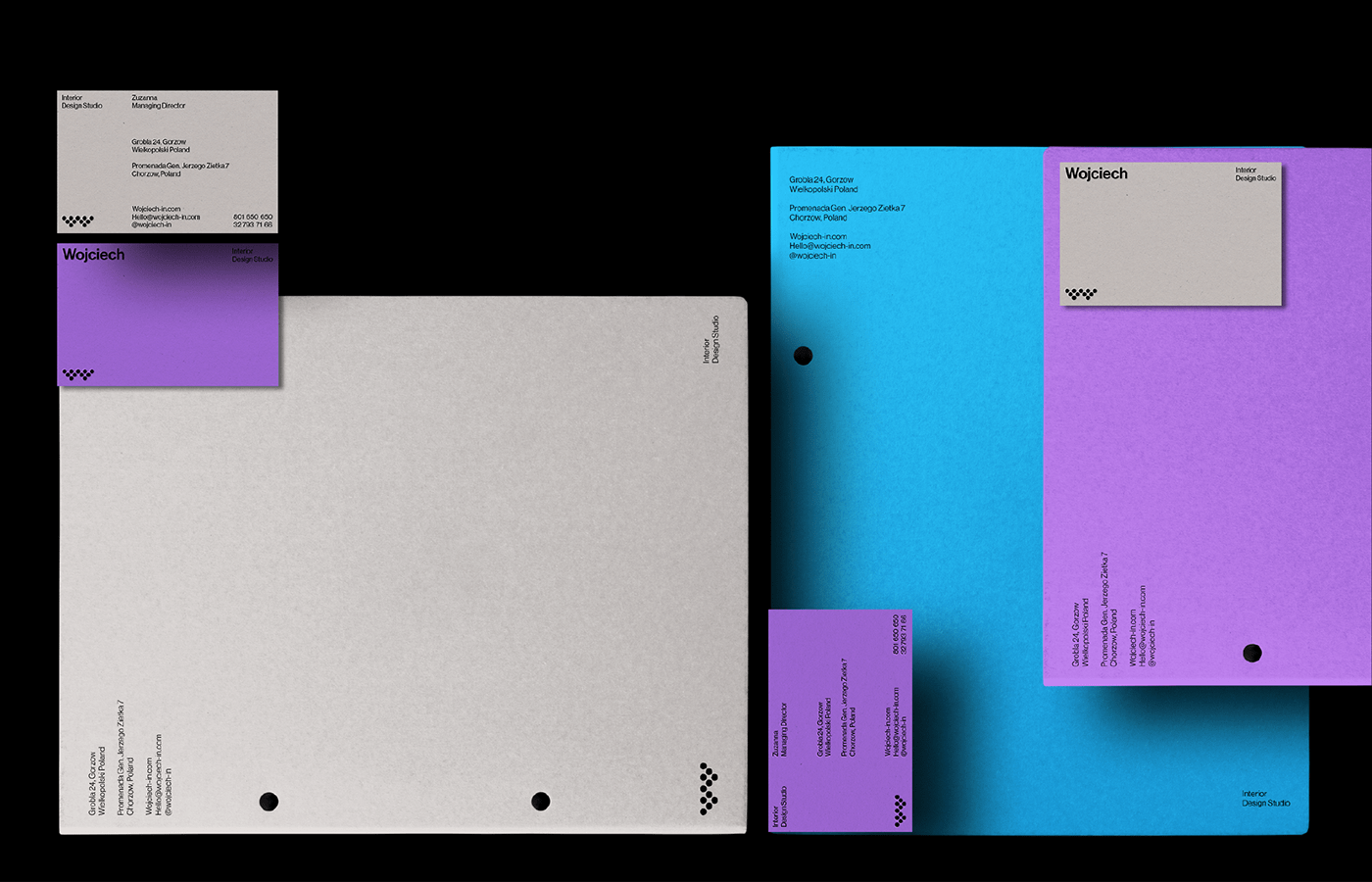
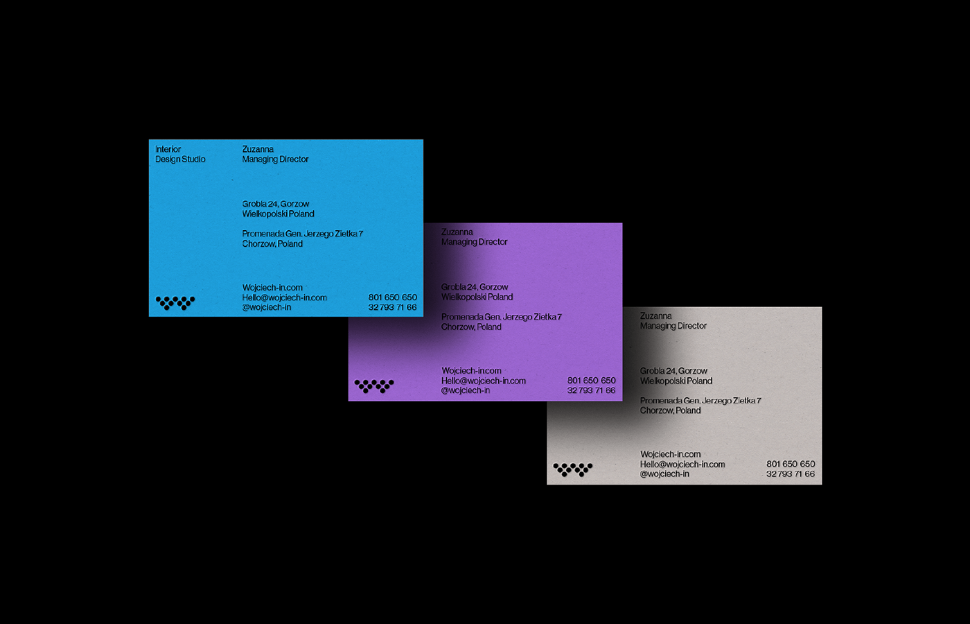
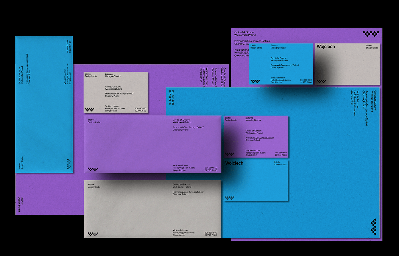
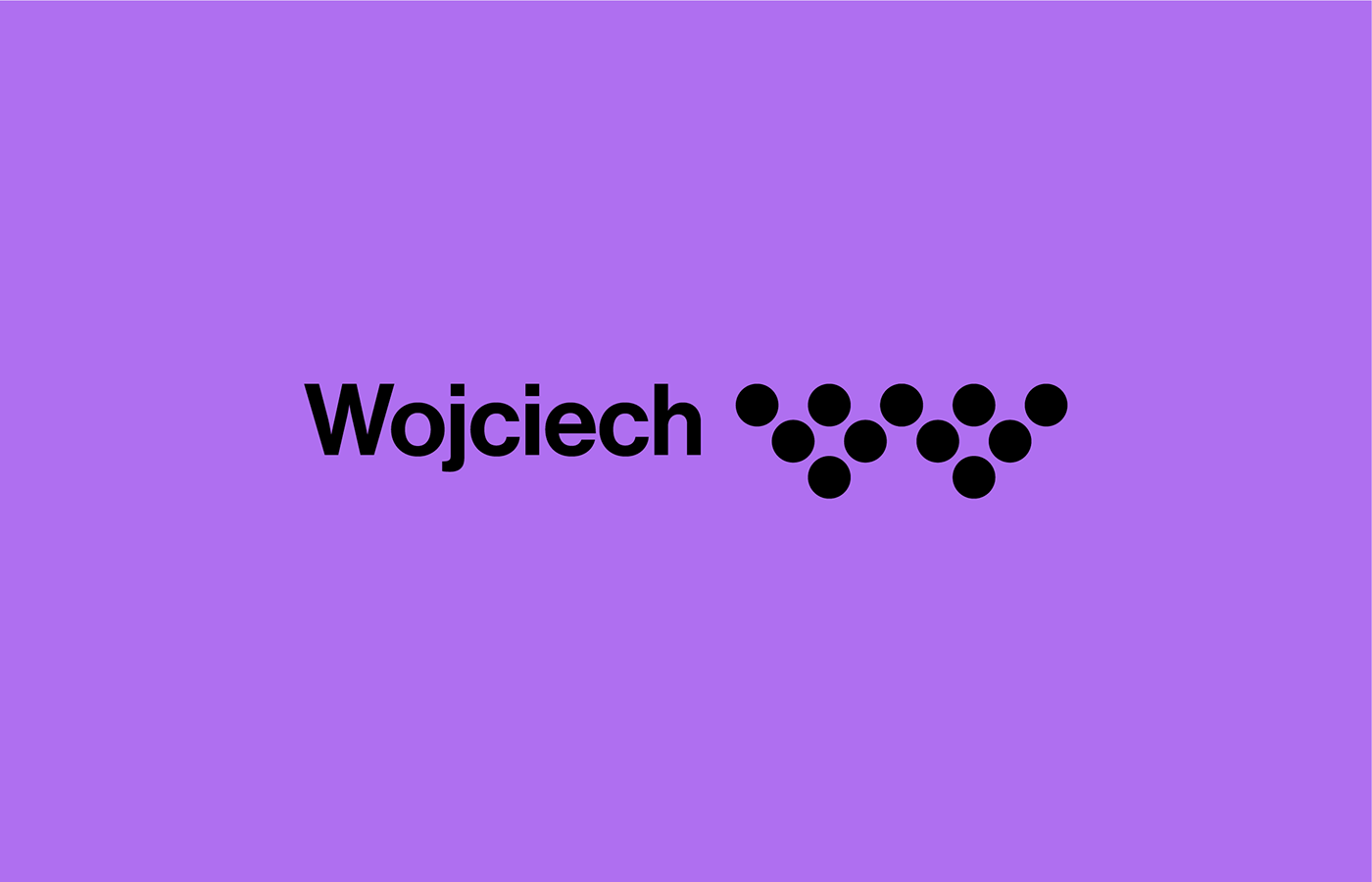
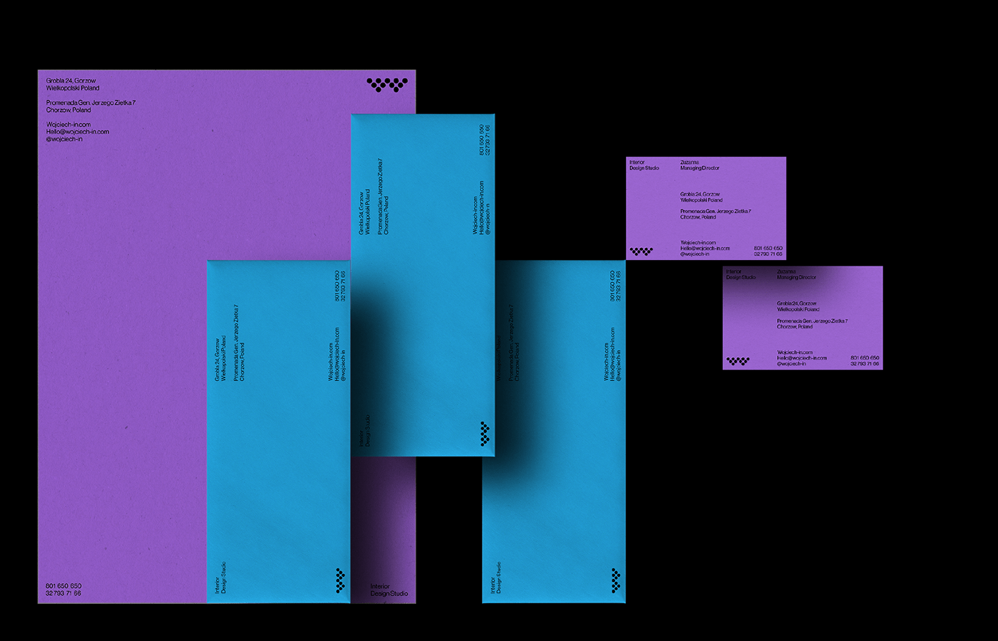
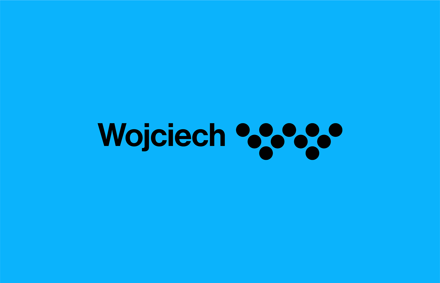
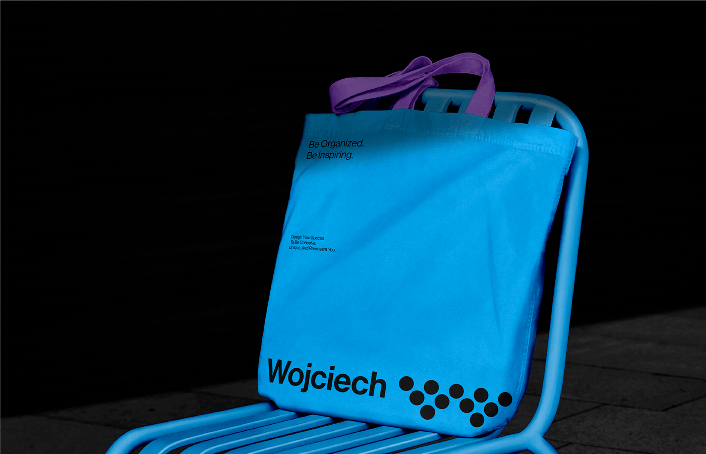
At the core of Wojciech Interior’s branding is the creative use of circles. The circular motifs are not just aesthetic choices but serve to represent the studio’s philosophy of continuity and wholeness in design. Circles often symbolize unity, and here they effectively convey the seamless integration and fluidity that Wojciech Interior aims to achieve in its design projects.
The brand’s color palette is another standout feature. Dominated by black and white, the design also incorporates shades of blue and purple. This combination provides a modern and sophisticated look while adding a touch of elegance and creativity. The colors are carefully chosen to evoke a sense of calm and professionalism, aligning perfectly with the brand’s identity as an interior design studio that values tranquility and precision in its projects.
The branding artifacts, from business cards to digital interfaces, maintain a consistent use of these elements. The circular symbols and the chosen color palette are seamlessly integrated across various media, ensuring that the brand’s identity is easily recognizable and cohesive. This consistency helps in building a strong brand presence, making Wojciech Interior a memorable name in the interior design industry.
Alee Hyder’s meticulous attention to detail and the thoughtful integration of design elements. His work on Wojciech Interior’s branding not only captures the essence of the studio but also sets a high standard for brand identity design in the interior design sector. Hyder’s ability to blend symbolism with practical design needs results in a brand identity that is both visually stunning and functionally effective.
Wojciech Interior’s branding is a testament to the power of simple but thoughtful design. By focusing on symbolic elements and a refined color palette, the brand successfully conveys its core values and stands out in the competitive field of interior design. This project serves as an inspiring example of how branding can effectively communicate a company’s philosophy and aesthetic vision.
Explore more about Wojciech Interior and the creative process behind its branding on Alee Hyder’s Behance profile .