by abduzeedo
Explore the striking branding and visual identity of Fertona, a financial services company. Discover how a strong logo and cohesive design create a lasting impression.
In the realm of financial services, establishing trust and credibility is paramount. Fertona, a financial services company, achieves this through a striking visual identity that marries simplicity with impact. Let's delve into the key elements that make Fertona's branding a success.
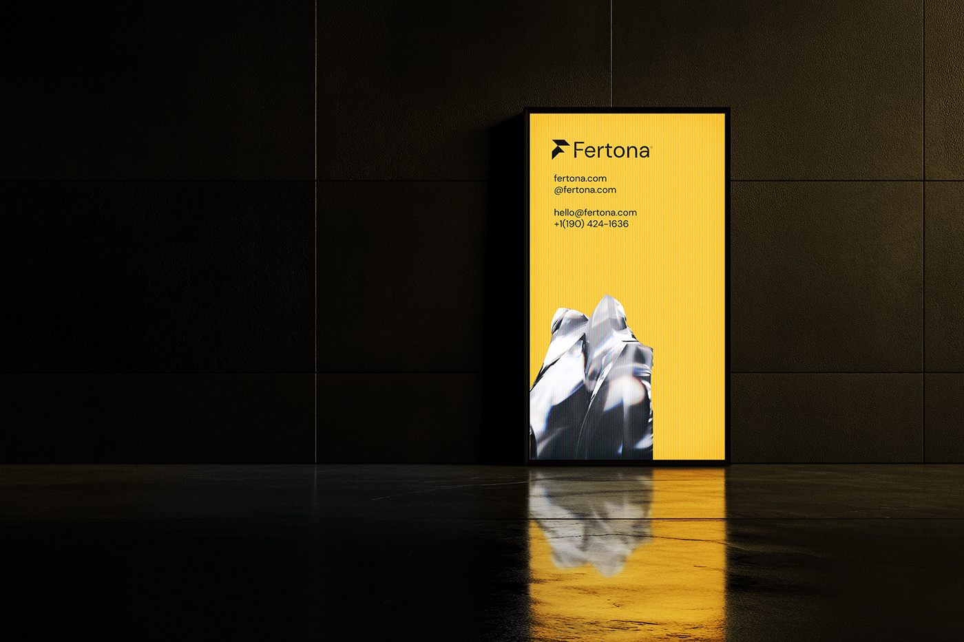
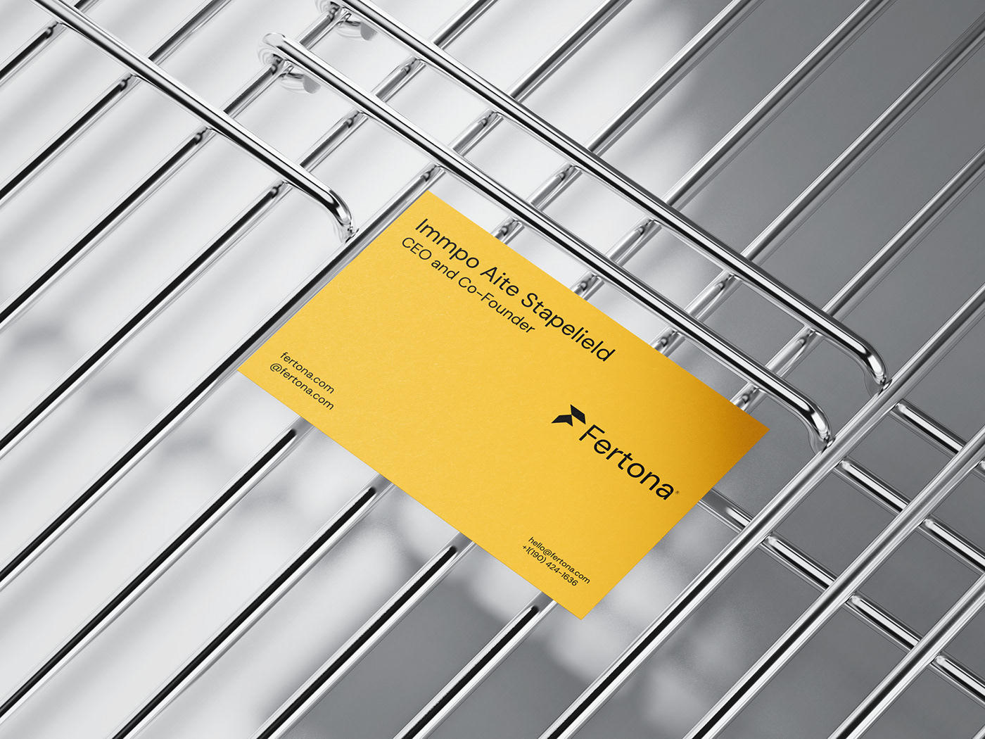
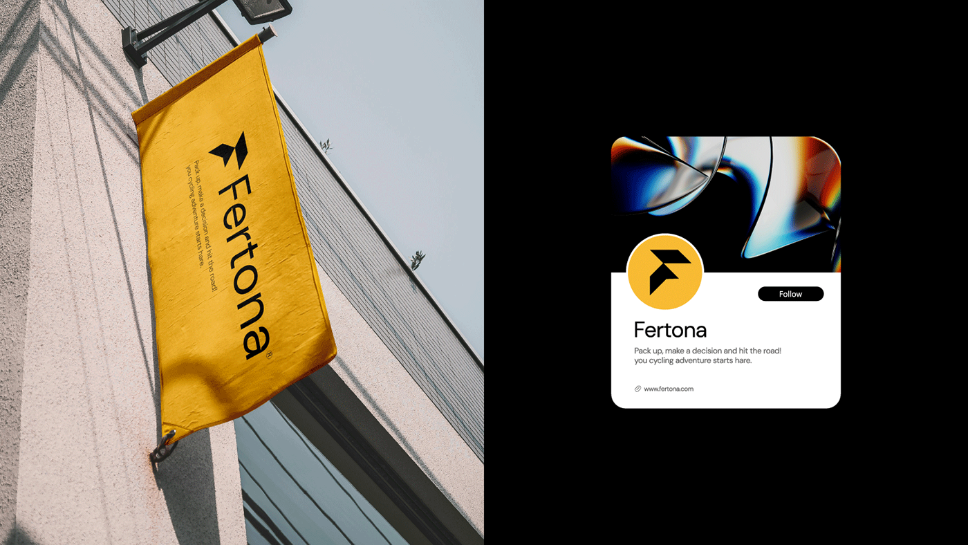
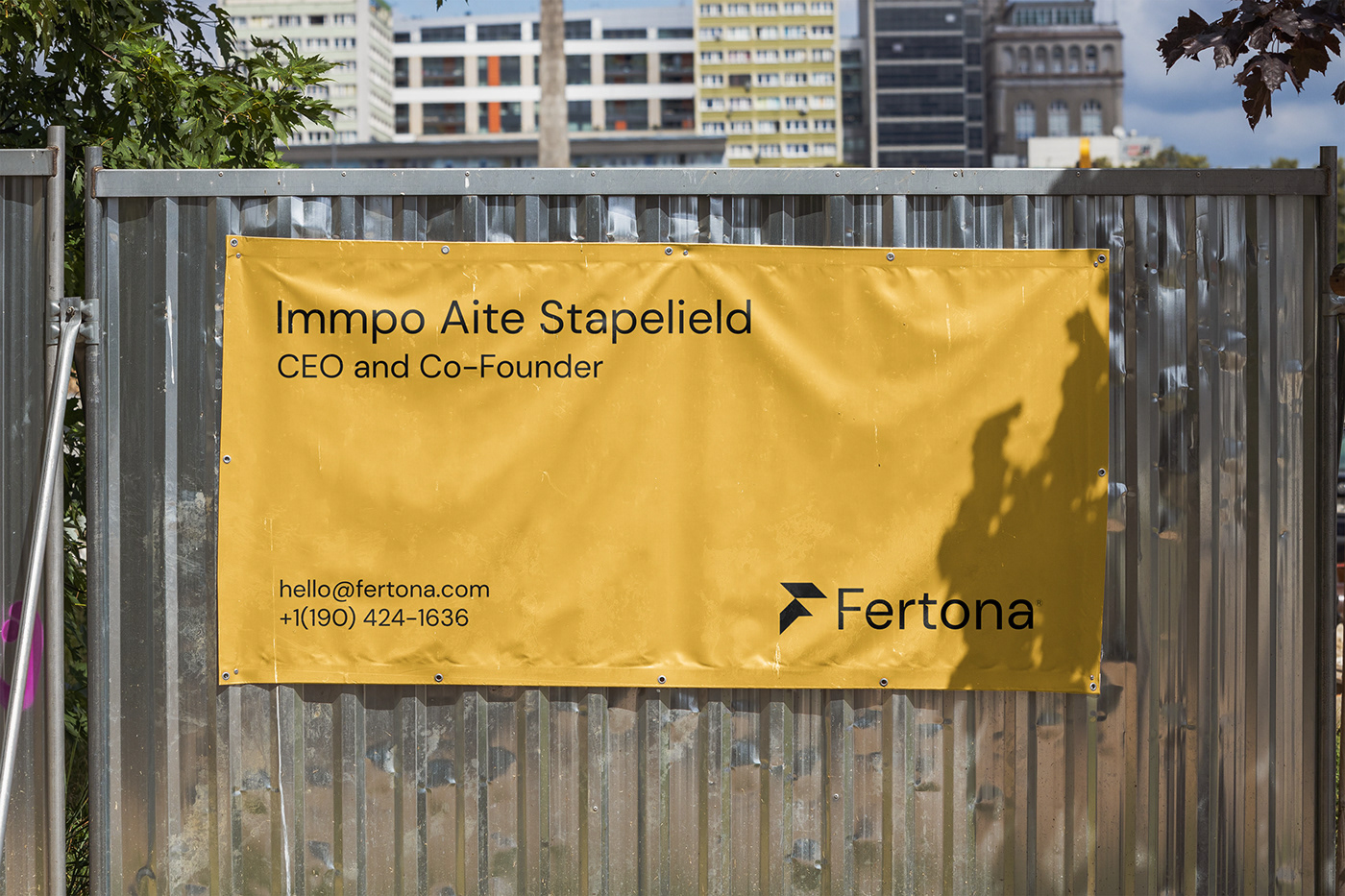
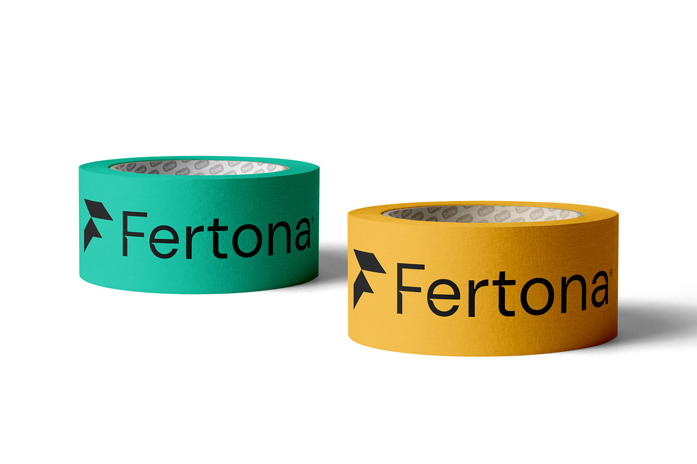
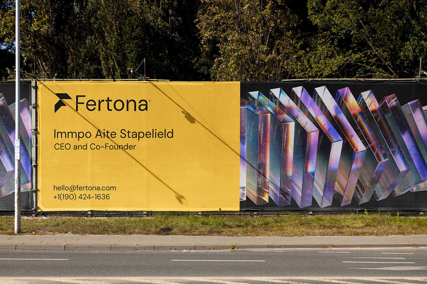
At the heart of Fertona's brand identity lies its logo, a stylized "F" that exudes both strength and dynamism. The sharp lines and geometric shapes convey a sense of professionalism and precision, qualities essential in the financial sector. The upward trajectory of the "F" suggests growth and progress, hinting at the company's commitment to helping its clients achieve their financial goals.
Fertona's color palette is a masterclass in contrast. The dominant use of black evokes sophistication and authority, while the vibrant yellow accents inject energy and optimism. This combination creates a visual language that is both bold and balanced, reflecting the company's confident yet approachable personality.
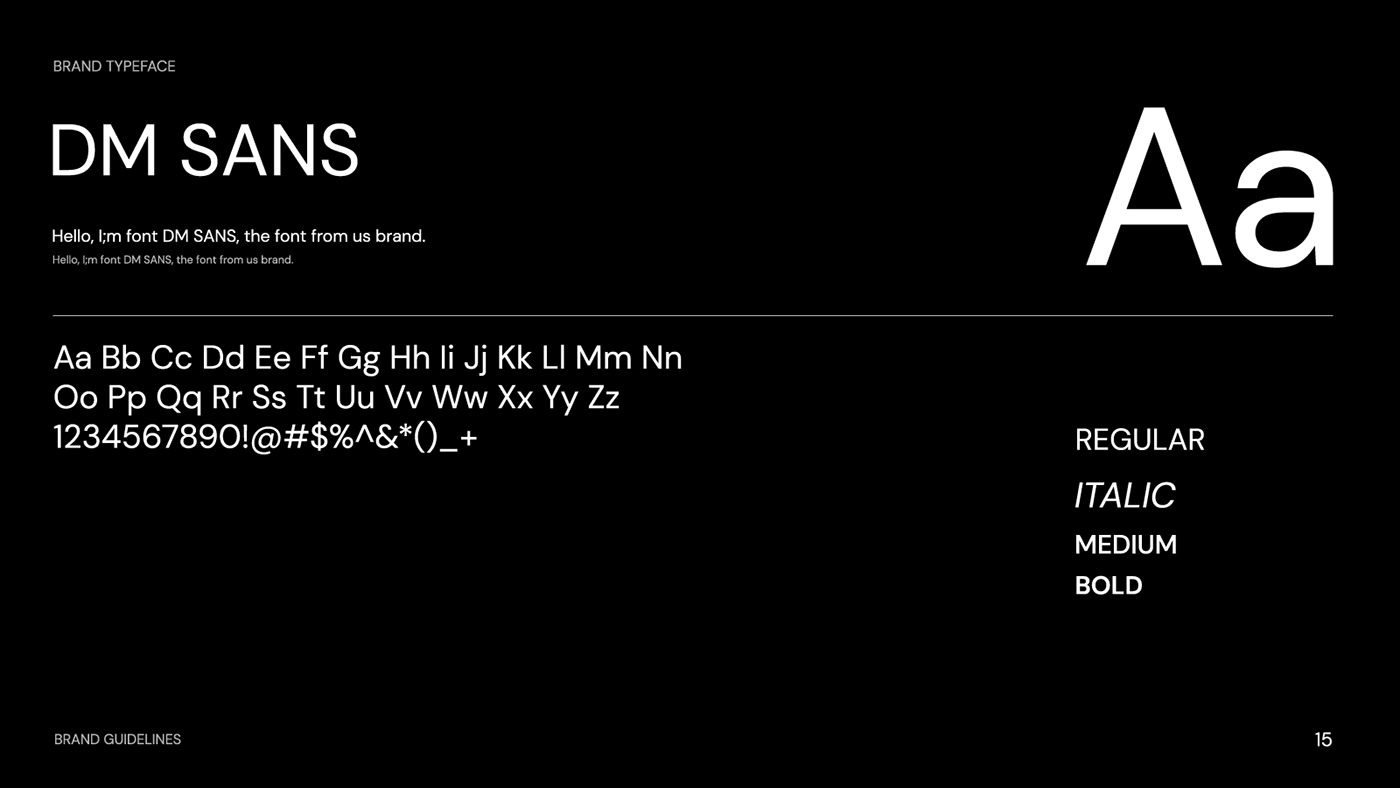
The choice of typography further reinforces Fertona's brand image. The clean, sans-serif typeface is contemporary and easy to read, ensuring clarity and accessibility across various applications. The subtle variations in font weight add visual interest without compromising legibility.
Fertona's branding extends seamlessly across various touchpoints, from business cards and stationery to website design and marketing materials. The consistent use of the logo, color palette, and typography creates a cohesive brand experience that strengthens recognition and recall.
Fertona's branding is a testament to the power of thoughtful design. By combining a strong logo with a cohesive visual language, the company has created a brand identity that is both memorable and impactful. This visual identity not only establishes trust and credibility but also sets Fertona apart in a competitive market.
Branding and visual identity artifacts


Key Takeaways for Designers
Fertona's branding offers valuable lessons for designers:
- Simplicity is Key: A simple yet impactful logo can be more effective than a complex one.
- Color Matters: Choose a color palette that reflects your brand's personality and values.
- Consistency is Crucial: Maintain consistency across all brand applications to create a cohesive experience.
- Think Beyond the Logo: A strong brand identity encompasses more than just a logo; it's a holistic visual language.
By embracing these principles, designers can create brand identities that resonate with audiences and stand the test of time.
For more information make sure to check out Darrin® on Behance


