by abduzeedo
In the ever-evolving realm of fitness and well-being, Basis London emerges as a beacon of balance and purpose. Founded by individuals who already boasted a successful Cross Fit gym, their vision was clear: to address the elemental aspects of holistic well-being often overlooked by their competitors. With a mission to unlock human potential by nurturing high-performance bodies, serene minds, and authentic connections, Basis London set out to redefine the gym experience with a new branding and visual identity.
The design journey embarked upon by Studio NinetyOne for Basis London was a testament to the principle of simplicity in sophistication. Their strategic approach revolved around harmonizing the fundamental components of the gym, both in terms of physical training and mental well-being. The result? A branding identity that speaks volumes through minimalist elegance.
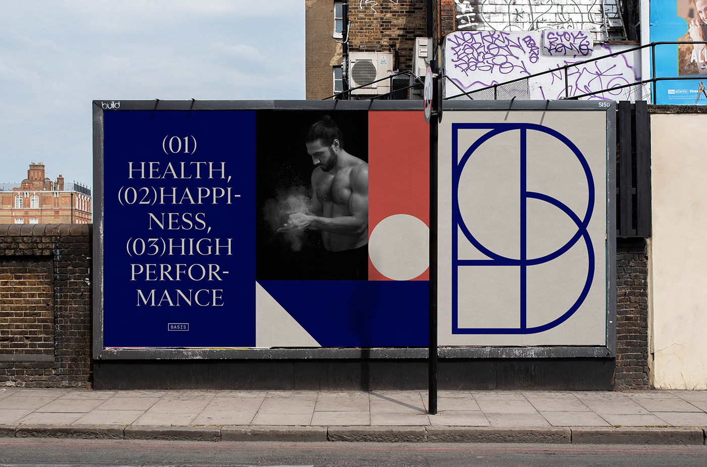
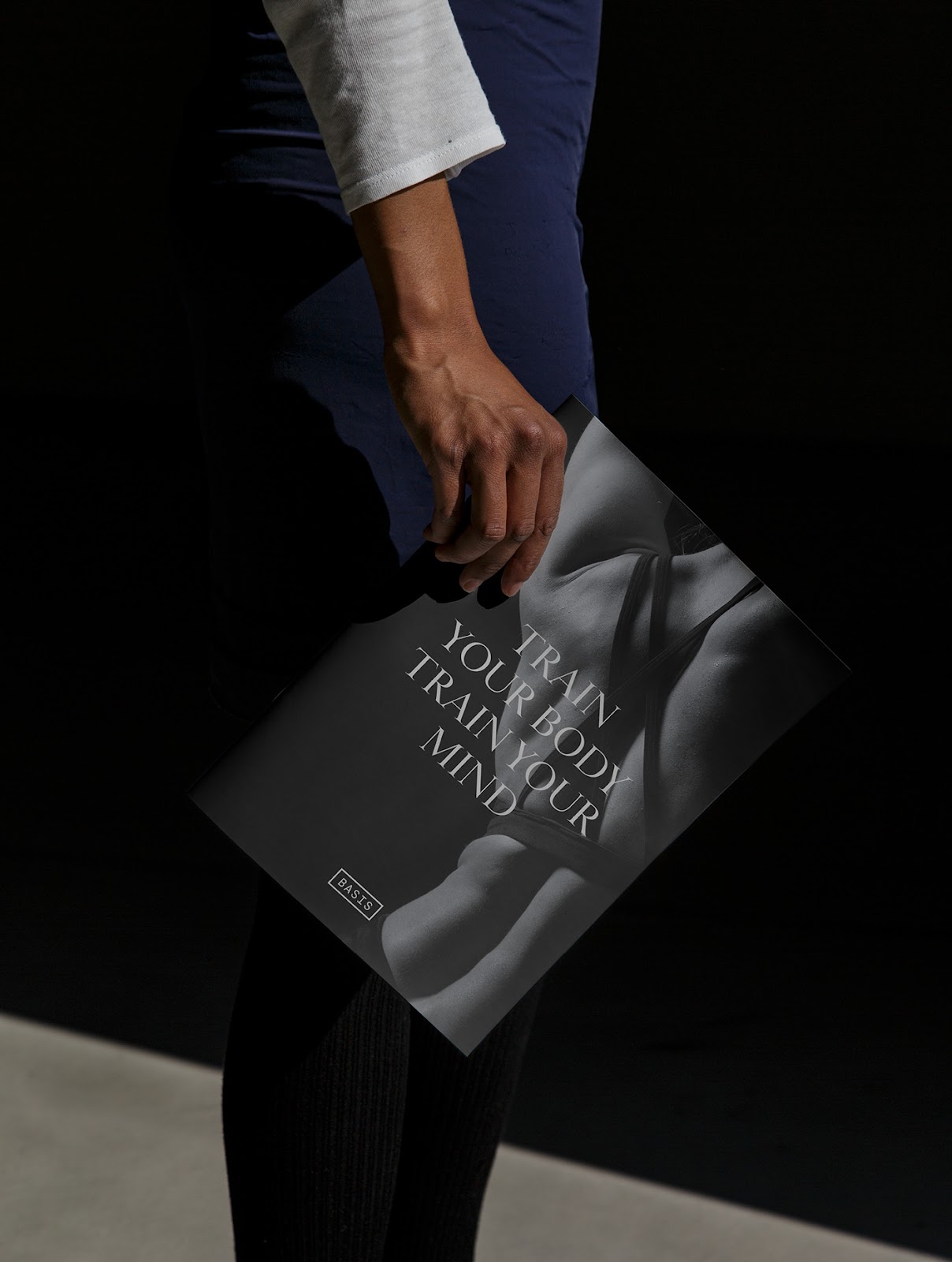
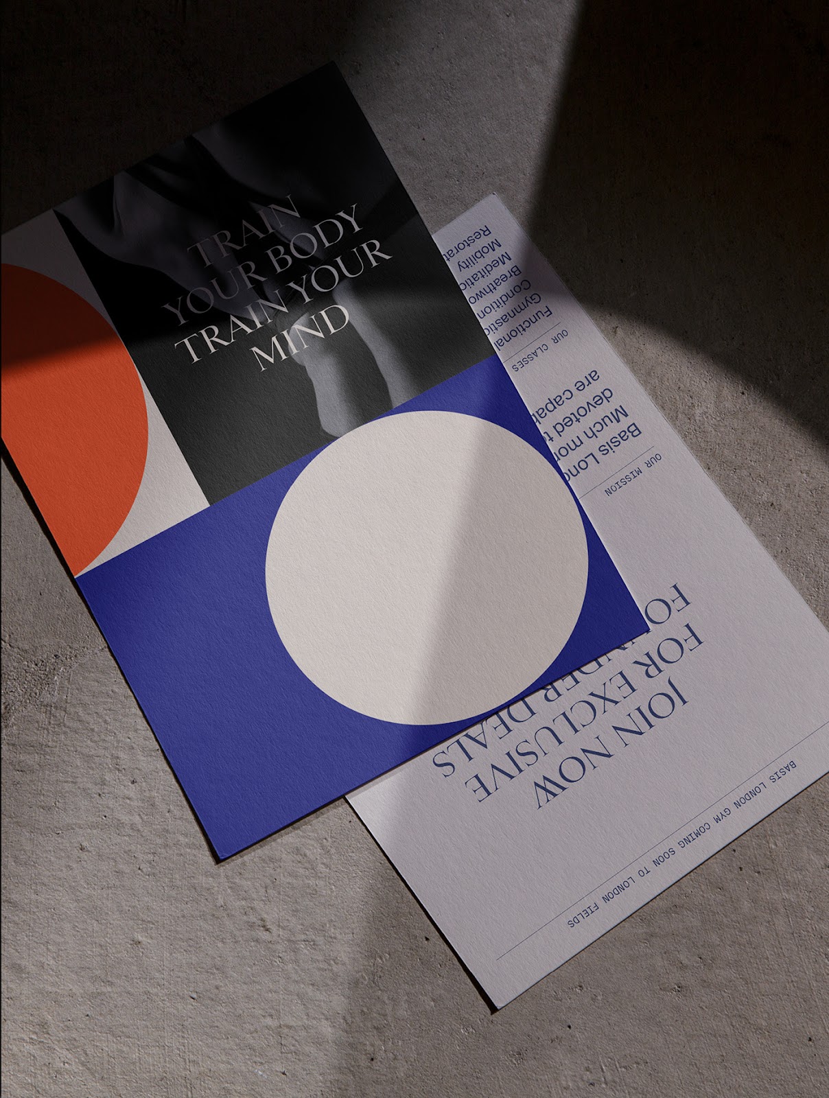
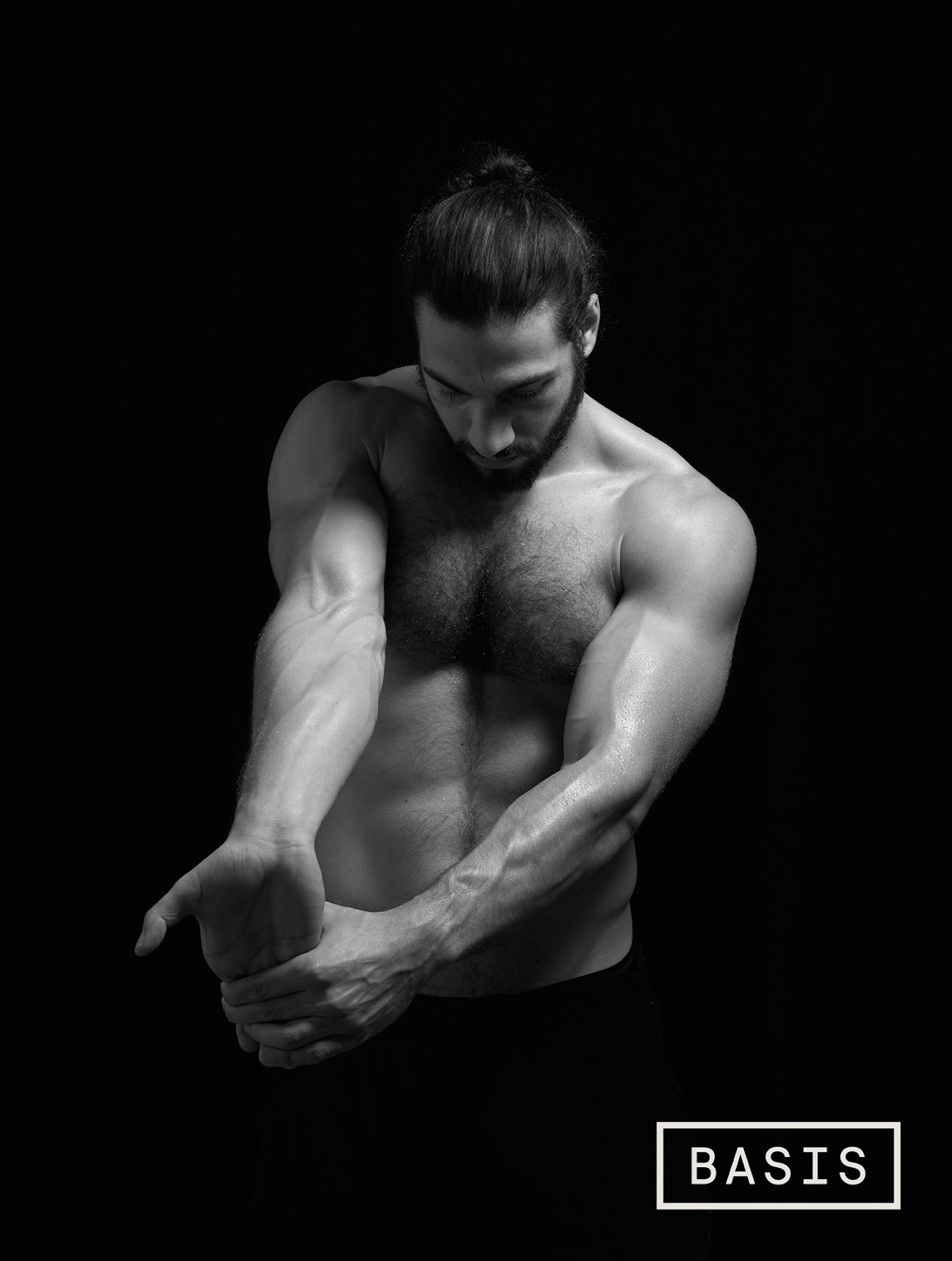
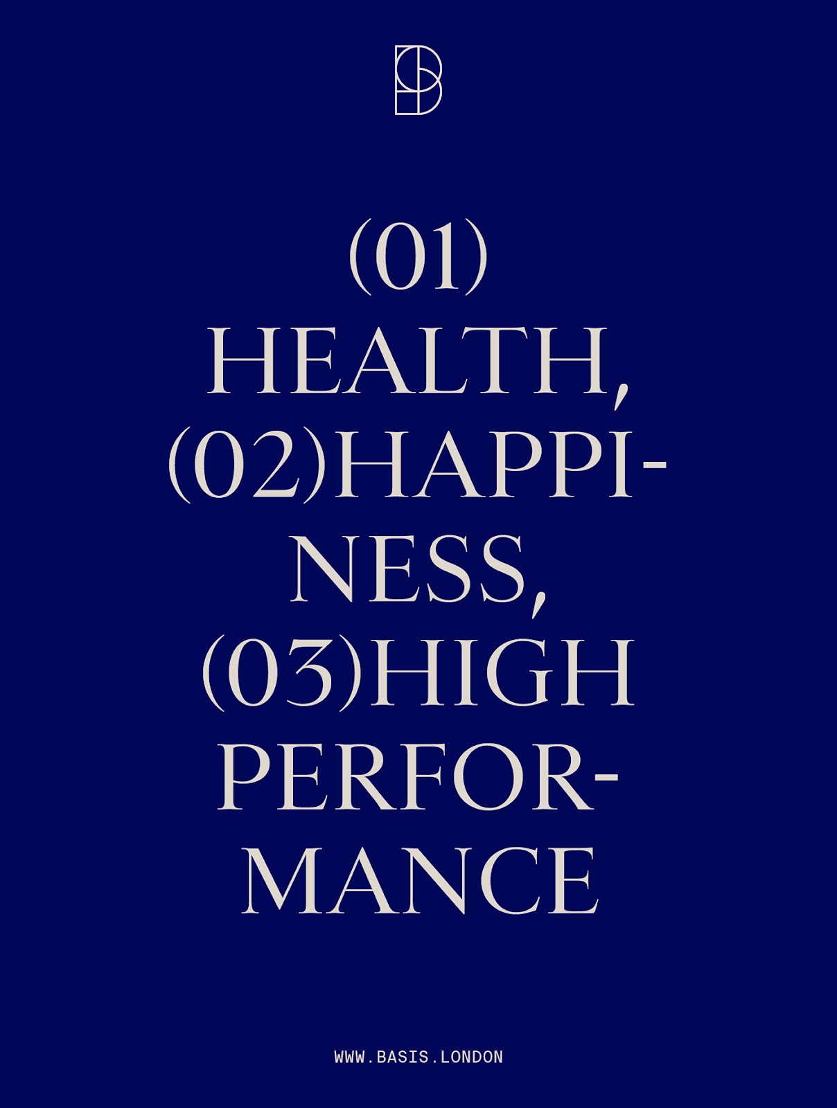
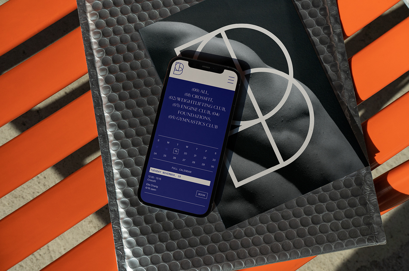
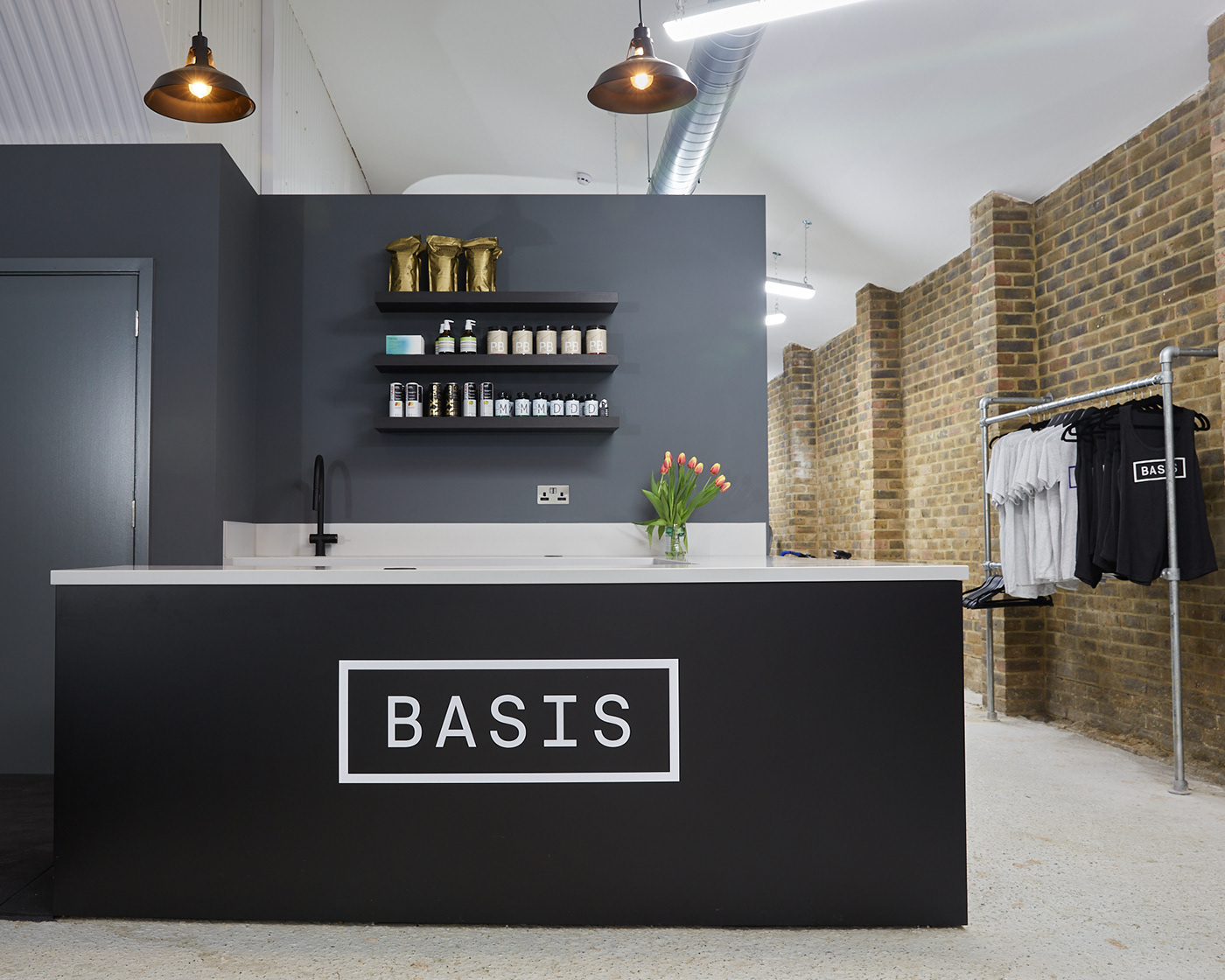
At its core, the branding revolves around a palette of base colors and geometric shapes. This choice was deliberate, allowing for flexibility and dynamism while paying homage to the traditional gymnasium floor markings. It's a system that breathes, offering a serene space for both body and mind to thrive. The art direction and subsequent photography work encapsulate this ethos, emphasizing the interplay between muscle and intellect.
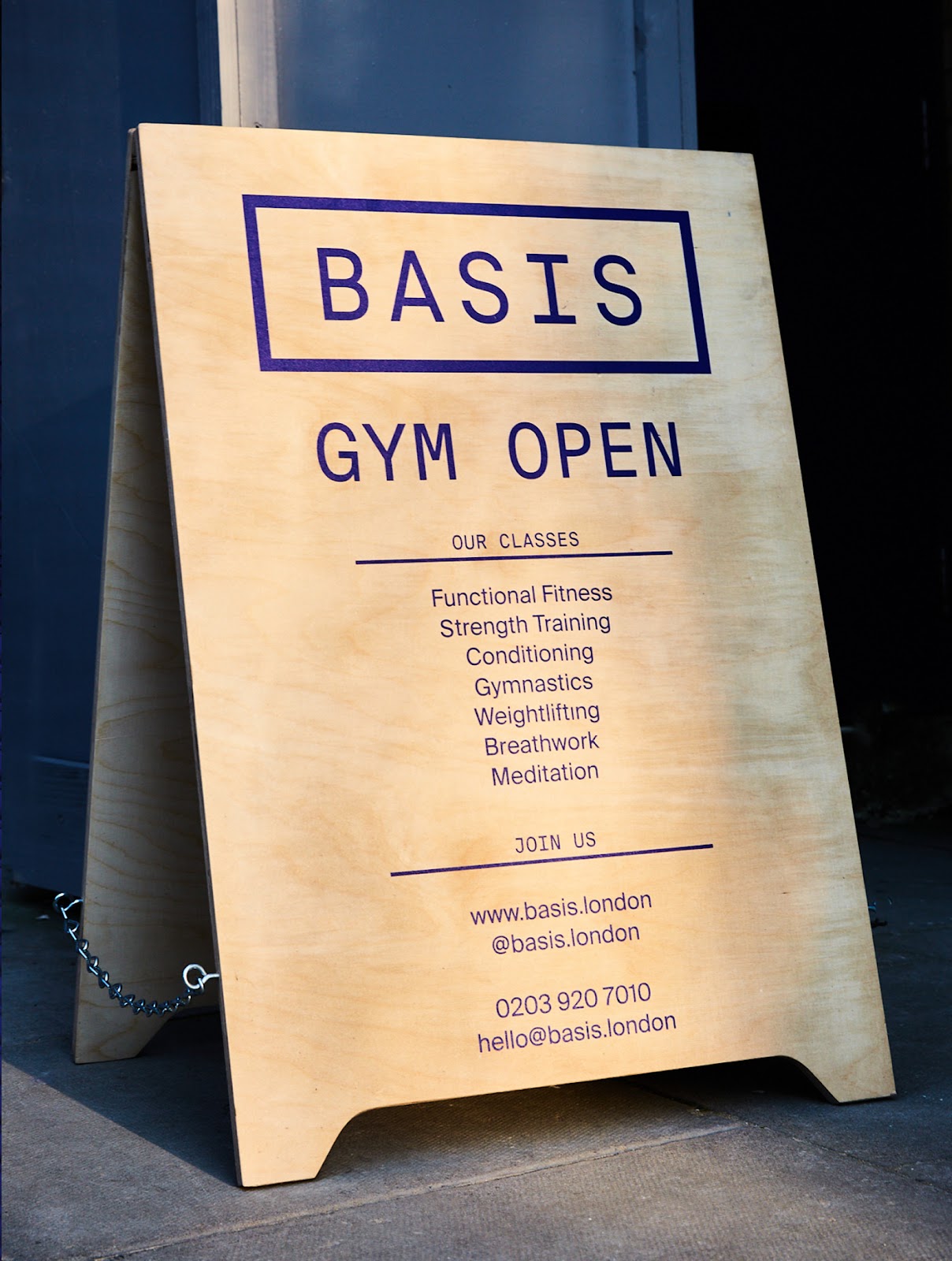
Basis London's logo, a subtle yet refined 'B,' draws inspiration from the markings found in versatile sports halls. It symbolizes the gym's adaptability while retaining precision and control. This universal graphic language effortlessly communicates the essence of Basis London, bridging the gap between physical and mental well-being.
What sets Basis London apart is its commitment to the future of the gym experience. It represents a holistic approach to happiness and peak performance. In a world cluttered with fitness fads and extravagance, Basis London emerges as a refined and clear alternative.
In conclusion, Basis London's branding and visual identity, meticulously crafted by Studio NinetyOne, is a testament to the power of simplicity in design. It captures the essence of a gym that values both the physical and mental aspects of well-being. With a minimalist yet purposeful approach, Basis London paves the way for a brighter and more balanced future in fitness and holistic wellness.
Branding and visual identity artifacts


Full case study on our website Studio NinetyOne