by abduzeedo
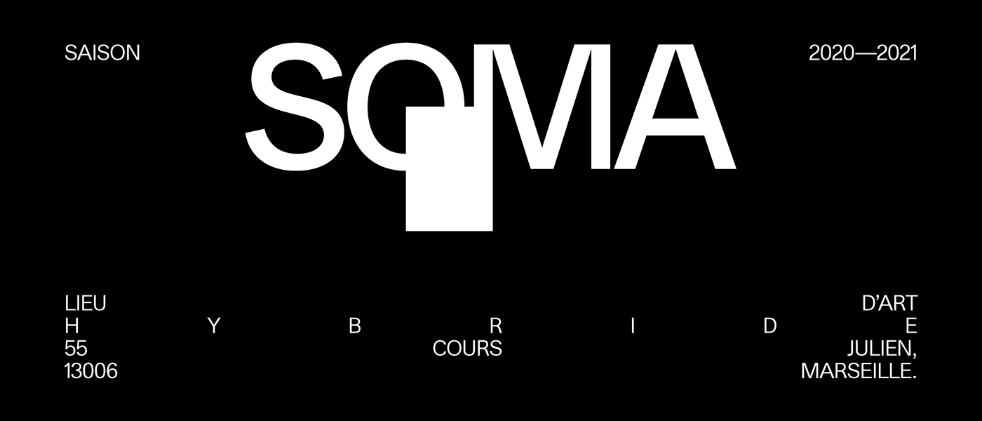
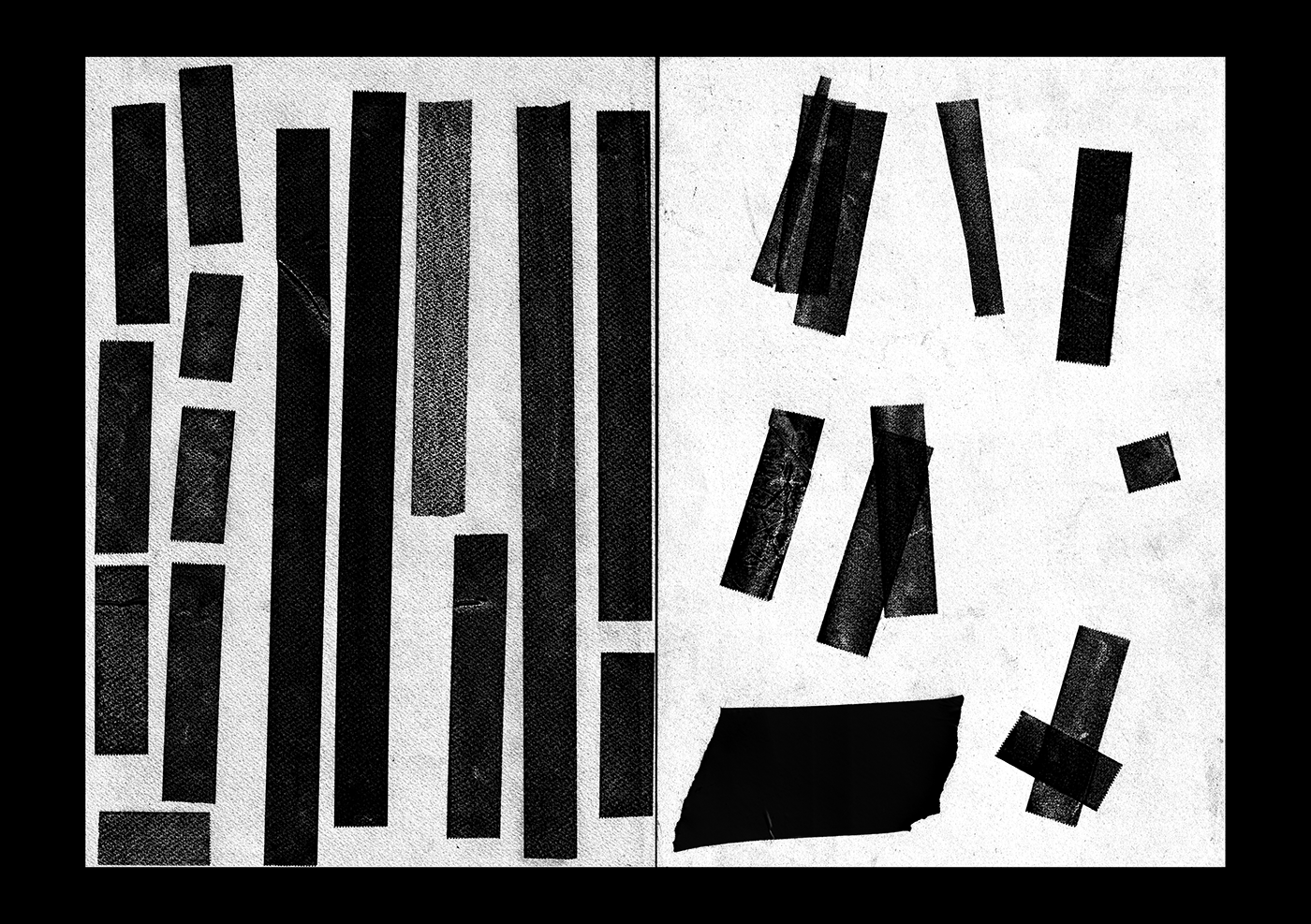
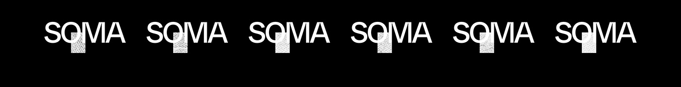
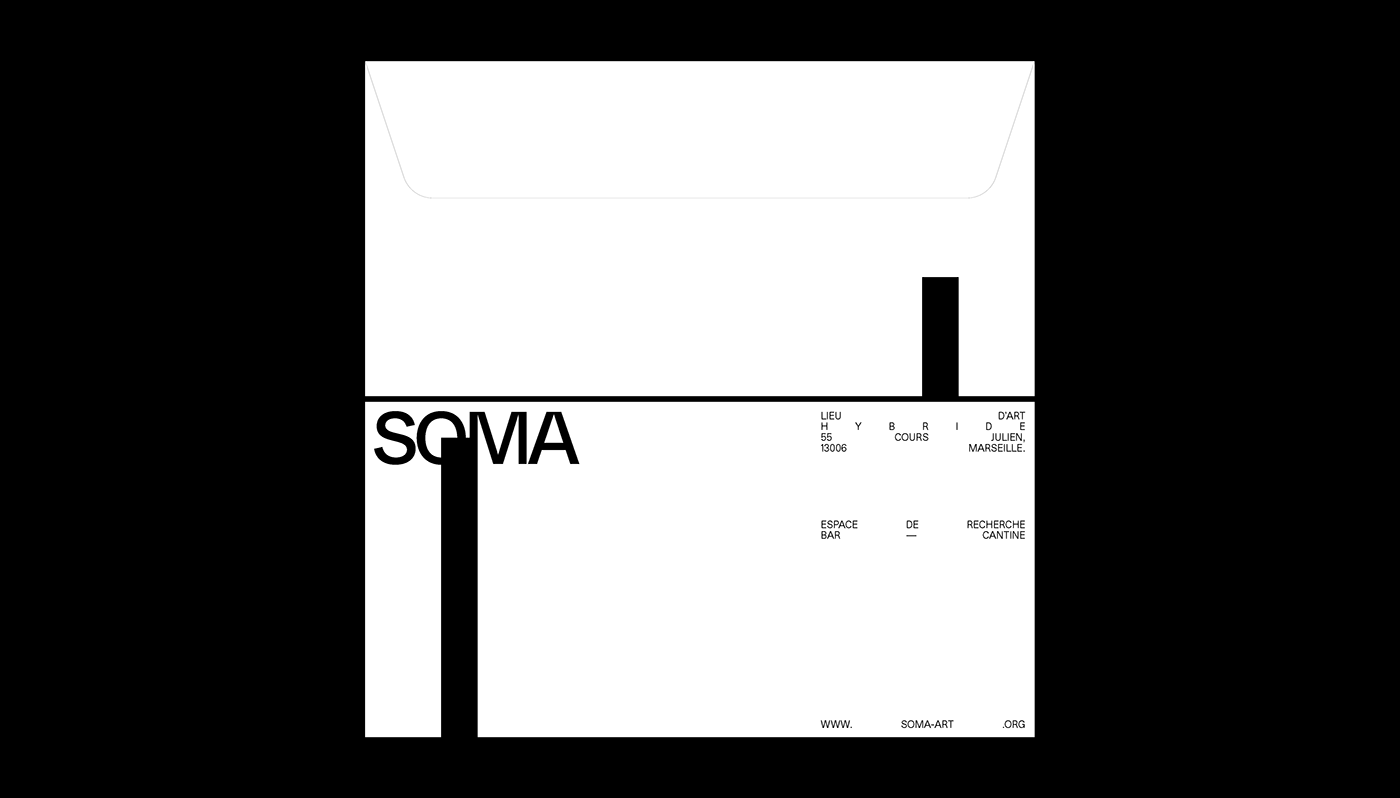
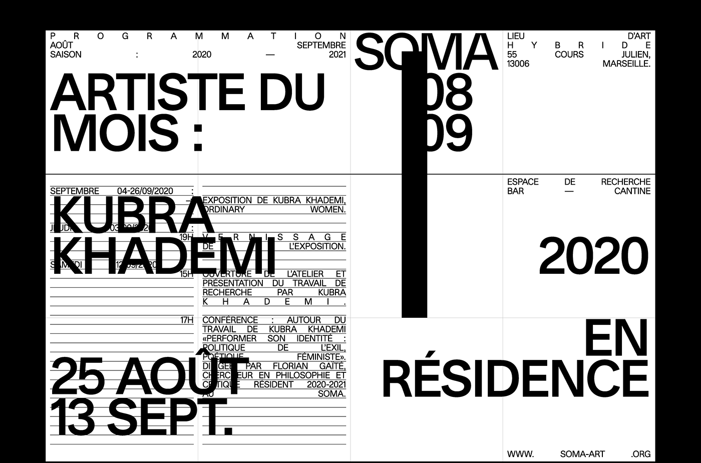
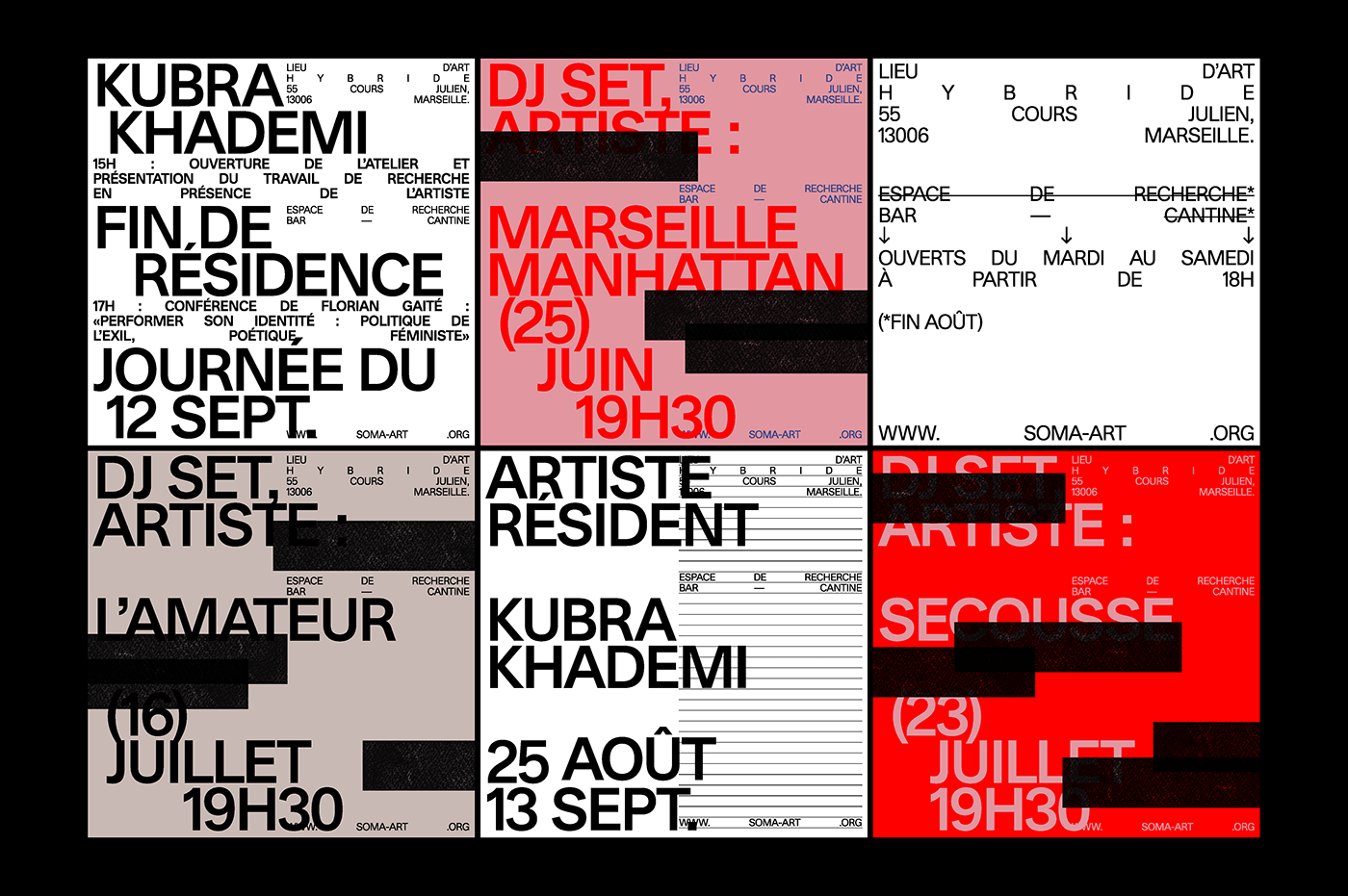
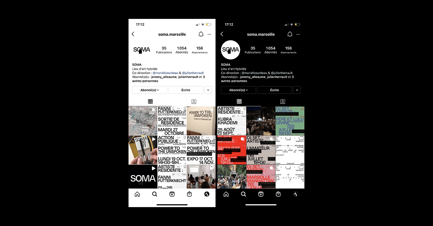
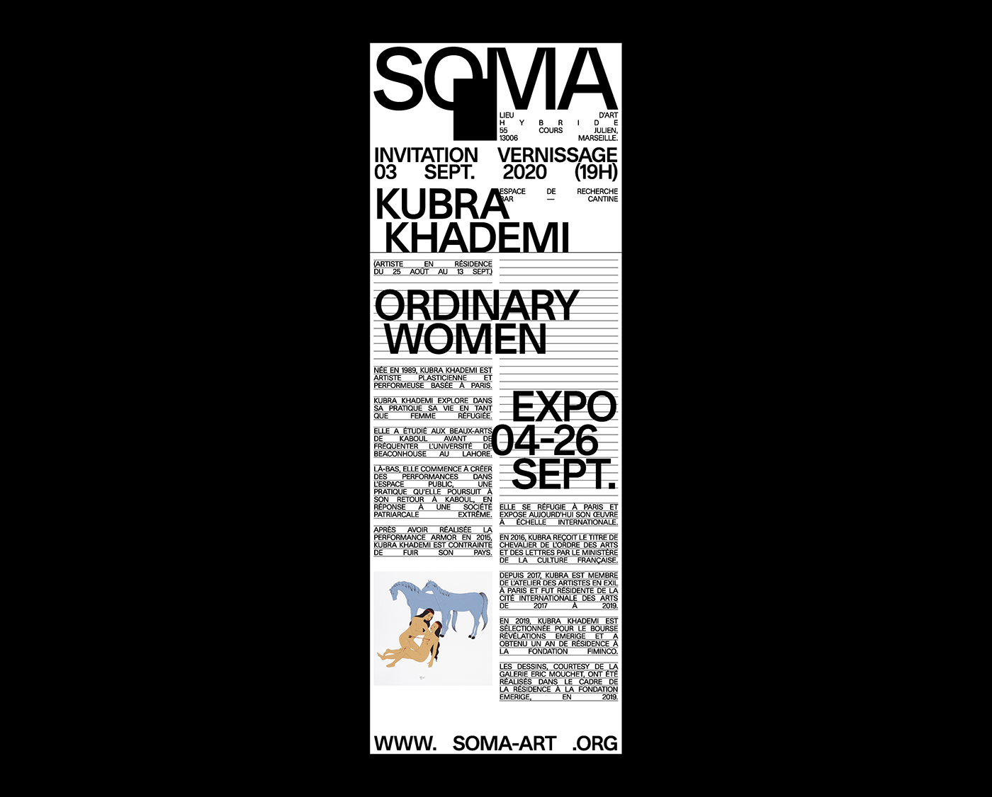
Quatrième Étage share a quite inspiring branding and visual identity project created for SOMA, an hybrid art place located in (55 Cours Julien 13006) Marseille. Co-directed by Muriel Bourdeau and Julien Herrault. The black square represents a piece of scotch tape, often used by artists for display, installation and presentation of their artwork. It is sometimes even part of the artwork itself. Its graphic form affixed to the letters SOMA allows the idea of taping a work of art to the walls of SOMA to be transcribed and thus makes the link between the place and its main intention: the display of works of art. To summarize their description, it’s just awesome!