by abduzeedo
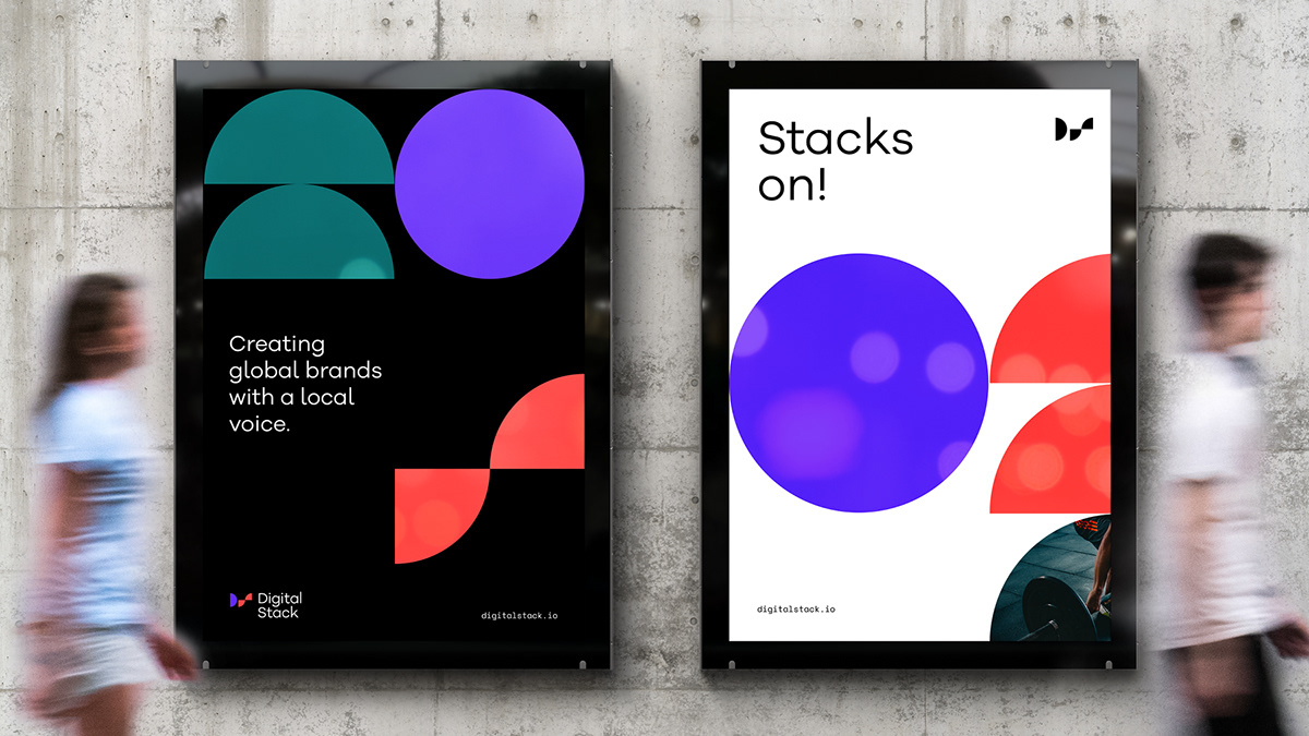
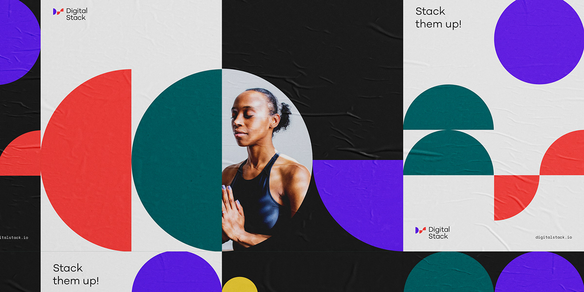
Motherbird shared a branding and visual identity for Digital Stack, a leading marketing and brand management platform for franchise and multi-location businesses, Digital Stack has undergone a transformative evolution and growth of their services and audiences. With this came the opportunity to clear the stack and redefine the company through a new brand position, strategy and identity that reflects the expertise, empowerment and value they deliver to their clients.
Leading by example
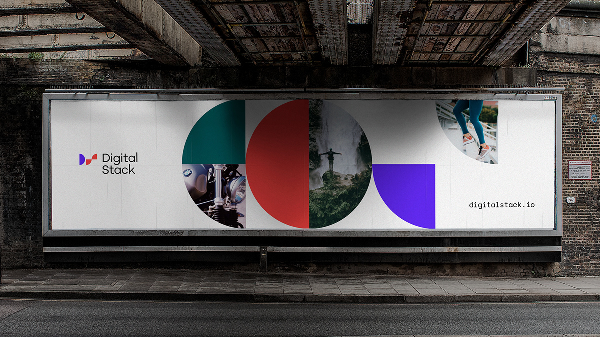
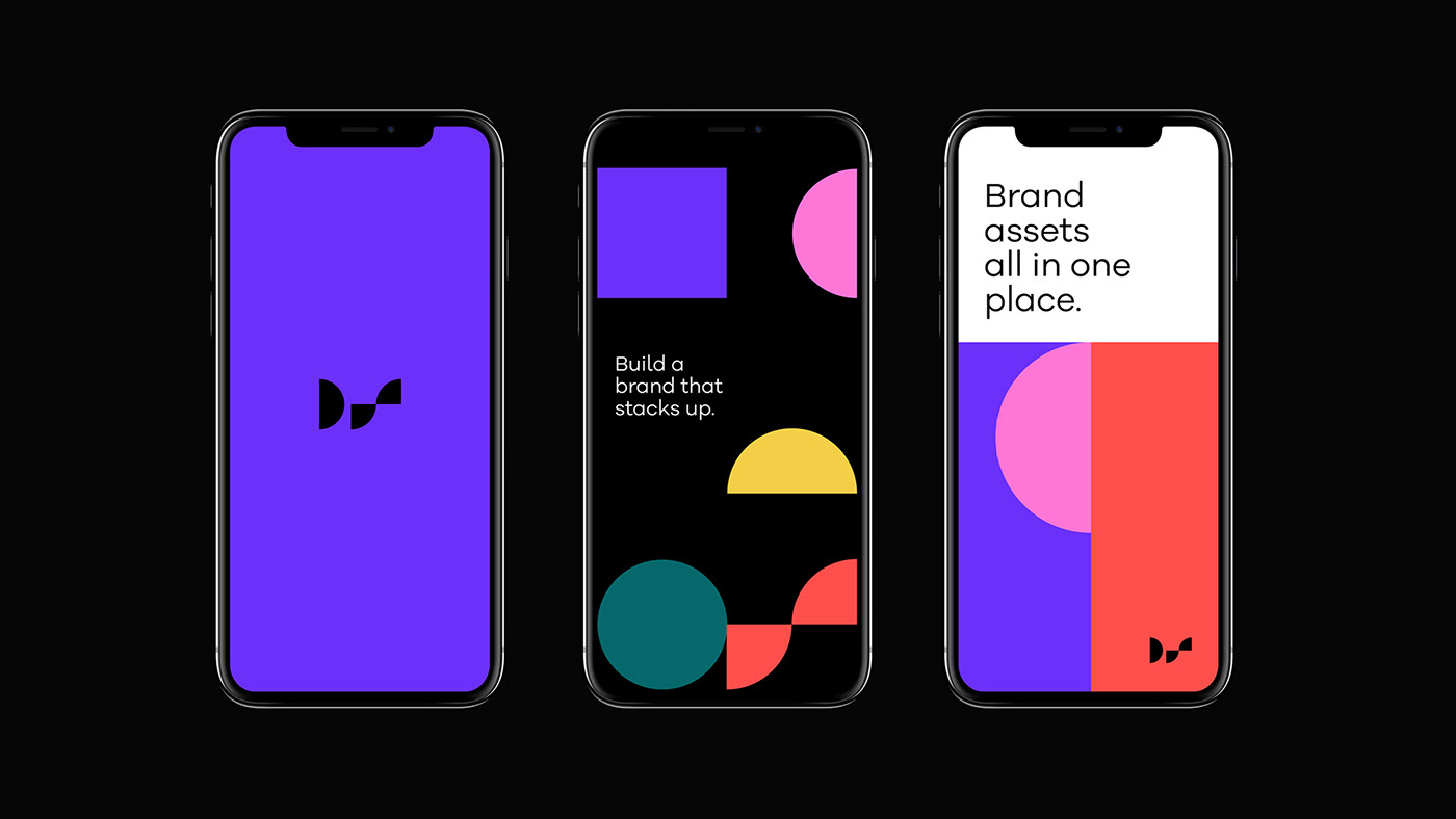
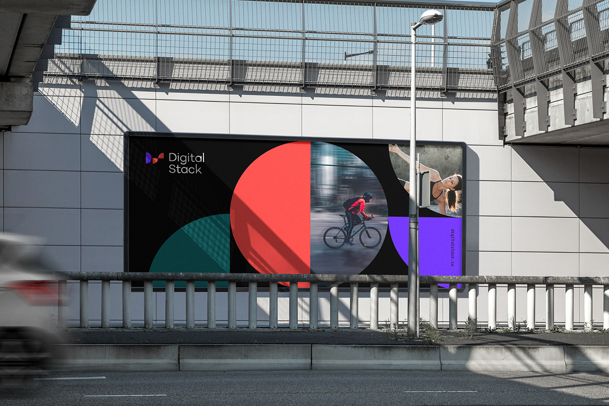
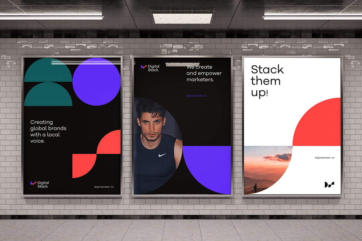
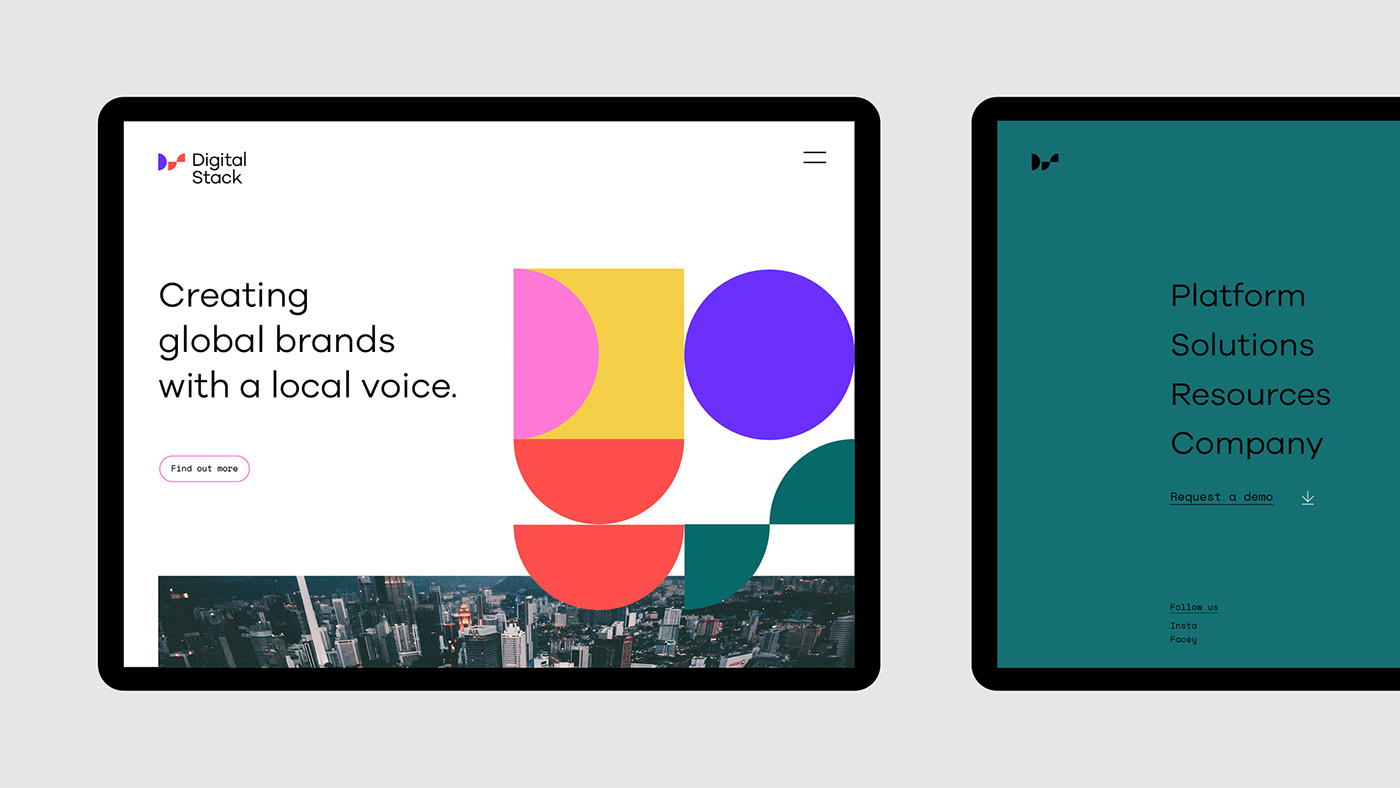
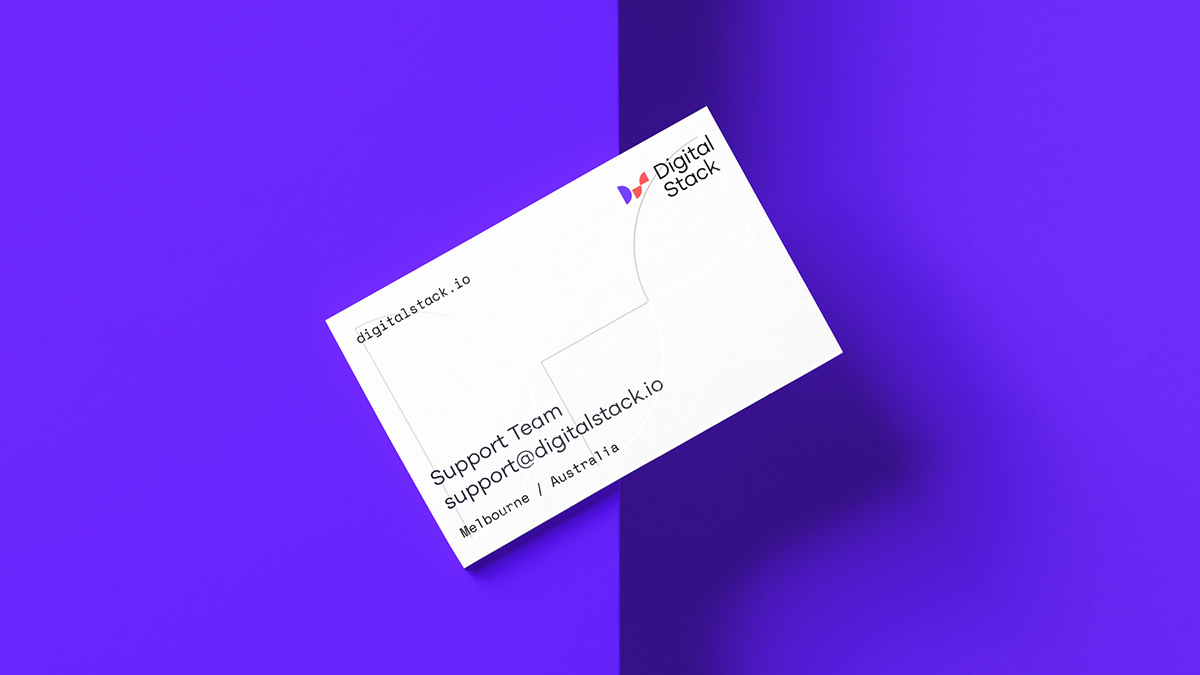
Asking clients to trust them with one of their most valuable assets; their brand, means Digital Stack must leave no doubt that they value and respect their own. Through a dynamic yet structured visual and verbal brand system, we delivered a brand identity for Digital Stack that ensures they practice what they preach.
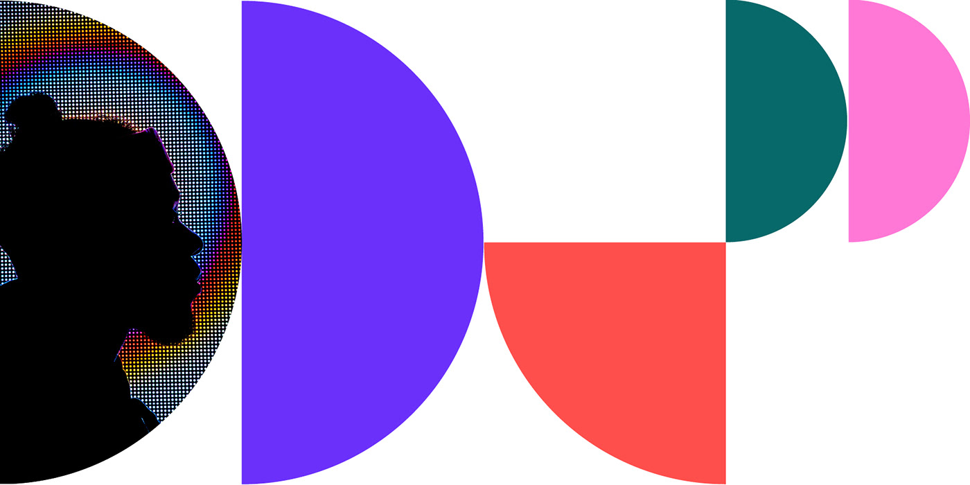
Dynamic and evolving shapes move effortlessly and flexibly within a strong gridded visual framework as a literal link to the Digital Stack name and their purpose of protecting and amplifying brands with consistency. The infinite variations serve as a visual metaphor that a brand is the accumulation of many moving pieces and can be tailored to connect with specific locations and audiences. There’s no one size fits all in local area marketing.