by abduzeedo
A few weeks ago my brother Eduardo Sasso showed me an idea he had for a web service that would be perfect for those who travel a lot or simply want to keep track of their adventures when they are away from their places. I loved the concept and I joined him along side with Gisele Muller and Fabiano Meneghetti to make that app become real. The name was already chosen, Mentaway.
Talking to my brother and Gisele, the creators of the whole idea, they gave me some insights on how they see the service, the goals and philosophy behind it. My role would be come up with the design.
The first thing I did was list some keywords:
- Traveling
- Map
- Route
- Compass
- Direction
- Away
- Pinpoint
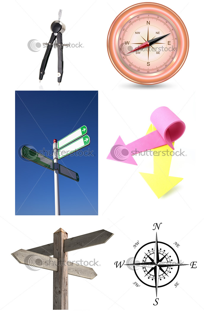
I started looking for compass, map and direction images. I collected quite a few images and got some ideas already in my mind.
First concept: Lettering and Arrow.
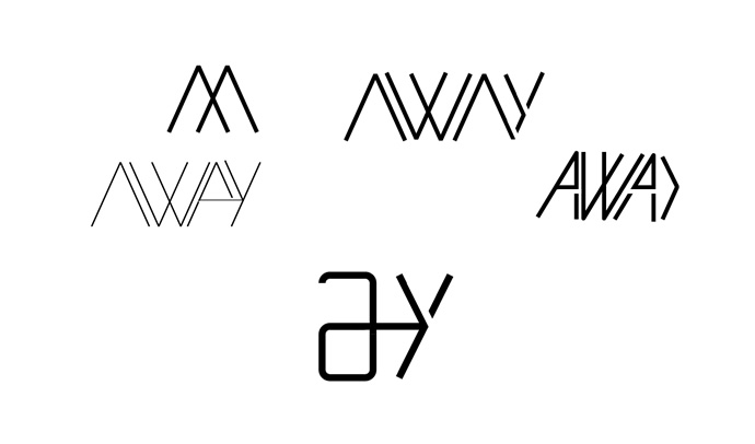
The first concept I explored was using an arrow in the lettering. Similar to the Fedex concept but using the A and the Y.
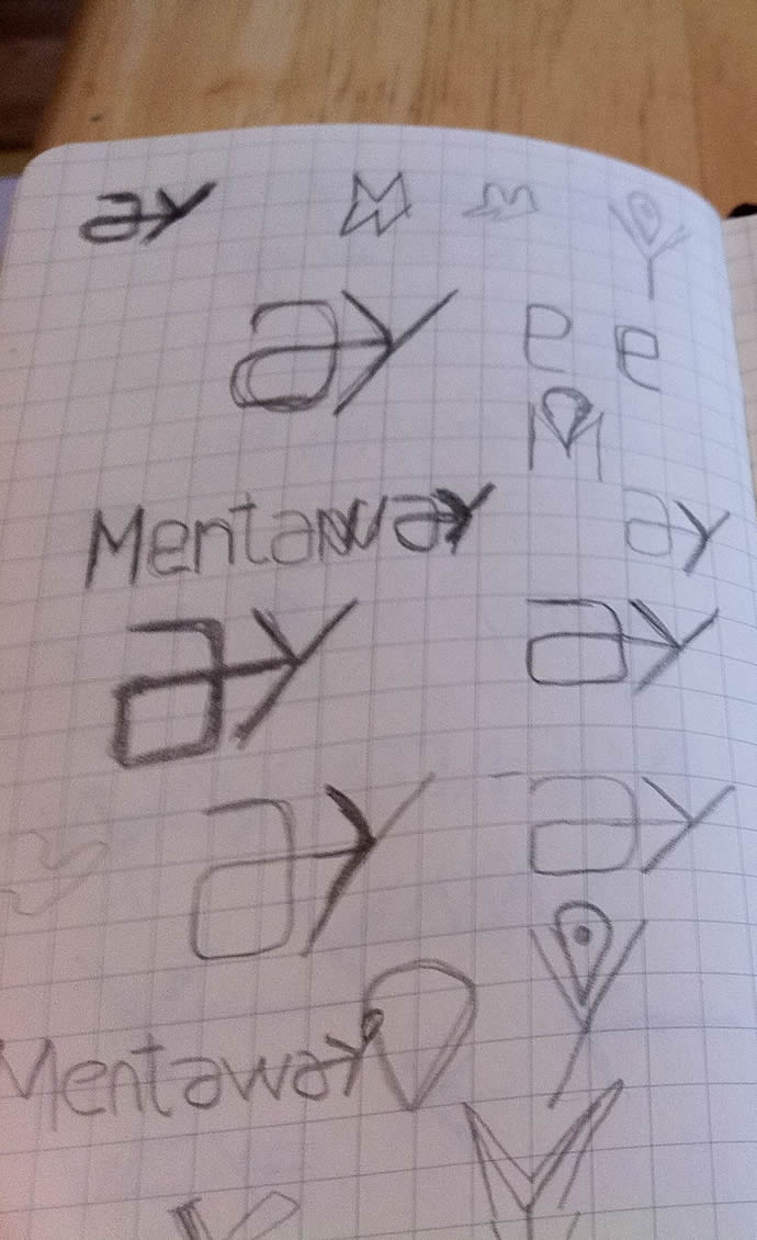
After sketching I went to the computer and tried to come up with something based on those ideas. It turned out that it wasn’t a very solid concept, it was hard to apply it in the lettering especially because the A and Y would have to be aligned in a way in order to make the arrow visible. Plus I thought it didn’t have personality and uniqueness. The Mentaway logo had to be something with a symbol in my point of view.
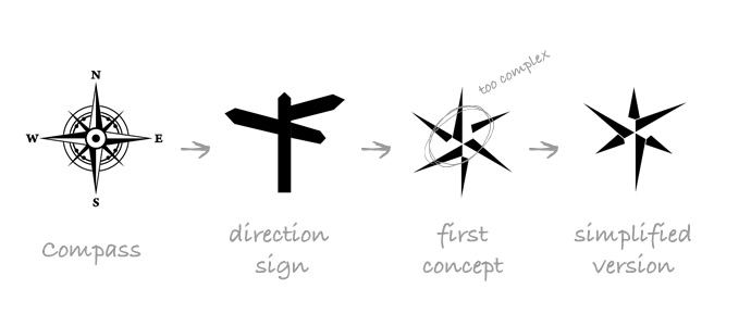
Second concept: Compass and direction sign
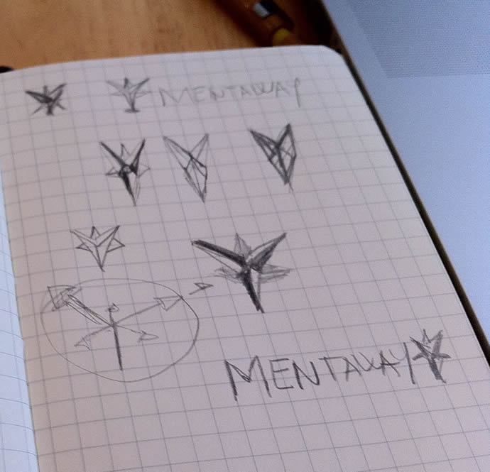
Time for the plan b, I checked the images I had selected and decided to explore the compass element. I also liked the idea of those direction signs, it is pretty much what the service is all about. Then back to some more sketching.... I know I sucked at that.