by abduzeedo
When it comes to branding, one of the most important elements is the logo. It's the visual representation of your brand, and it's the first thing that customers see when they encounter your business. So, it's no surprise that Full Punch, a design agency, was recently contacted to assist with redesigning the logo of Midland Appliance, a household appliance dealer located in Canada. Here are some insights about the project shared by Paul von Excite
Midland Appliance was founded in 1972, and since then, they've established themselves as a leading dealer in the upscale and luxury segments of the market. With such a long and successful history, it's important that their logo reflects their brand's values and identity. That's where Full Punch comes in.
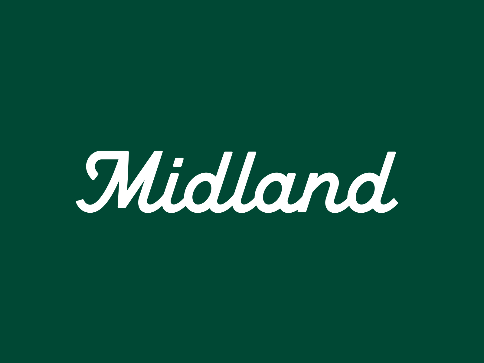
As an experienced design agency, Full Punch understands the importance of creating a logo that not only looks great but also effectively communicates the essence of the brand. In this case, they were tasked with creating a cursive-style typography that would give Midland Appliance a more refined and sophisticated look.
When it comes to typography, there are countless options available, but cursive is a classic choice that can add elegance and personality to any design. By opting for a cursive style, Full Punch is giving Midland Appliance a more sophisticated and upscale feel, which aligns perfectly with their focus on the luxury market.
But it's not just about the style of the typography - Full Punch also had to consider the color scheme and overall design of the logo. The right combination of colors and shapes can make a big impact on how customers perceive your brand. With Midland Appliance, Full Punch opted for a simple, clean design that emphasizes the typography, with a color scheme that's both modern and timeless.
Overall, the new logo that Full Punch created for Midland Appliance perfectly captures the essence of the brand. It's sophisticated, elegant, and modern, while also paying homage to the brand's long history. This is a great example of how a well-designed logo can enhance a brand's identity and reputation.
If you're looking to redesign your own brand's logo, it's important to work with an experienced design agency that understands the importance of branding and the impact of a great logo. With the right combination of style, color, and design, your logo can be a powerful tool in building a strong and recognizable brand. Check out the case study below.

Sketching
After reviewing the briefing, I started to get a sense of how the letters would work together in a different variety of styles. This immediately gave away that we needed to use the natural flow of the letters to our benefit.
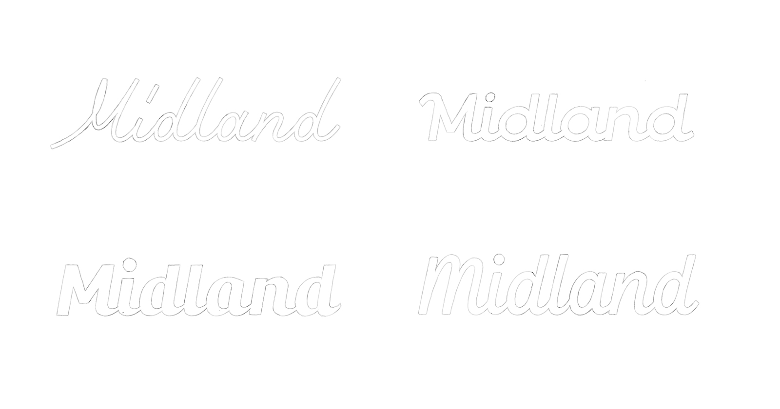
Concept Development
It was clear we needed to find a middle ground between the top two sketches. Using the flow of the top left sketch and the mono-line thickness of the top right sketch. Besides, adding a more pronounced M which could be used as a stand-alone icon.

Although definitely an improvement, the "M" felt a bit lost compared to the other characters. I decided to use the top right sketch "M" I made earlier as a reference because it felt more cohesive.

The middle bottom M felt the best as a wordmark and also as a stand-alone icon. With a small touch, reducing the length of the bottom left stroke, the foundation was set.
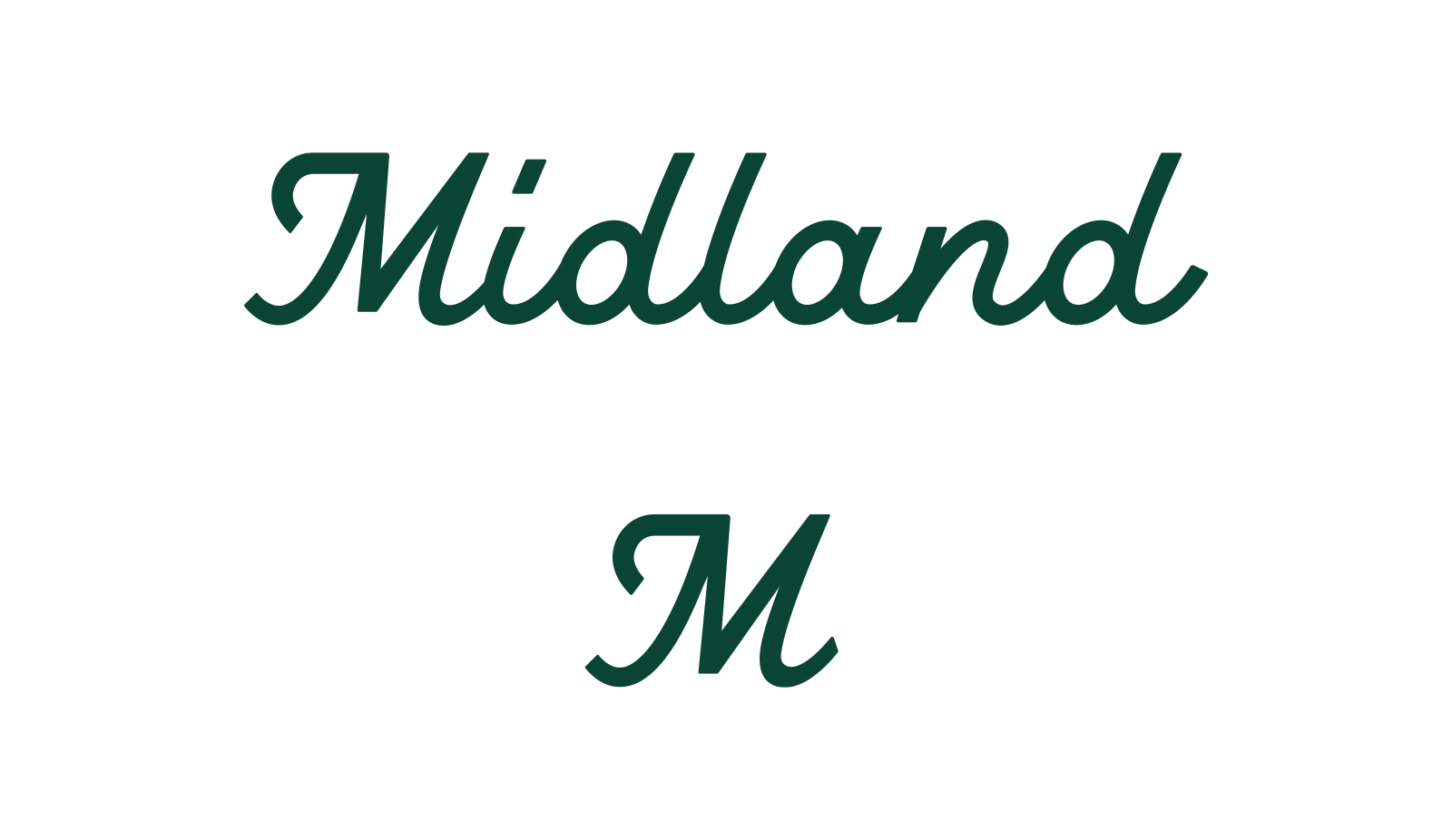
Refinement
It still feels a bit wonky overall, which we are going to solve in the final stage.
A few pointers:
- The ascenders are slightly bent, which need to be straight.
- Add extra weight and look at all the line work.
- Make sure all the characters have the same italic slant.
- Increase the top-line of the M.
- Reduce size of the "i" dot.
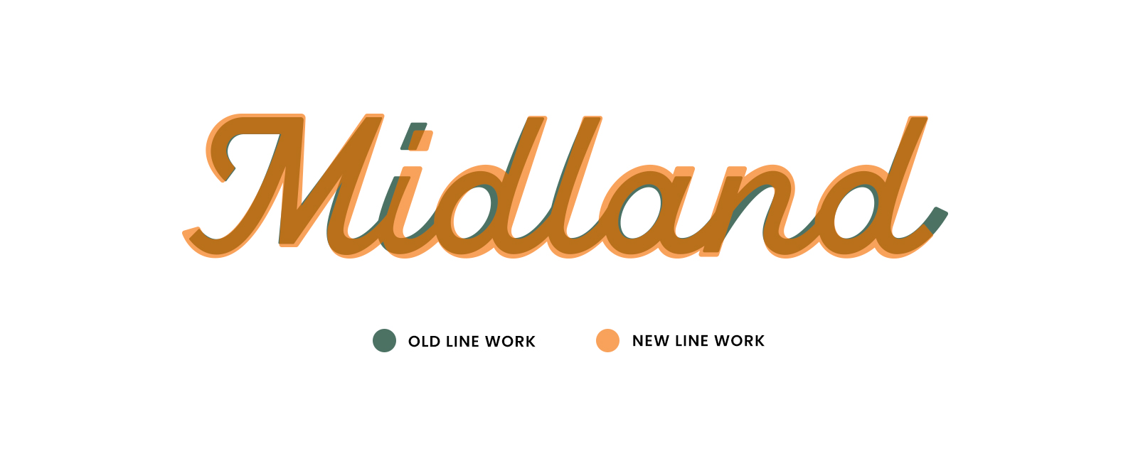
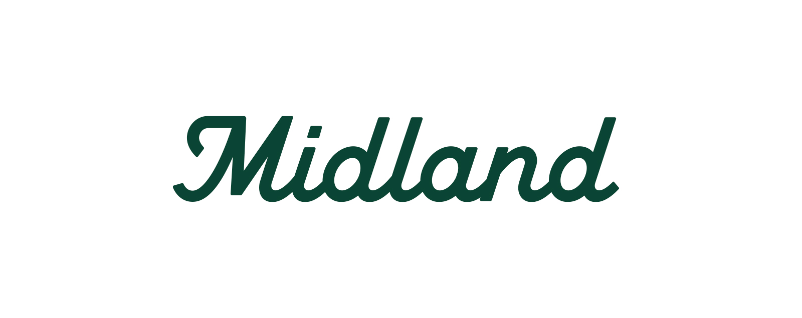
The Final Logo
The time spent to get it visually to this level was totally worth it. It feels cohesive as a whole and the consistency is massively improved.

For more information and to check out more works visit Paul von Excite's website.


