by abduzeedo
The world of editorial design received a refreshing touch of ingenuity when Rafaela Erna Kreutz unveiled her project for REVISTA CAJU's Semana da arte moderna ed.01, a publication that throws a spotlight on Brazil's vibrant Modern Art Week. Kreutz's work is an artful blending of the stark and structured Swiss Style with the heartwarming pulse of Brazil's rich culture.
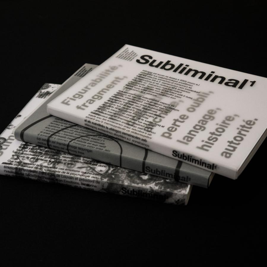
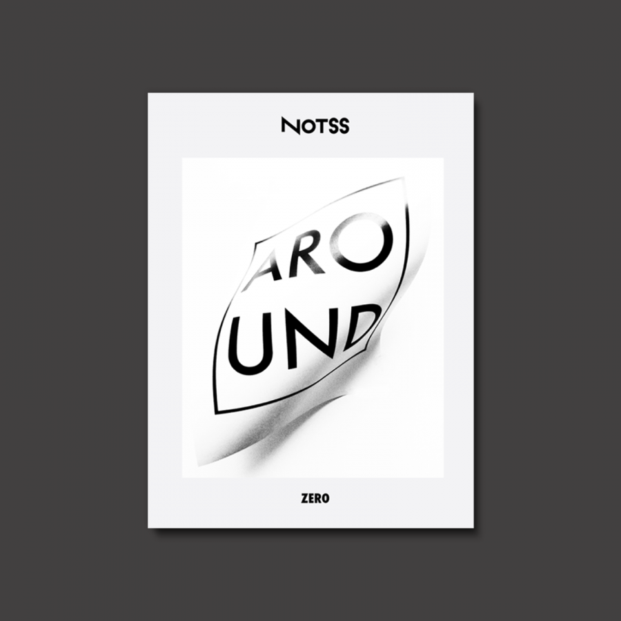
At first glance, the minimalist style is unmistakably reminiscent of the Swiss design school: clean lines, structured layouts, and a well-organized sense of space. However, this is not just another page out of the Helvetica handbook. Delving deeper, one notices the undulating flow of the more organic typography. It's as if the straight-laced Swiss fonts decided to dance to the samba beats, resulting in letters that are both fluid and full of life.
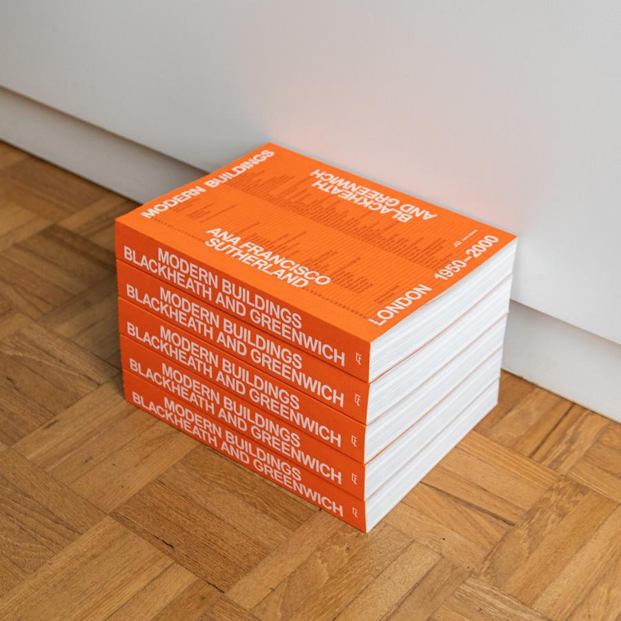
Then there are the sporadic bursts of vibrant colors, so intrinsic to the Brazilian palette. They act as visual interludes in the otherwise restrained design landscape, reminding the viewer of the country's tropical spirit. These bold splashes serve as not just aesthetic additions but a narrative device, guiding the reader through the various features of the Modern Art Week.
However, it's the subtlety in the melding of these two worlds that truly stands out. Kreutz doesn't let one overshadow the other. Instead, she achieves a harmonious balance where the cool, methodical Swiss approach is warmed by the passionate embrace of Brazilian artistry. It's a testament to her prowess as a designer that she makes this fusion seem both natural and novel.
In conclusion, Rafaela Erna Kreutz's design for REVISTA CAJU is more than just a visual treat. It's a cultural symphony, where two distinct design philosophies come together to sing a collective ode to the art of editorial design. As we turn each page, we are reminded that when done right, design can indeed transcend boundaries and become a universal language.
Editorial design artifacts
For more information make sure to check out Rafaela Erna Kreutz Behance Profile.
