by abduzeedo
Dive into the thoughtful editorial design of ‘EN TORNO A LA MATERNIDAD,’ crafted to resonate with themes of motherhood.
Pau Marín’s project, EN TORNO A LA MATERNIDAD, explores the essence of motherhood through a refined editorial design that merges visual storytelling with emotive impact. The design embodies the themes of care, strength, and the cycle of life, delivering a visual experience that’s as insightful as it is aesthetically appealing.
Design Approach and Concept
At the heart of this project lies a narrative-driven approach. Marín carefully crafted the layout to reflect the nuances of motherhood, using visual metaphors and deliberate design choices. The typographic elements are minimal yet impactful, guiding the reader’s eye through the content seamlessly. Serif and sans-serif typefaces interplay to emphasize the transitions between vulnerability and empowerment that define the maternal experience.
Photography plays a crucial role in this work, capturing tender moments that resonate with authenticity. Each image, strategically placed, adds layers of meaning, complementing the textual narrative. Marín’s ability to weave text and imagery together in a harmonious flow highlights the power of good editorial design to evoke emotions.
Layout and Visual Hierarchy
Marín’s layout decisions ensure readability while also inviting reflection. White space is used masterfully, giving the design room to breathe and allowing the reader to absorb the emotional weight of the content. The flow from one spread to the next feels intentional, never rushed, mirroring the natural rhythms of life.
The visual hierarchy emphasizes important sections, using bold headings and thoughtful subheadings. This structure not only aids in navigation but also underscores key messages without overwhelming the viewer. The balance between text, imagery, and negative space is a testament to Marín’s understanding of editorial design principles.
Thematic Consistency and Visual Metaphors
Colors in the project echo themes of nature and nurture, employing soft pastels and earth tones. These choices create a calming yet evocative palette that enhances the emotional resonance of the design. Visual metaphors, like the cyclical patterns in layouts, symbolize the never-ending cycles of care and love associated with motherhood.
For designers and illustrators, EN TORNO A LA MATERNIDAD serves as an inspiring example of how editorial design can amplify storytelling. The project encapsulates the emotional and cultural dimensions of its subject matter, offering a blueprint for blending design and narrative seamlessly.
Discover more about this project and Pau Marín’s impressive portfolio on Behance at behance.net/paumarn1.
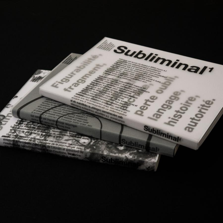
Editorial design artifacts
Credits and thanks
- Fina Perelló Andreu
- Maria José Fuentes Perelló
- Nuria Fuentes Perelló
- Nuria Marín Fuentes
- Claudia Marín Penella
- Pablo Lázaro Ballester
- Diane Gello
- Irene Martinez De La Vega
- Andrea Peregrín Moreno
- Coribel Zubillaga García
