Sustainable web design by Dodonut
Dodonut is a web design agency that brings ideas to life using design. The team believes every decision made by a human can impact the world, so it's also essential to consider the impact on a large scale in companies' practices. Sustainable web design is a great way to do this.
Dodonut cares about delivering value to thoughtful brands that want to grow sustainably.
Sustainability
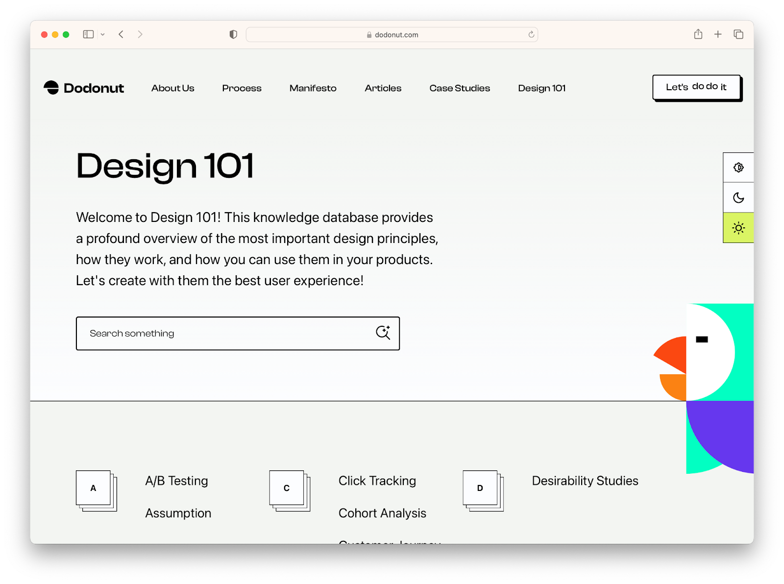
What is sustainable web design? It's the practice of creating optimized websites for humans and the environment: they use less energy and resources than other types of sites. They are easier for users to access, understand, and use.
For Dodonut, sustainable web design means conscious choices about what we put out into the world.
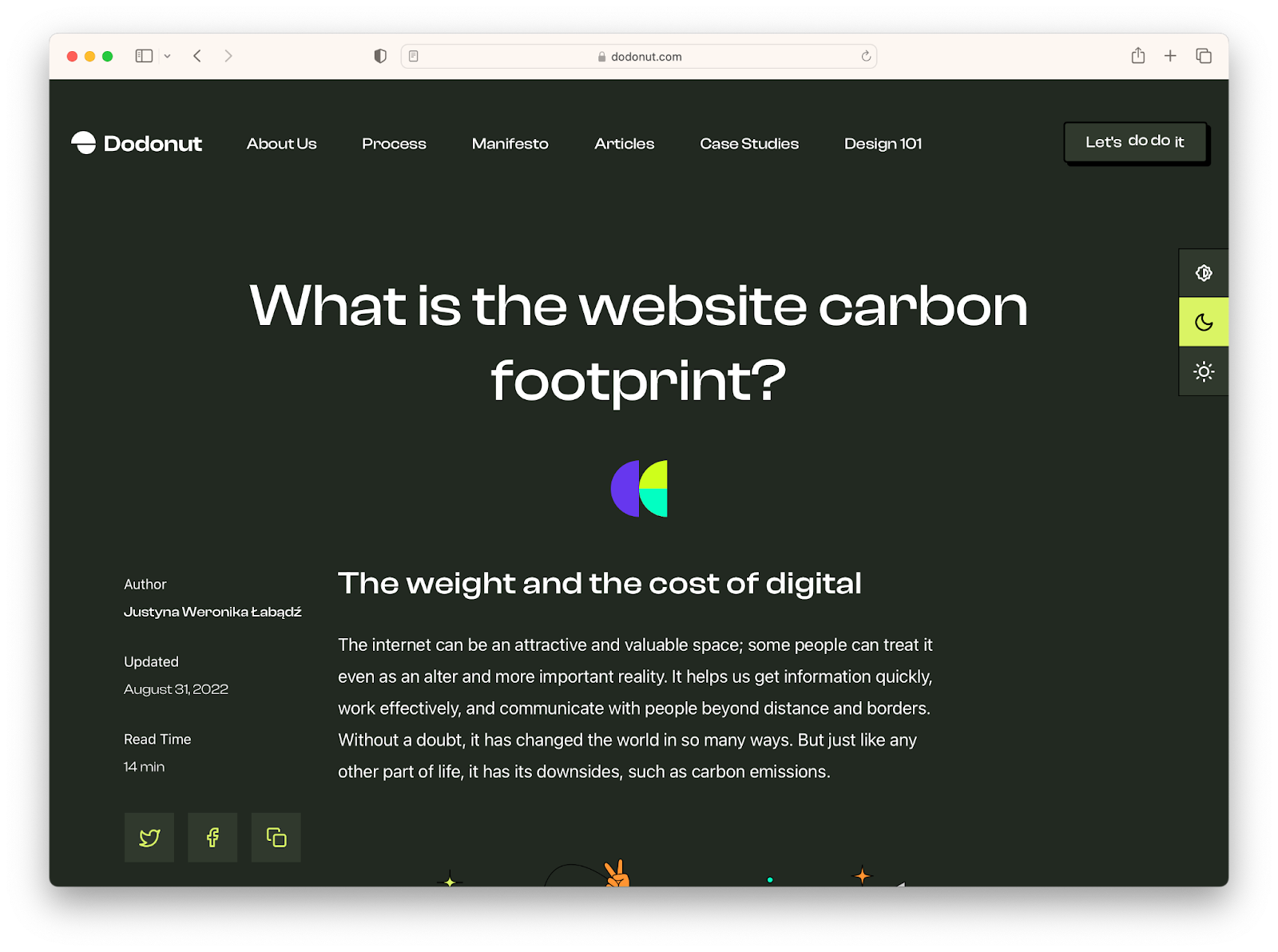
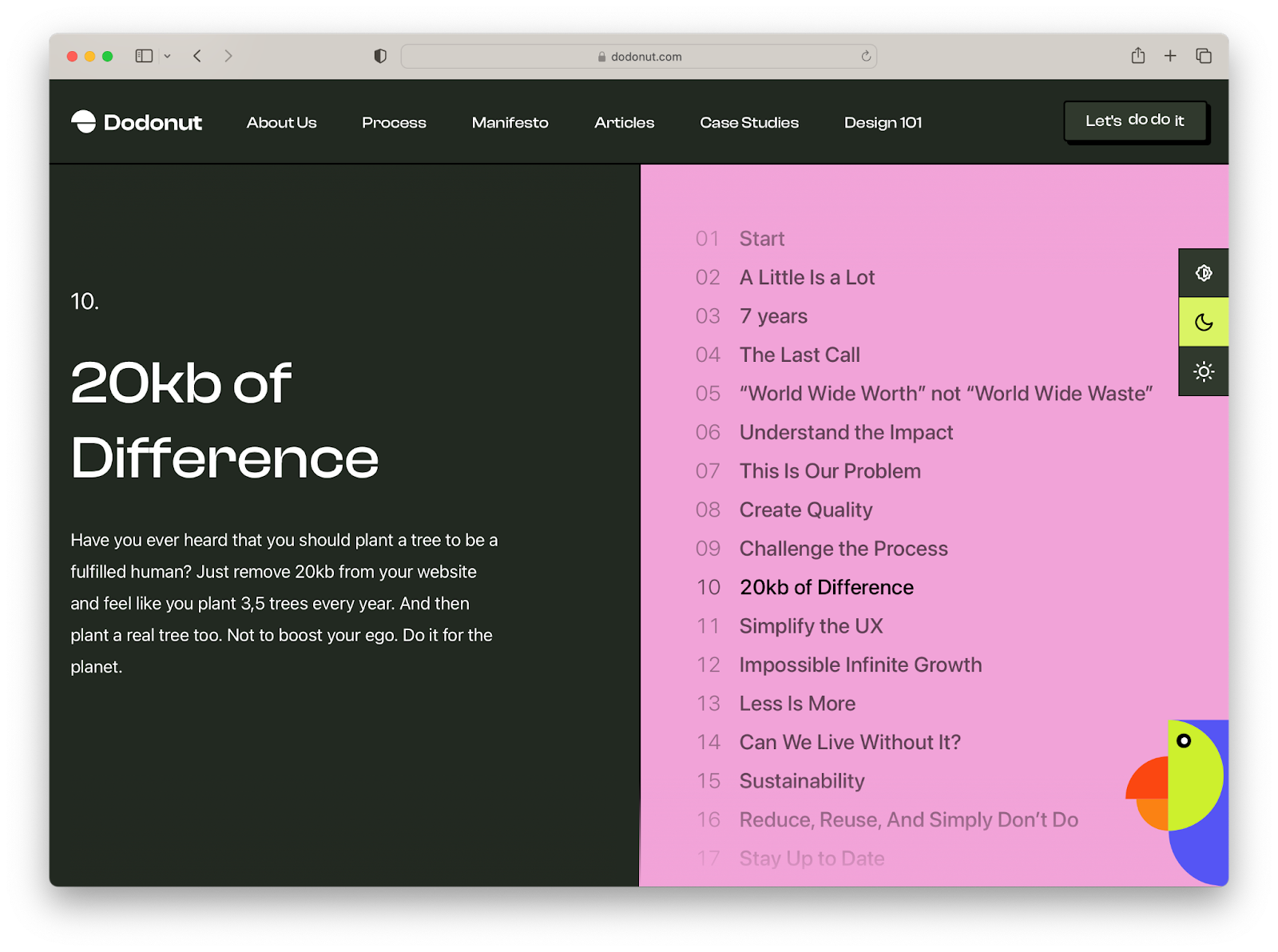
Dodonut aims to reduce carbon emissions as much as possible in the sustainable approach they implement at every web design and development stage. Their projects show that balancing a well-functioning website and its environment-friendly form is achievable.
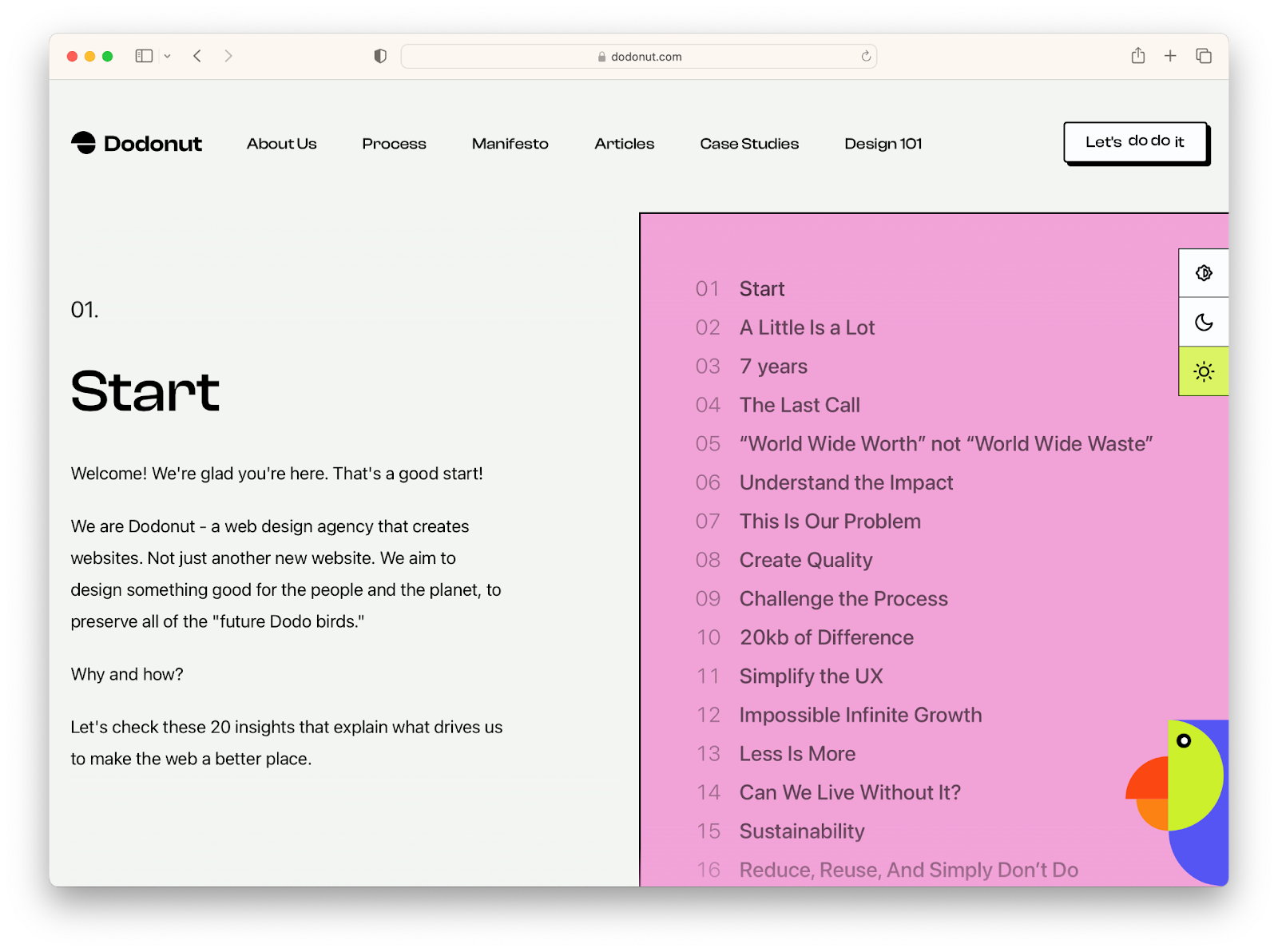
On their website, achievable is a calculator that measures and shows how reducing the website by an appropriate number of kilobytes can impact decreasing the emission of CO2 monthly. It also compares the results with the adequate number of planting trees and kilometers driven with the car.
Design
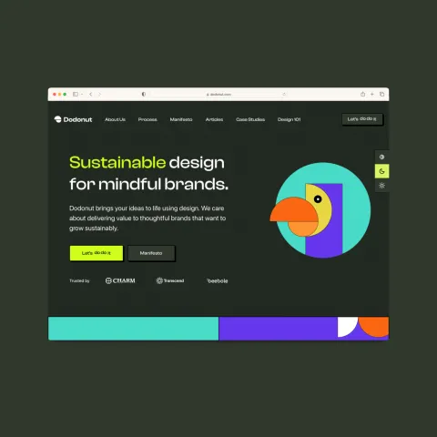
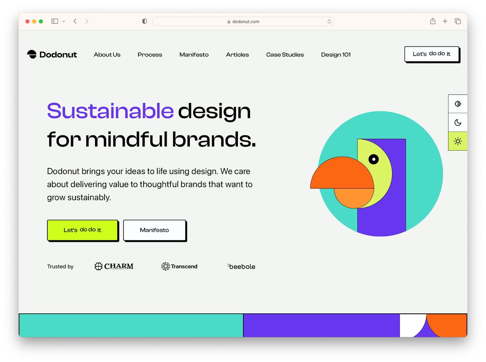
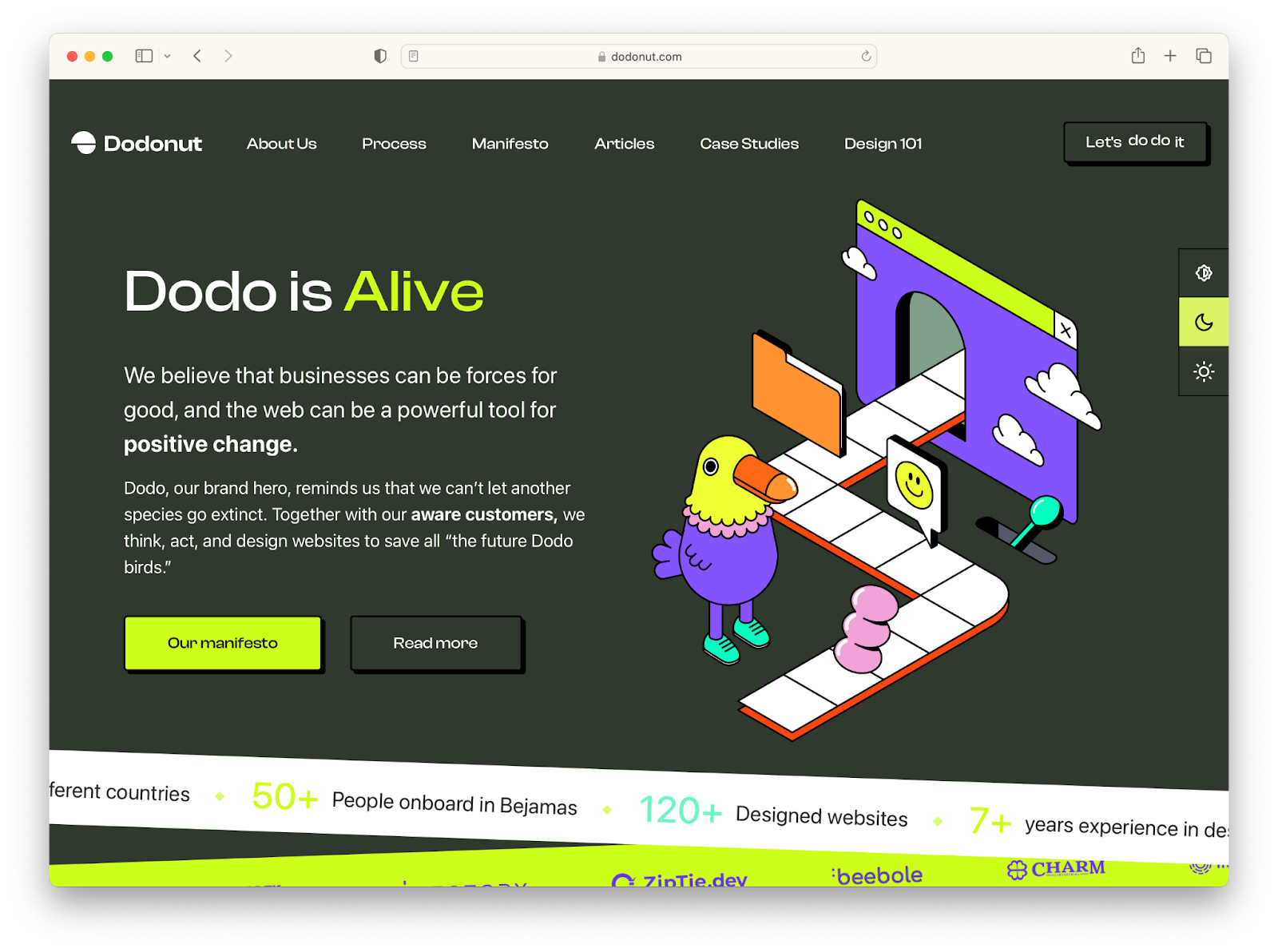
Regarding web design, the Dodonut team chose a Dodo bird as a brand hero to remember that they can't let another species go extinct. They work alongside our aware customers to think, act, and design websites to save all "the future Dodo birds."
Their web design style blends regular brutalism with more modern typography, illustration, and minimalistic animation. This lets the Dodonut team focus more on illustration and the world itself—its possibilities to bring meaning and content and be playful, modern, and attractive aesthetically.
Neubrutalism, as a chosen web design style, helps them celebrate the beauty of simplicity and minimalism, which are essential in the sustainable approach. In neubrutalism, content should be prioritized above all else. Design elements should be kept to a minimum, and they should not draw attention away from the main message or goal of the page. The purpose of this style is to make it easier for users to navigate the site, find what they're looking for, and get out quickly without having to deal with any unnecessary distractions.
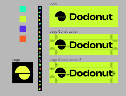
Logo
The brand hero, the Dodo bird, inspires the Dodonut logo. It combines geometrical forms extracted from this animal's characteristic part - a large, hooked beak.
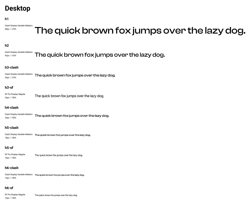
Styleguide
For typography, Dodonut chose Clash Display Variable Medium for headers that correspond with neubrutalism style and SF Pro Display font for the body text, which looks modern, is readable across many devices, and makes the text legible.
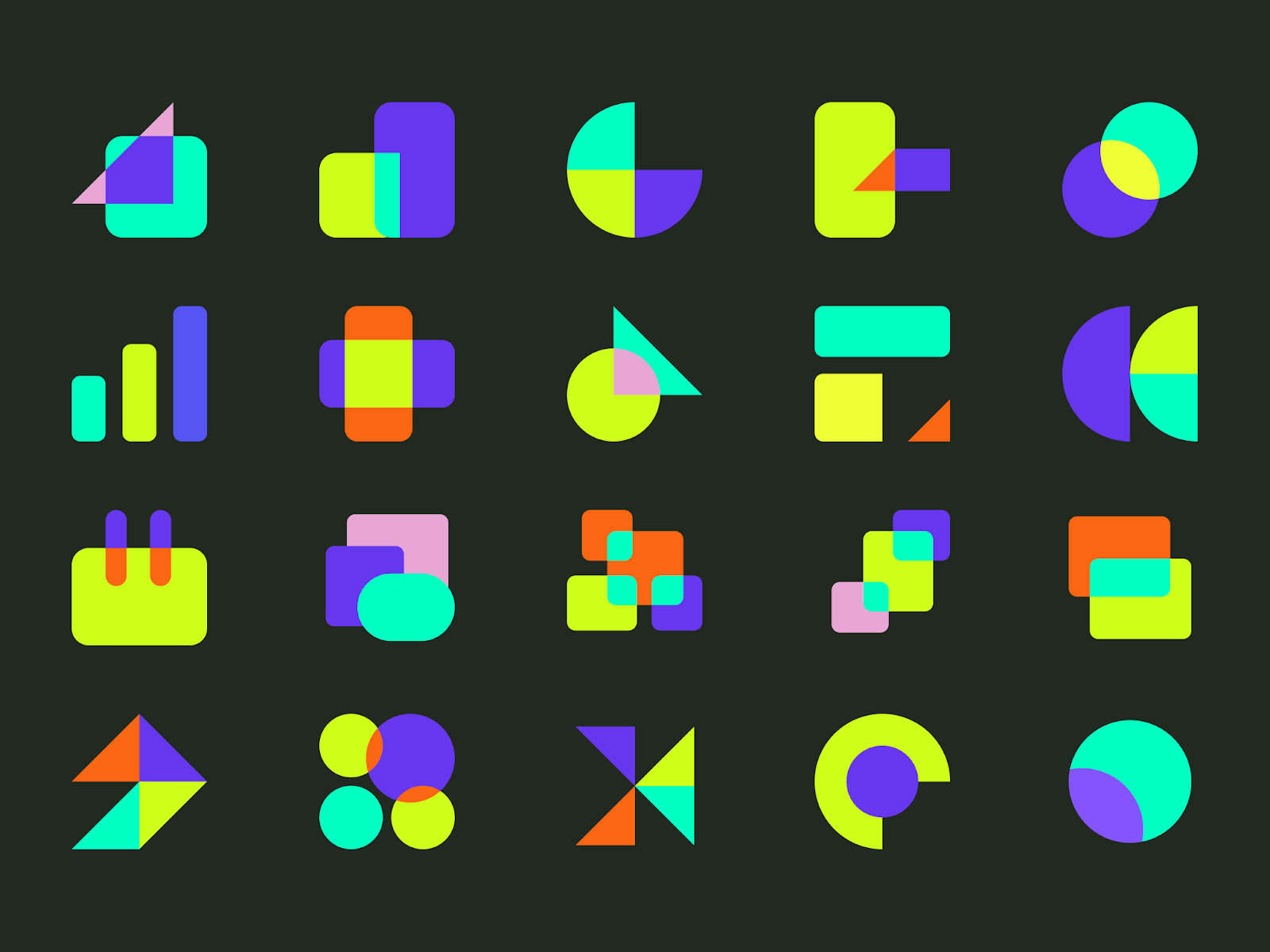
Dodonut assets and visual forms mix geometrical shapes that create little pieces of abstract art.
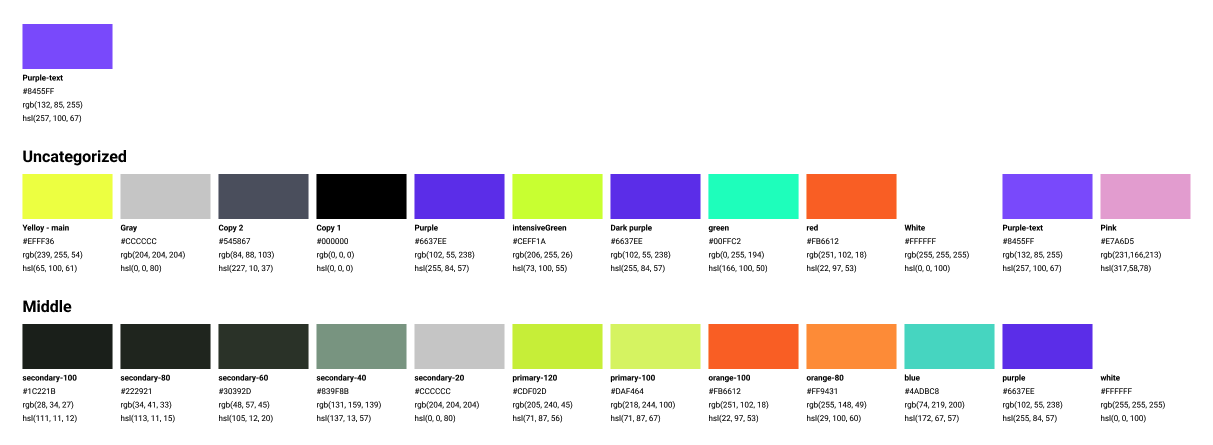
Color
For the color palette, Dodonut chose a set of mostly clear, bright colors that contrast with each other, intensifying the experience. The inspiration for them was a Dodo bird. This bird went extinct in the 17 century, and unfortunately, people created a few illustrations depicting it from this time. Therefore as some mythical animal, it can serve to recreate its figure in a fantastical, unrealistic way, which is emphasized by unnatural, bright colors.
Illustration
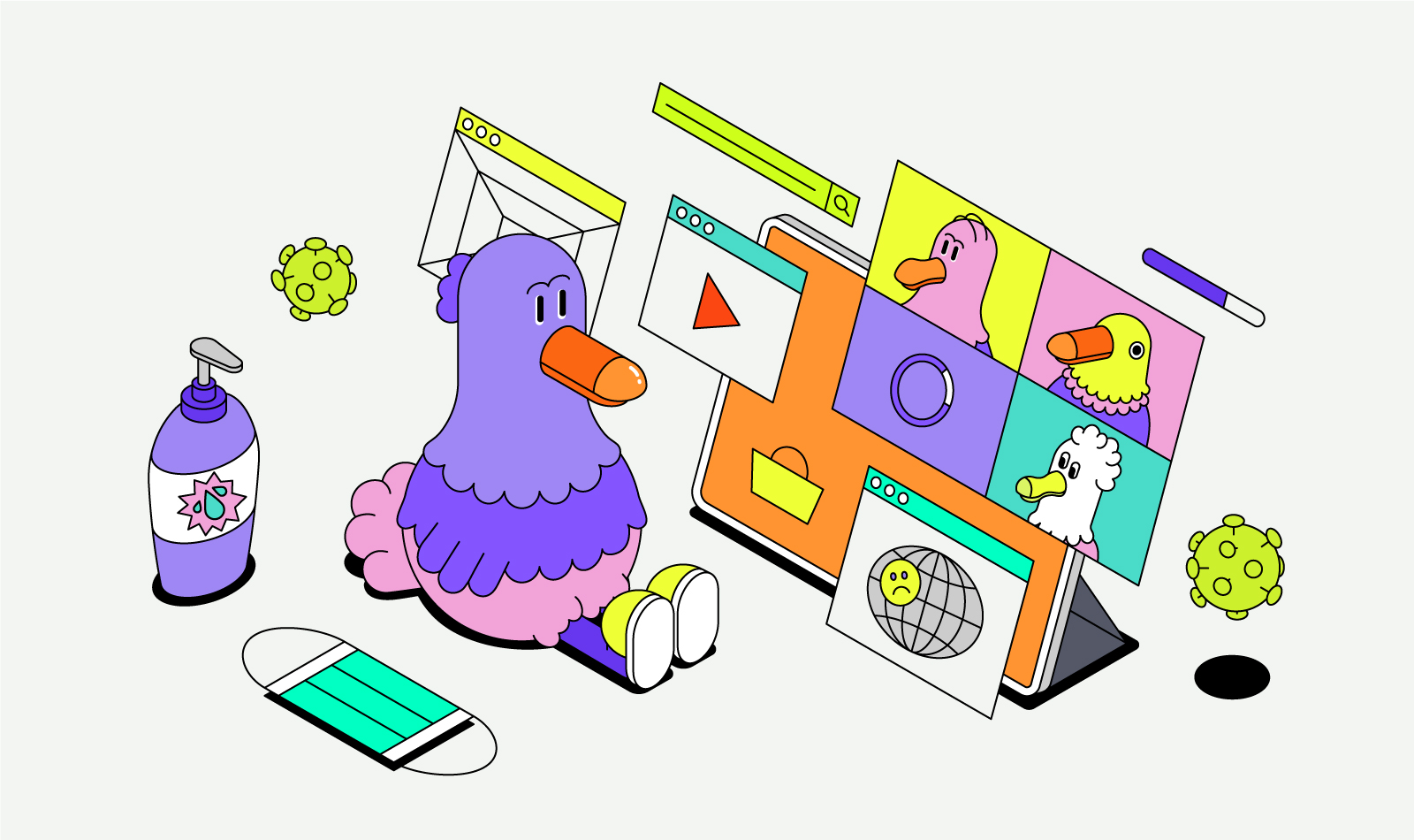
After testing several options, styles, and illustrators, the Dodonut team decided to create the set of illustrations with Justyna Lasota.
Her illustrations in the cartoon, descriptive style, show the brand hero, Dodo bird dealing with some challenges, taking inspiring action, and finding himself in unrealistic situations.
Her cartoons, mostly isometric illustrations, contain simple forms, and icons complement each other with a neubrutalism style.