by AoiroStudio
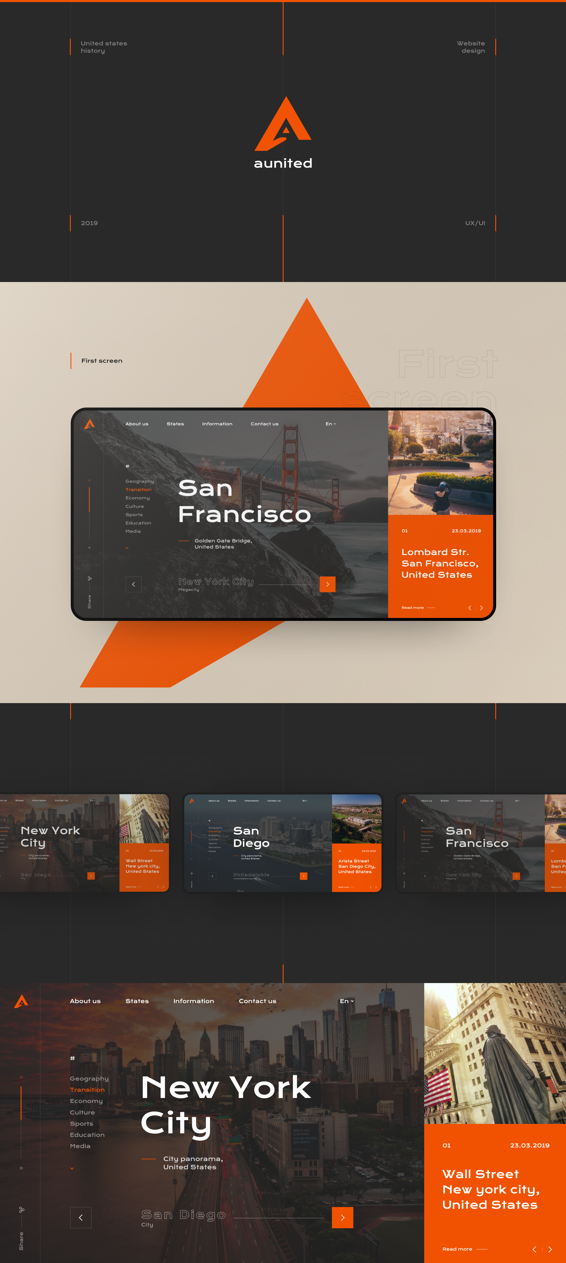
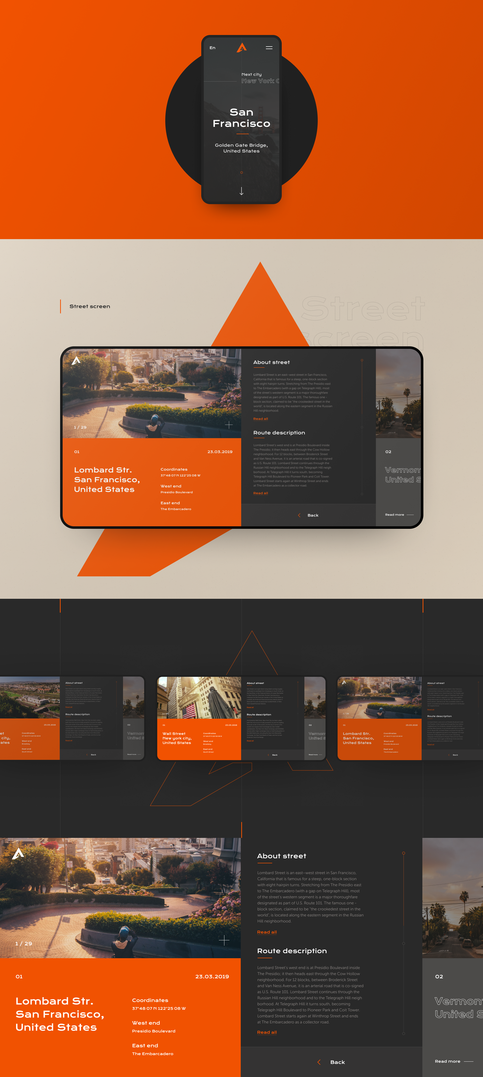
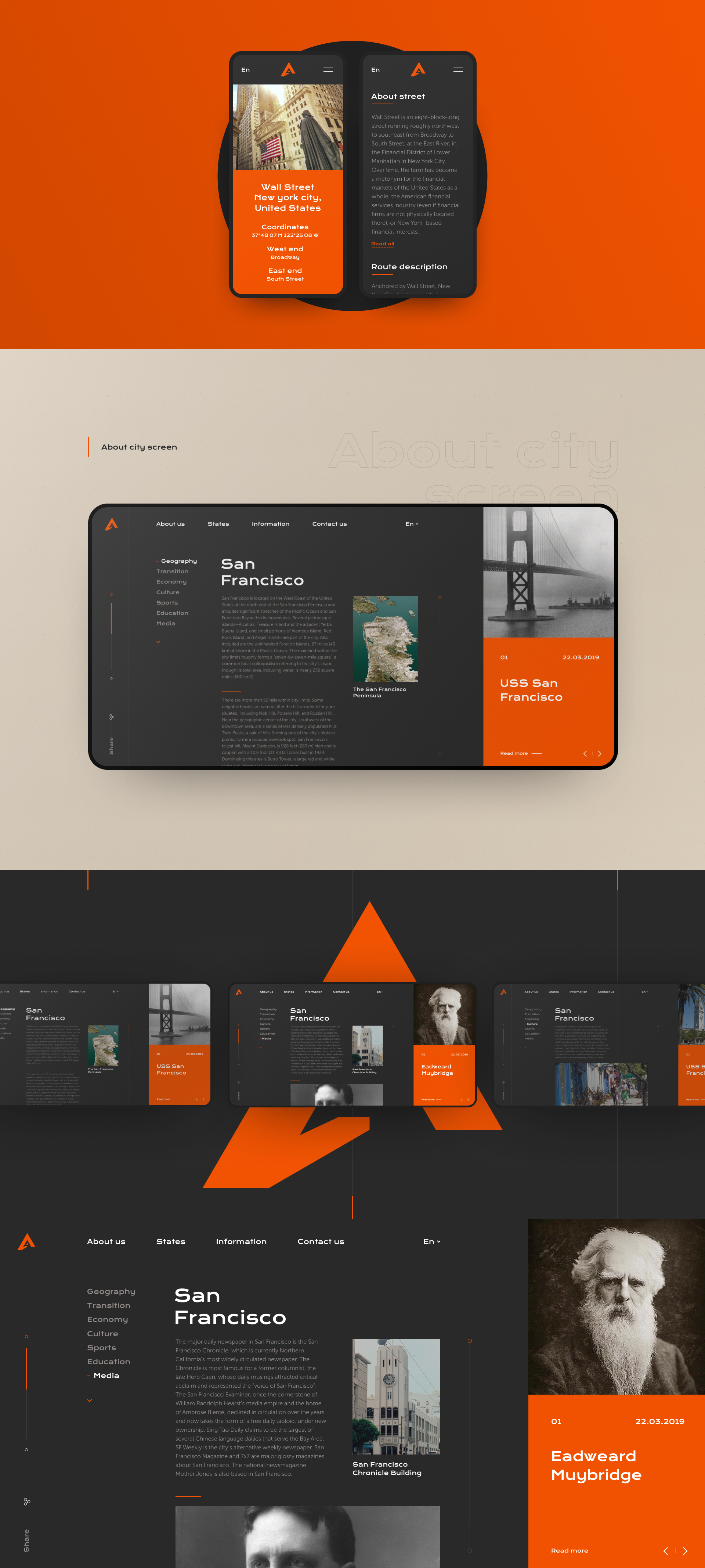
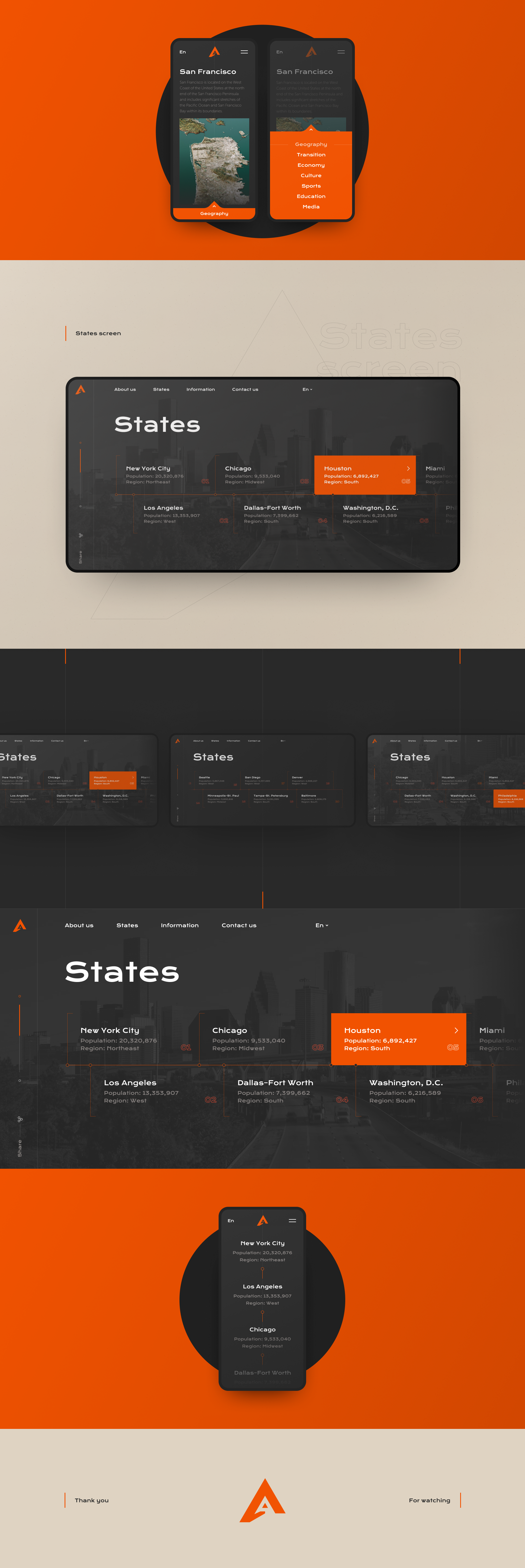
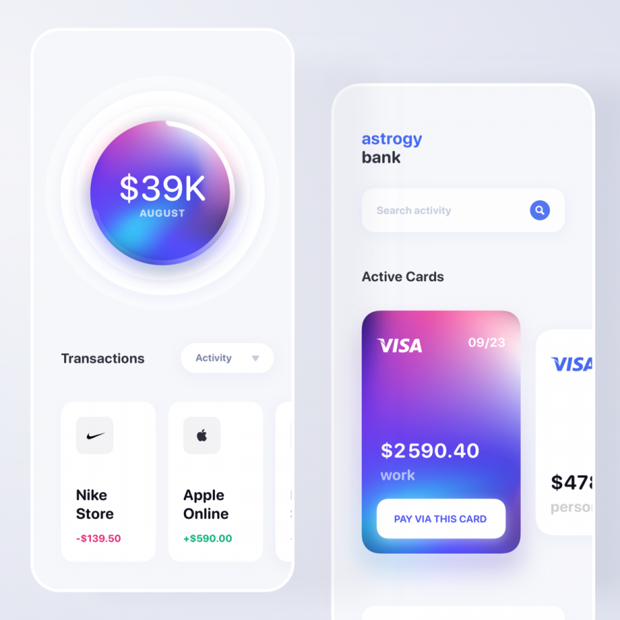
Kulik Oleg is a graphic designer and a UI/UX designer based from Kharkiv, Ukraine. We are sharing his web design concept for the United States history. It's an interesting approach especially with his colours, bright orange! Do you think it does compliment the images well? I do love his choice of typography and the text layouts are intuitive plus easy to read. One particular thing that I do like a lot is how it is presented. Because of the projects we see all the time on ABDZ, I have rarely have seen this approach and it's quite good.
