by abduzeedo
Discover Basker Brewing Co's branding and visual identity, designed by Andstudio, blending simplicity with craftsmanship.
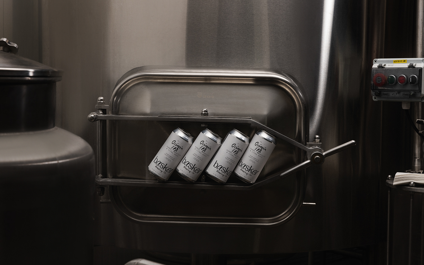
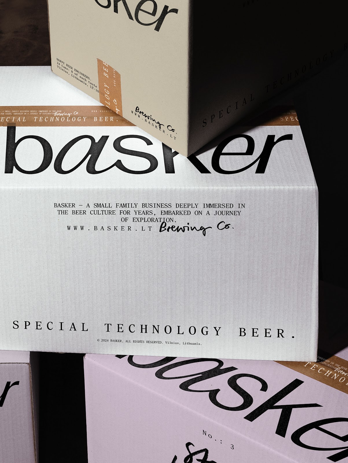
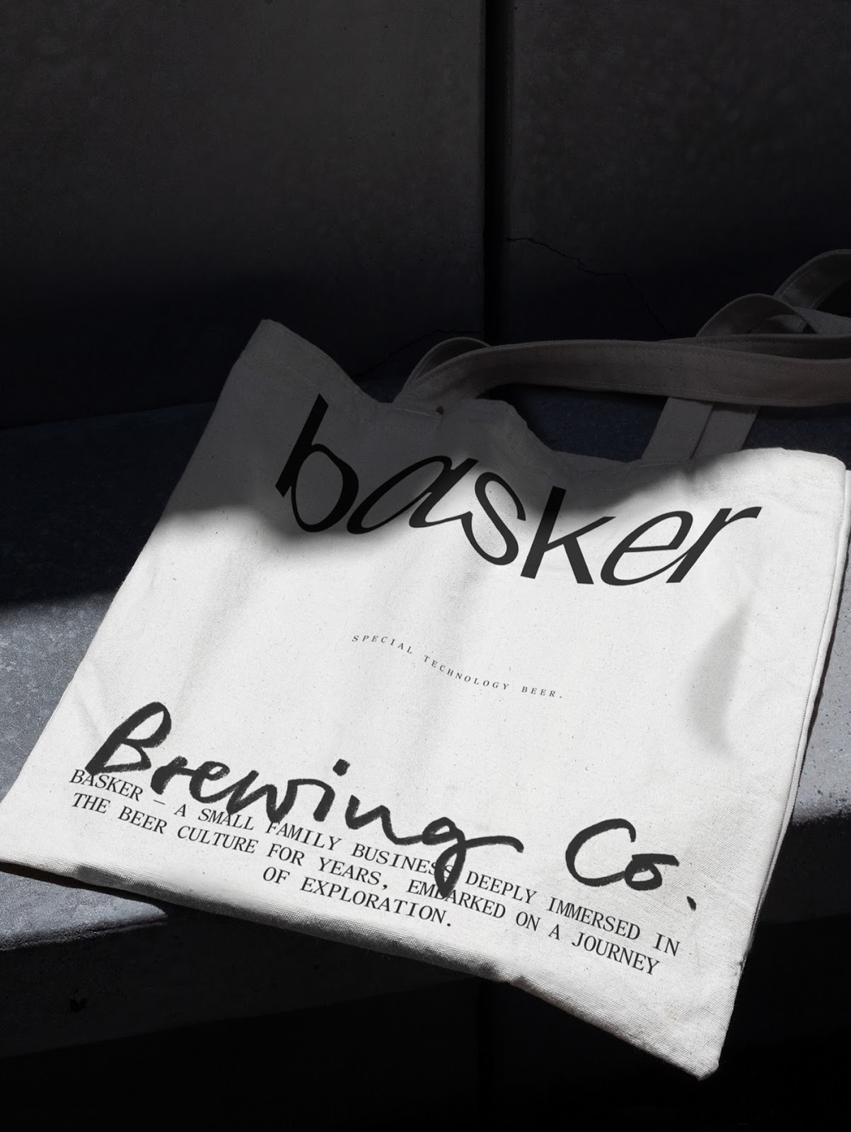
In a market flooded with bold, attention-seeking labels, Basker Brewing Co offers a different approach. Designed by Andstudio, this branding project strips away the noise, replacing it with a visual identity rooted in simplicity, precision, and craft. It’s branding that doesn’t demand attention—it earns it.
Walk down any craft beer aisle, and the experience is overwhelming—bright colors, intricate illustrations, and playful motifs compete for attention. While this works for some, it often overshadows the product itself. Basker Brewing Co sought to change that, opting for a design that reflects its beer’s essence: refined, balanced, and meant to be savored.
The name Basker, inspired by the verb “to bask,” conveys a sense of relaxation and enjoyment. This ethos carries through the entire branding system. Andstudio’s approach embraces a minimal yet expressive design, where the focus shifts from loud visuals to thoughtful details.
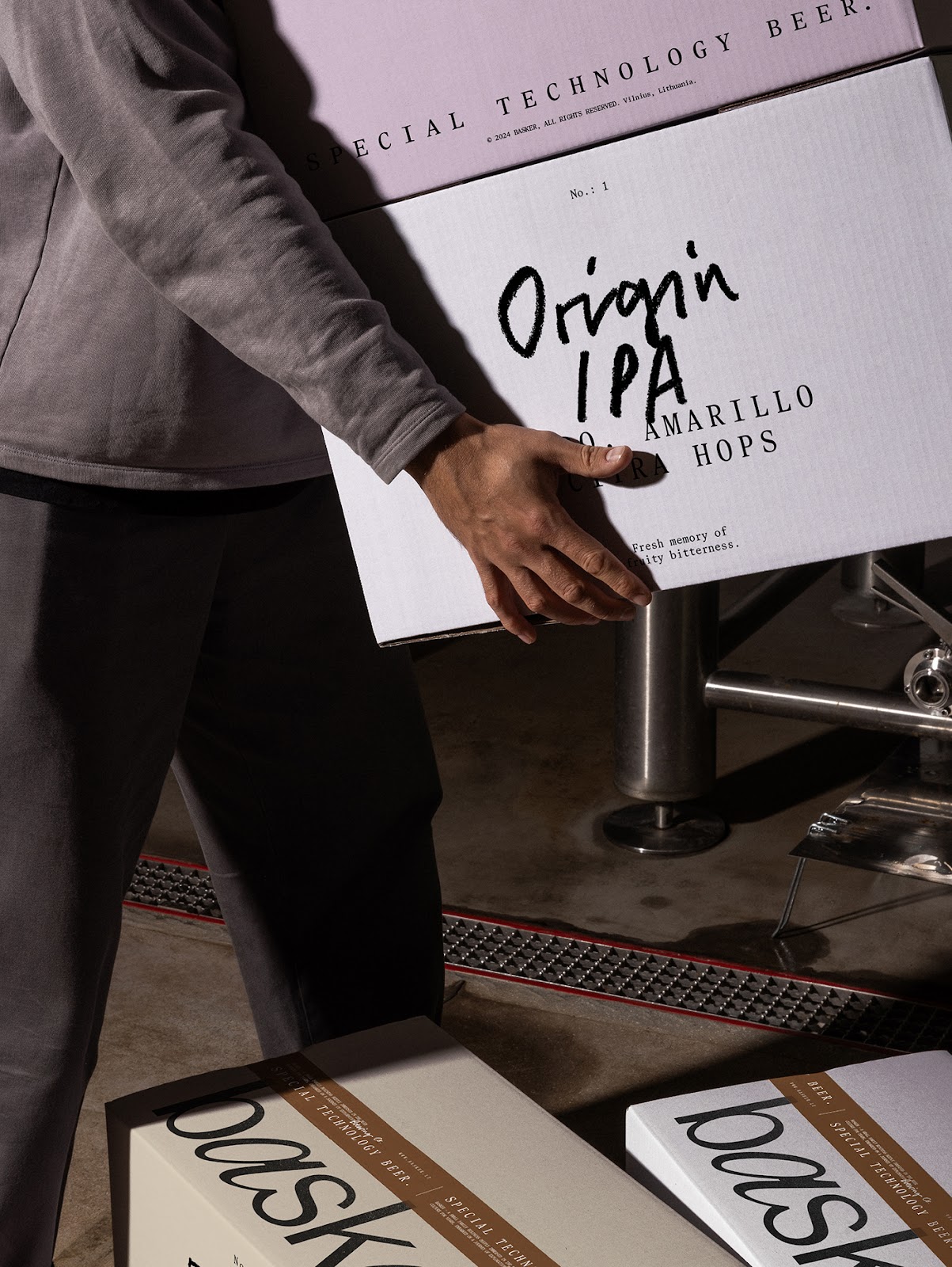
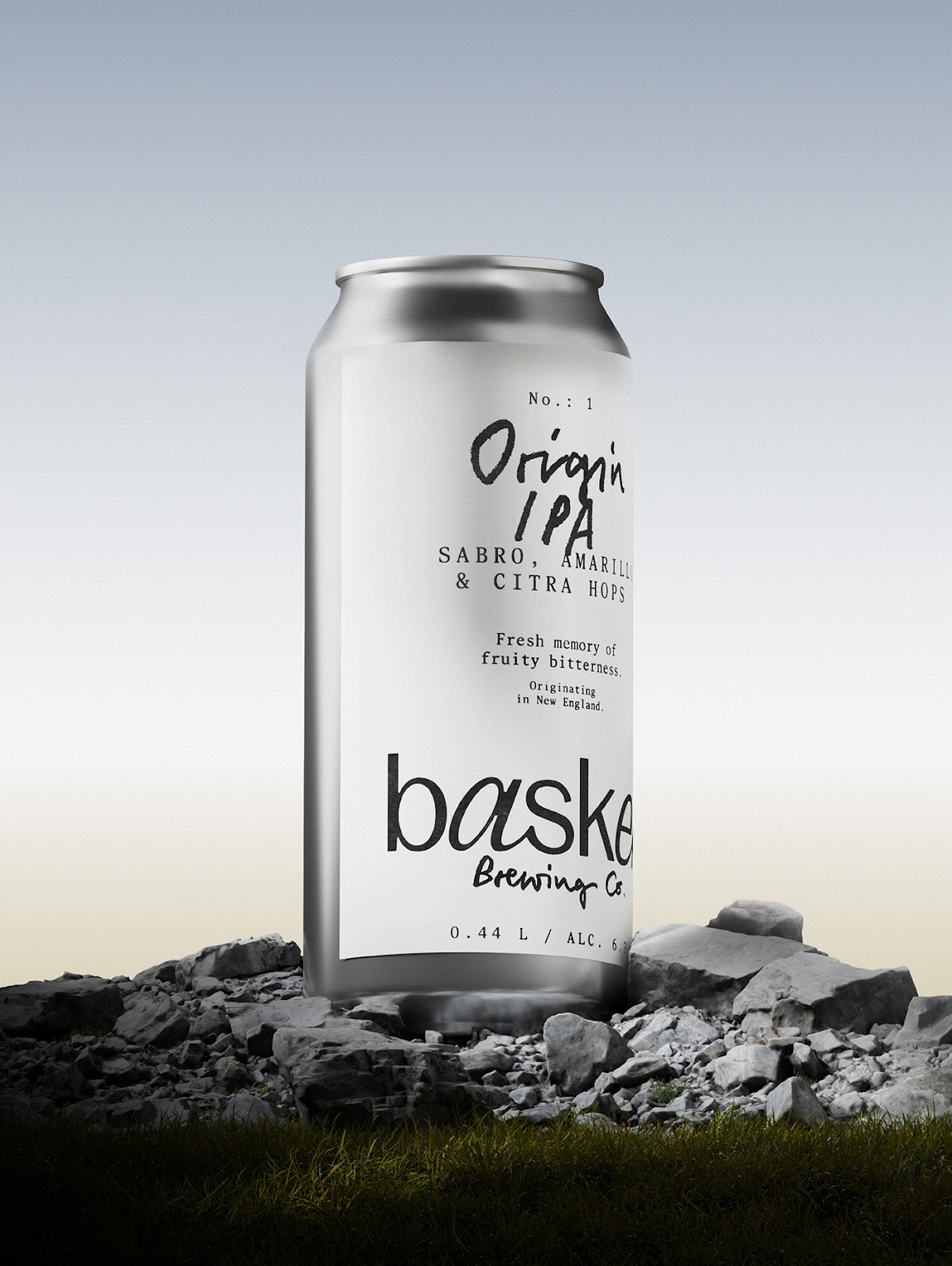
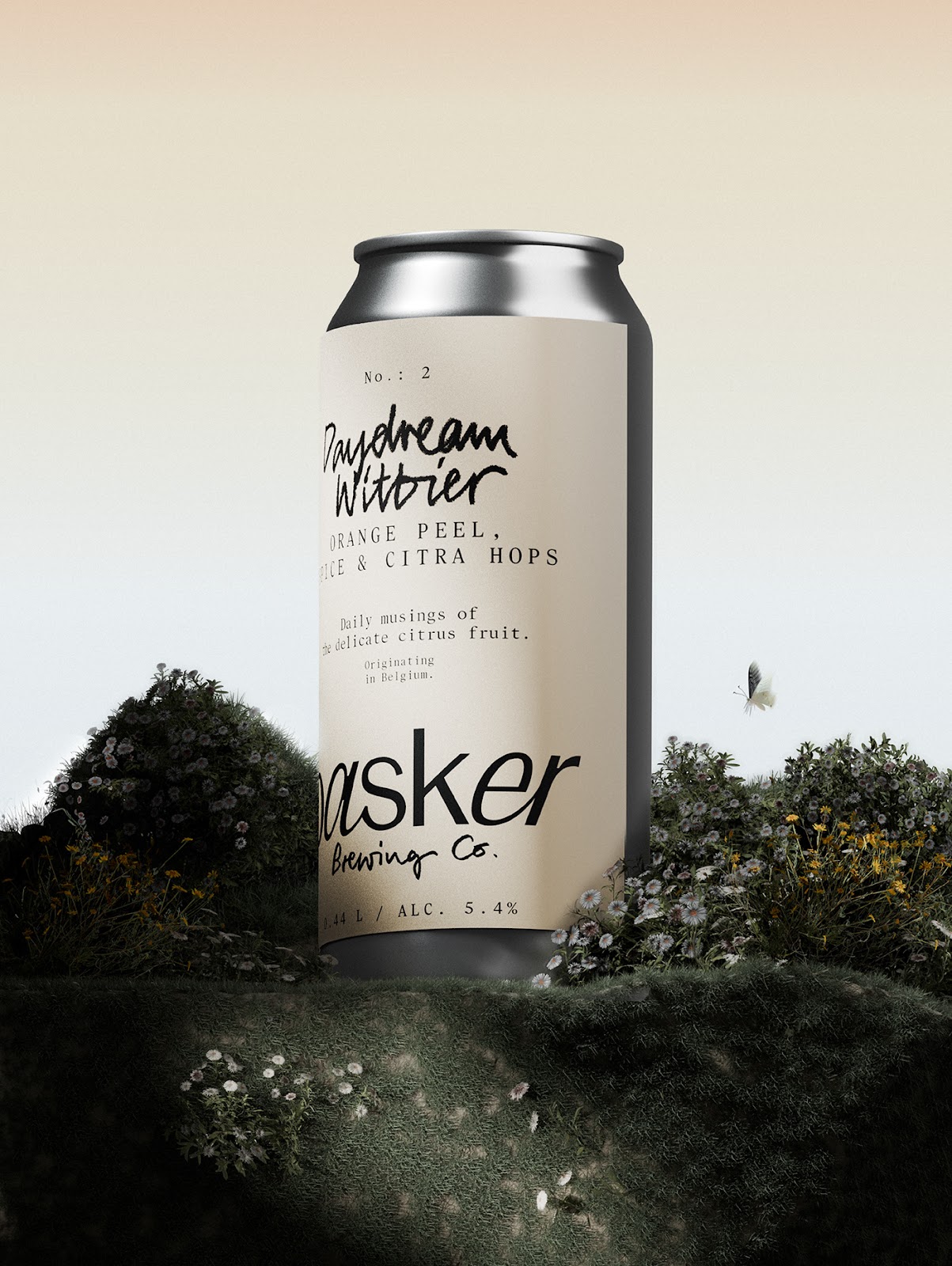
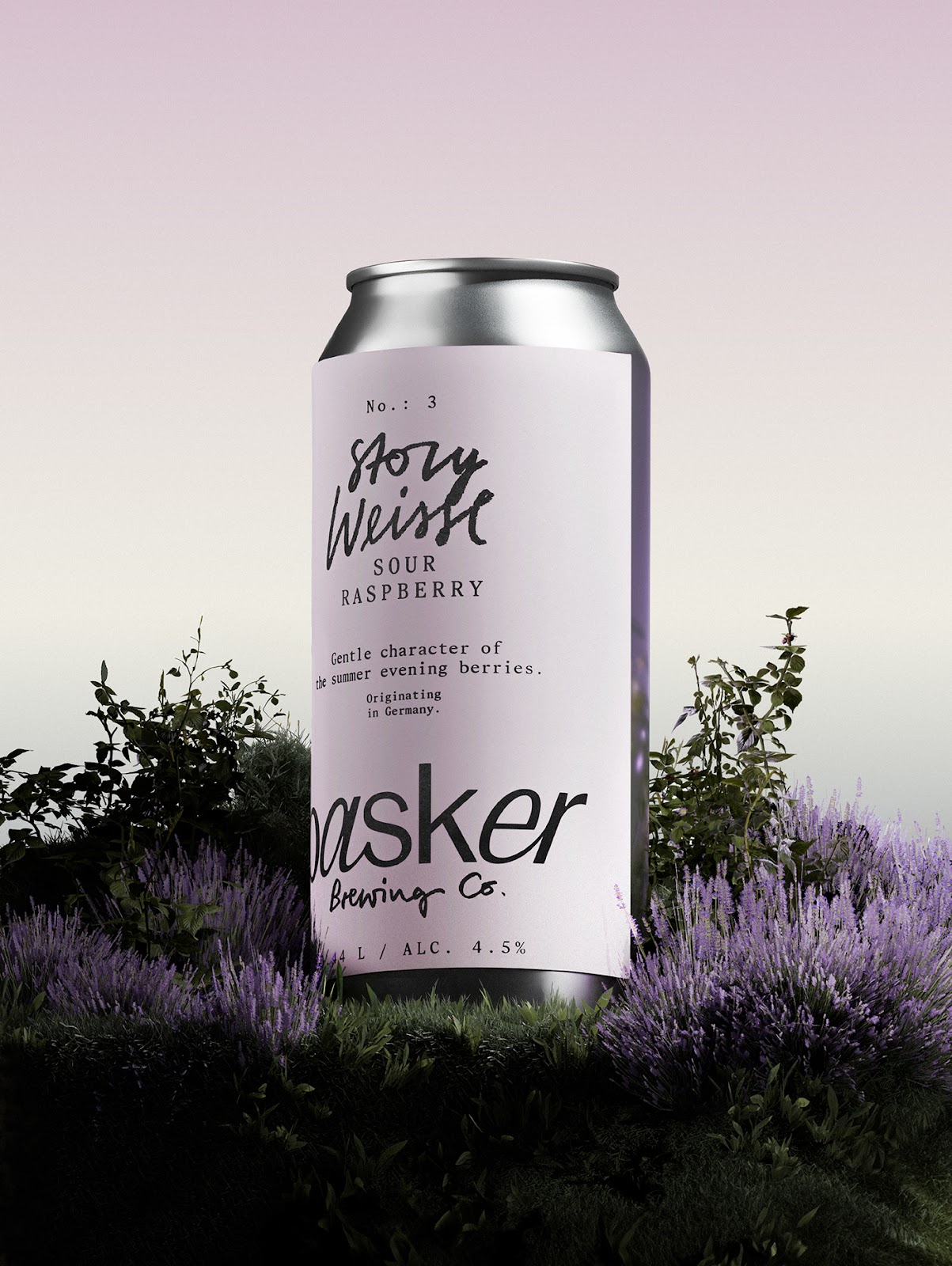
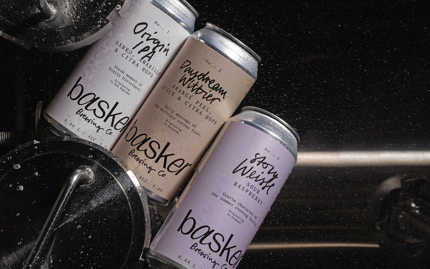
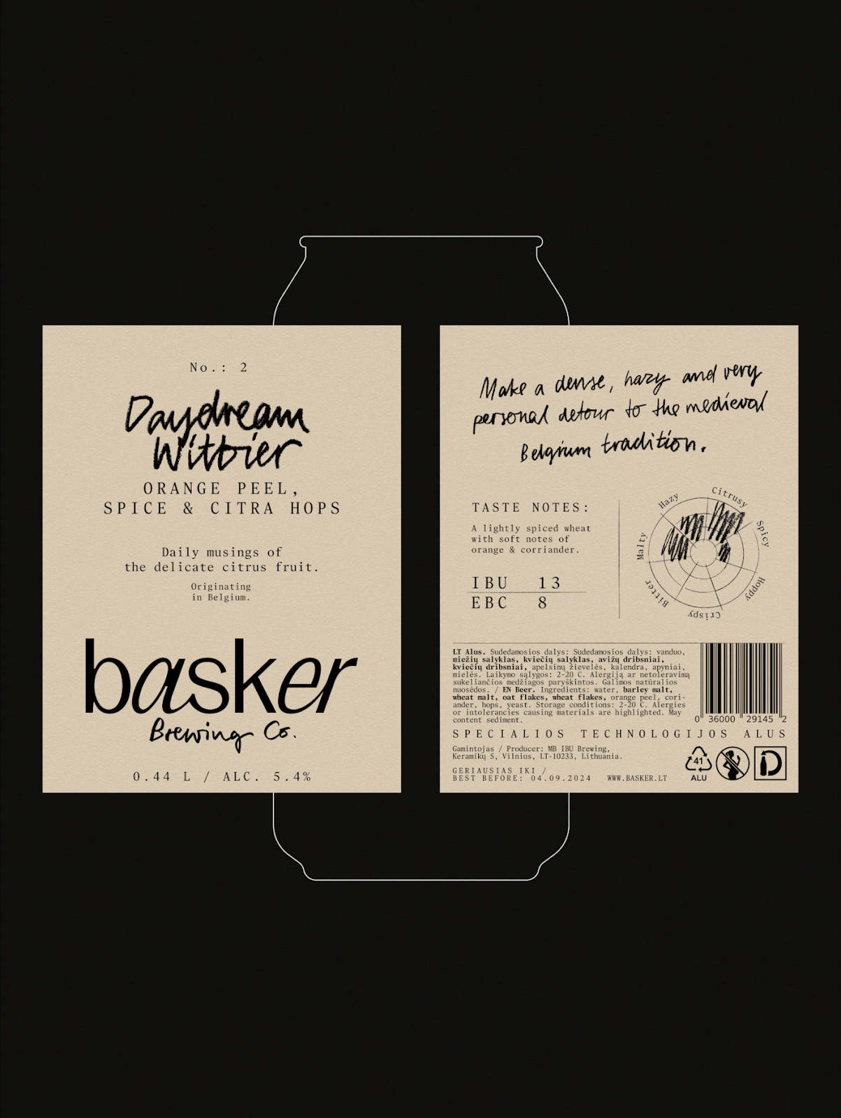
- Muted Color Palette: Instead of relying on vivid hues, Basker stands out with soft, understated tones like ivory and lilac. These choices create a sense of calm and allow the beer itself to take center stage.
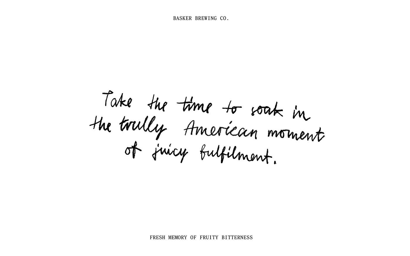
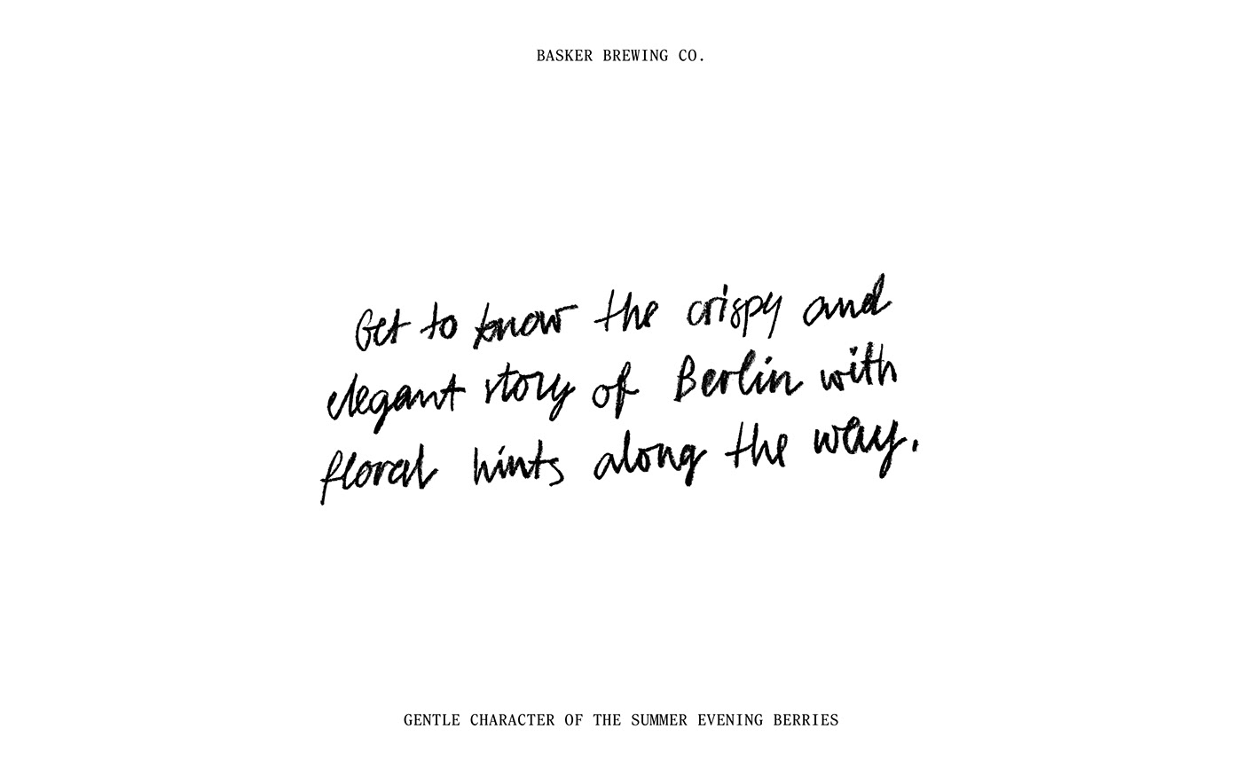
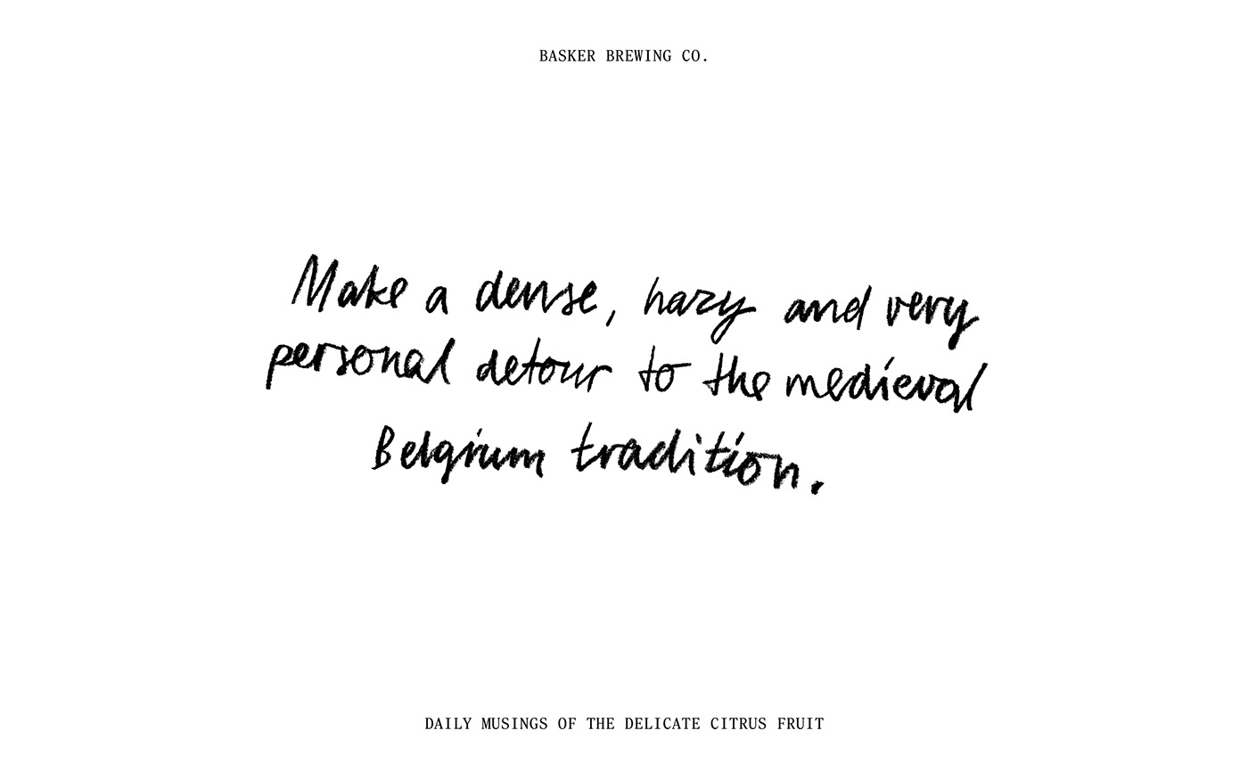
- Hand-Drawn Taste Palettes: A unique feature of the design, these visual representations of flavor connect the brewer to the drinker, offering a personal insight into the beer’s character.
- Typography-Led Identity: Instead of busy graphics, the branding leans on clean, black typography that highlights the product’s name and key details.
- Cohesive System: Whether it's a stout or a pale ale, the design system allows for consistency while letting each variety stand on its own.
Basker Brewing Co’s branding isn’t just about aesthetics—it’s about creating an experience. Every design decision reinforces the idea that craft beer is more than a beverage; it’s a journey of discovery. The brand’s minimalist approach makes space for the drinker’s own interpretation, rather than dictating one through visuals alone.
Basker Brewing Co and Andstudio prove that less can indeed be more. In an industry where standing out often means shouting the loudest, this branding succeeds by speaking softly but with absolute clarity. It’s an invitation to slow down, taste, and appreciate the craft behind the beer.
For a closer look at Basker Brewing Co’s branding and visual identity, explore the full project here: Andstudio on Behance.
Branding and visual identity artifacts


Credits
Client: Basker Brewing Co.
Brand Design: Andstudio
Photography: Martyna Paukste


