by abduzeedo
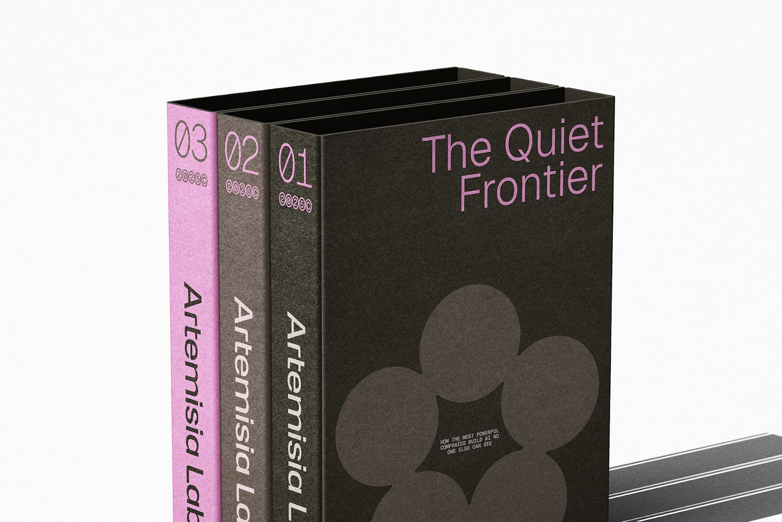
ROCHA Branding built the Artemisia Labs AI branding identity — a circular floral mark and deep earth-tone palette for precision-first enterprise clients.
Artemisia is an AI company that operates in sectors where getting it wrong is not an option. Life sciences. Telecommunications. Defense. Government. The firm builds fully custom models trained on client data, deployed on client infrastructure, and kept under complete client control. That mandate — total precision, zero compromise — shaped every decision in the identity.
AI Branding That Balances Rigor and Life
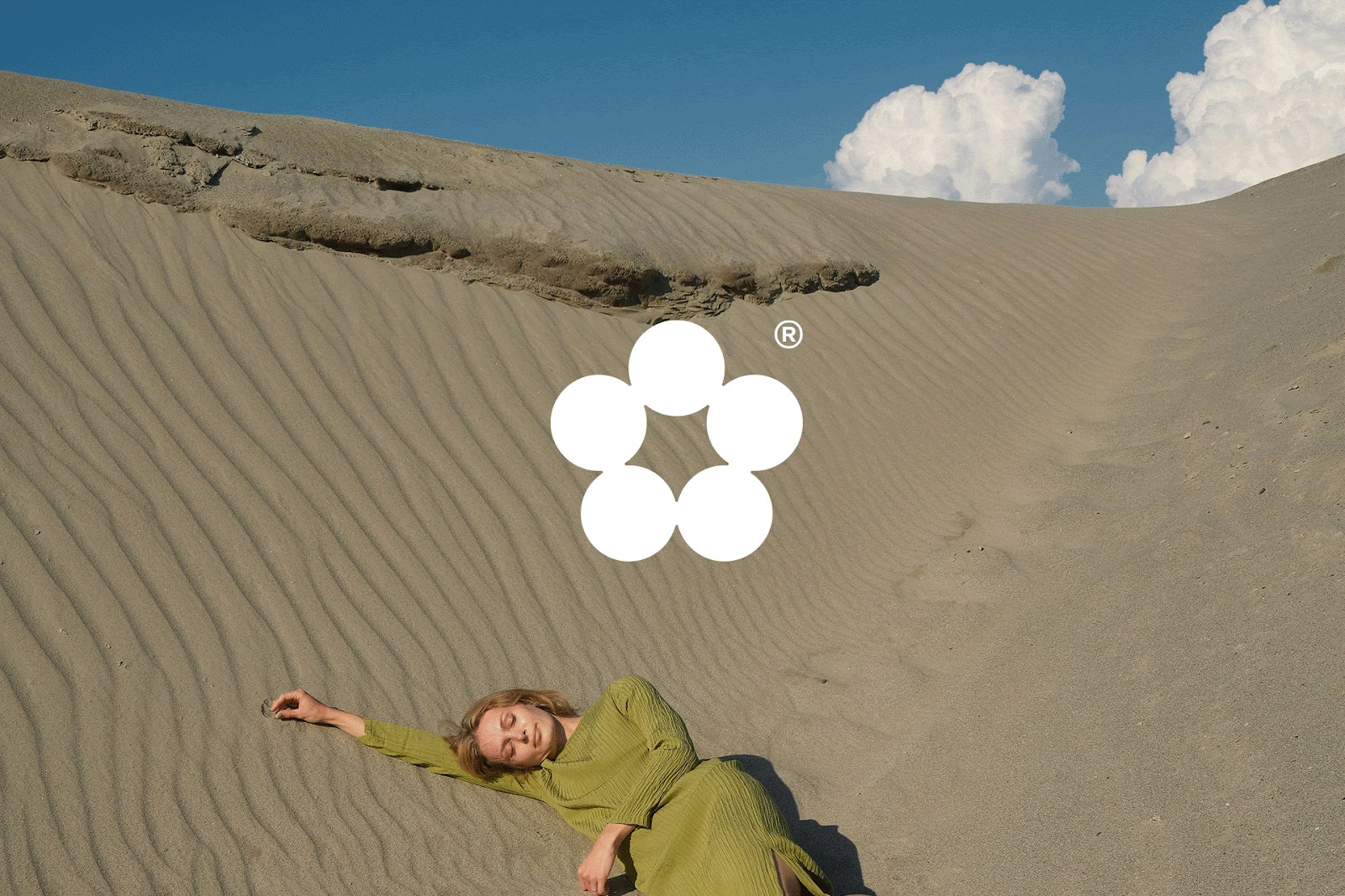
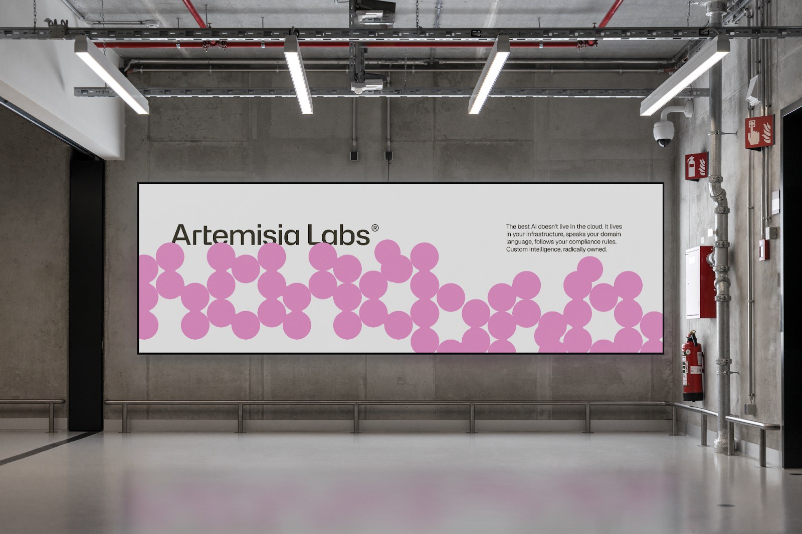
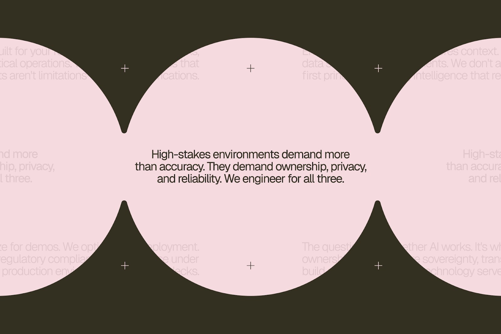
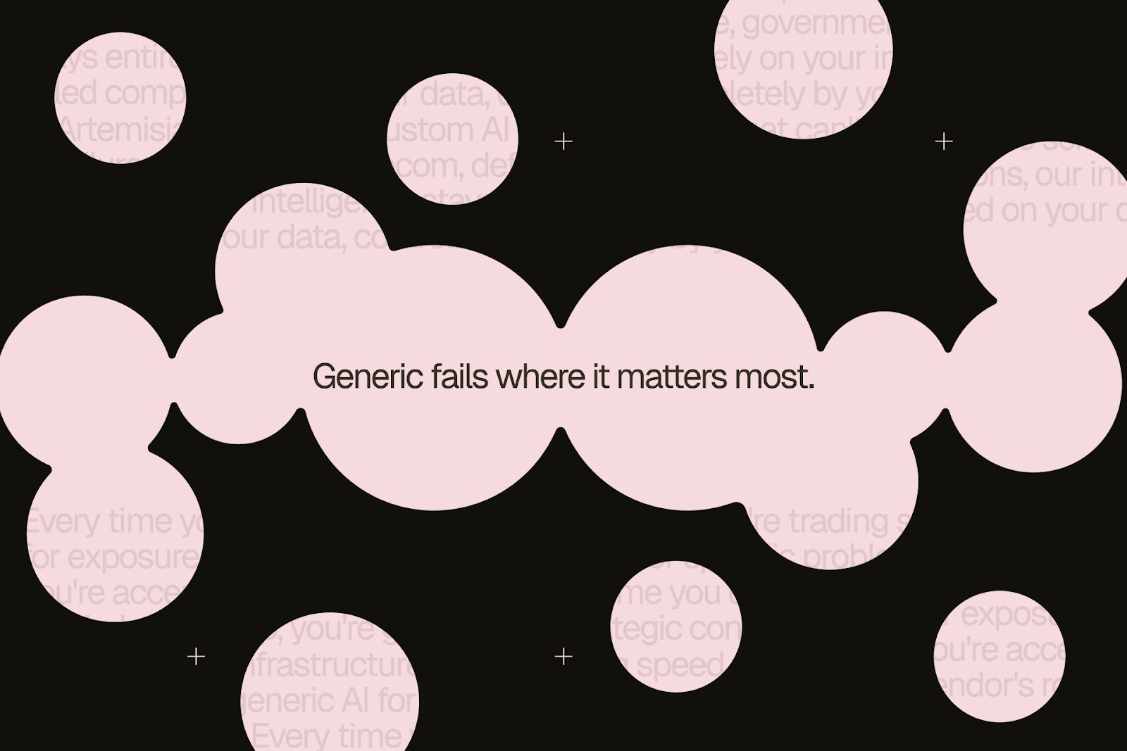
The most distinctive element in this AI branding project is the central mark: a circular symbol built from botanical geometry. It reads as corporate at first glance — tight, radial, controlled — but the underlying form is floral. That tension is intentional. ROCHA Branding used it to communicate what Artemisia actually is: a system that behaves like a living thing, yet operates with institutional discipline.
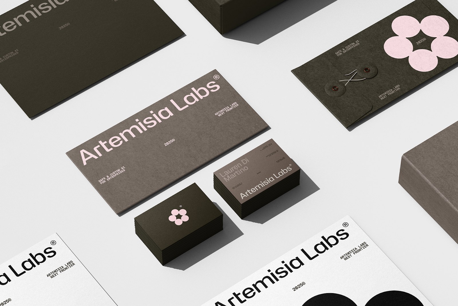
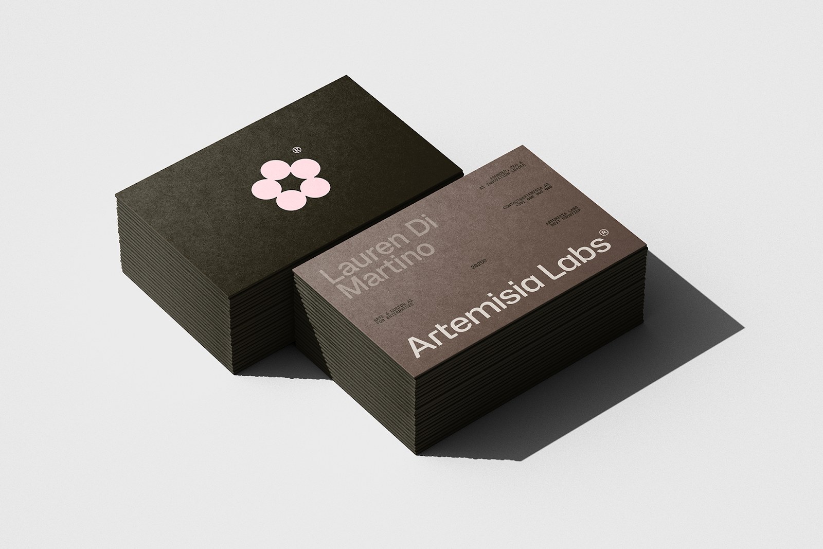
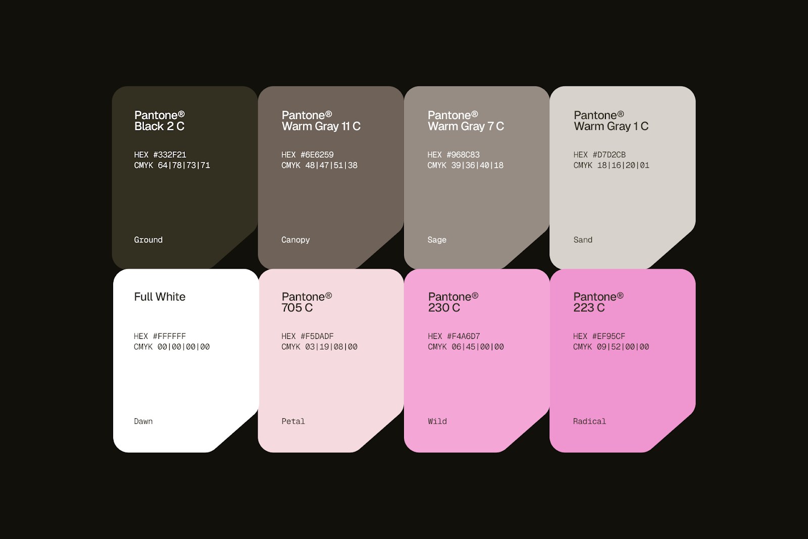
The color palette reinforces the same duality. Deep earth tones — rich browns and charcoals — anchor the brand in weight and seriousness. Then a warm pink accent cuts through. It does not soften the identity. It activates it. The combination reads as something that is both structured and instinctive, both institutional and alive.
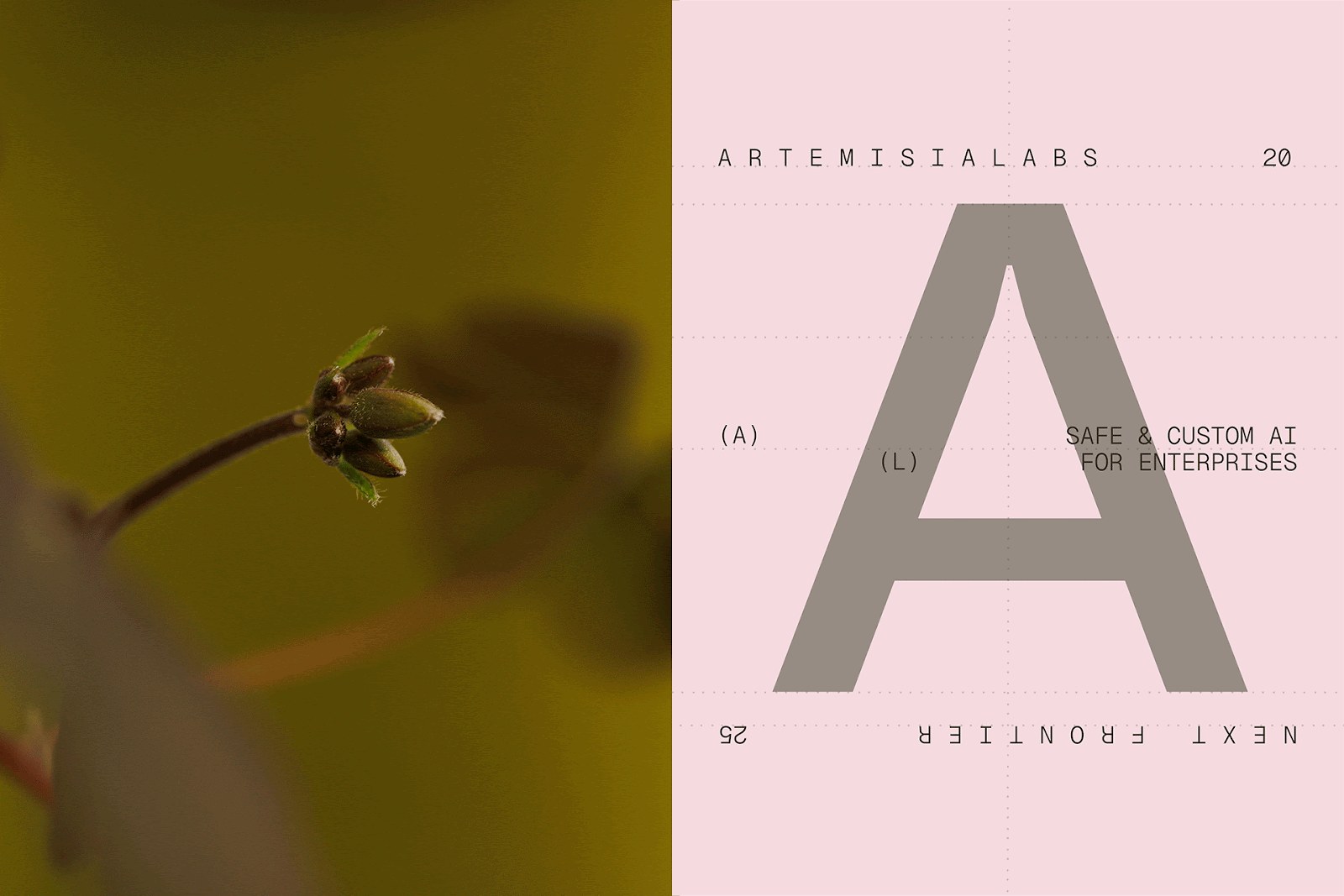
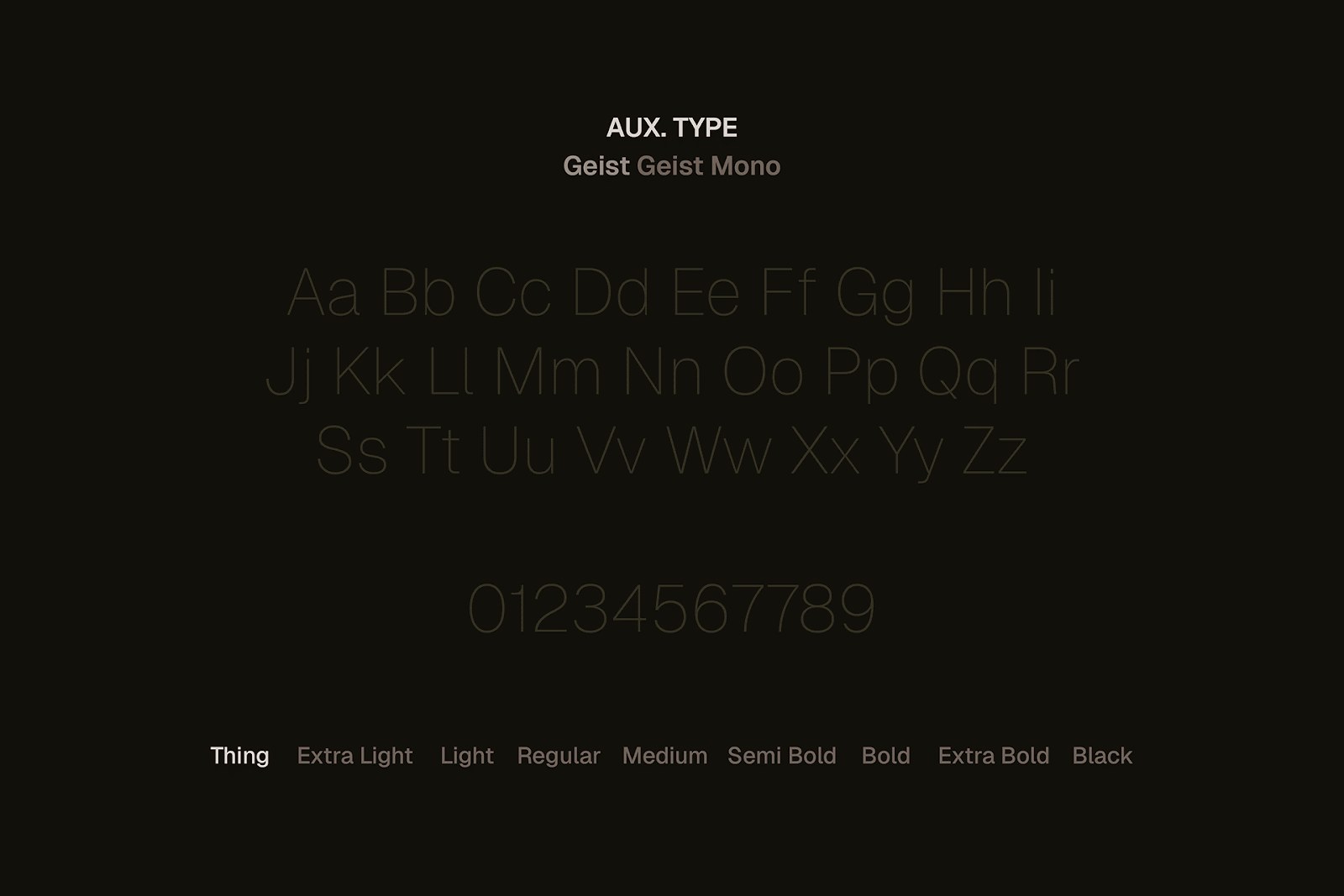
Typography across the system is clean and direct. The type choices prioritize legibility over personality, which makes sense for this client profile. When your audience is a defense contractor or a hospital network, you do not want the typeface showing off. You want it to hold the ground while everything else communicates.
The identity extends cleanly across touchpoints. Stationery, digital surfaces, and presentation formats all carry the same controlled tension. The botanical mark scales well — it holds at large sizes on brand covers and remains legible when reduced to a small stamp on letterhead. That kind of system thinking is what separates a well-resolved AI branding project from one that only works in a presentation deck.
What ROCHA Branding achieved here is a rare thing in the enterprise AI space: an identity that does not lean on the usual visual vocabulary of circuits, data streams, or cold futurism. Instead, it grounds Artemisia in something organic and earned. The brand looks like it has been built to last, because the company it represents has been built to operate where failure is not permitted.