by abduzeedo
Matej Špánik shared a branding and visual identity for NUDA bar. In Slovak "nuda" means boredom but NUDA bar's ambition is to be a place where you can have a great time with friends and enjoy top-class wines. NUDA bar offers a curated wine selection from the region and around the world as well as a variety of drinks and cocktails and all that paired with easy finger food and other snacks.
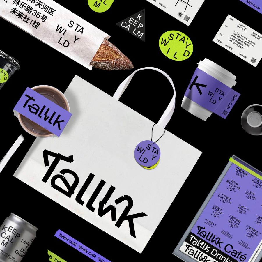
The concept of being anything but boring had to be translated into the visual identity as well. This was reflected in the character of the logotype. Each letter is in a different angle – the composition of the logotype is always random which creates a modular/dancing symbol. To tone down the overall impression of the identity the typography is more mature. The color palette is referring to the materials used in the interior.
The photo direction of the communication is based on the concept of having fun while drinking quality drinks. The photo style is a combination of raw & sharp techniques with blurry & long exposure techniques.
The communication is genuine with honest emotions. The blurry images are referring to the feeling of having blurred vision after a couple of drinks – and as the night progress, the images are blurred more and more.
Credits
- Photography: Miki Curik Jr. & Nora Jakub
- Interior: MAPA architekti & @nuda.bratislava
For more information make sure to check out Matej on:
