SanDisk Packaging Design System: Built to Scale Across Every SKU
Unspoken Agreement built SanDisk's packaging design system to scale across SD cards, USB drives, and SSDs — one visual language, no dilution at any size.
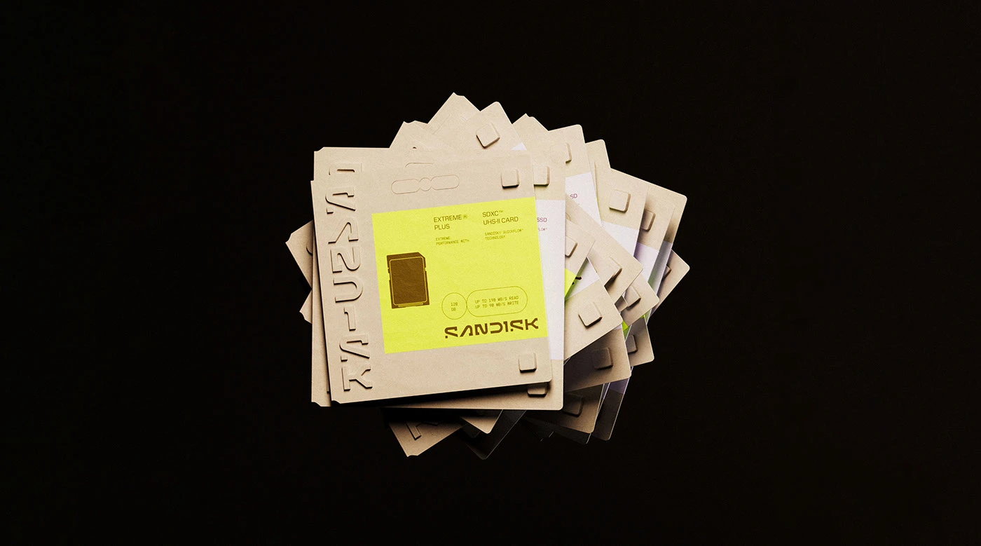
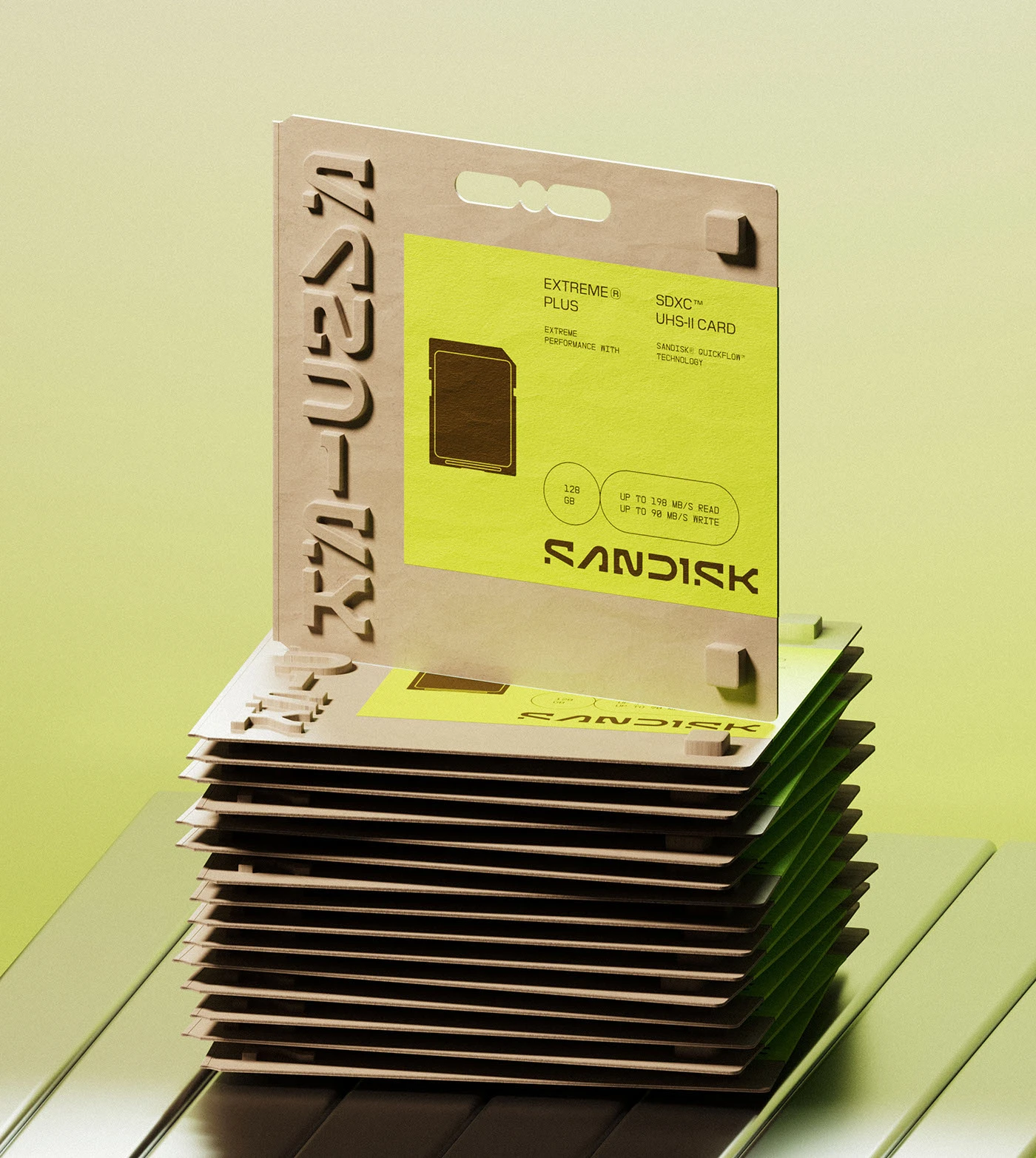
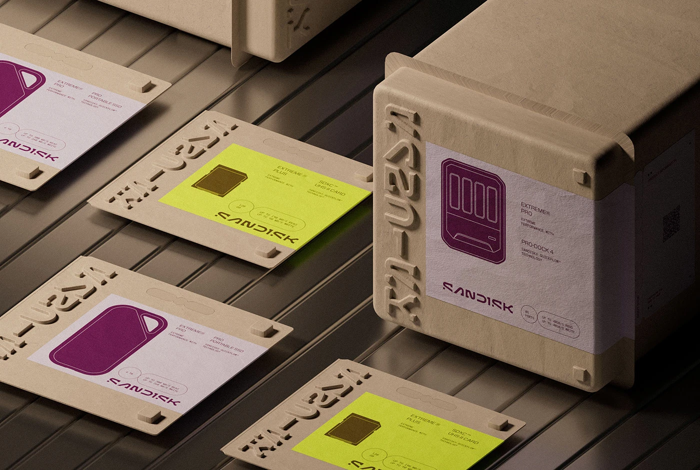
The packaging design system runs on two decisions that cannot be separated: a pure black ground (#0A0A0A) and a single acid yellow-green accent (#C8F000). No other colors appear across the entire system. The condensed wordmark "SANDISK" is set at roughly 180–200pt, letter-fit so tight the characters nearly touch, filling the full width of each face regardless of box dimensions. A neon accent panel occupies the top third of every SKU — the same proportion whether the surface is a blister pack for an SD card or a box for an SSD. The studio's tagline "RATED (G) FOR [GO]." sits in small caps within a ruled-line grid, treated as a structural label rather than marketing copy. Even the period is intentional.
SanDisk Packaging Design System: One Visual Language, Every SKU
Unspoken Agreement used 3D CGI renderings to validate the packaging design system before production — not as presentation polish, but as the actual proof step. The hero render stacks eight to ten identical boxes in a tower, shot from a low angle against a dark background, making scale and repetition the visual argument for how far the system stretches. Every SKU gets the same matte black ground, the same neon accent panel, the same condensed wordmark — only the proportions of the box change. The sustainability brief — reduce material waste without compromising shelf presence — shapes every structural decision in this packaging design work.