Tactile Design: Texture and Touch in Modern Branding
Tactile design is reshaping branding, packaging, and digital UI with texture, embossing, and material surfaces that make design feel as good as it looks.
Screens have flattened everything. Swipe, tap, scroll — interaction is mostly frictionless now. But a countermovement is gaining ground. Designers across branding, print, packaging, and even digital interfaces are leaning into texture. They are making surfaces that suggest weight, grain, and resistance. They are designing things that feel like something.
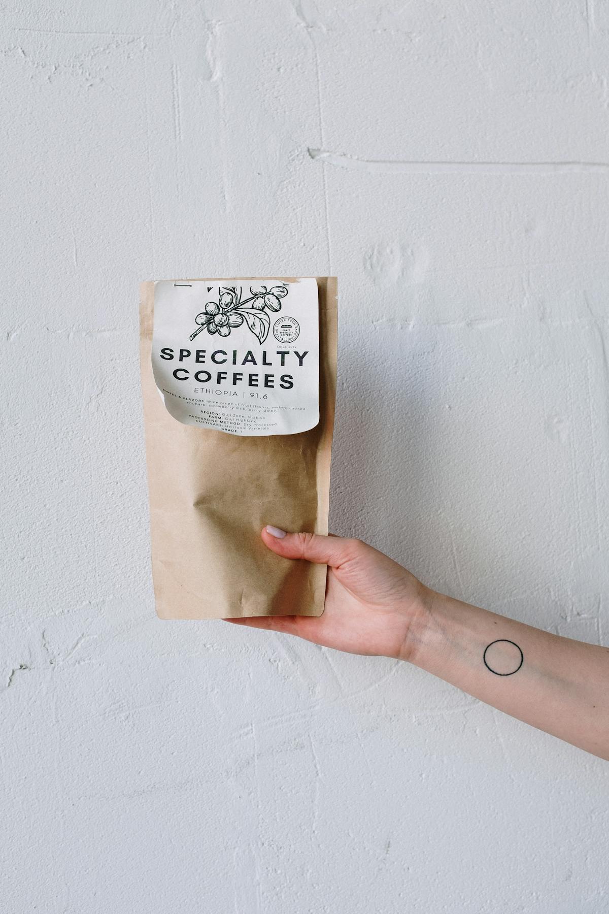
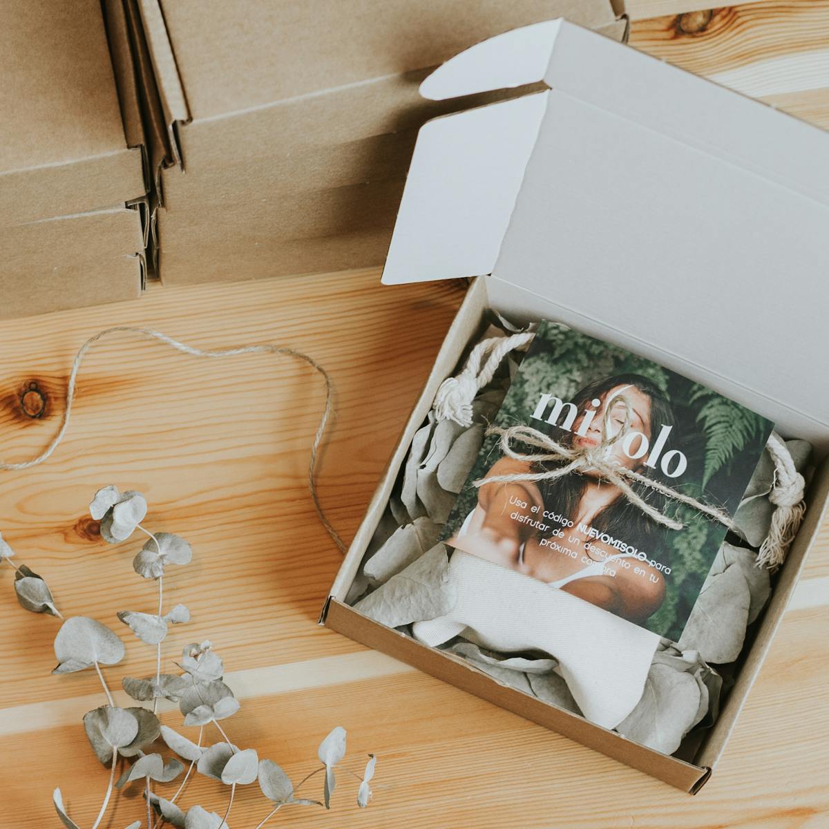
This is tactile design. It is not a single aesthetic. It is an approach — a commitment to material honesty and sensory depth. When a brand prints its identity on uncoated stock with debossed letterforms, the paper's tooth becomes part of the message. When a package uses kraft board with a blind-embossed logo, the roughness and the relief tell a story about craft and care before the product is even opened.
Tactile Design in Branding and Packaging
The most effective tactile design in branding starts with material selection. Studios working across print and packaging consistently reach for surfaces that have presence: cotton rag stock, duplex boards, textured uncoated papers, and natural materials like linen and wood pulp. These choices carry meaning. An uncoated cream paper reads handmade. A heavy coated board reads luxury. Kraft reads honest and sustainable.

Finishing techniques add the next layer. Debossing presses type or imagery into the surface, creating a recessed impression that readers touch without thinking. Embossing does the opposite, raising forms above the sheet. Foil stamping adds metallic contrast while still referencing physical material. Letterpress printing, with its characteristic ink bite and impression, turns the act of reading into a physical encounter with the page.
Tactile Design in Digital and UI
UI designers have long experimented with material metaphors — subtle noise overlays, paper-grain backgrounds, and linen-pattern interfaces that recall physical surfaces. The goal is not skeuomorphism for its own sake. It is warmth. A slight texture on a background removes the sterile coldness of a pure flat surface. It grounds the interface in the physical world.
Haptic feedback in mobile design extends this logic. A well-timed vibration when a button activates does not just confirm the action — it adds a moment of physicality that flat audio feedback cannot replicate. As displays improve and surface materials evolve, tactile design will bridge the screen and the hand more precisely.
The best tactile work understands that texture is not decoration. It is communication. Every grain, every impression, every surface choice sends a signal about quality, intent, and care. The studios and designers pushing this work are not chasing a trend. They are recovering something that flat digital design left behind.
