by abduzeedo
Explore Overnice's Squeezy variable font posters. Awesome graphic design merging digital flexibility with print for your next project.
Hey design friends! Let's talk type. For the longest time, fonts felt pretty fixed, right? You picked a weight, and that was that. But things are shifting, literally. Variable fonts have opened up a whole new playground for graphic design, letting type stretch, bend, and morph in ways we couldn't easily do before.
From Pixels to Paper
One studio diving headfirst into this dynamic world is Overnice. They cooked up a variable font called Squeezy, embracing all the cool possibilities – think type that adapts and animates. They even built a colorful interactive experience around it, which snagged an honor from Awwwards. Pretty cool stuff for the screen.
But the folks at Overnice thought, why should digital have all the fun? That's the question that sparked their Squeezy Variable Posters project. They decided to take the fluidity and vibrancy of their Squeezy font and translate it into tangible graphic design artifacts you can hang on your wall.
The Squeezy Poster Lowdown
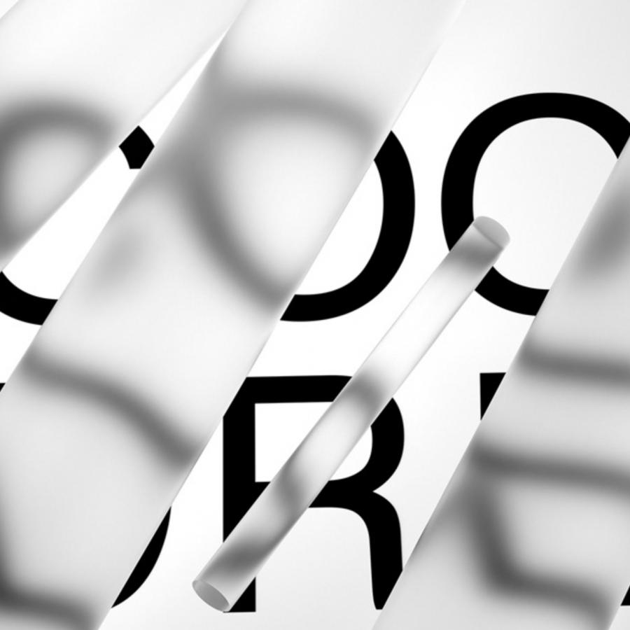
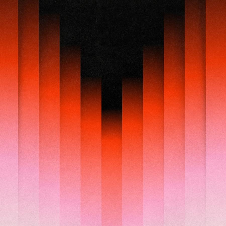
So, what did they create? A series of limited-edition posters. Each design takes a letter or concept – like "Gentle Gangster," "Exotic Xenos," "Vivid Vintage," or "Kinetic Kraken" – and brings it to life using the Squeezy font. The visuals play with form and overlapping colors, showcasing how the font can squeeze and expand.
The designs feel modern yet have a touch of retro charm, thanks to the color palettes and the smooth, expressive lines of the typeface. It’s a great example of how variable font technology can inspire fresh graphic design aesthetics. They didn't just type out words; they crafted visual statements where the letterforms themselves are the main event.
These aren't just quick prints, either. Overnice went for quality: museum-standard Giclee prints on hefty 300gsm matte fine art paper. Each one is a limited run of 25, making them pretty exclusive pieces. It’s a commitment to bringing that digital flexibility into a high-quality physical format. They measure 40x50 cm, ready to make a statement.
Why It Matters for Graphic Design
This project sits right at the intersection of typography, technology, and print design. It’s more than just posters; it’s a physical exploration of digital potential. Variable fonts offer incredible flexibility – adjusting weight, width, or other attributes dynamically. Seeing Overnice apply this to print reminds us that innovation isn't confined to screens.
The Squeezy posters demonstrate how graphic design can leverage new tools to create compelling visual narratives. The way the letters stretch and compress isn't just functional; it's expressive, adding personality and dynamism to the compositions. It pushes us to think about how type can perform visually, beyond just legibility.
For designers, it’s inspiring to see studios like Overnice experimenting and bridging the digital-physical gap. It challenges us to explore the capabilities of the tools we have and think about how they can translate across different mediums.
Check Them Out
These posters are a beautiful example of contemporary graphic design pushing boundaries. It’s exciting to see variable fonts moving beyond web applications and finding a place in print and physical products.
Want to see more or maybe grab one for your studio wall? Check out the Squeezy posters and more from the designers at: Overnice Goods and make sure to get a poster for your wall.
