by abduzeedo
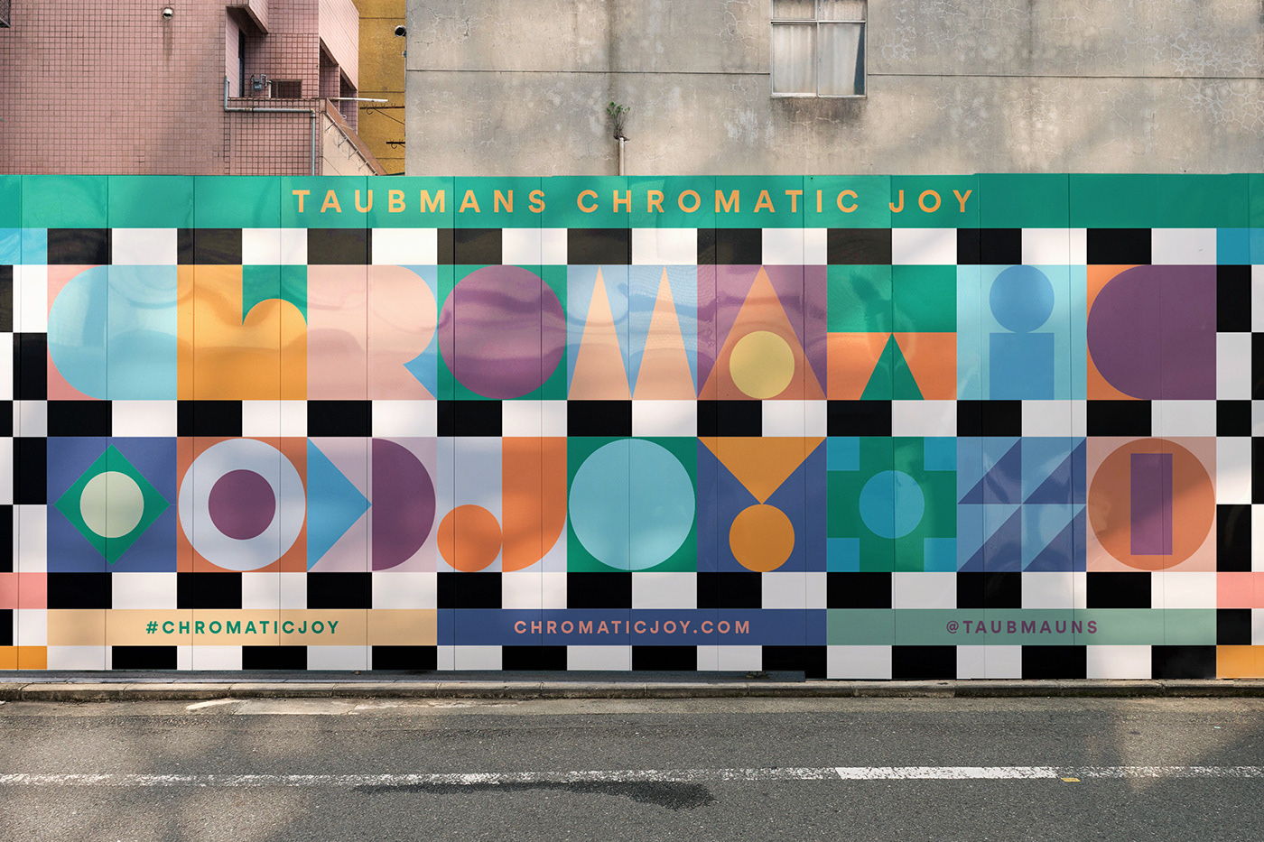
Leta Sobierajski and Wade Jeffree shared a beautiful art direction and graphic design project titled Taubmans Chromatic Joy. As they describe it, the project was a digitally physical approach to showcasing 2021’s trends in color. At the start of 2020, Taubmans began the year with an entirely different color forecast in mind, but then COVID 19 changed everything. For 2021, they could not imagine a world without color. Color is an integral element of our world and plays a vital role in our well-being. It is our subtle responses to color that make us human.
Instead of tepidly showcasing the typical colors of the year on an accent wall in a fabricated set, they opted to explore some more unusual applications and together they developed a strategy to create a more unconventional showcase of the year’s painstakingly assembled palette.
We had a lot of fun determining this modular typographic approach as it gave us infinite opportunities
Project description from the designers
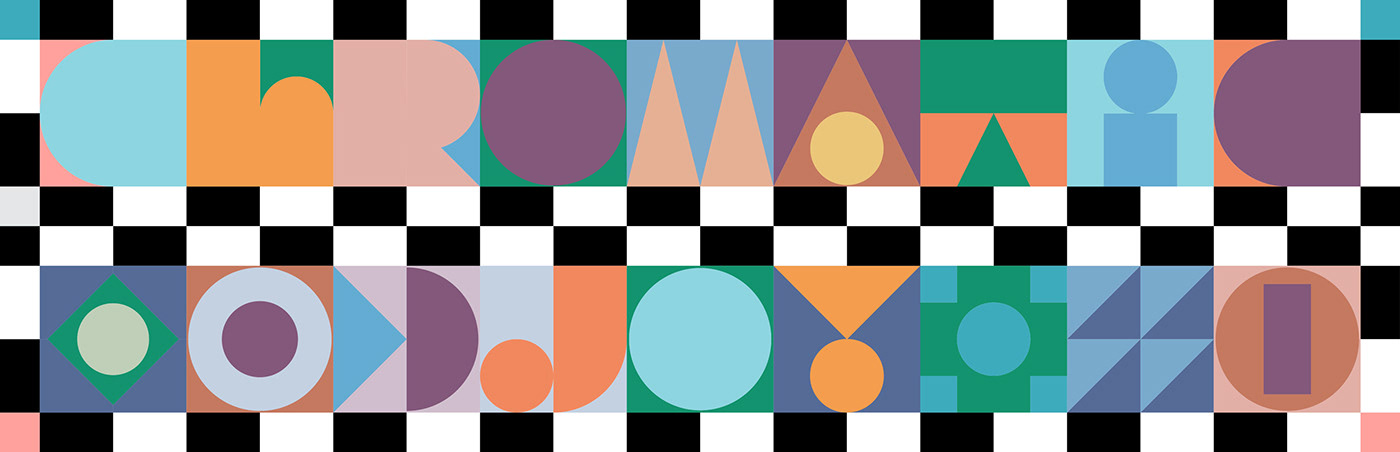
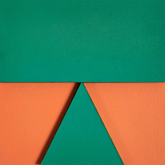
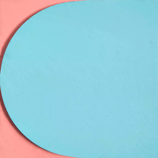
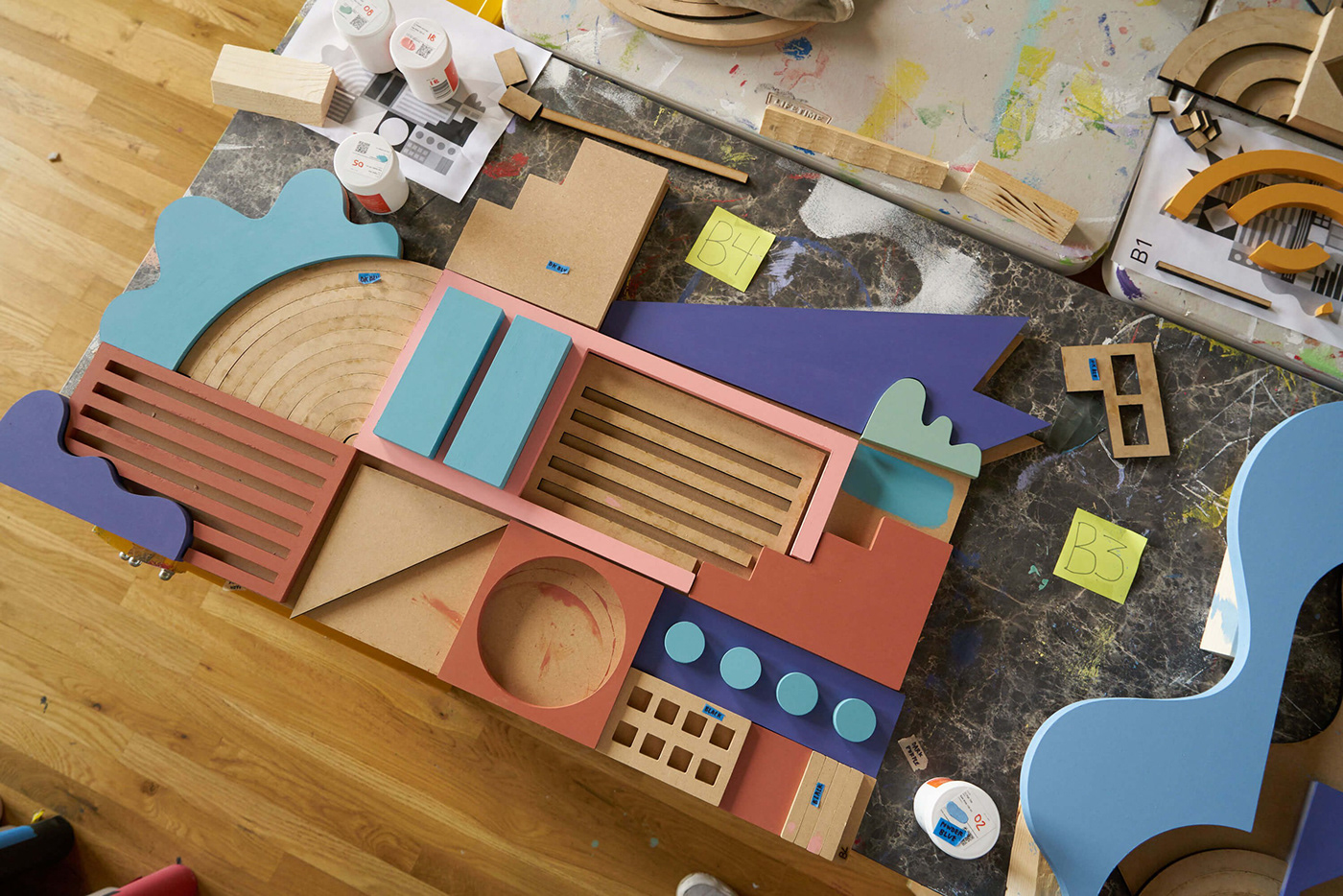
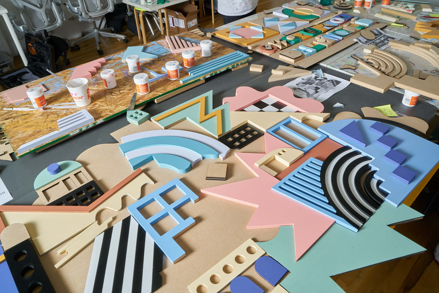
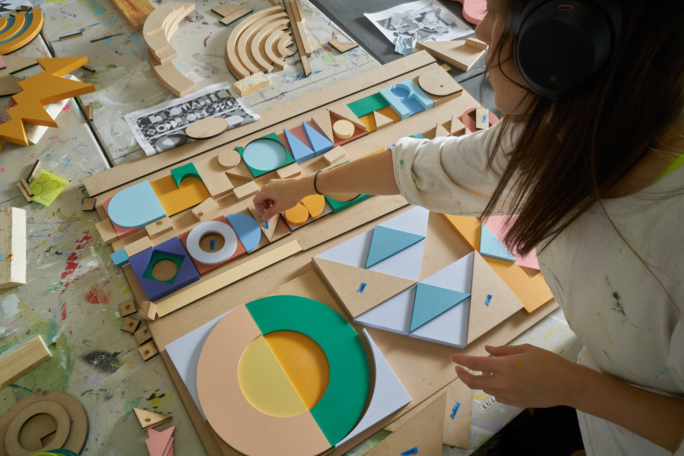
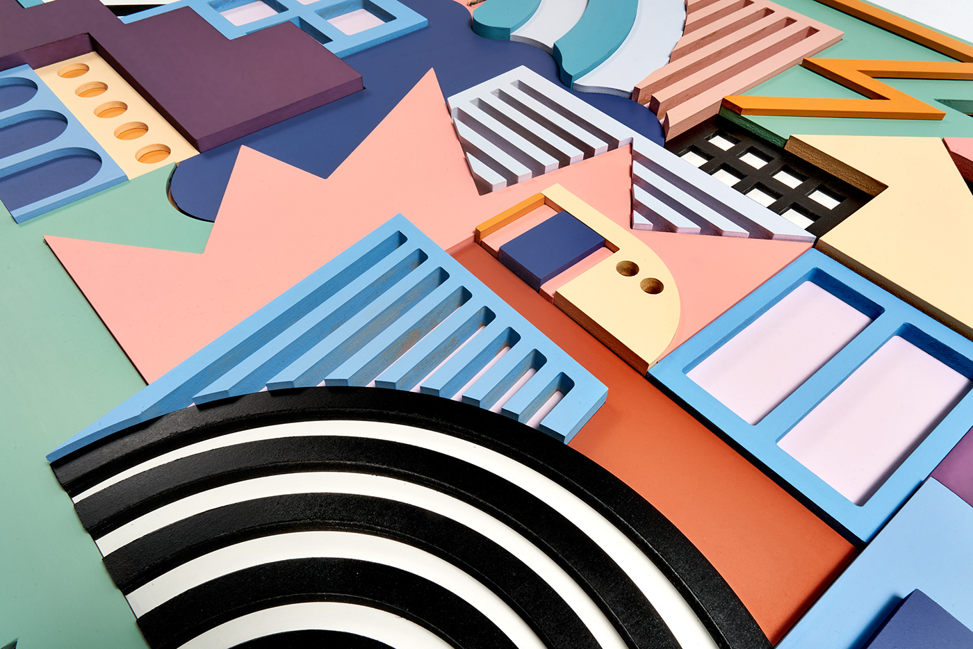
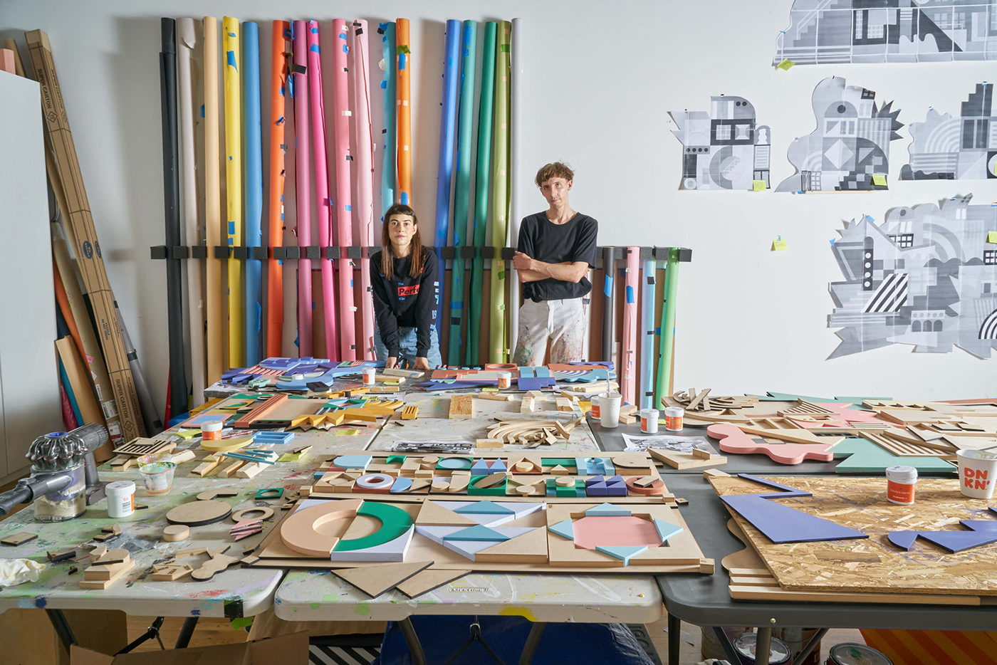
Initially beginning as a branding project, we designed and built the physical branding lockup for Taubman’s 2021 campaign, Chromatic Joy! Our multi-layered logo and its system of glyphs existed as physical wall reliefs that, when assembled, would create a giant composition that we photographed for the header of the website. Each of these letters and glyphs were hand painted to showcase the vibrancy and tactility of Taubman’s colors for 2021. We had a lot of fun determining this modular typographic approach as it gave us infinite opportunities to showcase Taubman’s color pairing possibilities with our material approach.
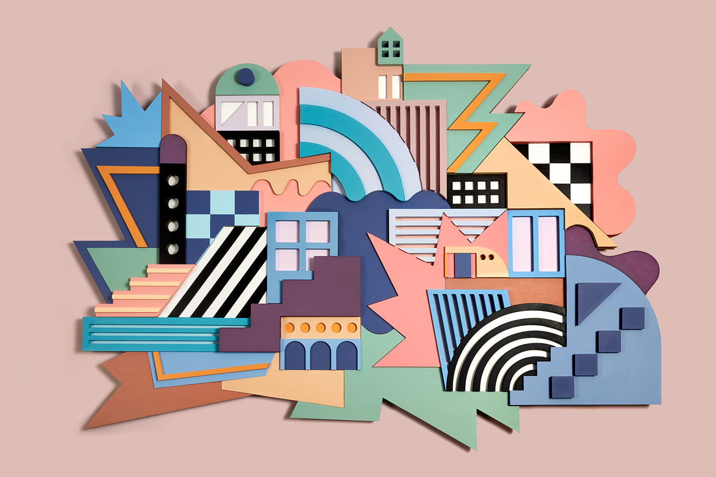
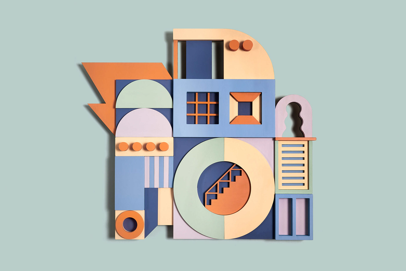
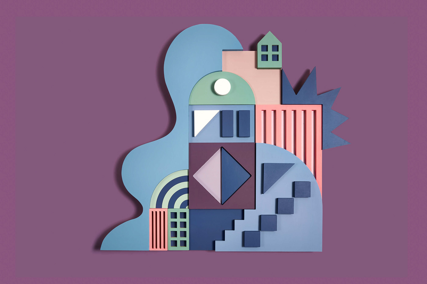
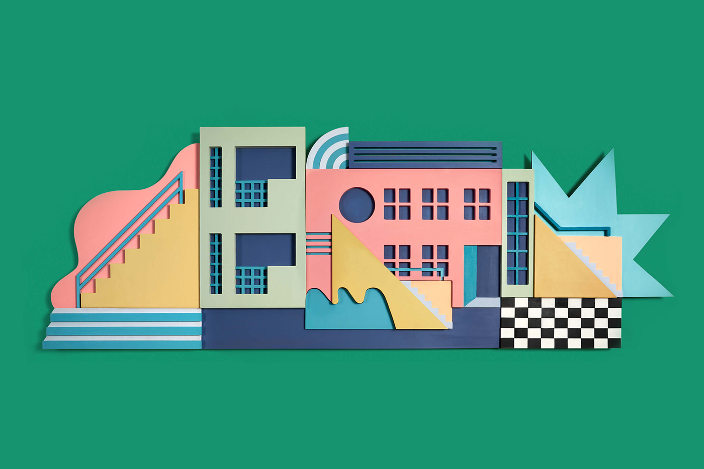
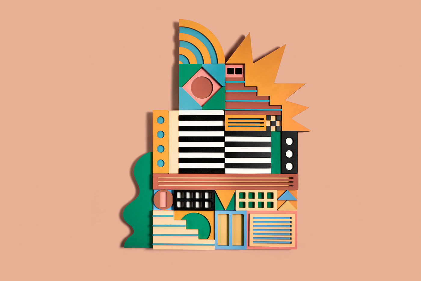
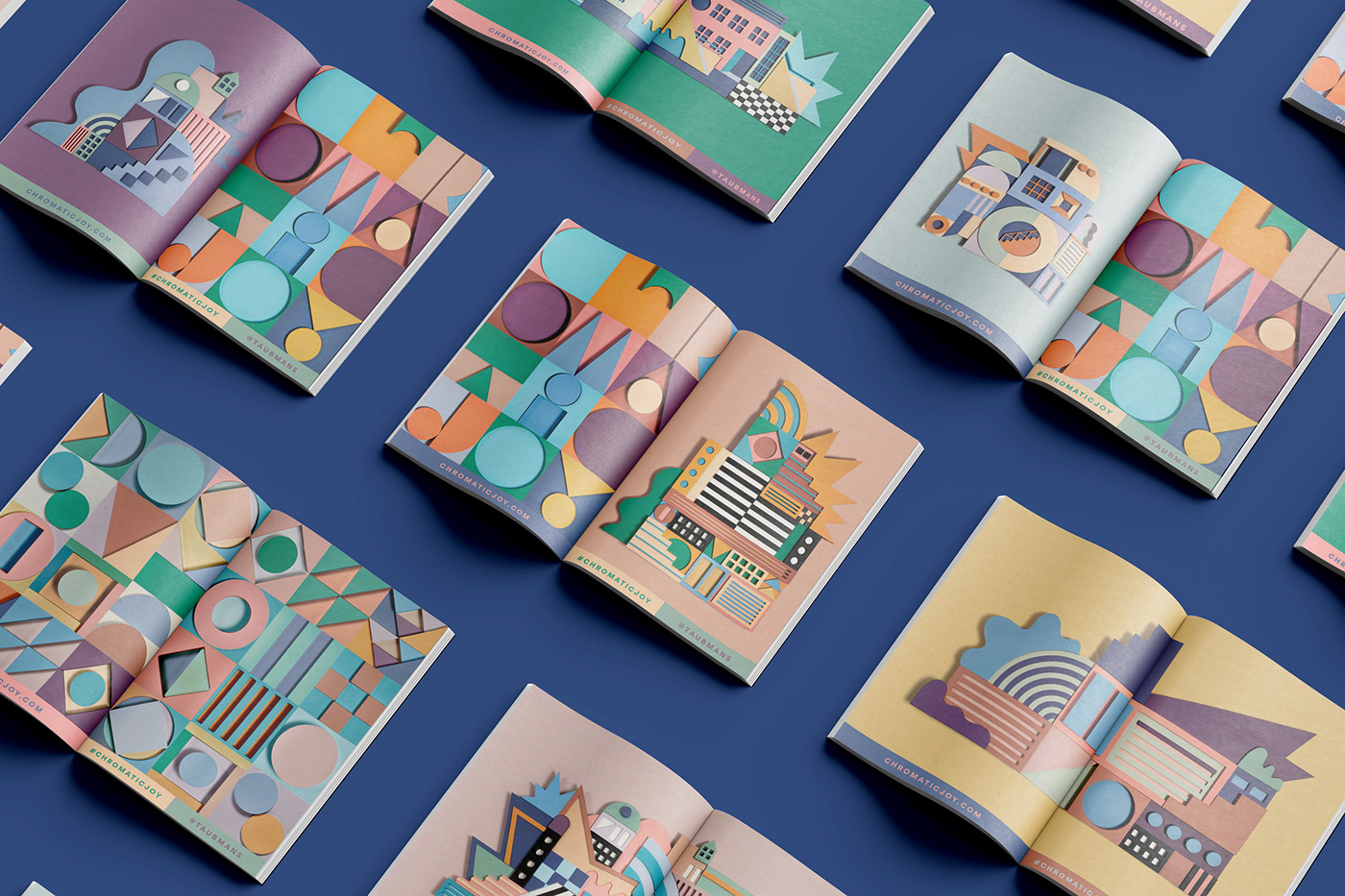
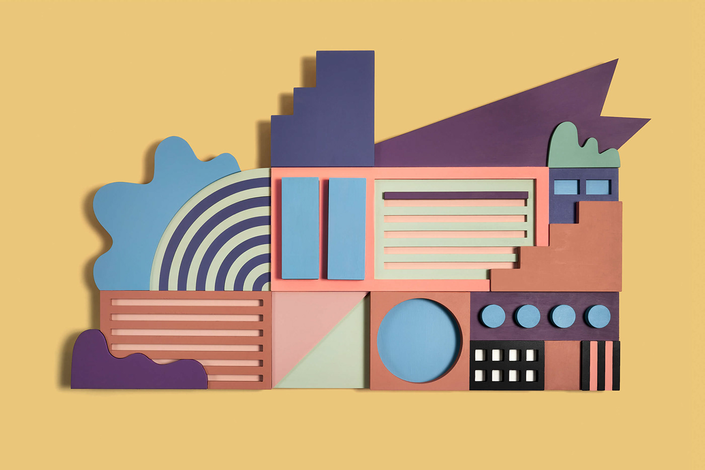
Additionally, we designed our own ideal buildings to supplement the site by pulling inspiration from architects like Kunihiko Hayakawa and Kazuo Shinohara. Everything was nicely linked together with the eclectic palette derived from Taubman’s colors of the year in order to exist on Taubman’s digital annual report website (designed by Sons & Co.) featuring loads of chromatic inspiration and insightful interviews with other colorful creatives such as Yinka Ilori, Camille Walala, and Adam Nathaniel Furman. We’re in there too ;)


Credits
- Client: Taubmans (PPG)
- Year: 2020
- Scope: Identity design, Campaign Design, Artwork, Sculpture
- Website Design: Sons & Co
- Typeface Design: Metis Foundry
For more information make sure to check out wadeandleta.com


