by abduzeedo
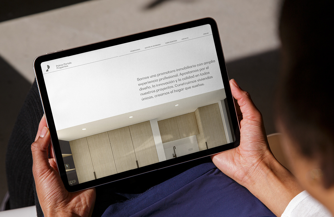
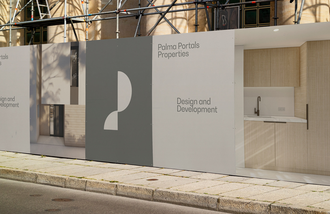
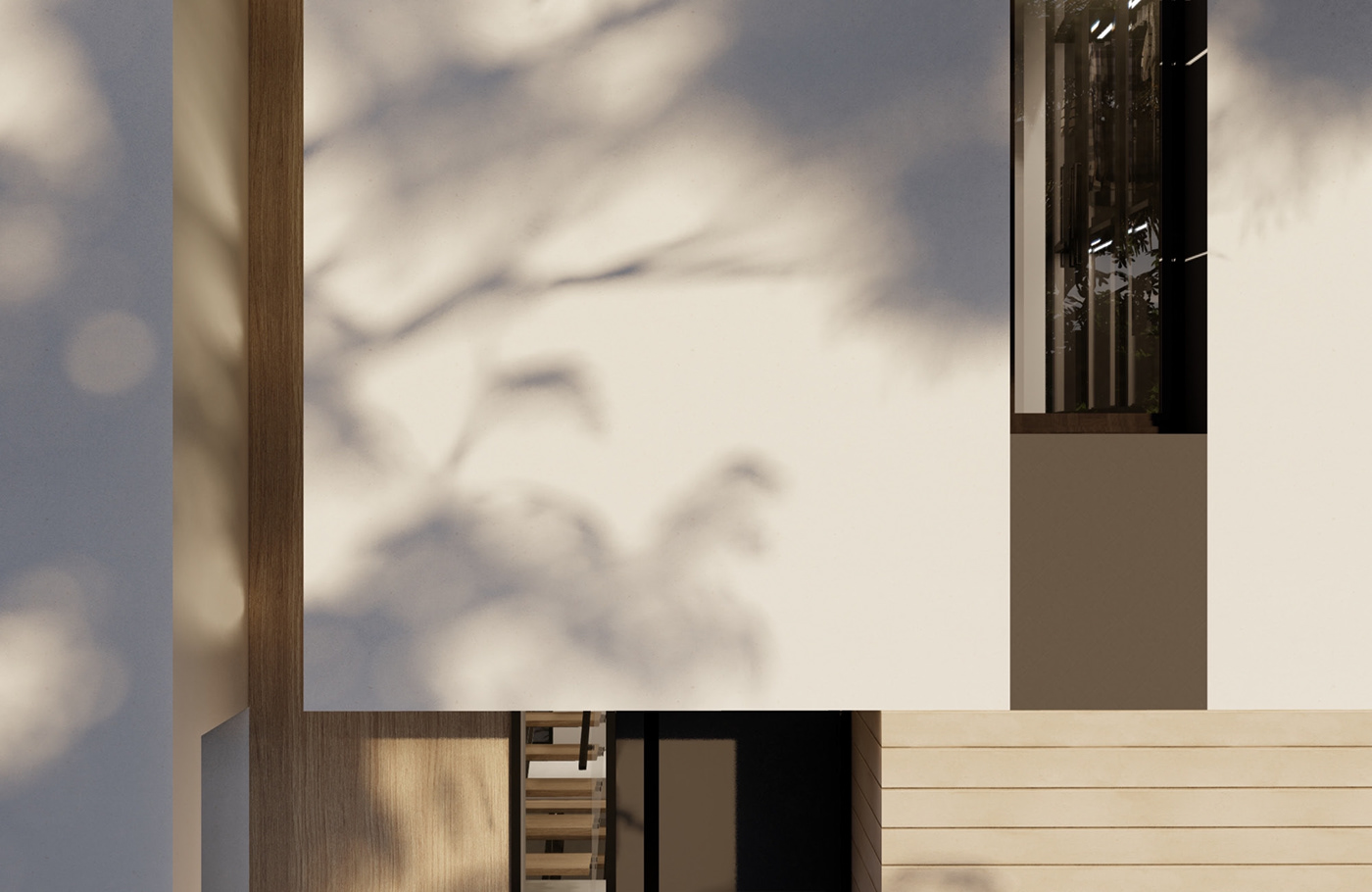
As design enthusiasts explore the world of branding and visual identity, it becomes evident that minimalism can be both impactful and communicative. Palma Portals Properties, a development company stationed in the heart of Palma de Mallorca, stands testament to this principle. With their keen focus on new builds and refurbishments, they seamlessly intertwine quality and design in all their ventures, from multi-family edifices to luxury abodes.
The genius behind this branding endeavor, Enrique Presa, has manifested a visual identity that is both evocative and understated.
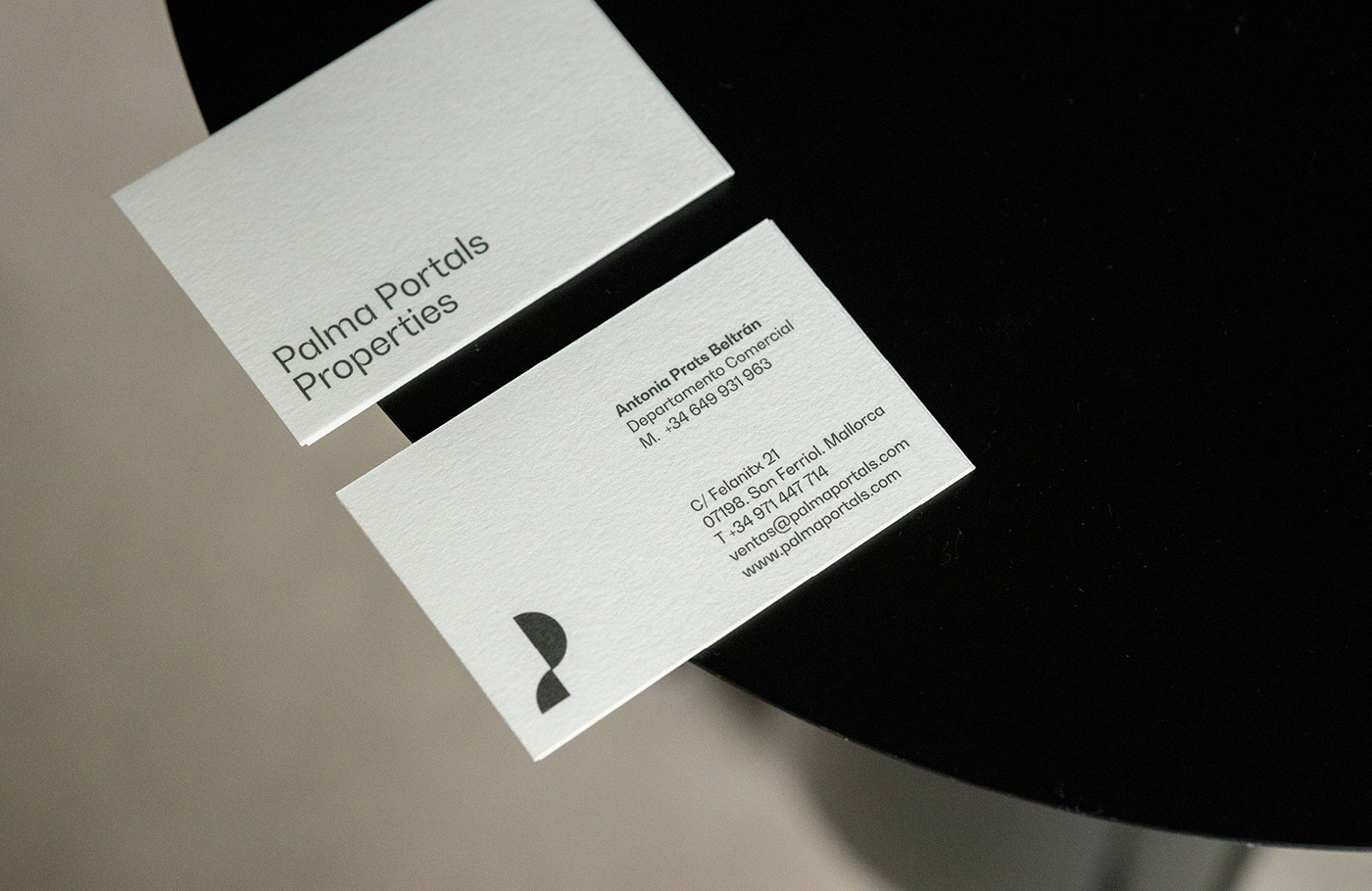
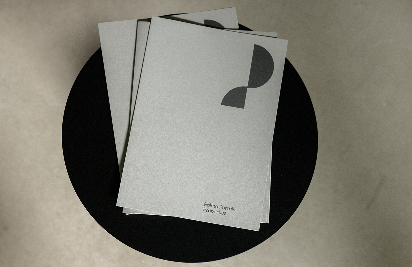
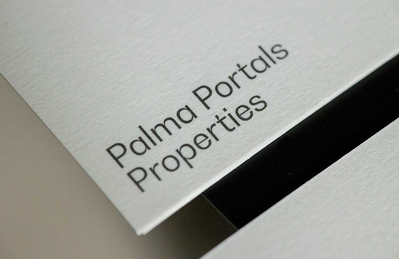
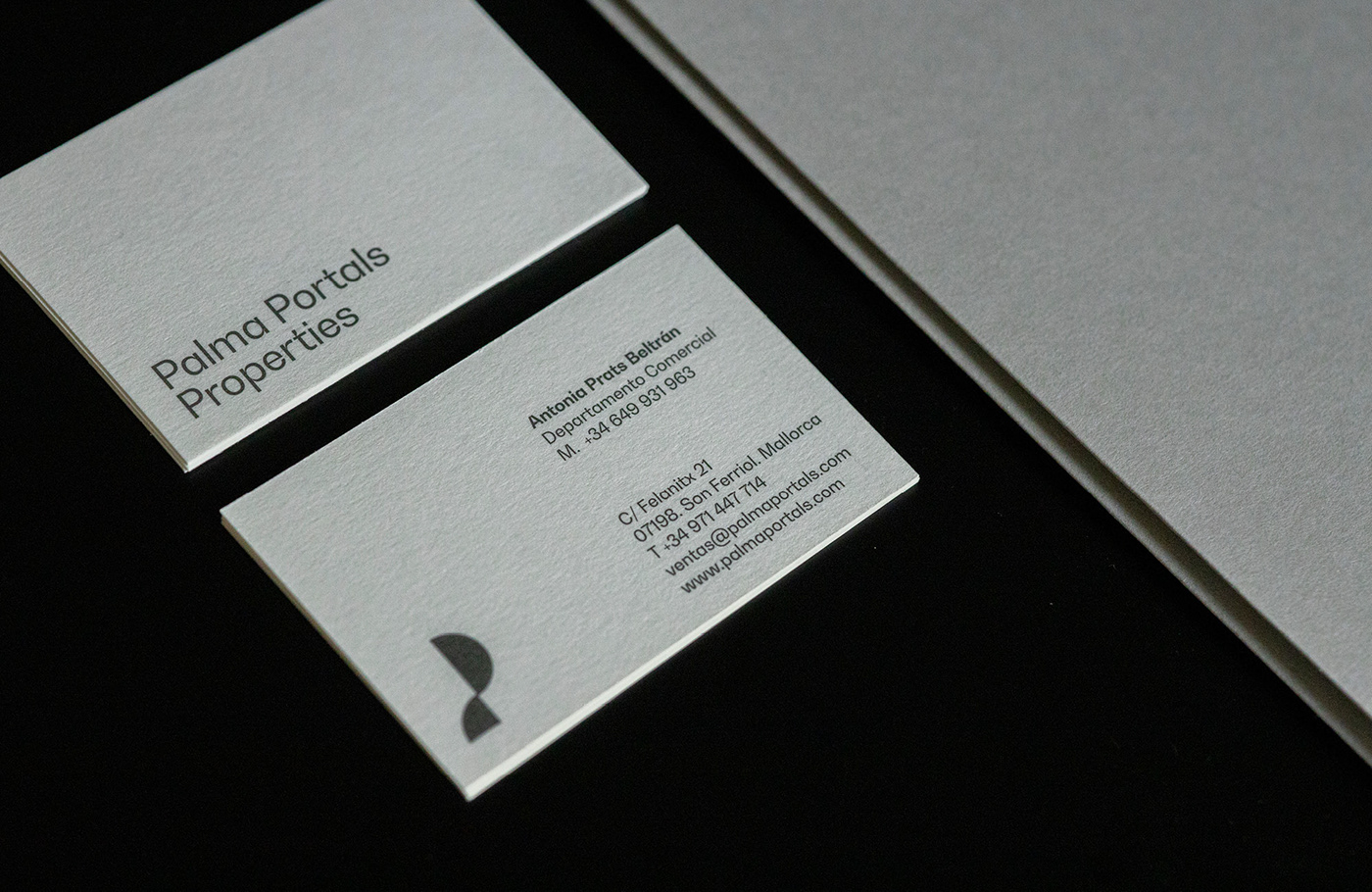
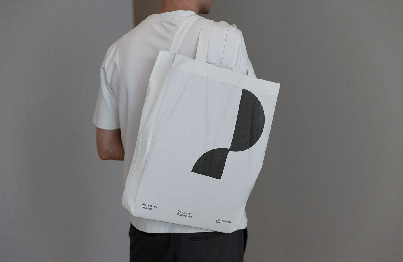
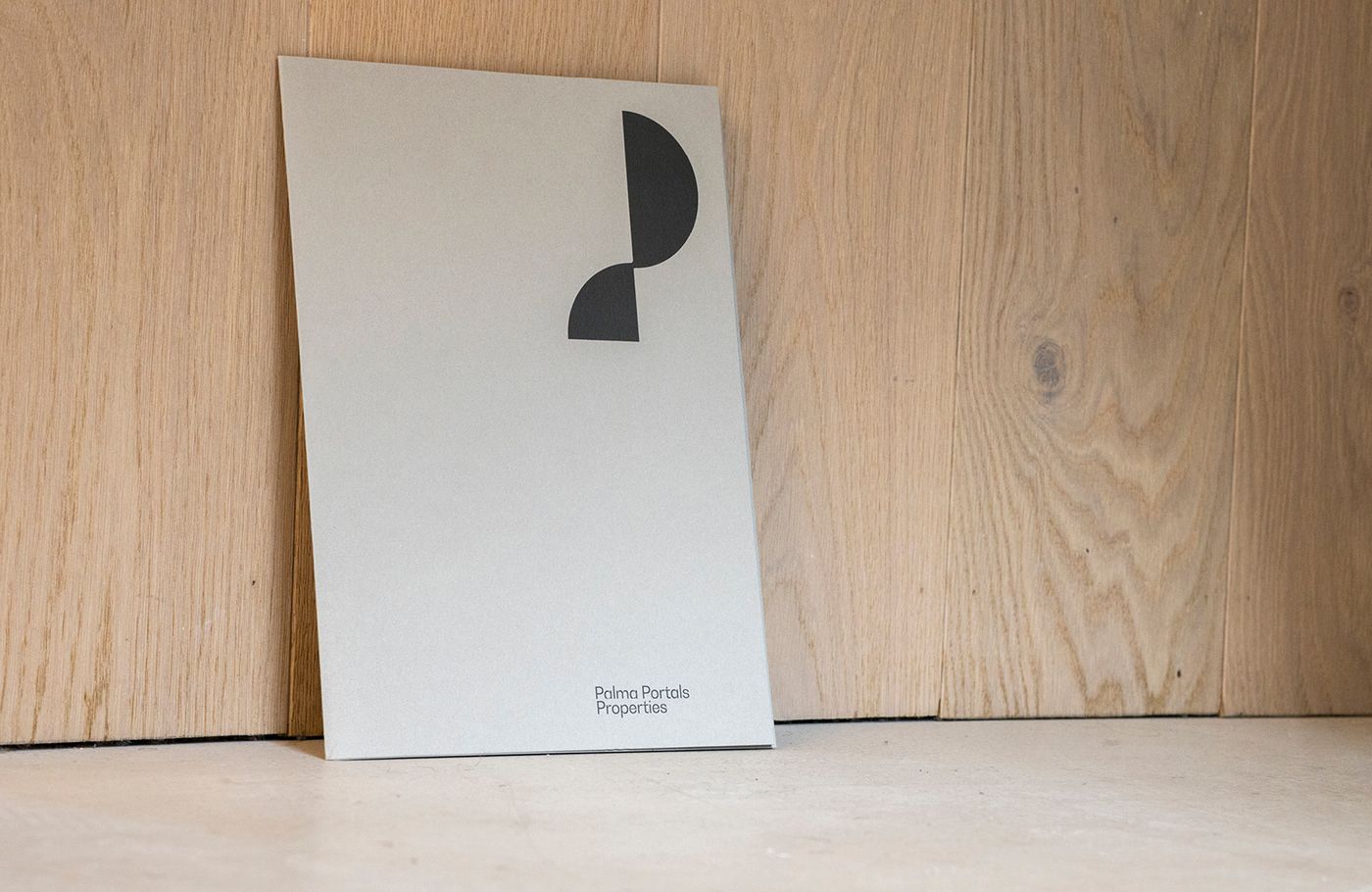
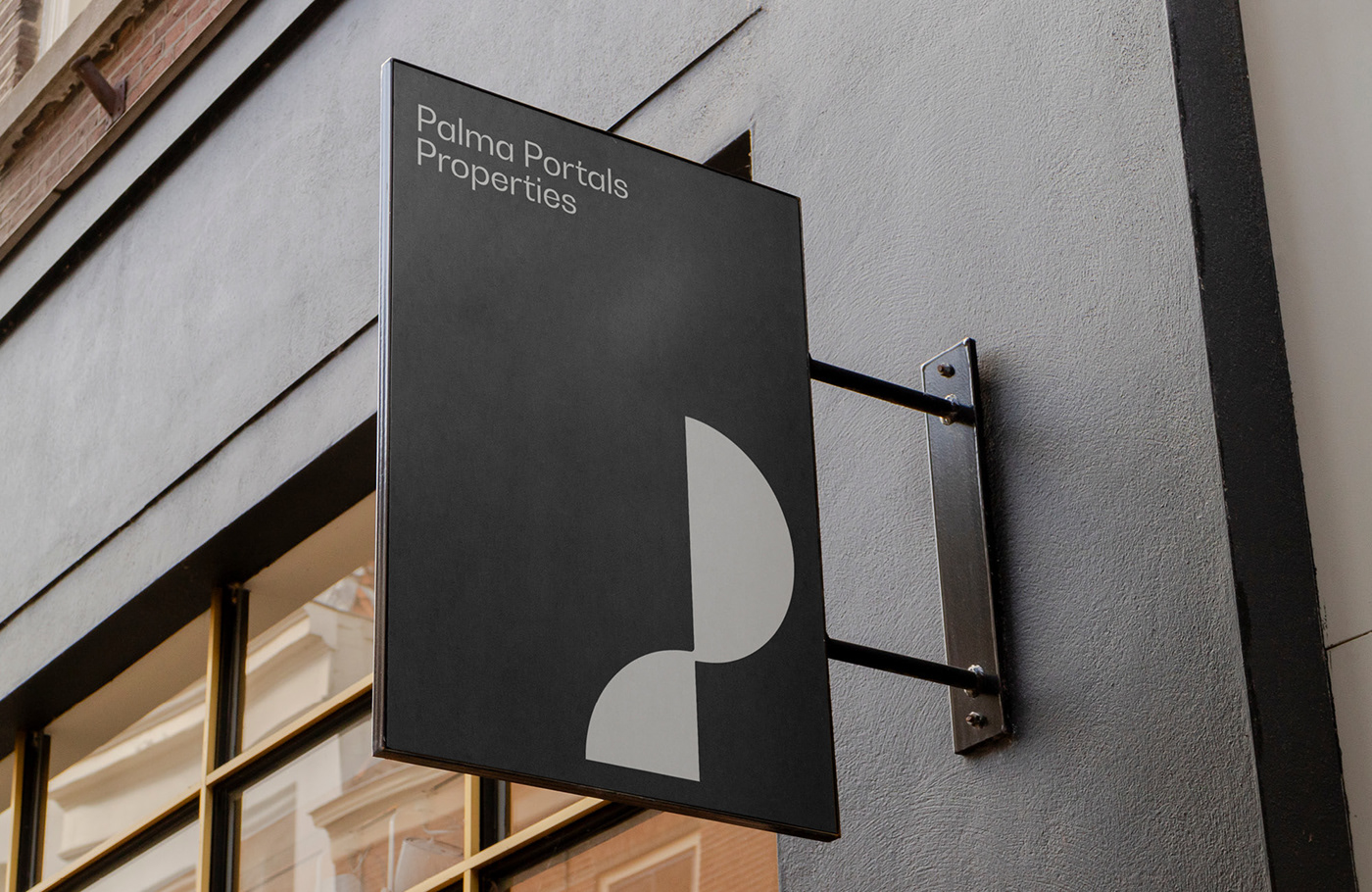
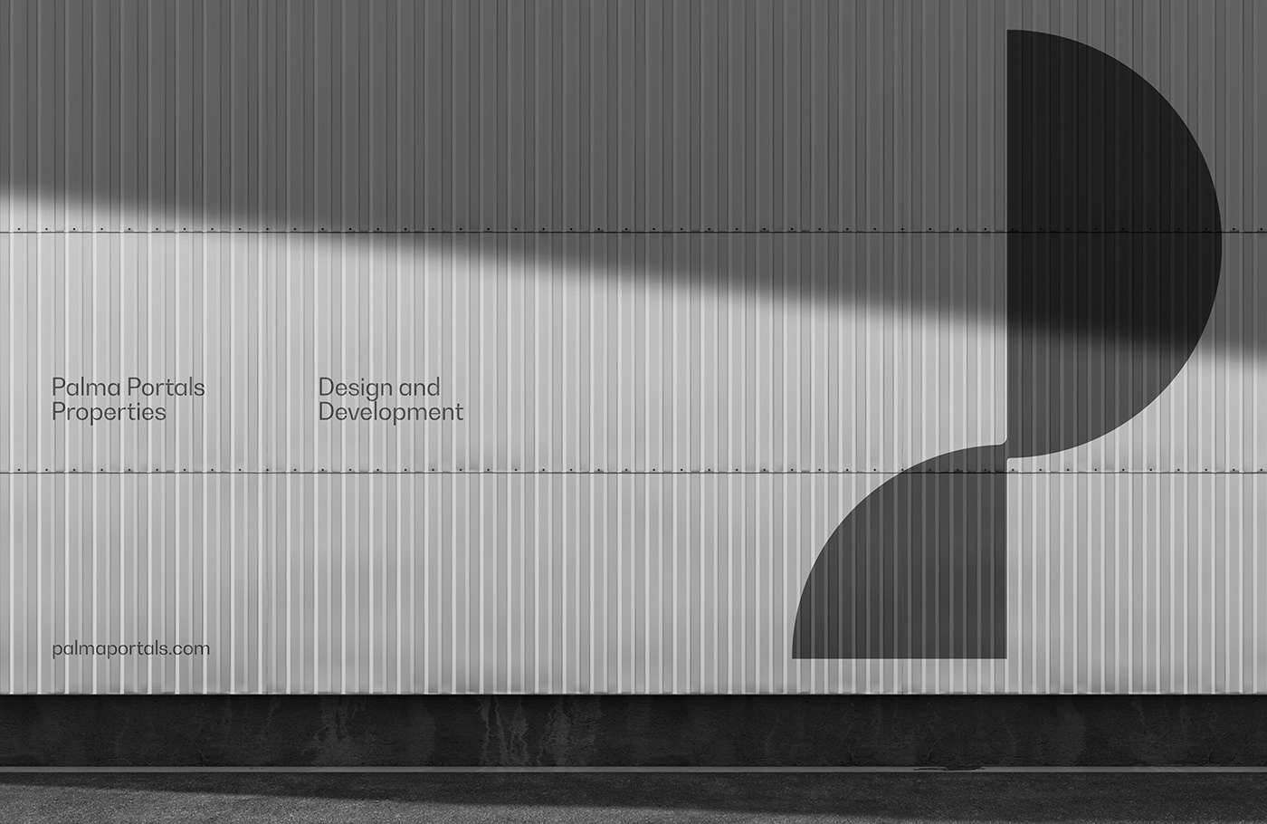
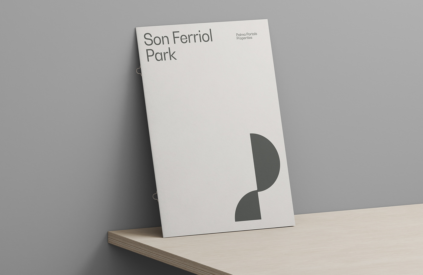
Taking a closer look at the images provided, one can immediately recognize the emblem that has been employed for Palma Portals Properties. It's an emblem that plays with pure geometric shapes, resonating well with the core essence of construction and architectural design. One could argue that these shapes are not merely visual elements but symbolic representations of concepts deeply rooted in construction, growth, and timelessness.
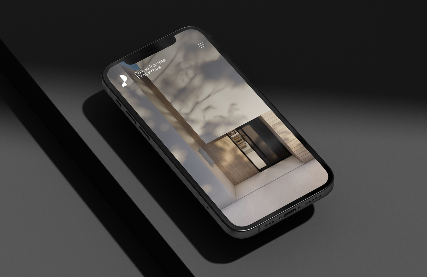
The color palette of the brand remains neutral and classic, reinforcing the themes of simplicity and timelessness. This approach ensures that the brand remains versatile and can be adapted to various mediums, from business cards to large banners. It's a representation of stability and longevity in the ever-evolving realm of real estate.
The printed materials, as visible in the attached images, showcase the emblem's adaptability. Whether it's on the corner of a paper or centered on promotional collateral, the logo maintains its integrity, symbolizing the brand's commitment to quality and precision. The use of whitespace around the emblem provides it with the room it requires to breathe, emphasizing the minimalist design approach.
What stands out about Enrique Presa's design for Palma Portals Properties is not just its aesthetic appeal but its functionality. A good visual identity should not only be memorable but also versatile, and this project ticks both boxes. By focusing on elementary geometric shapes, Presa encapsulates the brand's core values and their commitment to architectural brilliance.
To sum up, Palma Portals Properties' branding is a splendid example of how simplicity can lead to clarity in communication. Through the use of geometric shapes and a neutral color palette, the visual identity echoes the company's dedication to quality construction and timeless design. Enrique Presa's work serves as a reminder that in the world of design, sometimes less truly is more.
Branding and visual identity artifacts


For more information make sure to check out enriquepresa.com or follow him on Instagram Enrique Presa Studio.
