by abduzeedo
The world of branding and graphic design is ever-evolving, but certain projects manage to stand out with their sheer brilliance and creativity. 'Solino by Fol.' is one such marvel from the reputed design studio, Fol., based in Istanbul, Turkey.
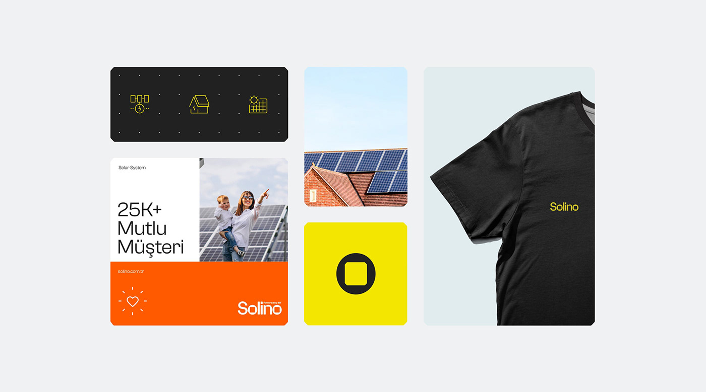
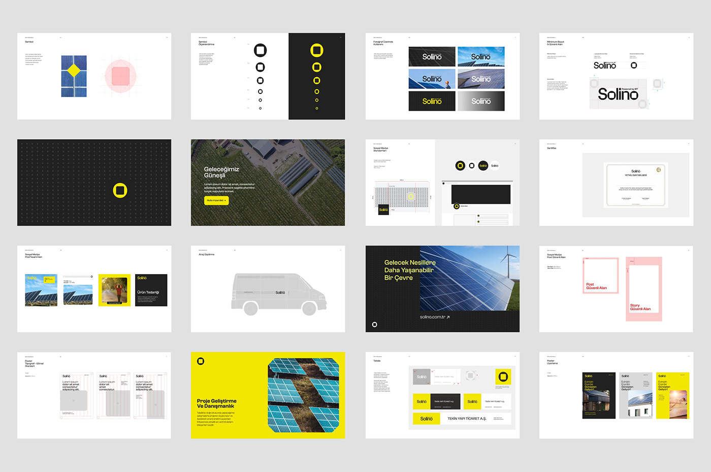
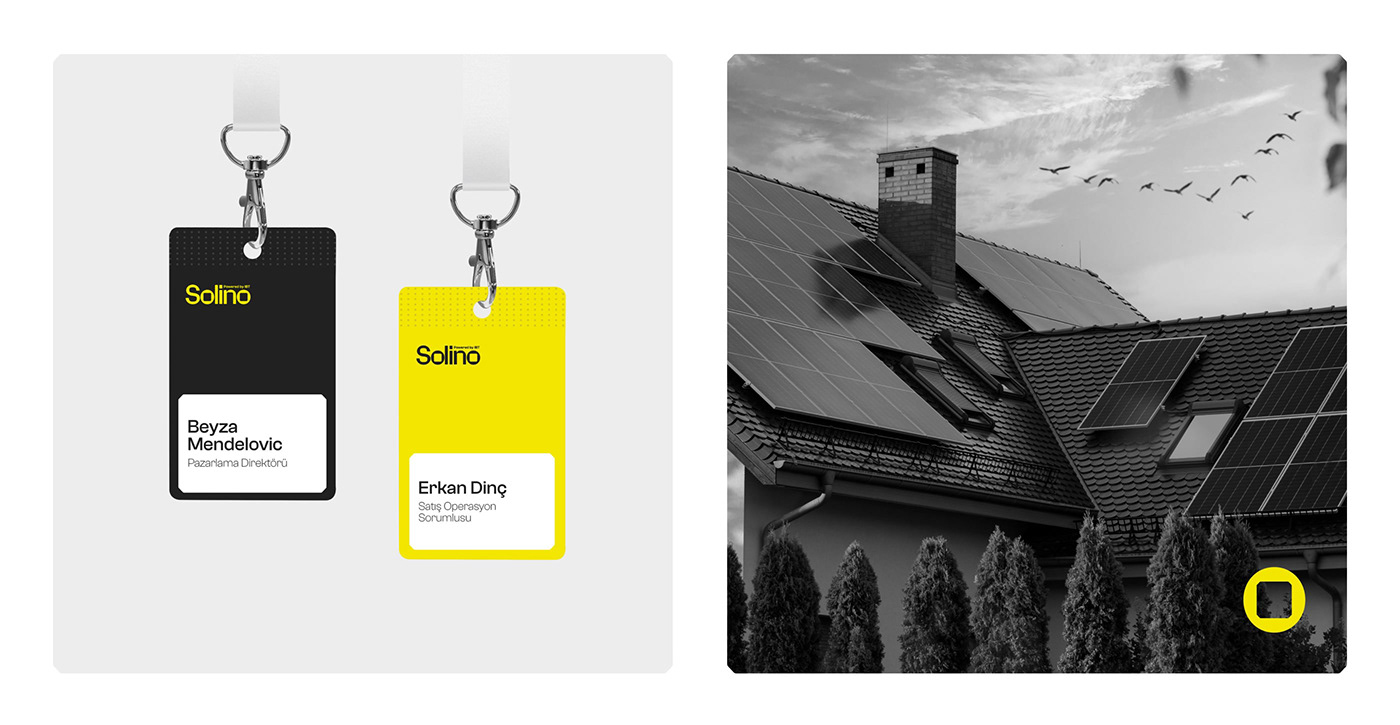
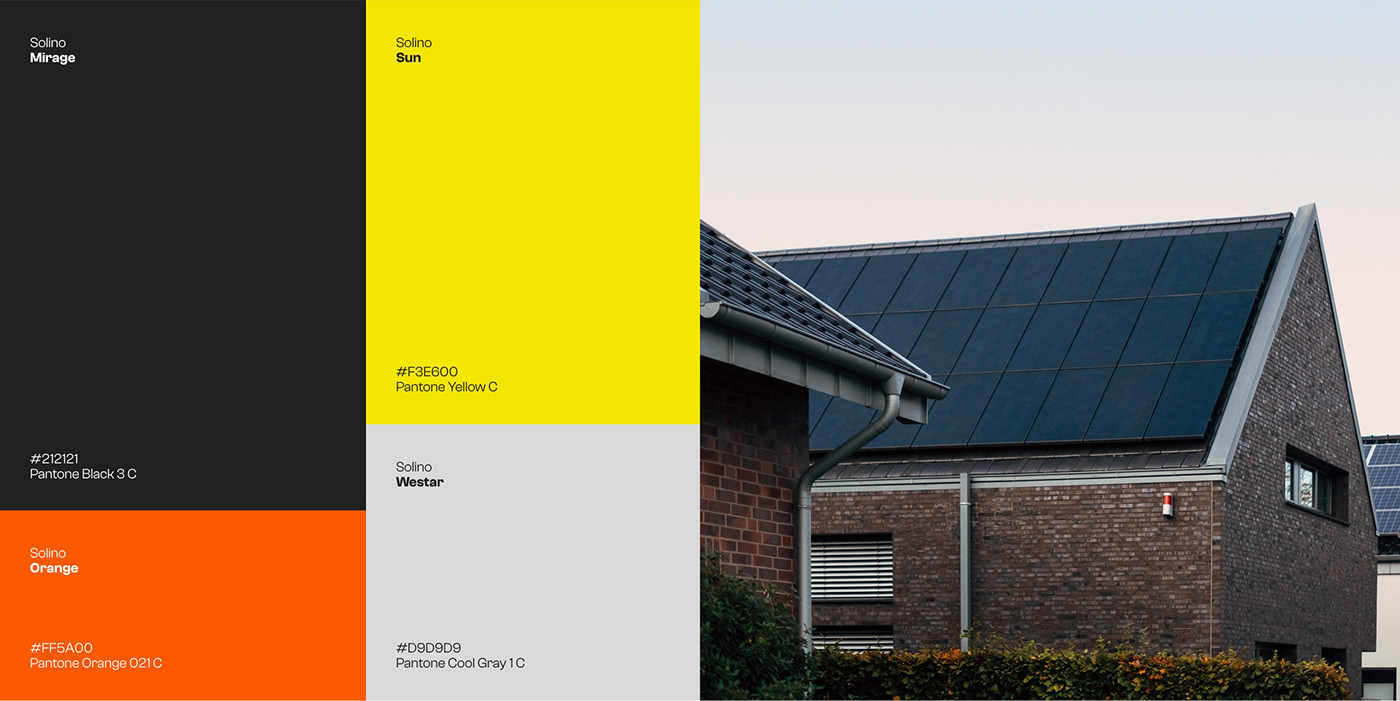
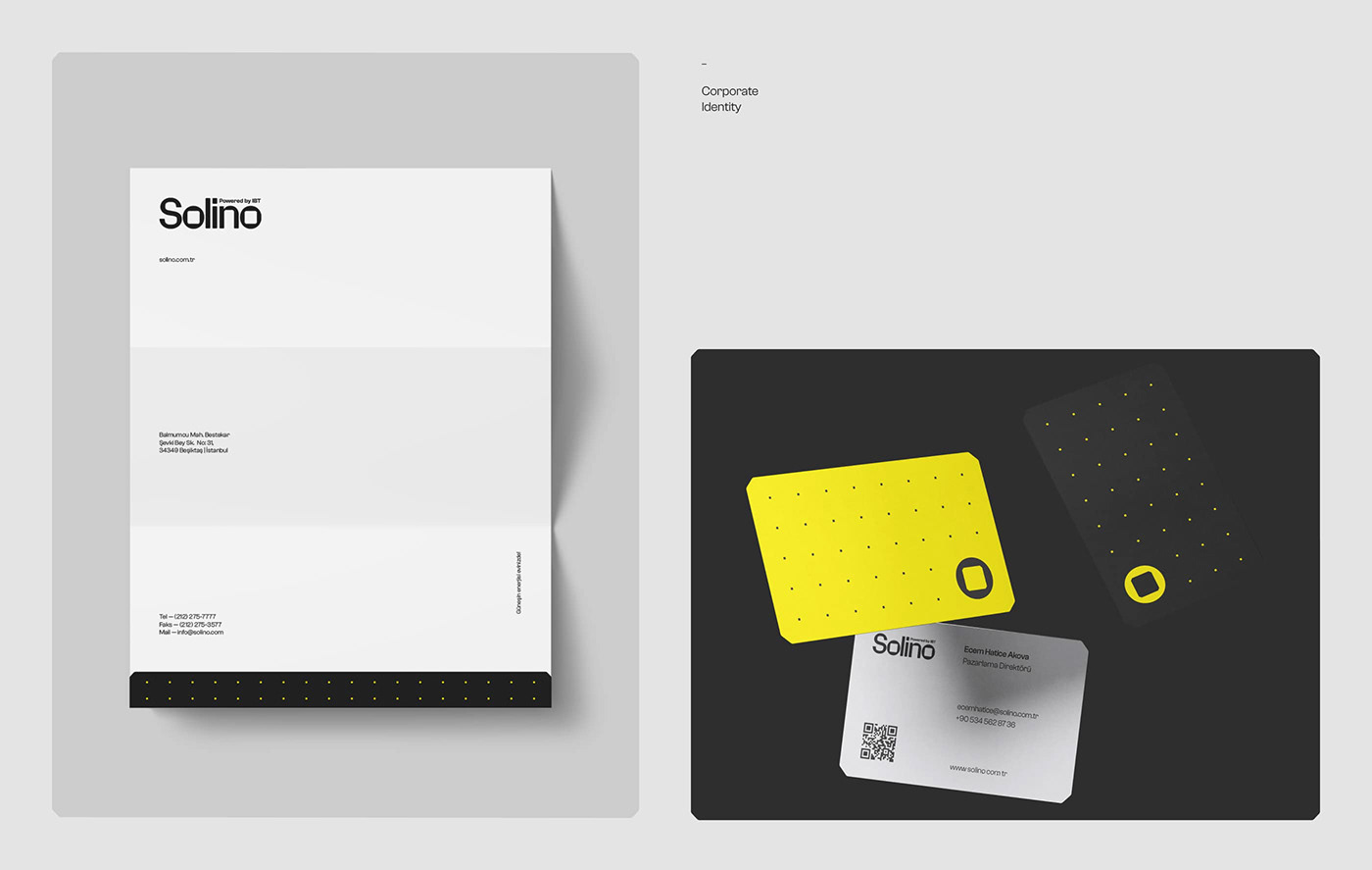
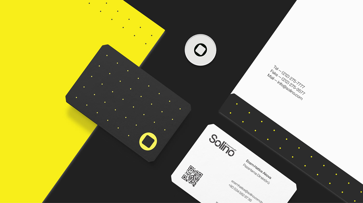
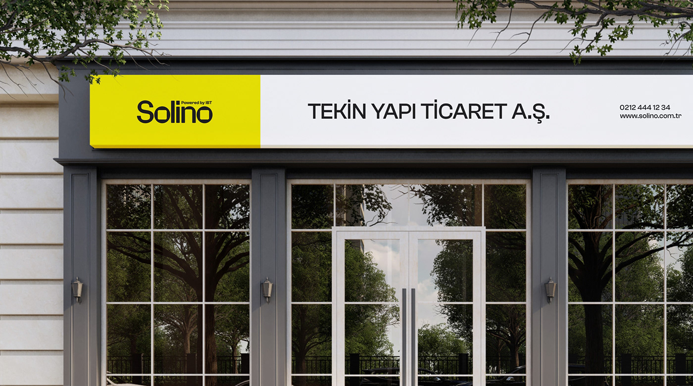
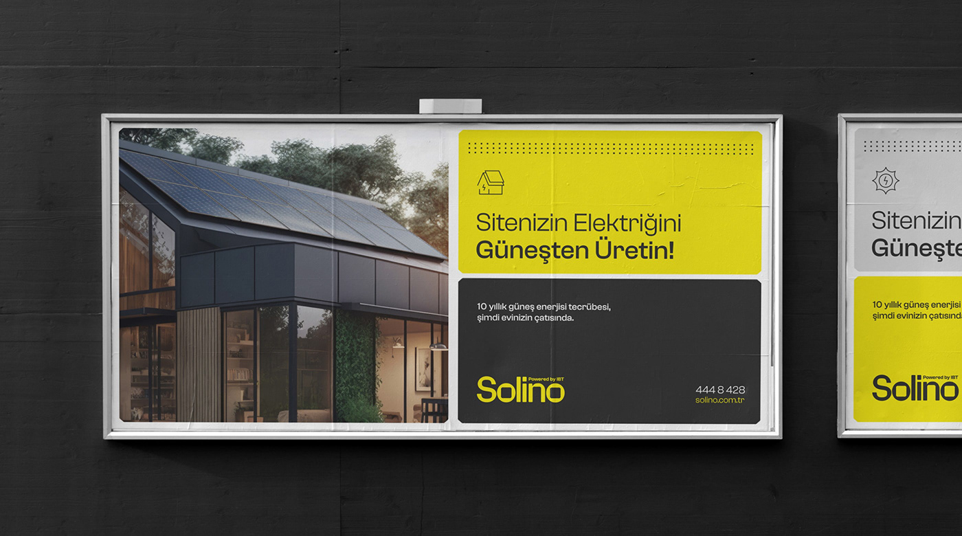
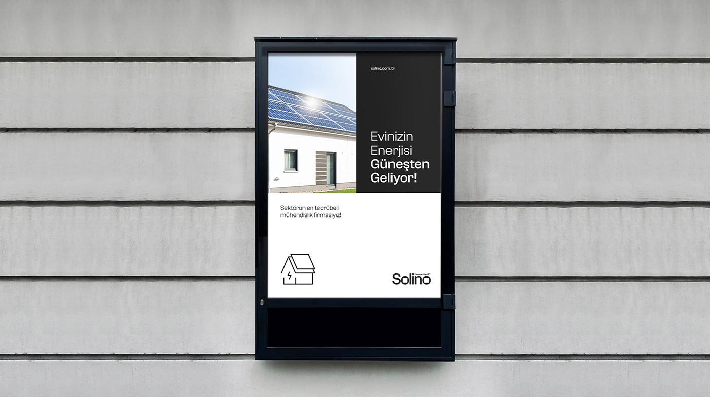
At the core of this brand's visual identity is a harmonious and impactful color palette. The bold decision to choose yellow and red as accent colors is both daring and distinctive. These colors are historically perceived as being strong, vibrant, and full of energy. In the context of Solino, they act as a compelling backdrop that draws attention and ensures that the branding remains memorable.
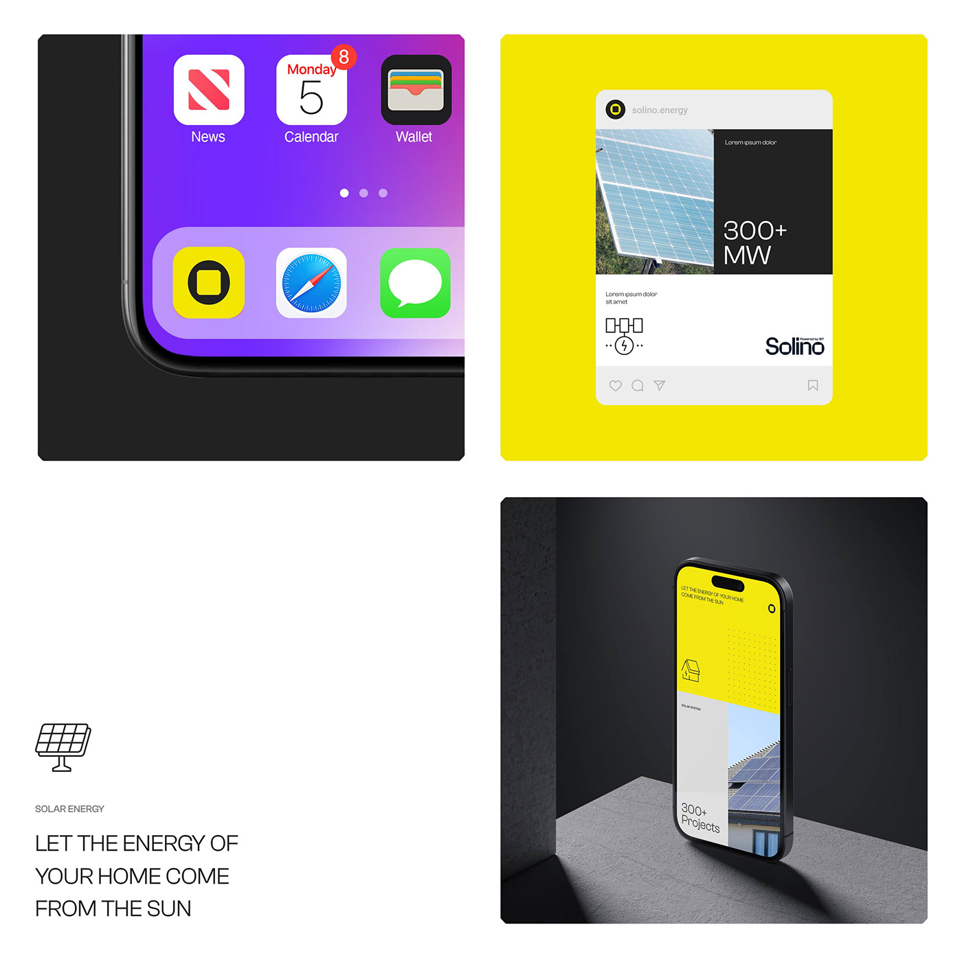
The symbol of Solino deserves special mention. A circle and a square juxtaposed perfectly, it is an emblem of simplicity and versatility. This intriguing geometric blend not only stands on its own but also serves as a form for the accompanying typography. It's a testament to how Fol. skillfully balances aesthetics with functionality.
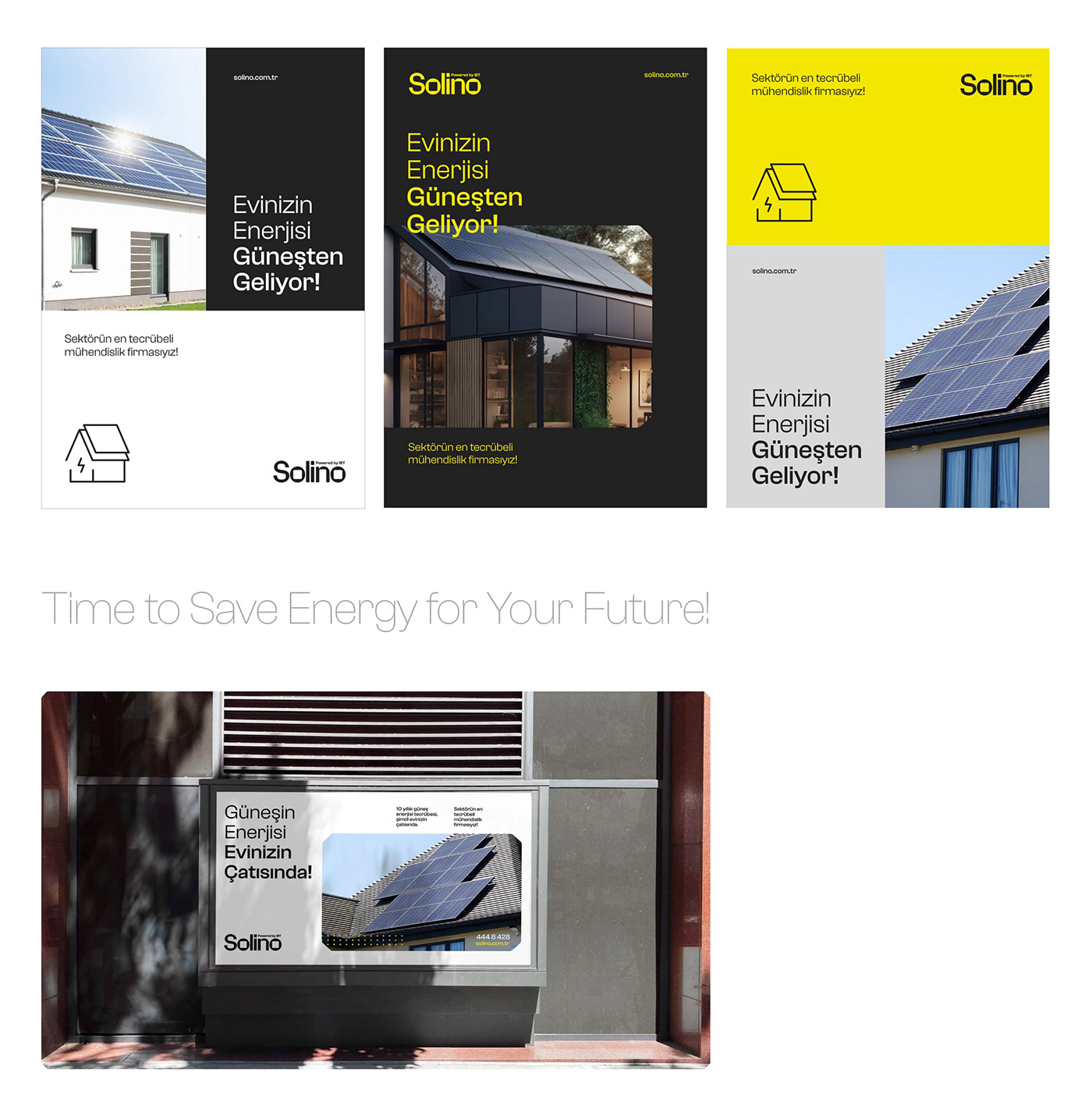
Speaking of typography, Solino's logotype is another great extension of the symbol. The design studio has cleverly incorporated internal font contours that borrow shape edges from the primary symbol. This ingenious interplay between the symbol and typography ensures cohesion across the brand's visual representation. The choice of a clean sans serif font for the brand's visual identity typography further emphasizes the brand's modern, sleek approach. The contrasting font sizes create a dynamic visual rhythm that is both appealing and easy to digest.
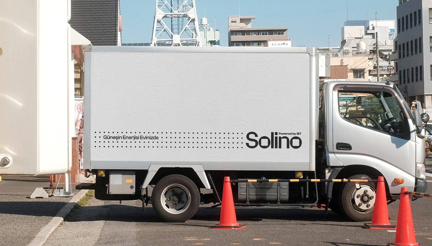
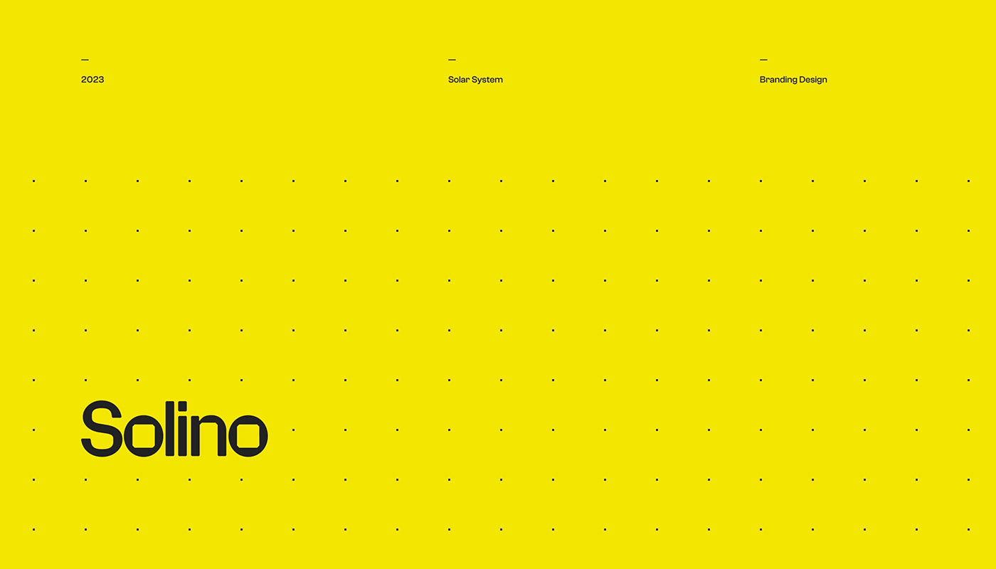
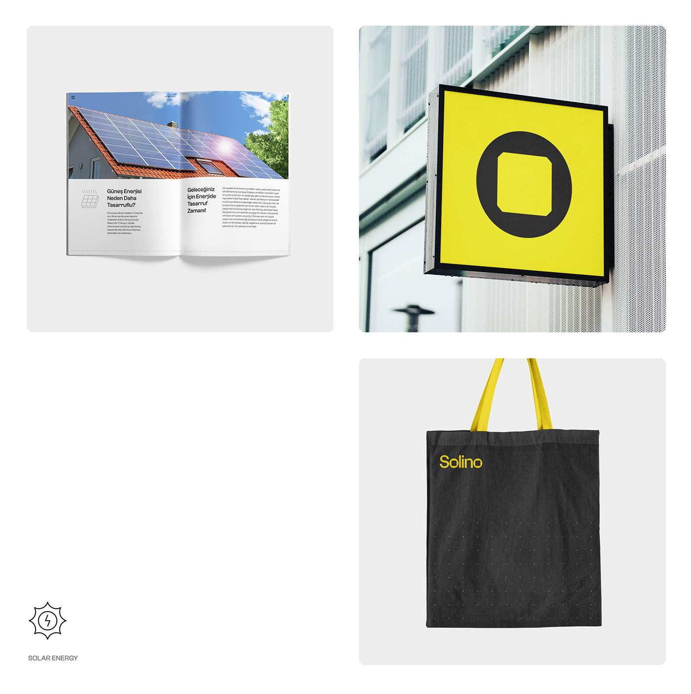
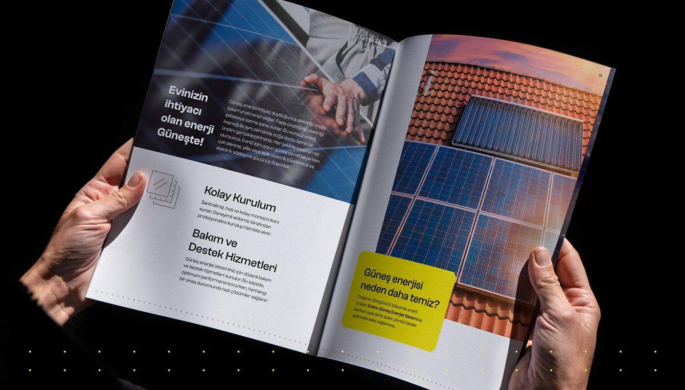
An element that particularly catches the eye is the dotted pattern employed in some of the visual identity materials. It imparts an elegant touch while also infusing a sense of freshness. This subtle addition serves as a reminder of the attention to detail that Fol. brings to their designs.
In conclusion, Solino by Fol. isn't just a brand; it's a study in design excellence. It epitomizes how the right color palette, symbolic representation, and typography can coalesce to create a timeless visual identity. For design enthusiasts and professionals alike, Solino is a beacon of inspiration, reminding us of the limitless possibilities that lie within the realm of design.
Branding and visual identity artifacts