by abduzeedo
The Studio | AB is the result of more than 7 years of experience in the graphic world, digital and project management. Passionate about these constantly evolving fields, it was in 2016 thatThe Studio | AB embarked on the adventure of entrepreneurship. With experience in both graphic, digital and innovative fields, they have acquired project management skills during their previous professional experiences. Cultivating an attraction for design, in that it is responsive and creative, they have developed my knowledge of DTP and UX tools during their professional career.
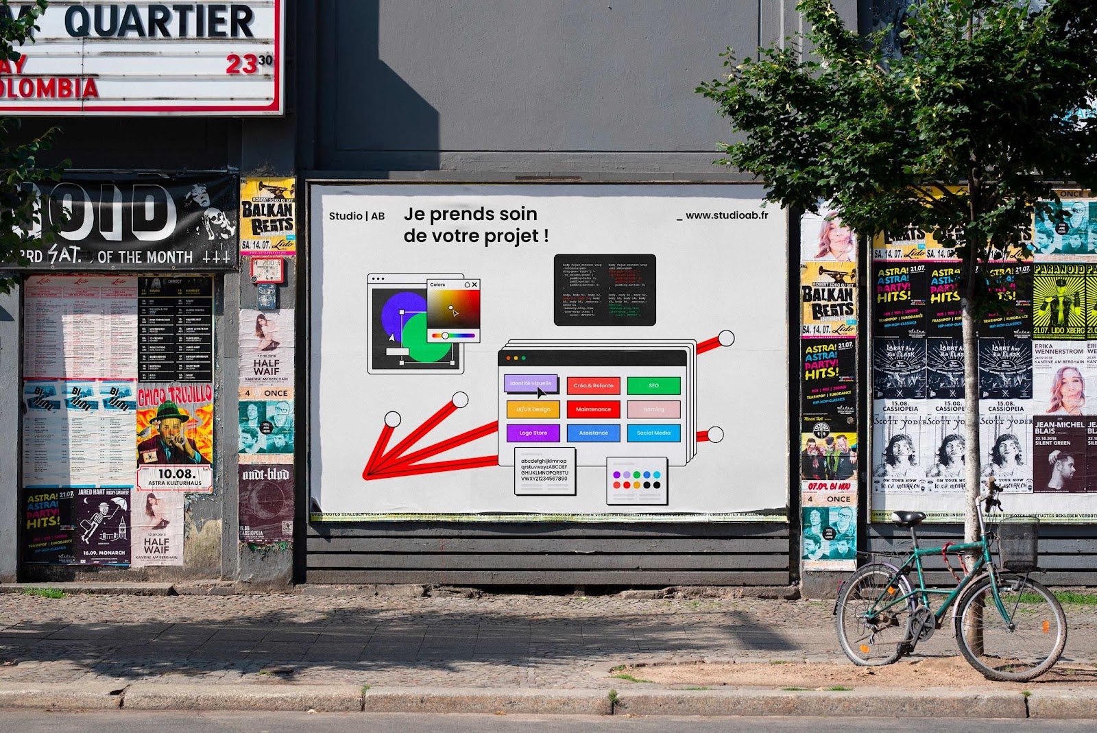
I take care of your project! In March 2018 I put an end to my adventure as a digital project manager on a permanent contract to embark on a new, more personal project. Three years later, after devoting my time and energy to developing my business, I decided at the end of 2020 to change my structure and mark a new turning point. I wanted to change my messages, my positioning as well as the way I was going to communicate. The start of 2021 was marked by an overhaul of my activity, both visual and strategic. Here is the story of the Studio | AB.
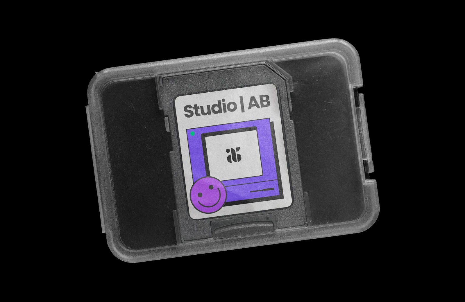
New visual identity
Being independent is synonymous with managing all of your activity independently. There are of course aspects that can be outsourced, accounting, legal, finance... but overall, many activities outside of client projects require devoting a significant part of their time: prospecting, commercial documents, communication, social networks...
"How do I produce visual elements to illustrate my content, while being original, distinctive, efficient and creating this content quickly?"
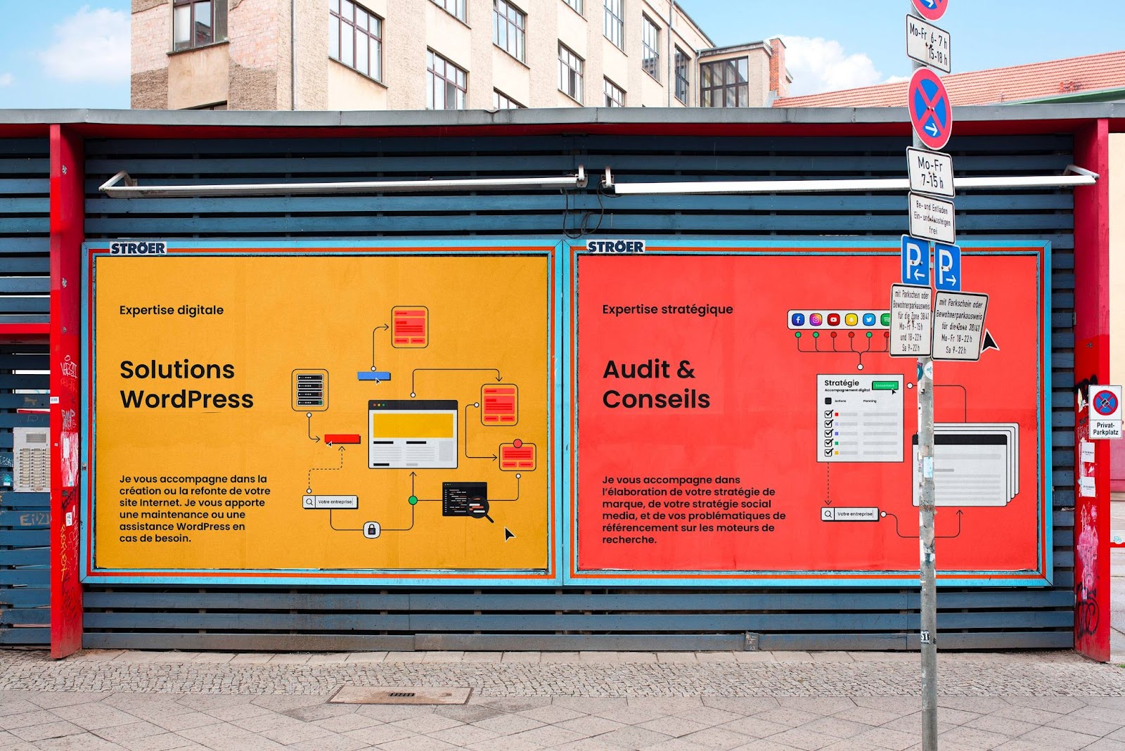
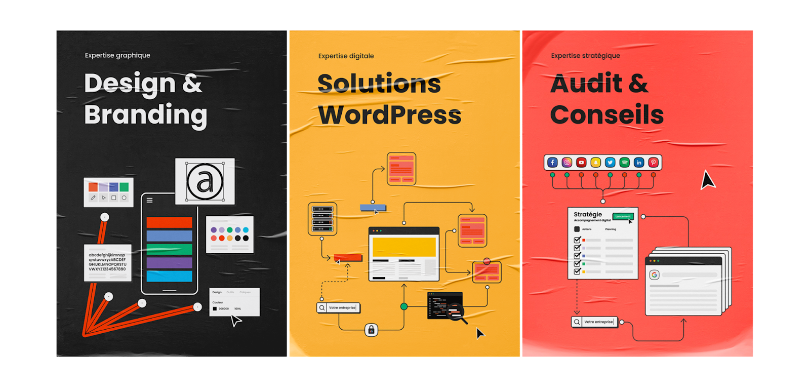
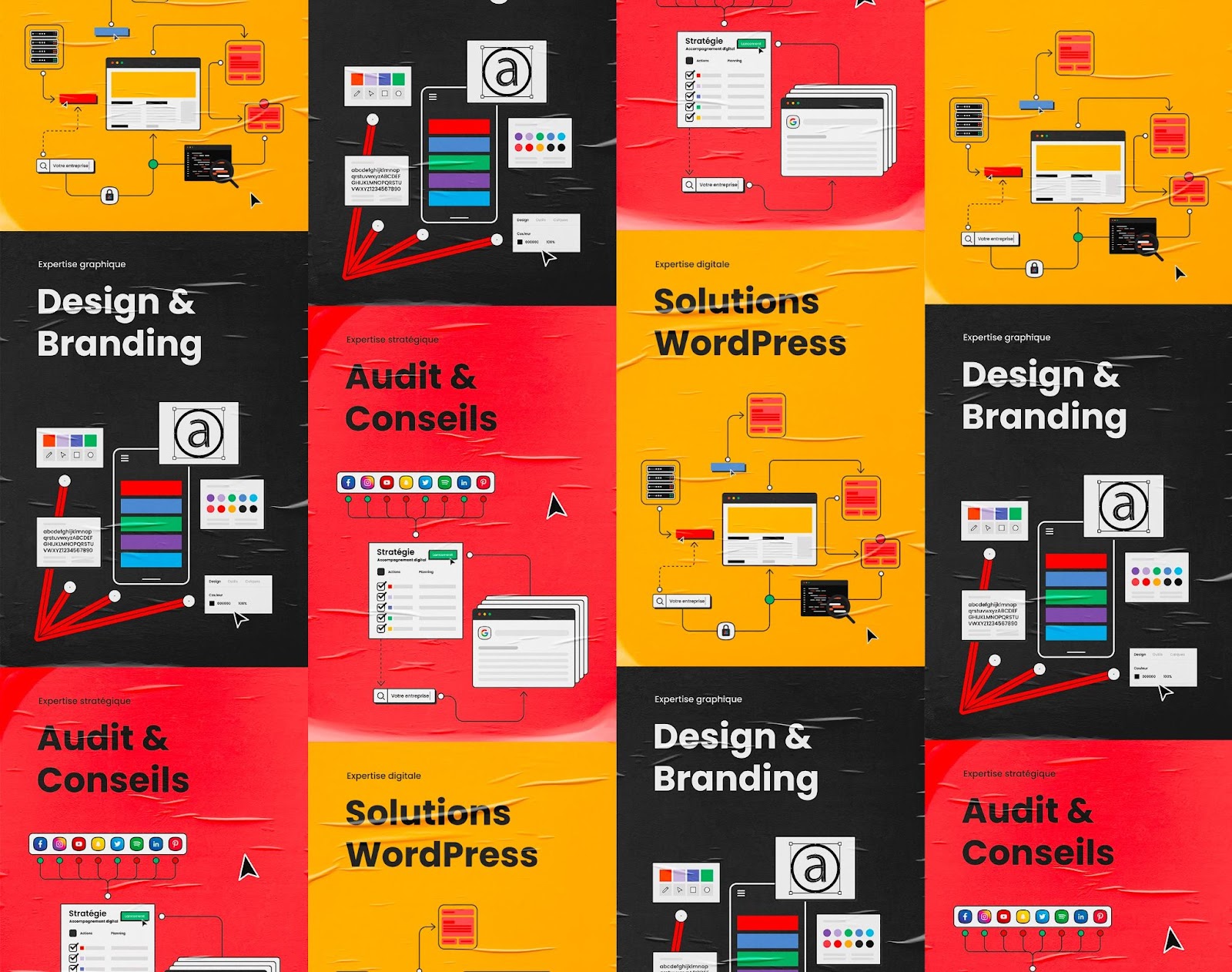
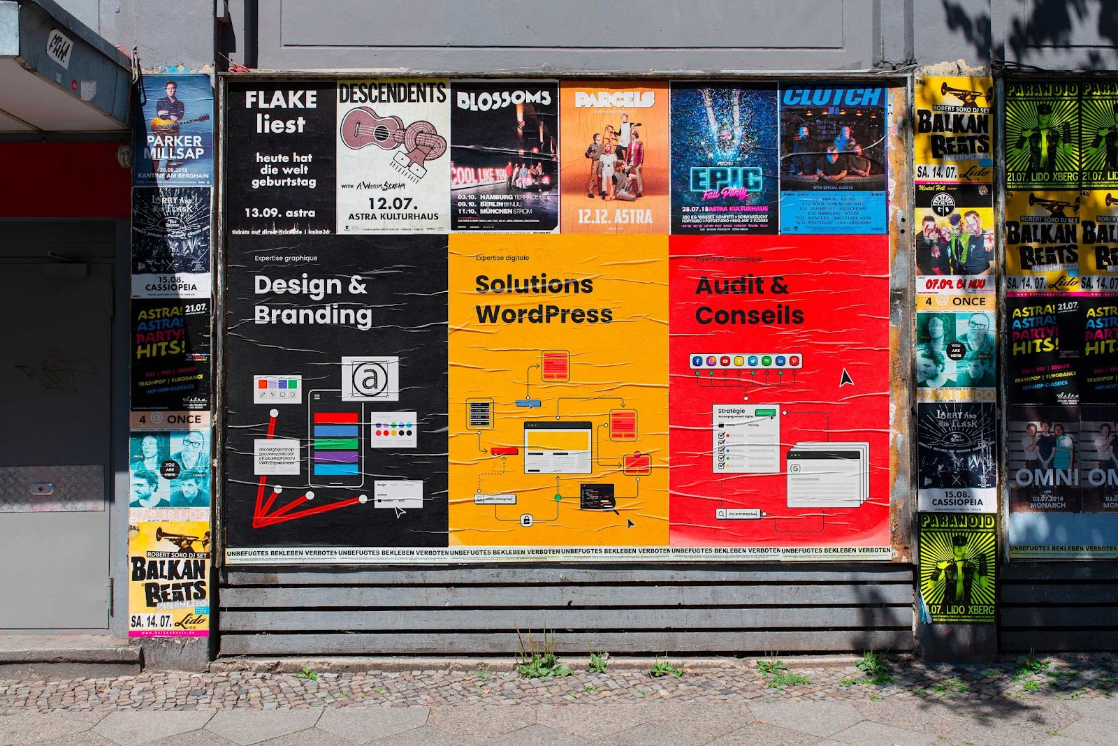
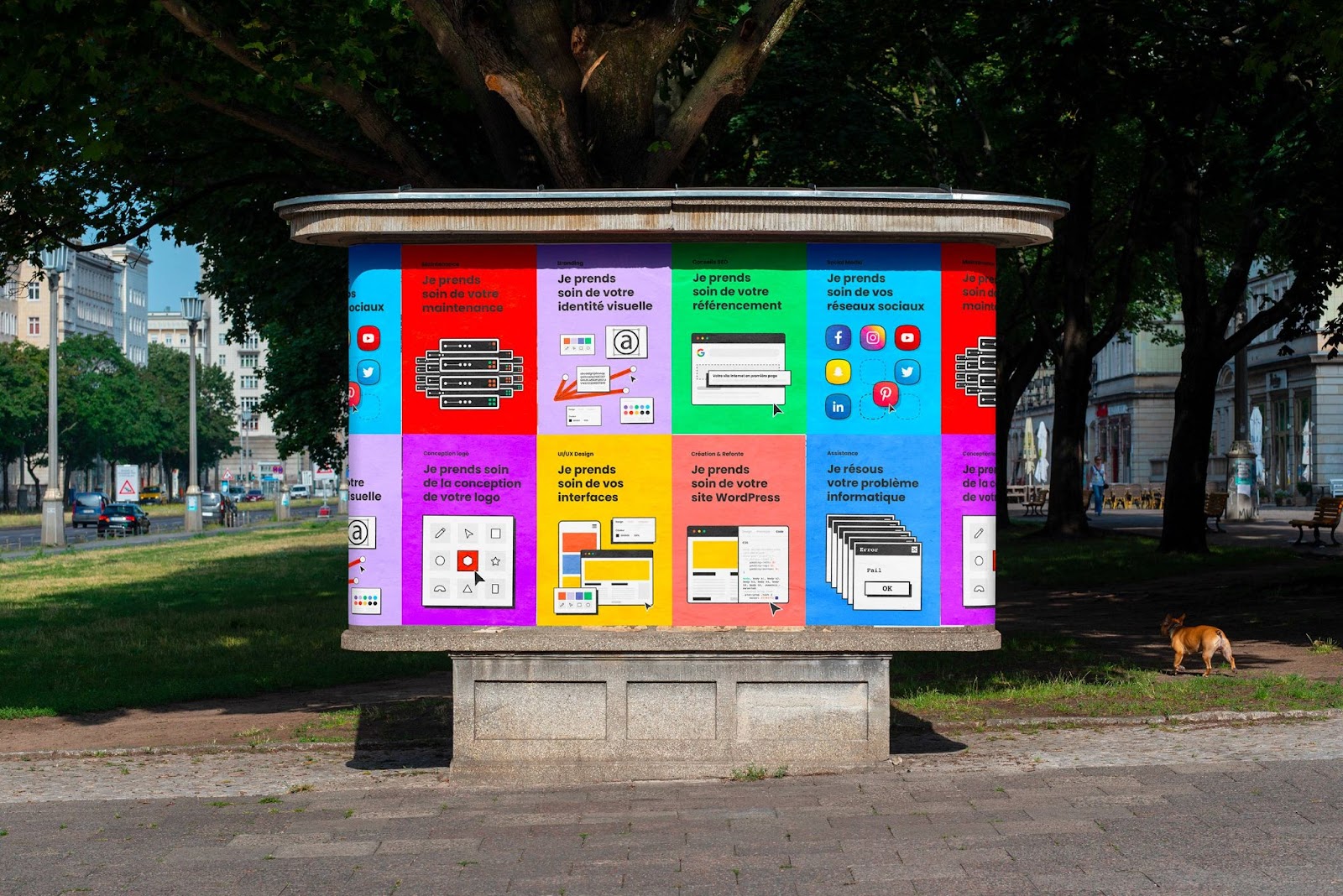
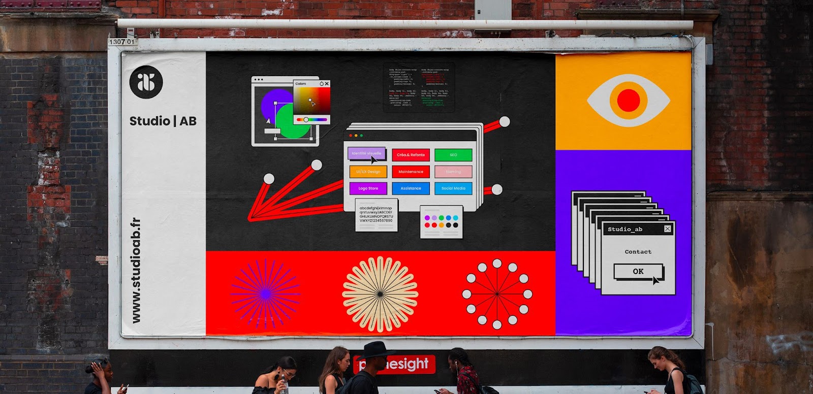
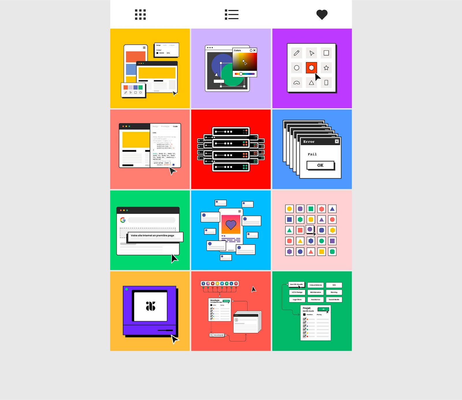
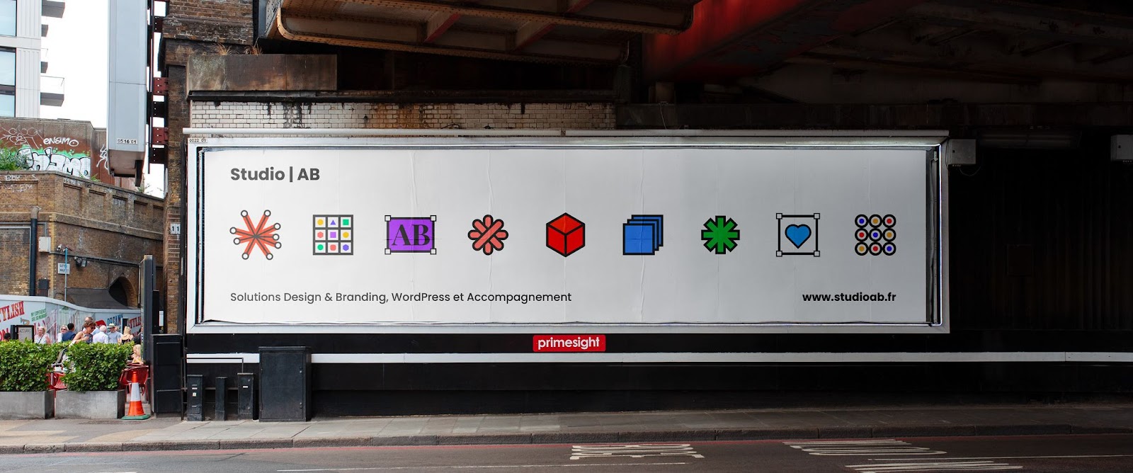
The graphic redesign is part of a process of increasing productivity and efficiency without harming the quality of the elements created within the framework of my activity. The question that arose was the following: how to produce visual elements to illustrate my content, while being original, distinctive, efficient and by creating this content quickly? The choice therefore fell on a minimalist, colorful graphic style associating a set of shapes adapting to the entire visual system, in terms of elements and colors.
Color system
A bias for color! In order to offer a coherent visual whole based on complementary colors, a research work was carried out. The colors chosen are straightforward. They can be easily combined with each other and make it possible to create a set of original, creative and visually impacting supports.
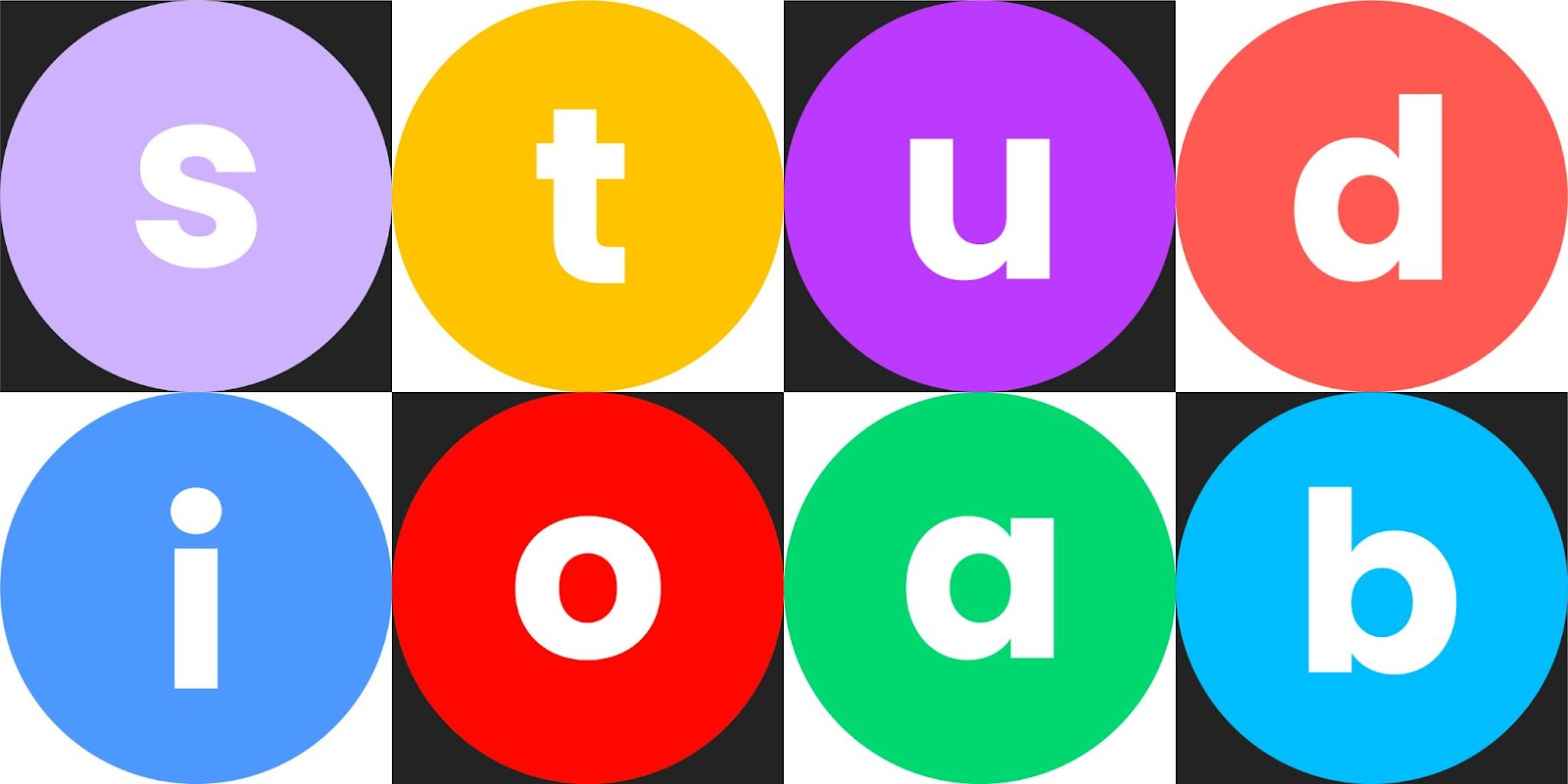
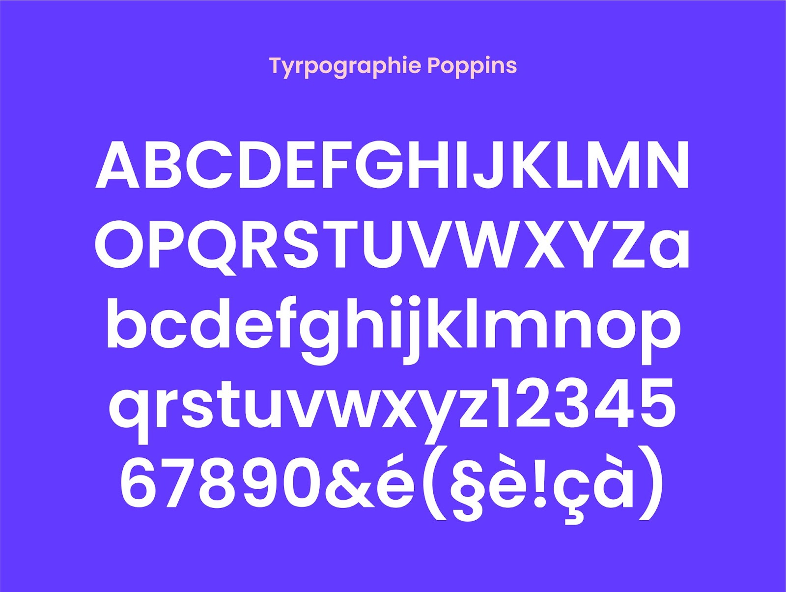
Typography
Poppins, the choice of simplicity is essential!
My choice fell on Poppins because it seemed important to me to use a font that can adapt to any media in order to save time. Mailing, business cards, website and other digital tools. To be in tune with the times and offer a more marked universe, I had thought of the Syne typeface offered on Google Fonts. But this is not available on all tools and requires installation steps. In addition, it is a particularly visual typography. My graphic universe is already well marked, I wanted more simplicity on this aspect, which allows me to offer an identical font, even on more formal documents.
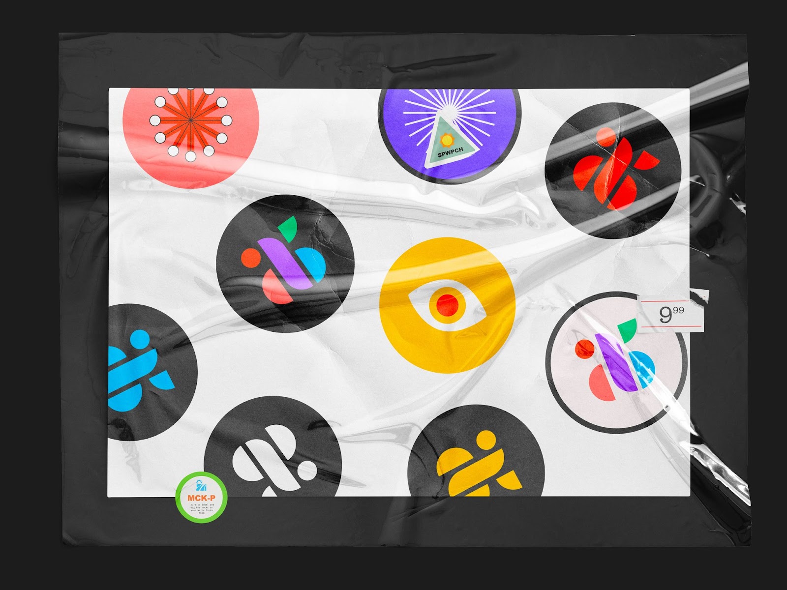
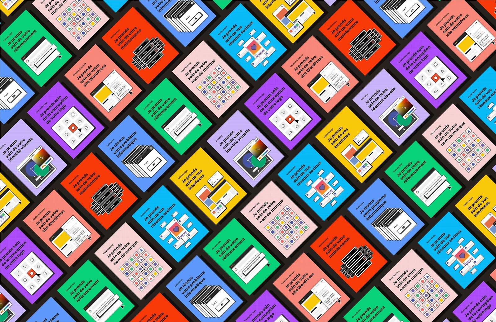
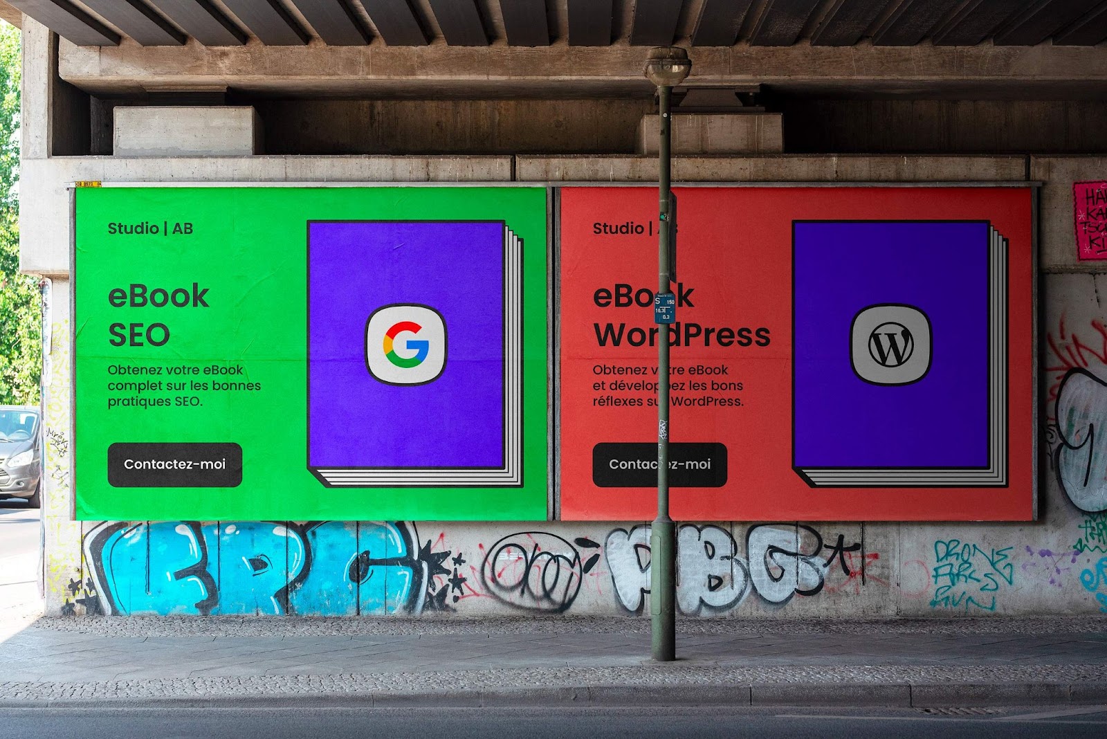
Variations of the visual system
Social networks and Print: This new visual system perfectly matches my current needs. I no longer need to spend time looking for a photo that everyone already has or has seen to illustrate my content. These become distinctive and original while being very easily declined on all of my communication media: social networks, business cards and print.
For more information make sure to check out:


