by abduzeedo
Discover Danish Bakery’s refreshed branding by Redorange Malta, blending tradition with a modern visual identity.
Danish Bakery, a staple in Malta’s culinary scene since 2001, has always been known for its high-quality bread and dedication to innovation. With this strong foundation, the design team at Redorange Malta took on the challenge of reimagining the brand’s visual identity. Their mission: to honor Danish Bakery’s legacy while crafting a modern brand that resonates with today’s audience.
Minimalism with a Purpose
The centerpiece of Danish Bakery’s new identity is a bold, custom wordmark. The bespoke typeface conveys professionalism and reliability while exuding warmth—qualities deeply rooted in Danish Bakery’s reputation as a local favorite. A minimalist color palette was carefully selected to bridge the gap between corporate refinement and the authentic, homegrown spirit of the bakery.
This design decision reflects a conscious move away from overly corporate aesthetics. Instead, the new identity emphasizes warmth and authenticity, creating a connection with both loyal customers and potential new audiences.
Building on Legacy Through Design
Redorange embraced the bakery’s mission of crafting top-quality bread using innovative techniques. This inspired a visual narrative that preserves the historical essence of Danish Bakery while making it more dynamic and adaptable to modern touchpoints, from digital platforms to physical packaging.
The branding process focused on versatility, ensuring that the identity would feel cohesive across all mediums. Whether in-store signage, social media graphics, or product packaging, the new design conveys consistency and professionalism without losing the personal touch that sets Danish Bakery apart.
Warmth in Every Detail
Rather than leaning heavily into corporate imagery, Redorange used subtle, familiar design elements to convey the heart of the brand. The end result is a visual identity that feels approachable, authentic, and effortlessly modern—just like Danish Bakery’s products.
This project is a testament to how thoughtful branding can respect tradition while embracing innovation. By creating a flexible yet cohesive identity, Redorange Malta has given Danish Bakery the tools to maintain its reputation and attract a new generation of customers.
For a closer look at the design process, visit Redorange Malta’s case study.
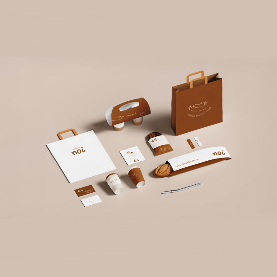
Branding and visual identity artifacts
Credits
- Client: Danish Bakery
- Agency: Redorange
- Creative Direction and Design: Stelios Ypsilantis
- Graphic Design and Motion: Michela Sammut
- Project Management: Alison Gauci
- Web Development: Bison Studio
