Tion, Germany’s second largest independent power producer new brand by Fable&Co
Fable&Co shared the new brand identity for Tion. Hurtling towards the energy transition, Tion (previously called Pacifico Renewables) identified the need to strategically reposition & rebrand to facilitate a wider breadth of proposition. Fable&Co. embarked on a journey of discovery into the very heart of publicly listed green energy investments.
Strategically motivated ambitions ignited the decision for Pacifico Renewables to evolve from a renewables native into the energy transition company of tomorrow – sparking significant new opportunities for investors. Shifting their focus beyond purely solar & wind projects they set their sights on a wider & more diverse spectrum of global opportunities on offer, as the worlds electricity system seeks to decarbonise.
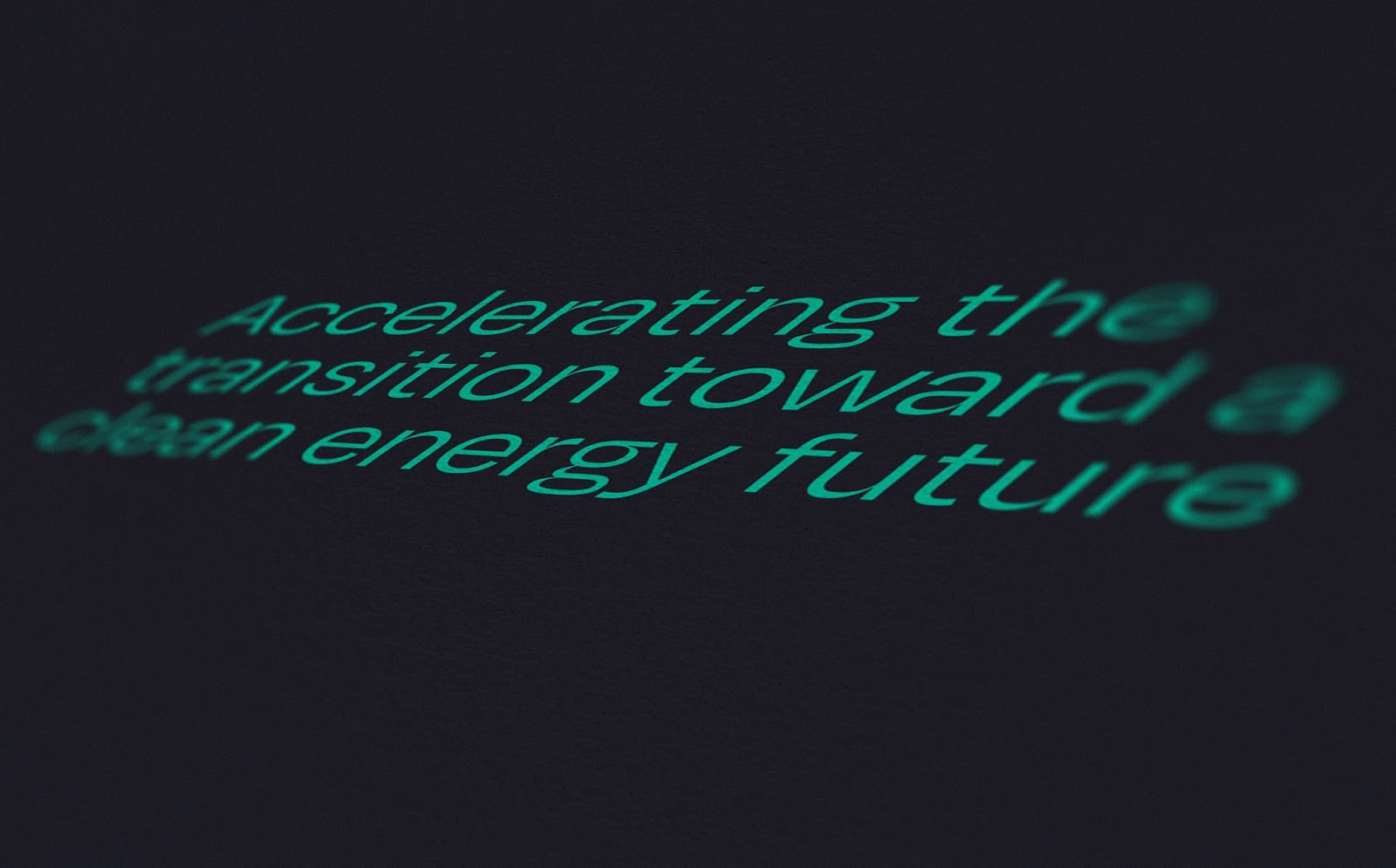
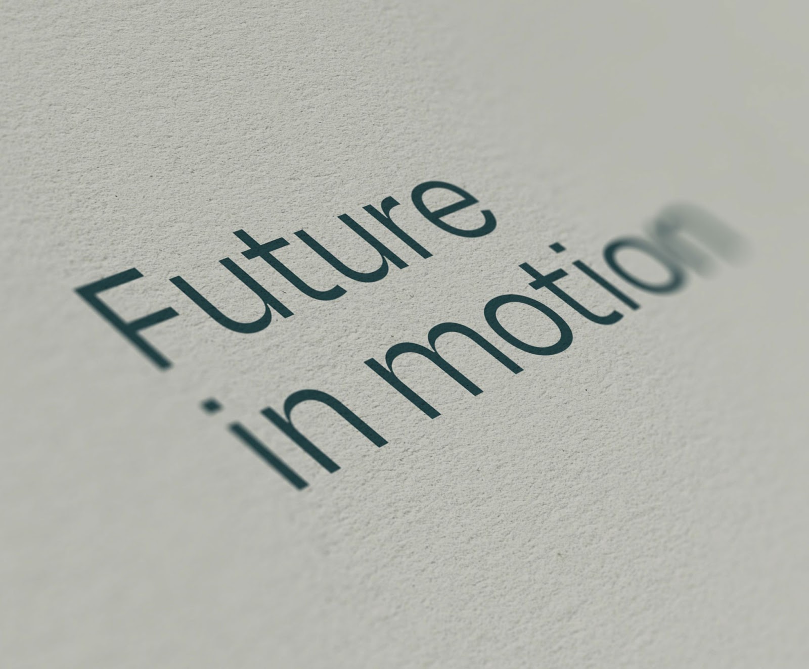
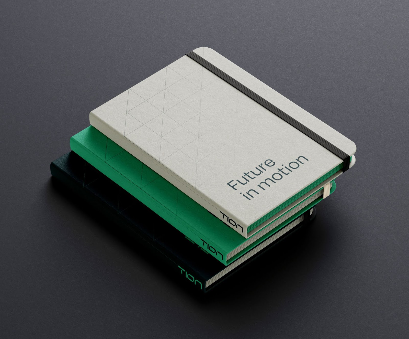
The new brand mission statement, ‘Accelerating the transition toward a clean energy future’, is used front & centre throughout branded communications to clearly articulate the brands noble ambitions & objectives. A shortened version of this mission statement was crafted – ‘Future in motion’. This emotive yet succinct new tagline balances a positive, inspirational & motivational sentiment throughout the brand messaging.
A new brand name was imperative to better reflect their new proposition & positioning. Following multiple naming workshops, the client made the decision to embrace the name ‘Tion’ – representing their lofty ambitions & future aspirations.
- The suffix ‘-tion’ composes the last four letters of “transition”, whilst commonly found in nouns of action such as “acceleration”, “innovation” & “motion”.
- ‘Tion’ is memorable, modern & dynamic, & perfectly captured their progressive nature & agile approach, along with their purpose & virtues as a brand.
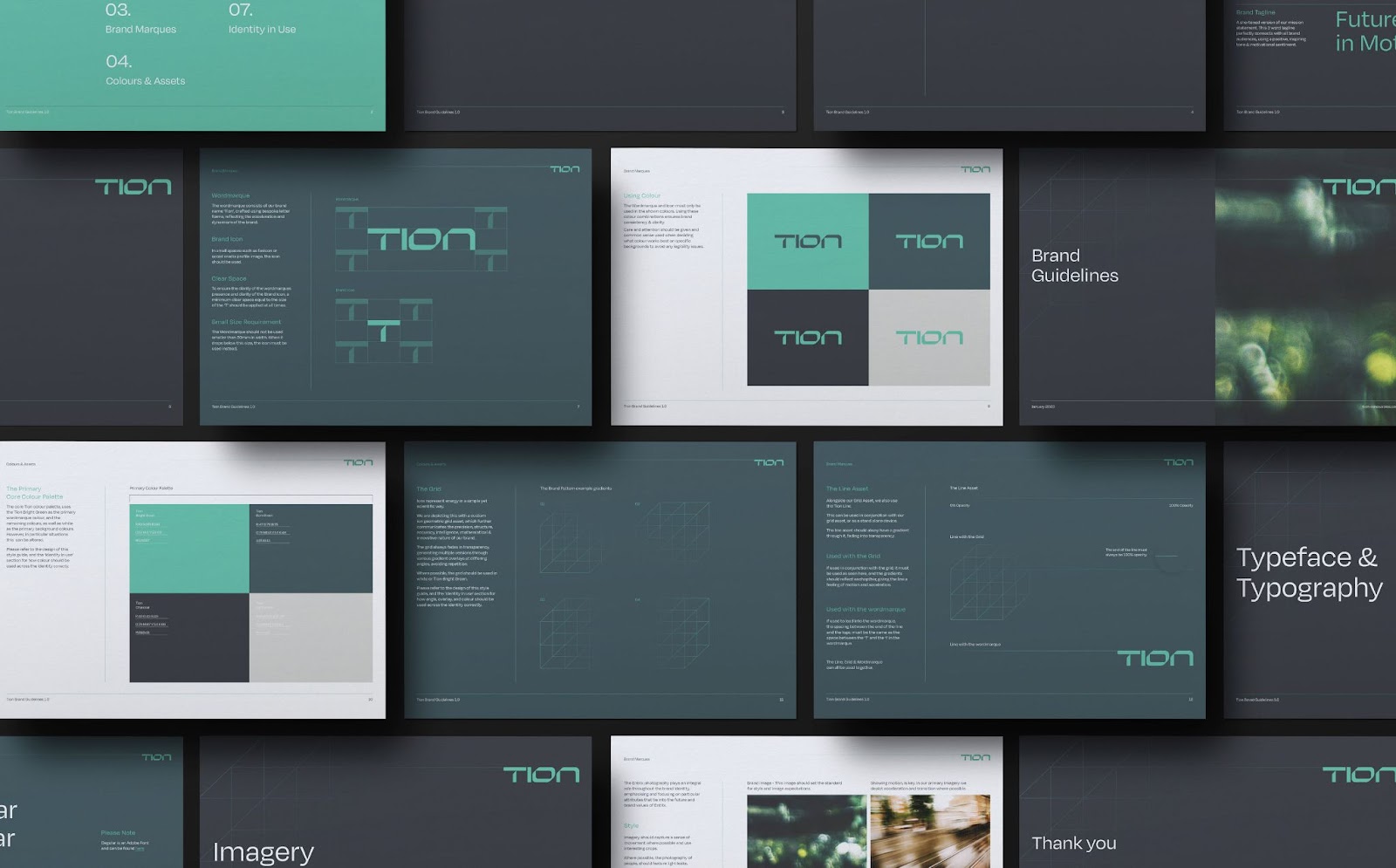
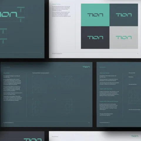
The visual identity was created to represent Tion Renewables as a highly progressive, innovative & forward thinking renewable energy company, whilst maintaining a crucial sense of quality, trust & reliability. From the technical & confident character innate within the logo, through to the ‘ion’ inspired grid asset & motion influenced extending lines, the brand identity tells a subtle visual story of the brand mission, ‘accelerating the transition toward a clean energy future’, in a simple yet scientific way.
Depicting this narrative with precision, structure, accuracy, intelligence & innovation all found in abundance throughout the elements of the identity system.
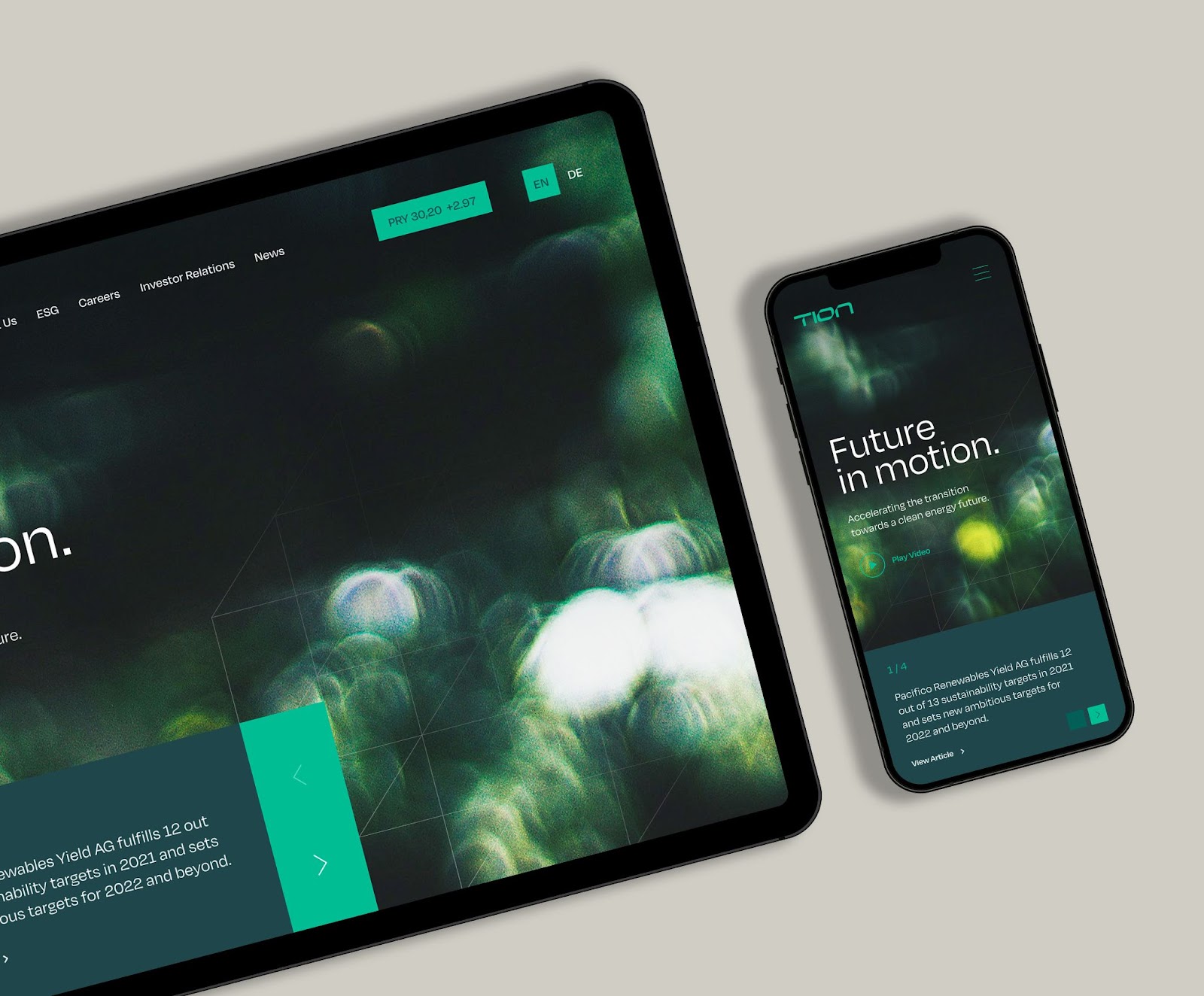
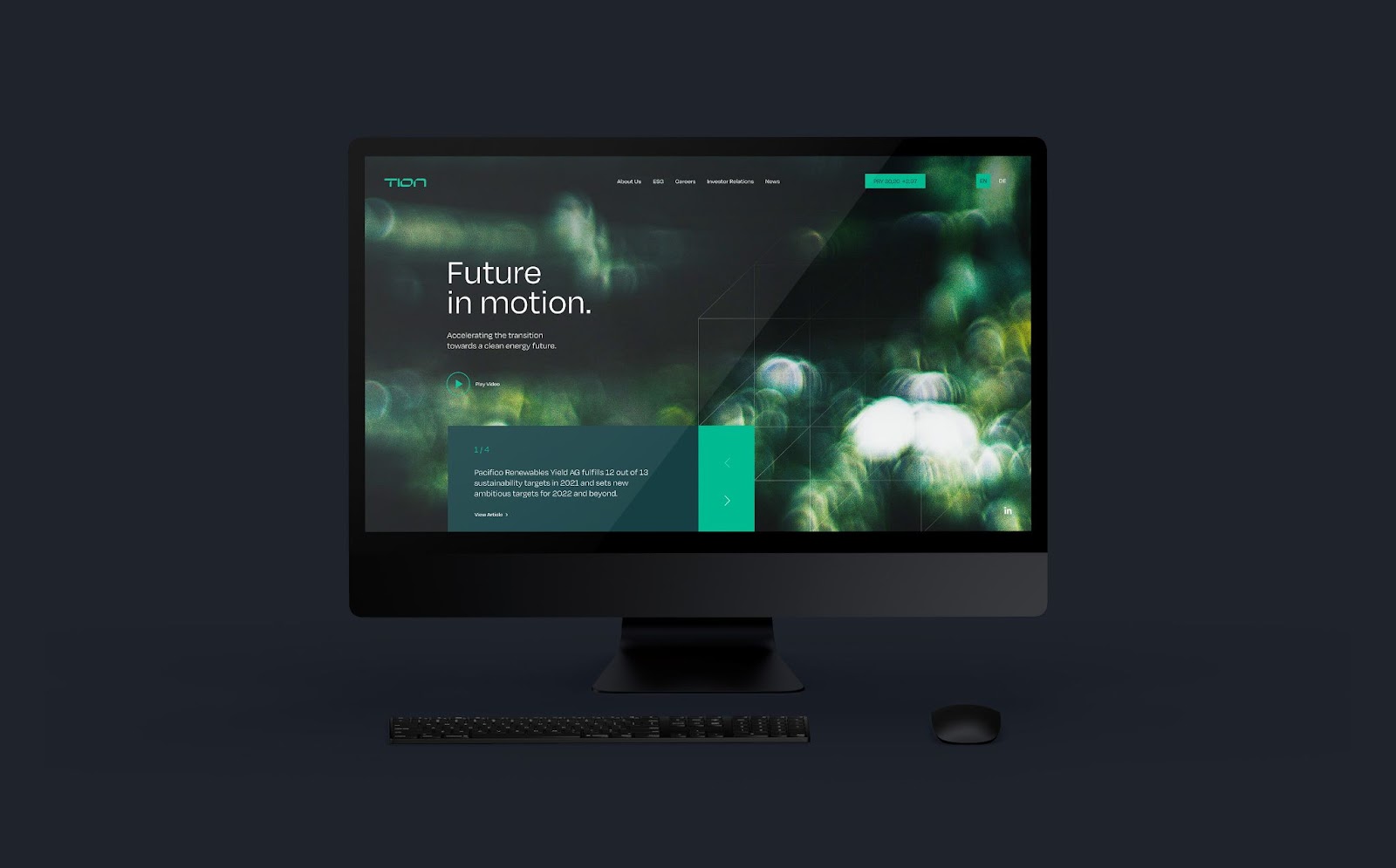
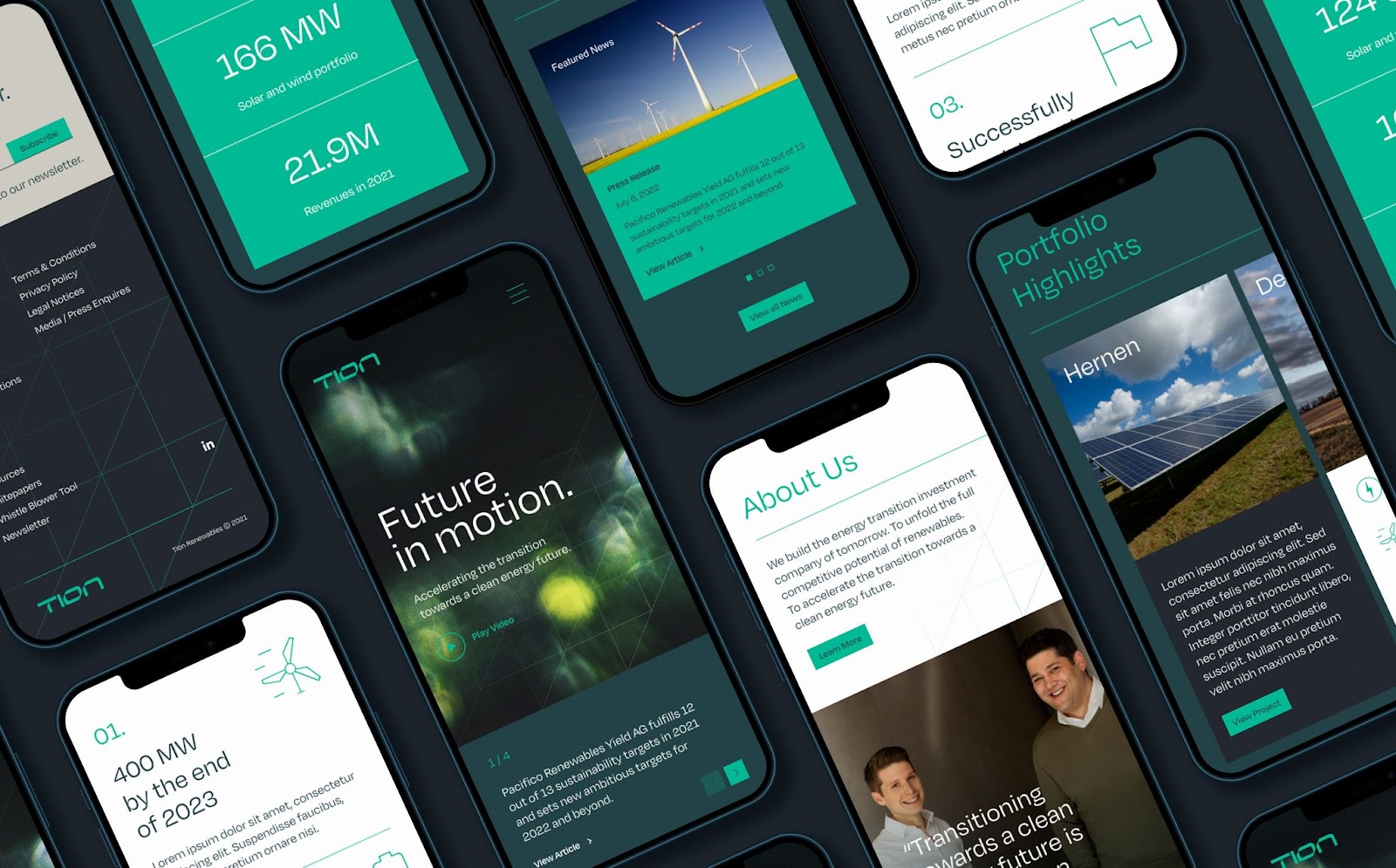
The new website would play a crucial role in promoting the brand by effectively communicating Tion’s brand mission, culture & personality. Becoming the employer of choice by attracting the brightest minds within the energy industry was fundamental to their continued growth & success.
As a publicly listed independent power producer, it was crucial that the website adhered to regulatory requirements, such as housing legacy data & reports. Integrations with real-time share information & third party HR software were also utilised to streamline business efficiencies.
It was important to strike just the right balance of practical & effective, with providing a progressive & rewarding user experience. This was achieved through the use of subtle line animations & on-page transitions that created an engaging experience, whilst thought-provoking statistics & statements reinforce Tion’s experience & credibility.
For more information make sure to check out Fable&Co website.