by ibby
Explore Visual Voices for Change, a new book from Zetafonts and TypeCampus that frames typographic posters as a vital tool for global social reflection, at a time when we most need it.
Design often oscillates between being a service and being a statement. Most design books lean toward the former, cataloging aesthetics and formal execution. However, "Visual Voices for Change · Global Typographic Posters" belongs to a different category. This publication, born from the global Fight for Kindness campaign, treats graphic design as a civic practice. It moves past the idea of typography as decoration and positions it as an active force capable of shaping culture and making invisible values visible.
The project is a collaboration involving the Italian type foundry Zetafonts and the educational platform TypeCampus. It gathers a massive collective of designers, educators, and cultural producers. The core objective is simple. It frames visual communication as a tool for dialogue and inclusion. In this context, typography is a language of responsibility. Every font choice and every layout carries a consequence. The book argues that design is never neutral. It is always a stance or a signal.
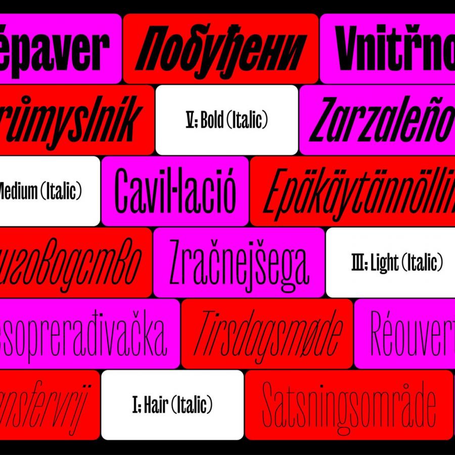
Structure-wise, the publication functions as a cross-disciplinary conversation. It moves beyond the typical gallery format by incorporating essays, interviews, and deep-dive case studies. The visual breadth is significant, showcasing typographic messages in over 34 languages. This linguistic variety reinforces a crucial point. While design form is not universal, its impact is.
The roster of talent involved is impressive. From the intricate motion work of Mat Voyce to the bold cultural expressions of Vanessa Zúñiga Tinizaray, the diversity of styles reflects a global snapshot of modern activism. Samar Maakaroun of Pentagram and Duy Nguyen of M — N Associates contribute perspectives that bridge the gap between high-level branding and grassroots messaging. A foreword by Steven Heller provides the necessary historical context, linking these modern posters to a long lineage of social graphic design.
Debora Manetti, the Program Director at TypeCampus, suggests that typography is how we feel words, not just how we read them. The book documents the evolution of the Fight for Kindness initiative since 2022. It proves that letterforms can amplify meaning and create emotional resonance. This resonance can trigger positive social reactions. By focusing on kindness and empathy, the project uses the "soul" of typography to humanize digital and physical spaces.
Distributed by LazyDog Press and The Printing Office, the book is a physical artifact of a digital movement. It serves as a reminder that designers have the power to move people socially. As the book begins its international tour through Florence, Milan, and Frankfurt, it invites the design community to reconsider their own tools. This is not just about making things look better. It is about making things matter more through the intentional use of type.
Project by Zetafonts and TypeCampus. Published by LazyDog Press.