by abduzeedo
Explore the stunning branding and visual identity work for Alma Store, showcasing how design tells a unique story in retail.
Hey, fellow creatives! Let's talk about something truly inspiring in the world of branding: the rebranding proposal for Alma Store by Maria Heer. It’s a fantastic example of how thoughtful design can shape a retail experience.
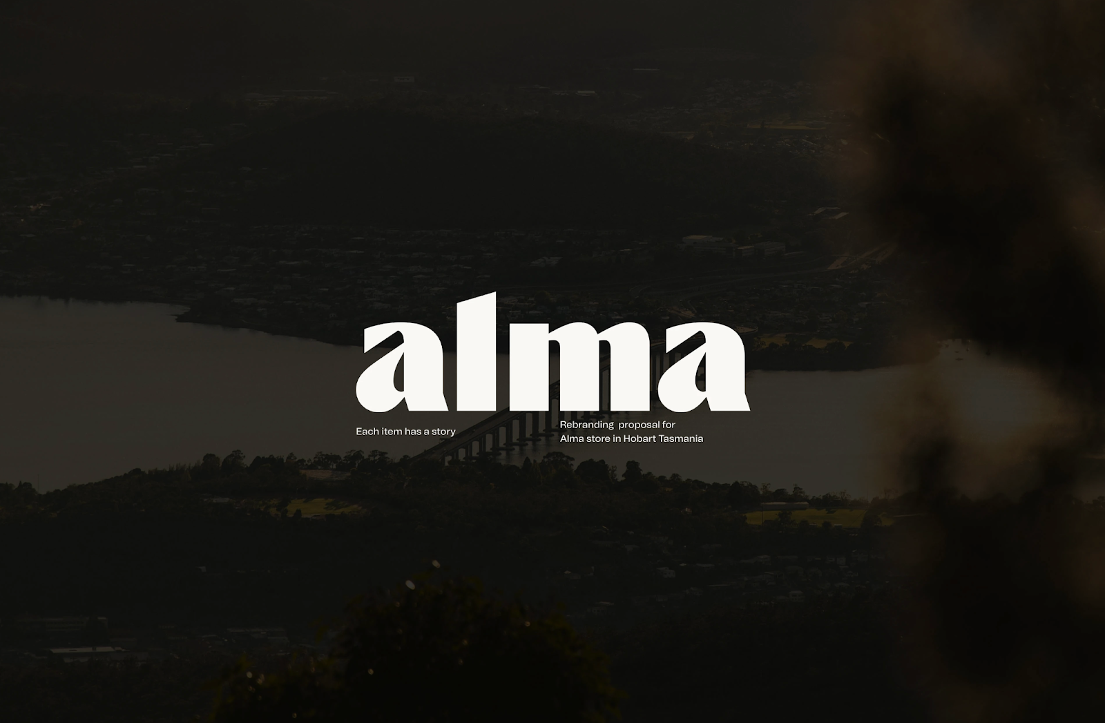
Alma Store, located in Hobart, Tasmania, is unique. It's not just about selling items; it's about sharing stories. Each product is hand-picked, carrying its own narrative and purpose. This focus on individuality is central to the store’s appeal, creating an extraordinary experience for customers who want to feel part of something special.
Crafting the Alma Visual Identity
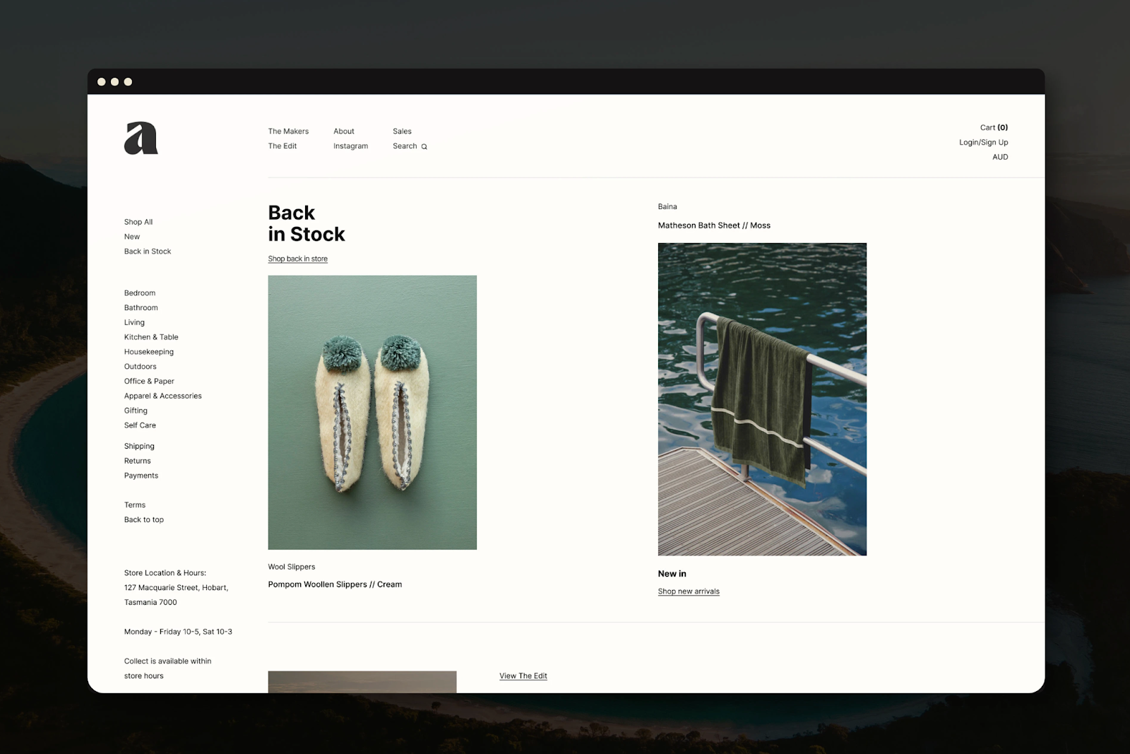
The new branding truly captures this essence. Maria Heer's design for the "Alma" logo is modern and minimalist. The brand name uses a bold font, creating a strong contrast that feels both elegant and energetic. What truly sets it apart are the diagonal cuts around the letters. These elements add a sense of dynamism, making the logo visually engaging. This clever design also allows the letter "A" to stand alone as a distinctive symbol, a smart move for versatile branding (as seen in the provided images, page 3).
Beyond the Logo: A Cohesive System
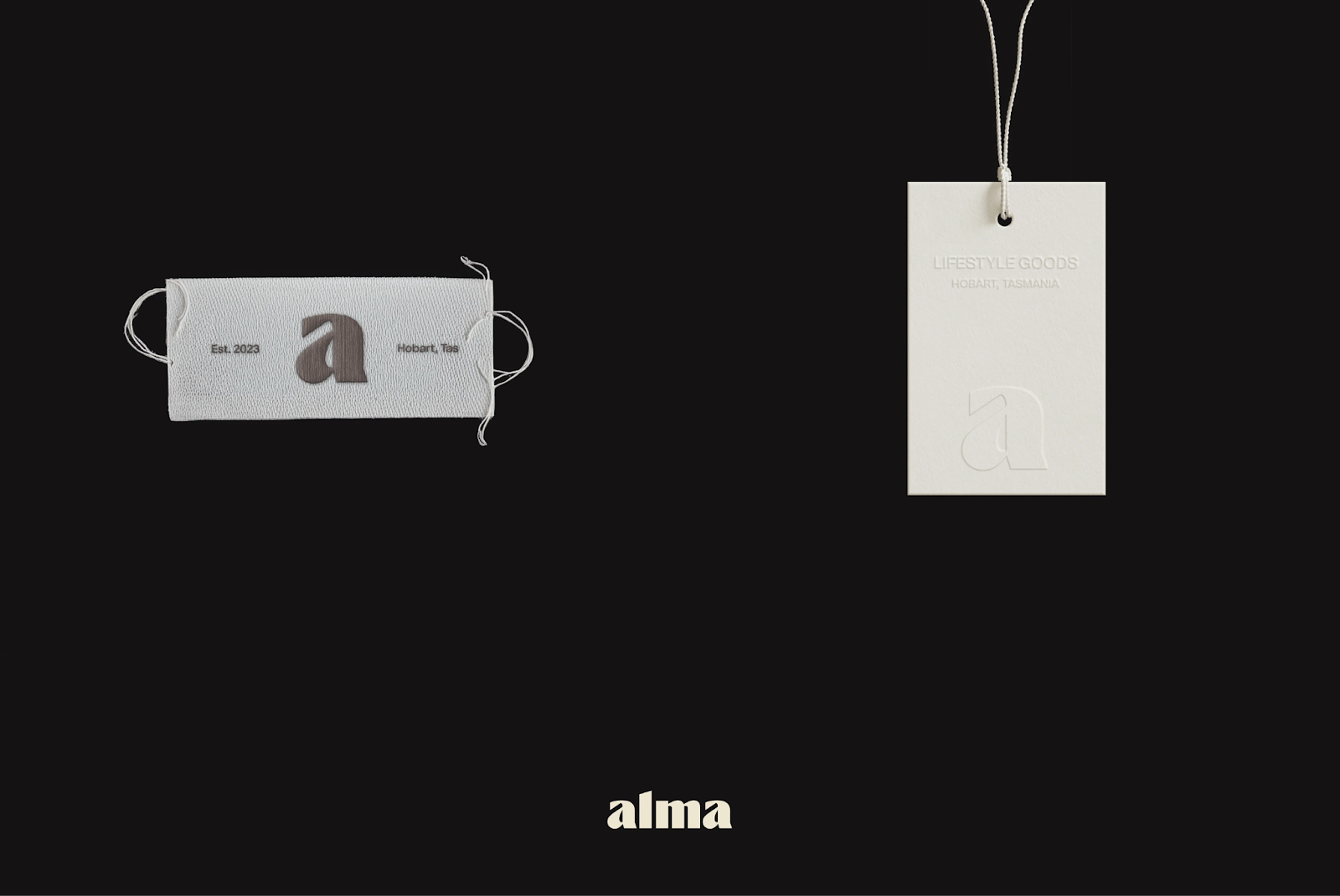
The branding extends far beyond just the logo. Maria Heer developed a full visual identity system. We can see artifacts like store signage, packaging, and even digital interfaces (page 3 and 4 of the provided document). The consistent application of the logo, typography, and color palette ensures that every touchpoint reinforces the Alma brand.
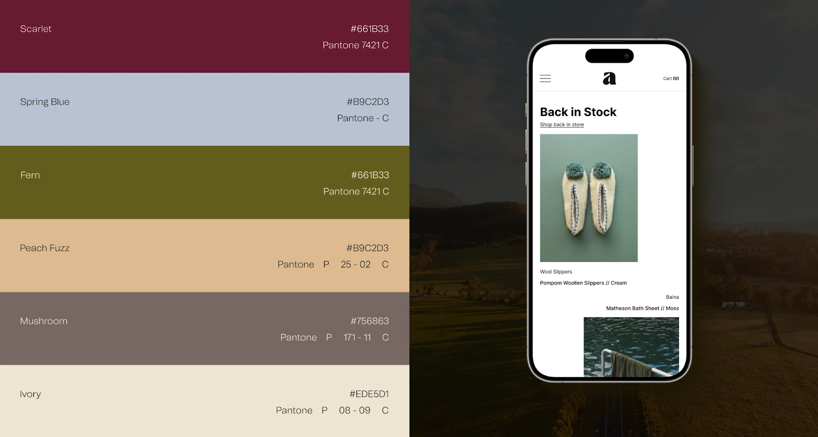
The color palette itself is carefully curated, featuring sophisticated hues like Scarlet, Spring Blue, Poach Fuzz, and Ivory (page 4). These colors work together to create a warm yet contemporary feel, aligning perfectly with the store's "lifestyle goods" focus. This kind of thoughtful color selection is crucial for conveying a brand's personality without saying a word.
The Power of "Each Item Has a Story"
The tagline, "Each item has a story," is prominently featured in the branding artifacts (page 2). This simple yet powerful phrase perfectly encapsulates Alma's unique selling proposition. It’s a testament to how concise messaging, when paired with strong visual identity, can resonate deeply with an audience. This synergy between message and design is what elevates good branding to great branding.
This rebranding succeeds because it understands the core values of Alma Store. It translates the idea of "individuality" and "narrative" into a tangible visual language. The clean lines, bold typography, and strategic use of color all contribute to a premium yet approachable feel. It’s the kind of branding that feels authentic and inviting, making customers curious to explore what stories await them inside the store.
For anyone looking to understand effective branding and visual identity, Alma Store's redesign offers valuable lessons. It highlights the importance of a cohesive design strategy that tells a story and connects with its audience on a deeper level.
Explore more of Maria Heer’s work here: https://www.behance.net/mariarheer