by abduzeedo
Explore Botaniste's brand evolution and stunning packaging design, blending natural inspiration with a premium feel for the B2C market.
Design is always changing. It's great to see brands handle big shifts well. Plakton.pro recently helped Botaniste do just that. Botaniste is a haircare brand. It moved from selling to businesses to selling directly to people. This big change needed a fresh look for its brand and packaging. The result is a great example of elegant brand change.
The Challenge: From Business to Consumer
Botaniste used to focus on businesses. But more people now want good hair health products. So, Botaniste decided to reach them directly. This new group of buyers is pickier. They care about how well a product works. They also care about how the brand looks and feels. They want a connection to nature.
Making the Brand Look Better
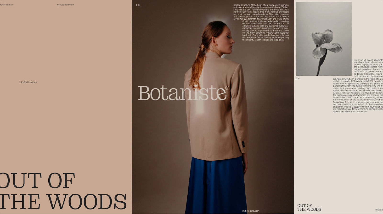
To attract these new buyers, Botaniste needed a look that felt natural and high-end. The goal was to use ideas from botany. This would create a visual style that showed health and quality. Roser Padrés is a skilled designer. She worked with Plakton.pro to make this happen. You can see more of Roser's work at Roser Padrés on Behance.
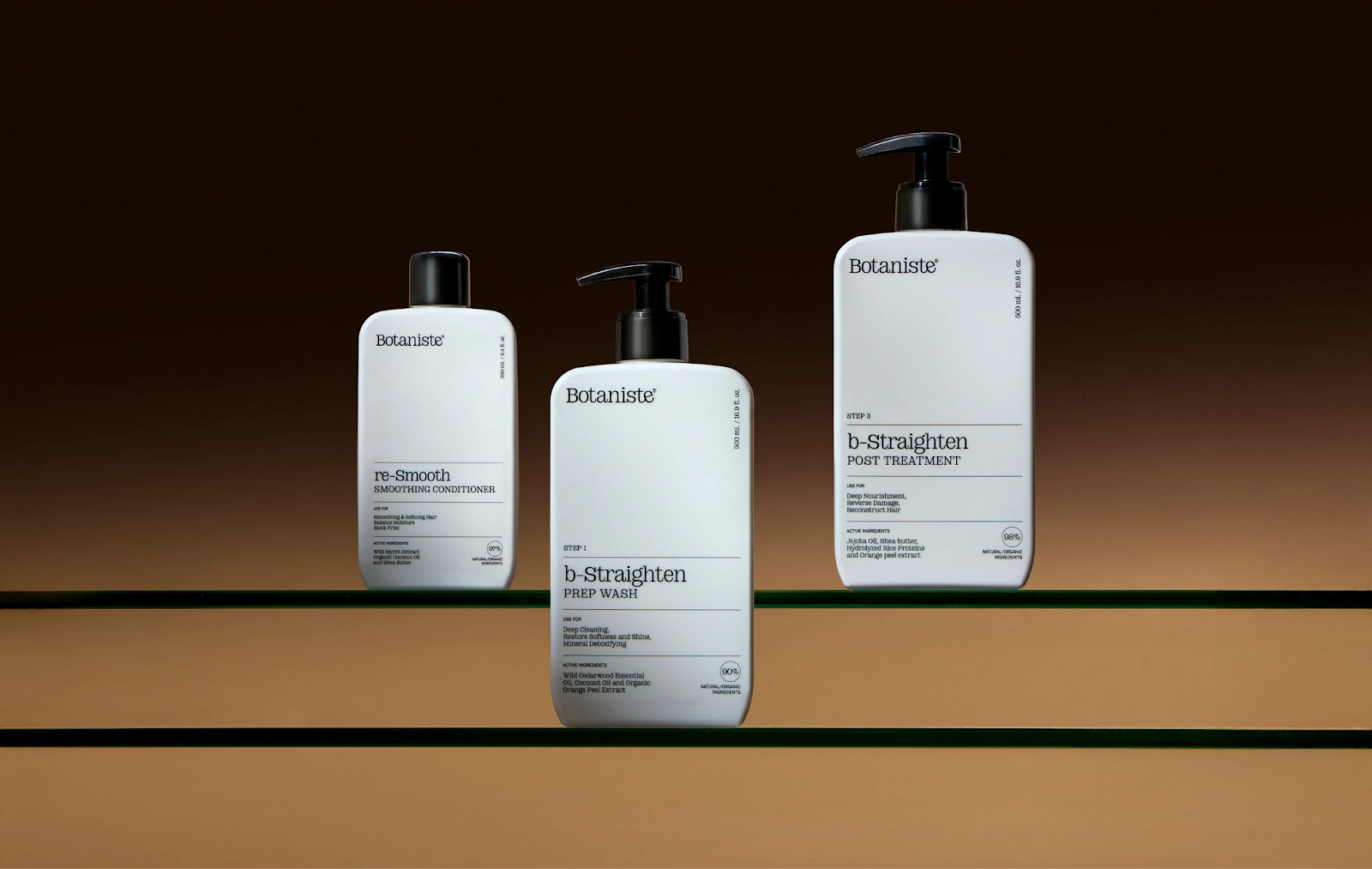
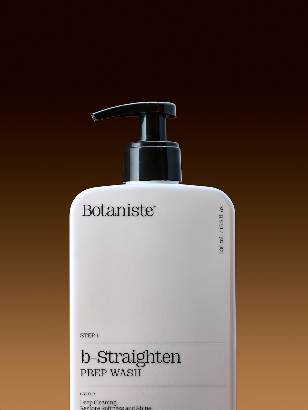
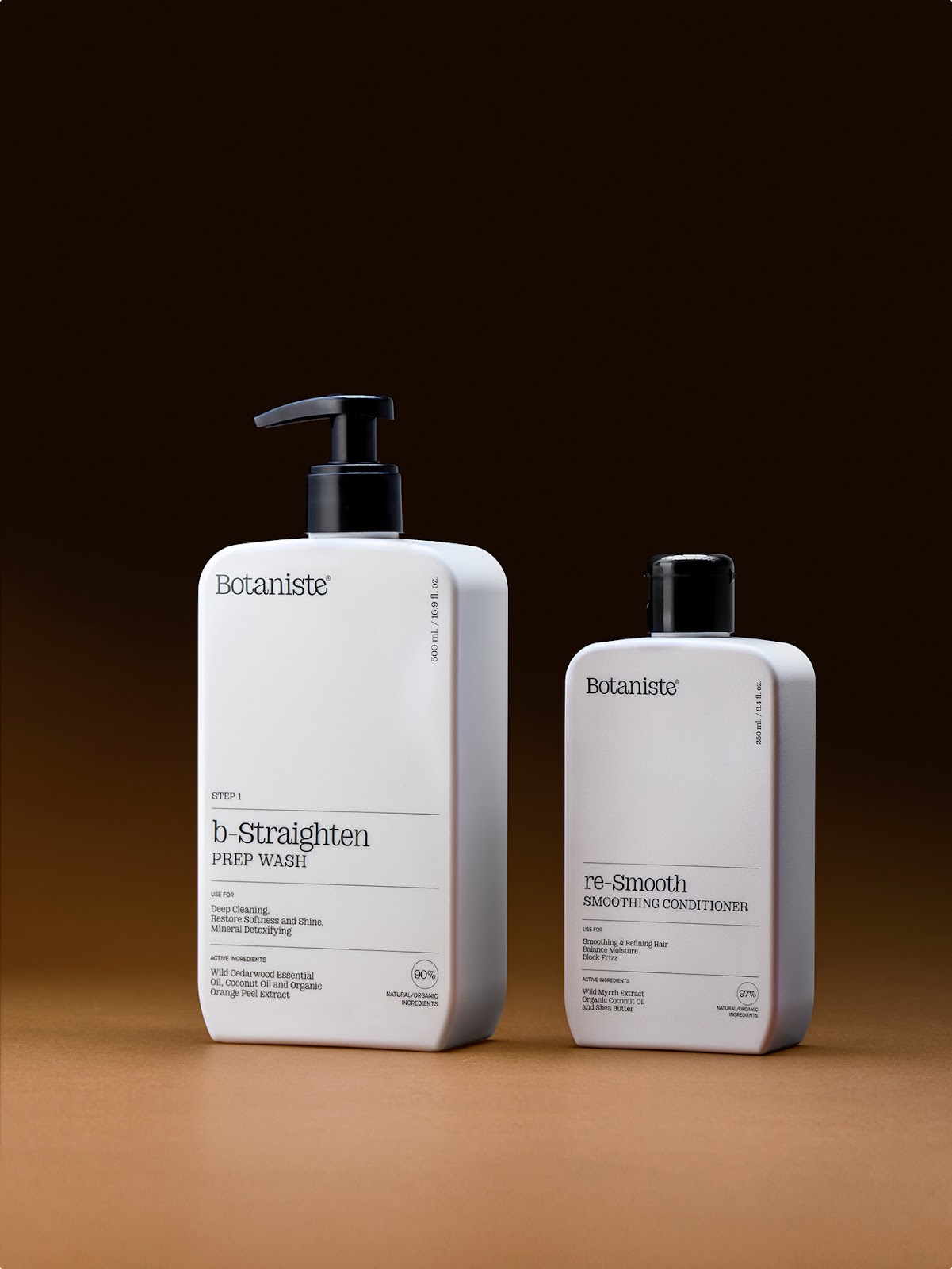
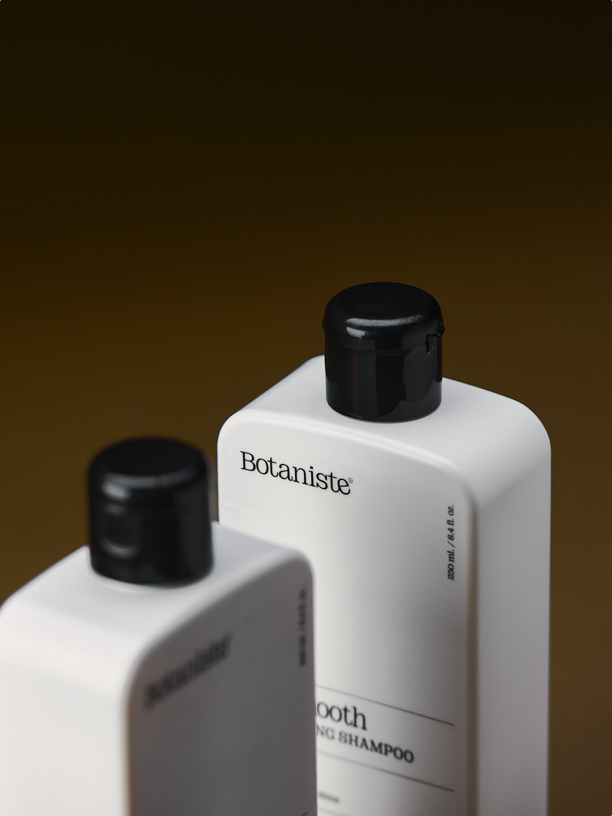
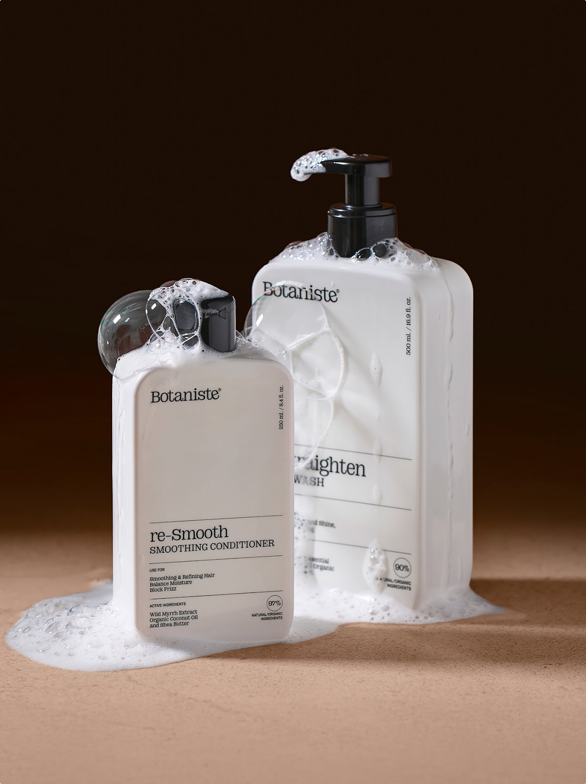
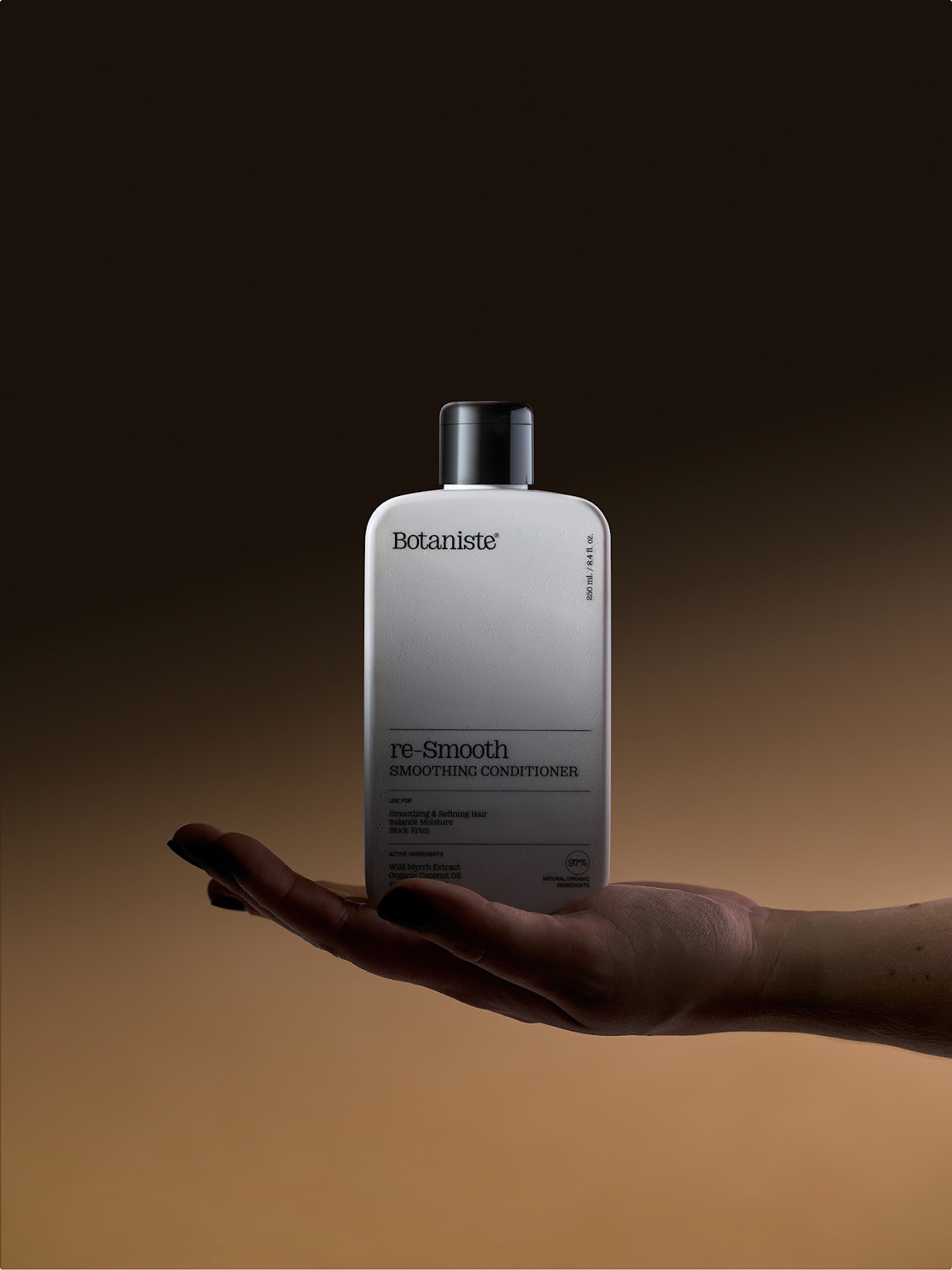
The new packaging clearly shows this change. The bottles for "b-Straighten PREP WASH" and "re-Smooth SMOOTHING CONDITIONER" are clean and simple. They are white with black pumps and caps. This look feels sophisticated and pure. The simple design lets product names and benefits stand out.
Smart Packaging Details
Let's look at the packaging details. Take the "b-Straighten PREP WASH" bottle. It clearly says "STEP 1." It also says "USE FOR Deep Cleaning, Restore Softness and Shine." "Mineral Detoxifying" is also listed. Key ingredients like "Wild Cedarwood Essential," "Coconut Oil," and "Organic Orange Peel Extract" show its natural side. A big "90% NATURAL/ORGANIC INGREDIENTS" label highlights this commitment.
The "re-Smooth SMOOTHING CONDITIONER" also lists its benefits. These include "Smoothing & Refining Hair," "Balance Moisture," and "Block Frizz." Its active ingredients are "Wild Myrrh Extract," "Organic Coconut Oil," and "Shea Butter." Both products show their size. The PREP WASH is 500 ml/16.9 fl. oz. The conditioner is 250 ml/8.4 fl. oz.
The overall feel is clear and trustworthy. It shows they know what today's buyers want. The design is not messy. It focuses on showing important facts in a nice way. A simple, modern font also makes the brand feel more upscale.
Nature Meets Premium Style
Plakton.pro helped Botaniste mix nature and premium style. The new look places Botaniste in a more natural setting. It also makes it seem more aspirational. This project shows how good graphic design and packaging design can really help a brand. They can change how a brand is seen and how many people want it.
This work by Plakton.pro, with photos by Sergio Ávila, gives great tips. It's for anyone wanting to refresh a brand. It's also for those entering a new market. It shows how a strong visual plan can share a brand's values. It can also bring in new customers.
Check out more of Plakton.pro's inspiring design work at Plakton.pro.