Coastal Cool: Gage Roads Huey's Laid-Back Branding and Packaging Design
Dive into the branding and packaging design of Gage Roads' "Huey" Coastal Lager. Discover its retro typography and coastal-inspired visuals.
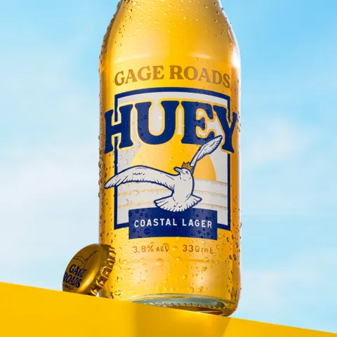
Gage Roads, Australia's leading independent craft brewery, recently introduced "Huey," an all-natural mid-strength coastal lager. This launch also marks Gage Roads' 20th anniversary. The internal creative team at Good Drinks Australia spearheaded the branding and packaging design for this new release, aiming to capture classic coastal vibes.
The design is a direct nod to Gage Roads' origins. The brewery was named after a channel of water between Fremantle Port and the picturesque Rottnest Island. This connection to the coast is evident throughout Huey's visual identity.
For the first time, Gage Roads' brand mascot, Huey the illustrated seagull, takes center stage on the packaging. This charming character, combined with soft retro typography, evokes a sense of nostalgia. The typography itself drew inspiration from hand-painted signage often seen around Fremantle Port, Gage Roads' home base. This blend of elements creates a timeless and inviting look.
The packaging for Huey is thoughtfully executed. The lager is presented in a clear flint bottle, a first for Gage Roads. This choice allows the liquid inside to glow, reminiscent of a Western Australian sunset, reinforcing the brewery's commitment to natural beers. The bottle neck features an emboss of the brand's logo on the front and the seagull mascot on the back, adding subtle, premium details.
The 6-pack wrap maintains an understated elegance, mirroring the bottle's label. Instead of cut-outs, it features a subtle metallic gold printed finish, adding a touch of sophistication. The overall impression is one of effortless cool, perfectly aligned with the "sun, salt, and sand" experience Huey promises.
This branding and packaging design for Huey truly embodies its coastal lager identity. It's clear that every element, from the mascot's prominent placement to the choice of bottle, was carefully considered to evoke a specific feeling. It’s a design that feels both fresh and familiar, inviting you to kick back and enjoy. It’s a stellar example of how effective branding and packaging design can transport you to the very essence of a product.
To explore more of Chris Rowson's work and inspiration, visit his portfolio directly: https://chrisrowson.squarespace.com/gage-roads-huey
Branding and packaging design artifacts