by abduzeedo
In the vast expanse of the design realm, the marriage of intentionality and creativity births masterpieces. One such collaboration emerged between Studio 28K and Everbloom—a brand ardently journeying towards converting passion and self-expression into tangible opportunity.
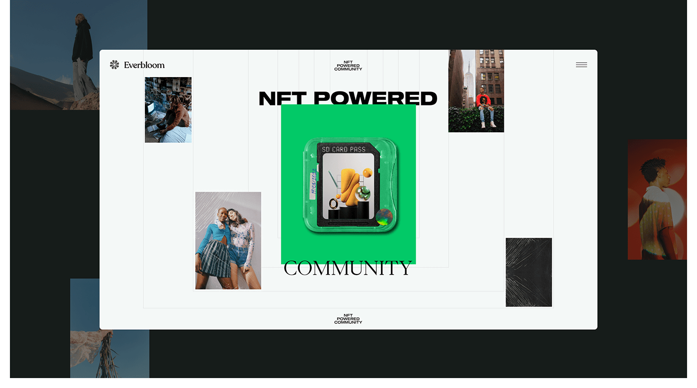
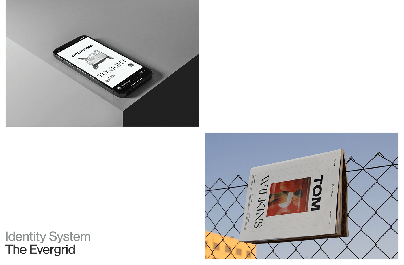
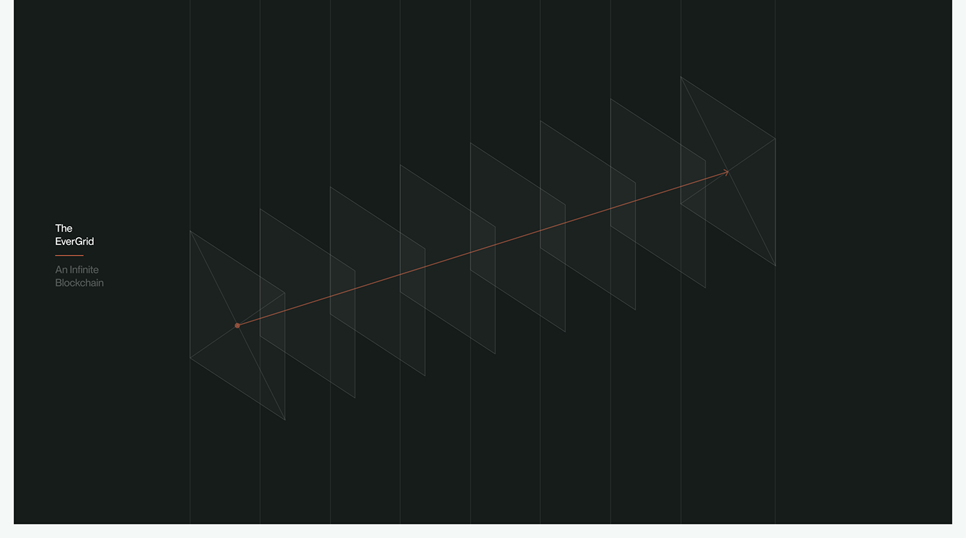
Everbloom, in its very essence, is reminiscent of perpetuity—evolving, adapting, and persisting. This dynamic nature of the brand called for an identity that was both malleable yet strong. The answer? The EverGrid. Conceived as an open-ended, creative framework, the EverGrid is not merely a structure; it's a playground for boundless creativity.
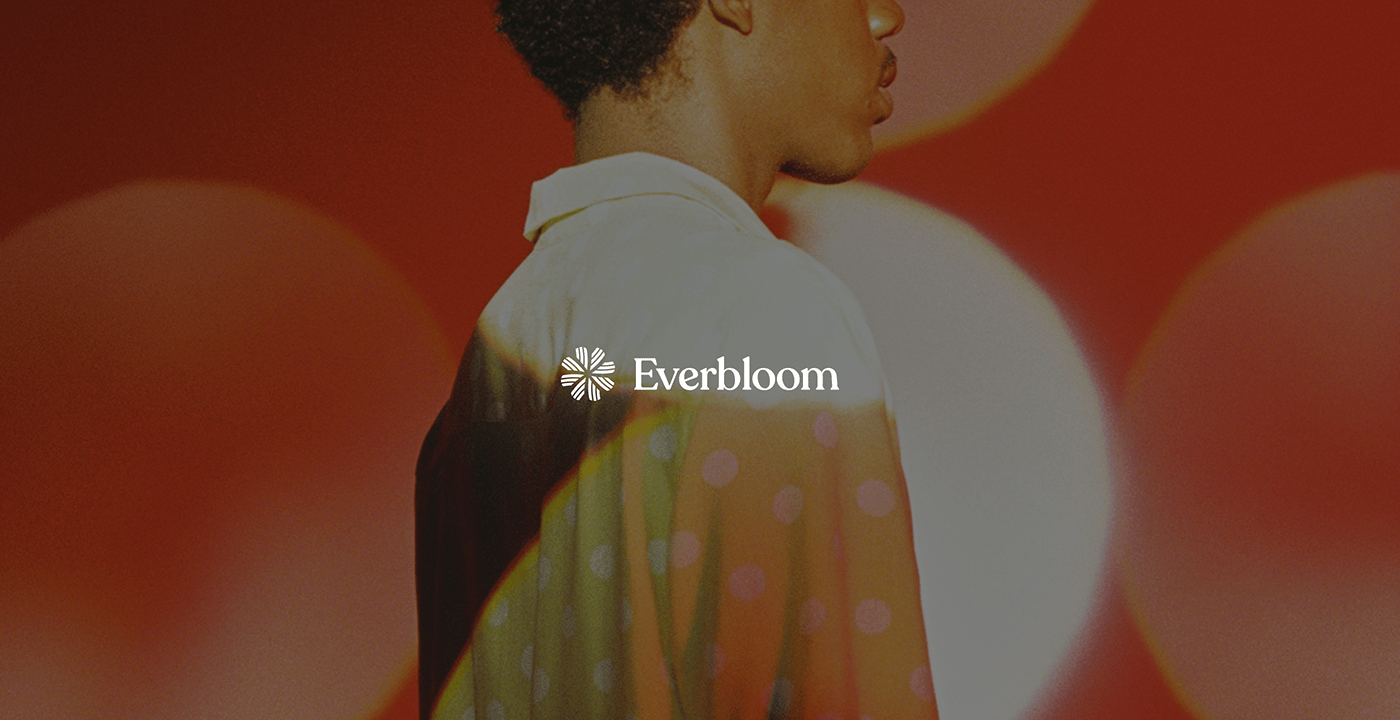
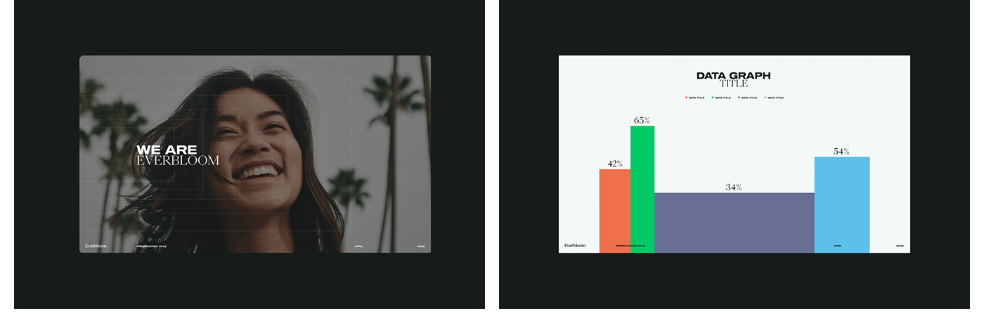
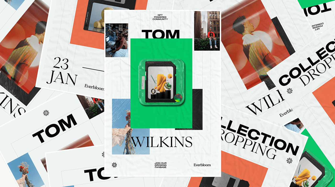
The image attached poignantly captures the quintessence of Everbloom's branding. The visual identity, while appearing simple at first glance, reveals layers of complexity upon closer examination. The foundation is built on bold typography, which stands out as a testament to the brand's audacity. This audacity is harmoniously balanced with a meticulous composition, deeply rooted in the principles of a grid system. Such an approach ensures that while the design can be flexible and dynamic, it remains anchored and consistent.
Color choices in branding are never arbitrary. The vibrant shades of green and orange are not just choices; they're statements. Green, often symbolic of growth, renewal, and energy, resonates with Everbloom's mission of turning passions into opportunities. The orange, vibrant and attention-grabbing, reflects the brand's fervor and zest. These vivacious colors, when juxtaposed with the timeless elegance of black and white, create a visual symphony—both fresh and contemporary.
Furthermore, the imagery used is a breath of fresh air. Contemporary, relevant, and striking, it augments the brand's identity, making it relatable and aspirational simultaneously. Such choices demonstrate the sheer brilliance of Studio 28K's strategy, which, while rooted in design principles, isn't afraid to break the mold when necessary.
In conclusion, Everbloom's branding and visual identity, sculpted by Studio 28K, is a masterclass in design thinking. It's a narrative of how intentional choices, when coupled with creative liberty, can craft a brand identity that's not just visually pleasing but also deeply resonant with its ethos. The EverGrid is a testament to that—a framework that's both structured and free, echoing the very spirit of Everbloom.
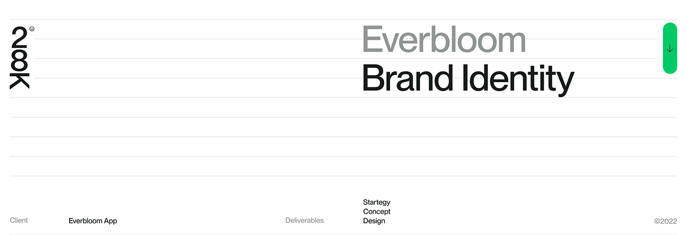
Branding and visual identity artifacts


For more information make sure to check out Studio 28K website and follow them on Behance.

's Packaging Design")


