by abduzeedo
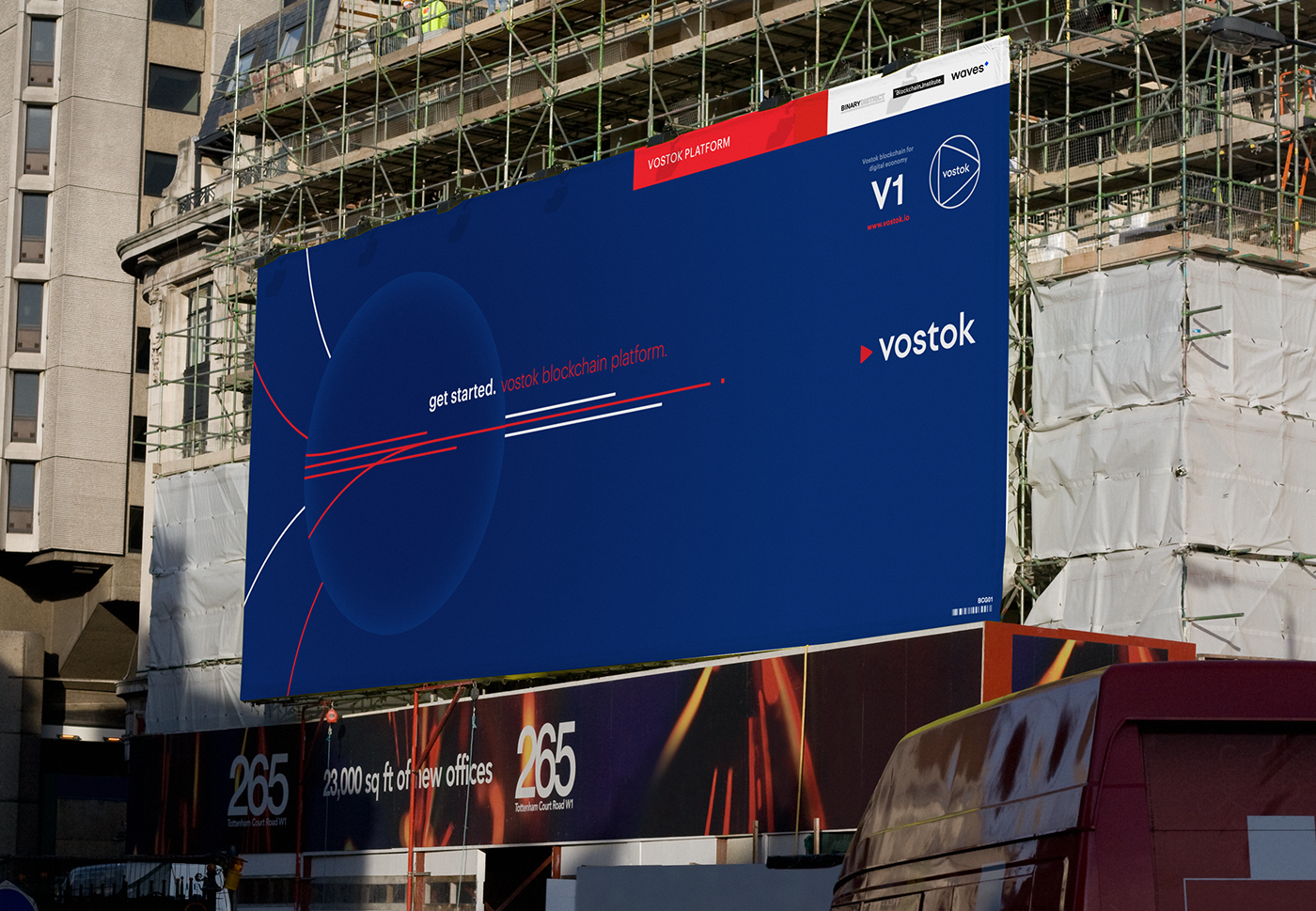
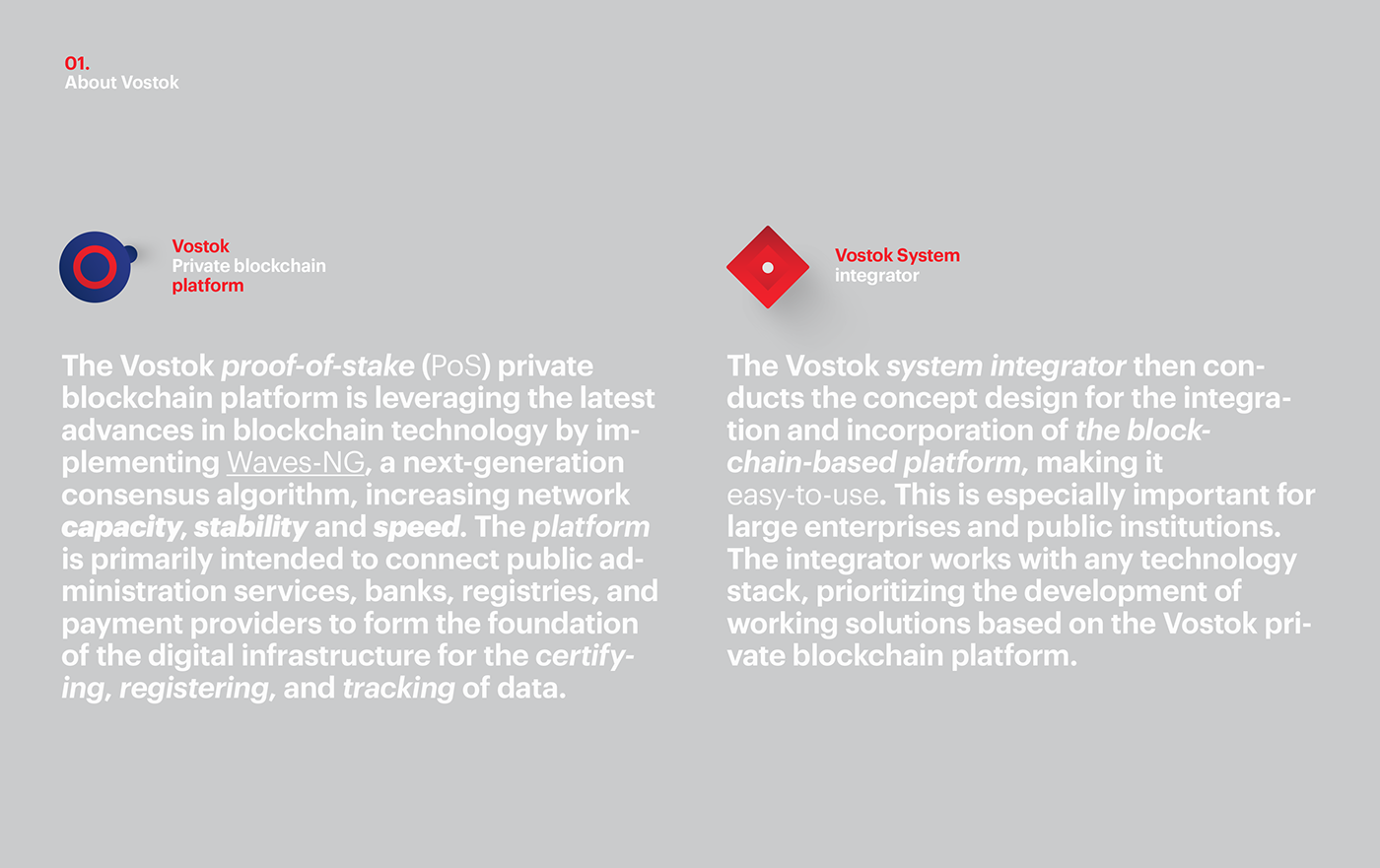
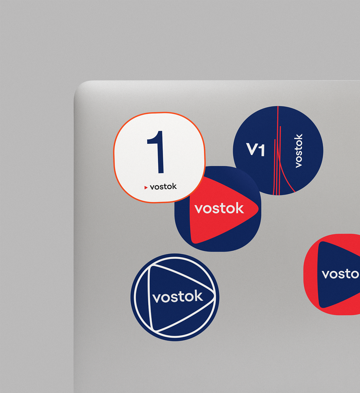
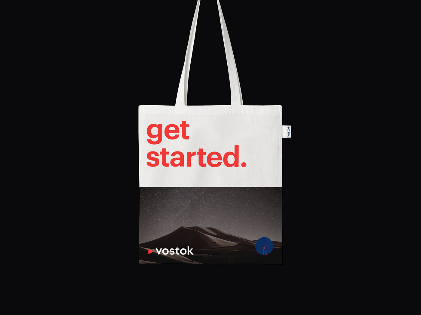
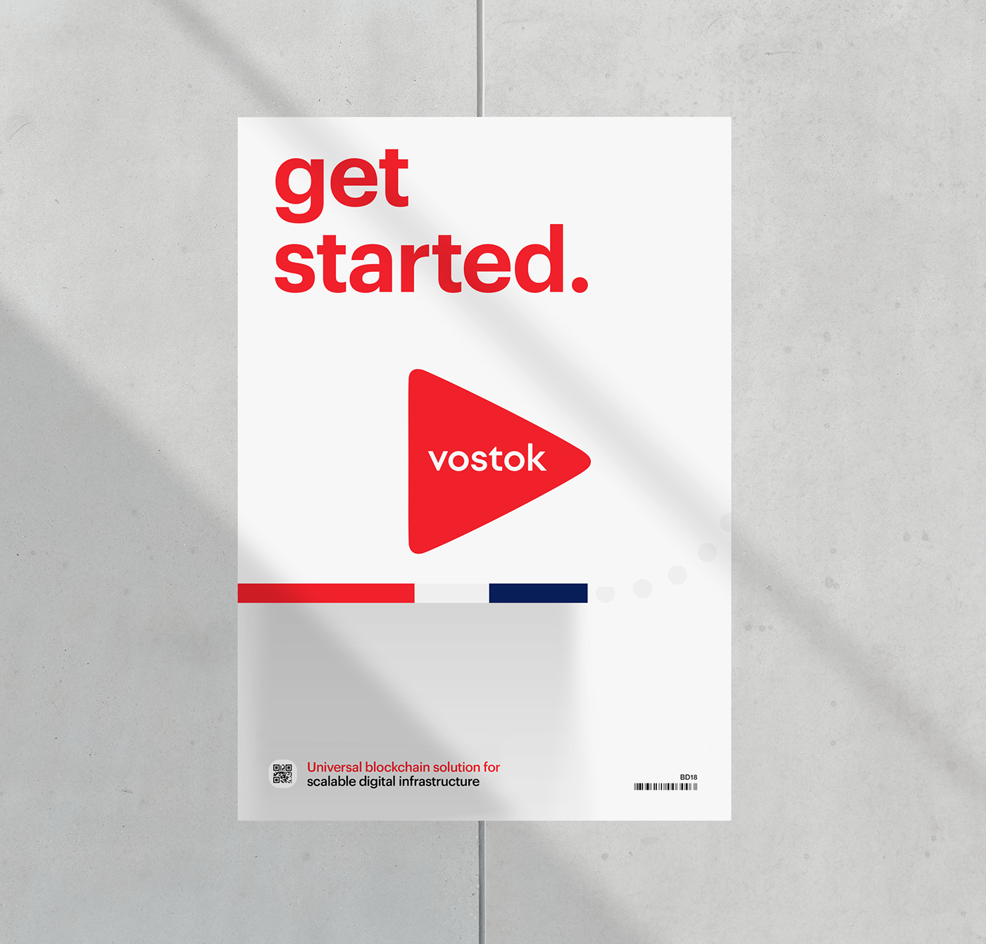
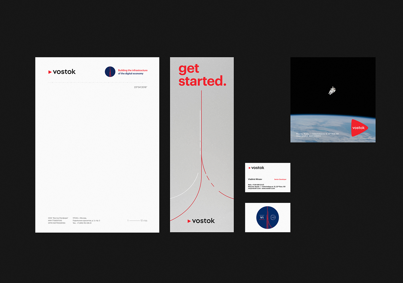
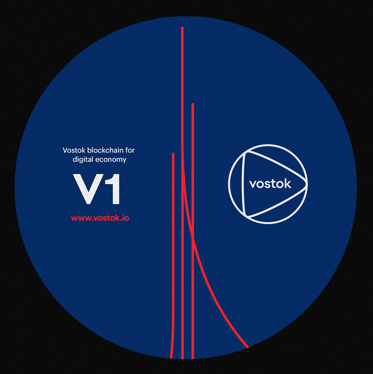
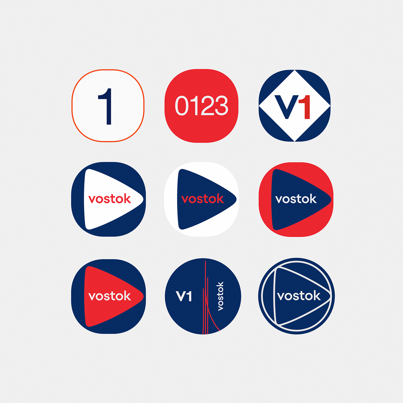
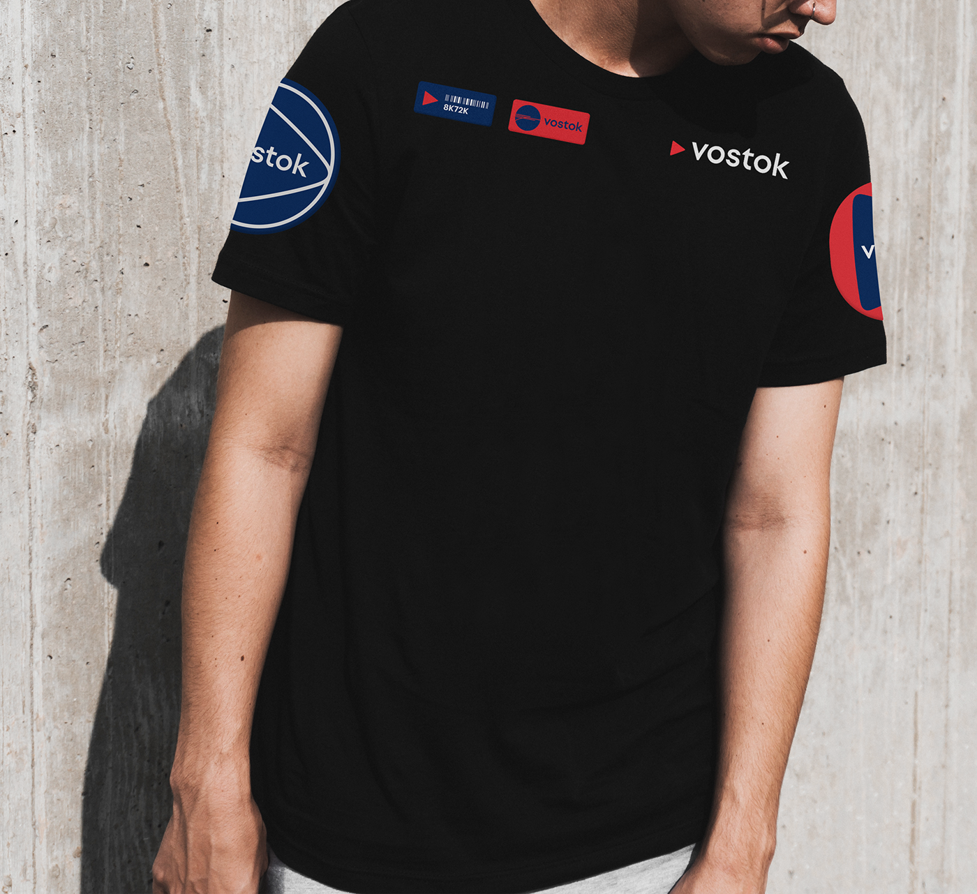
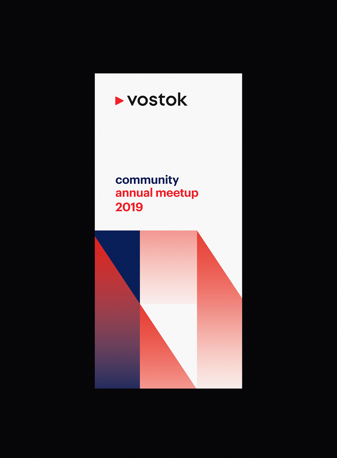
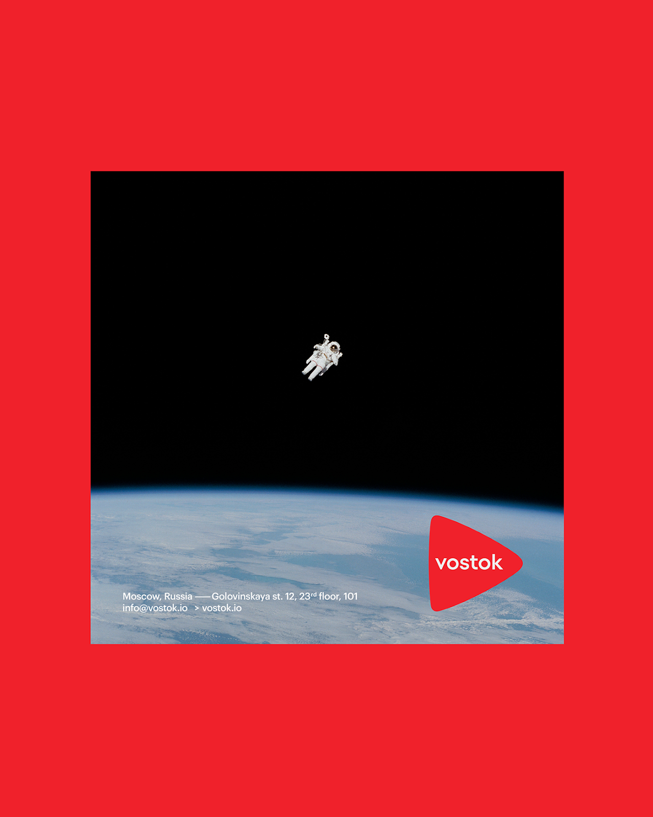
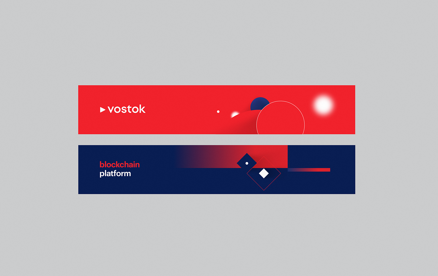
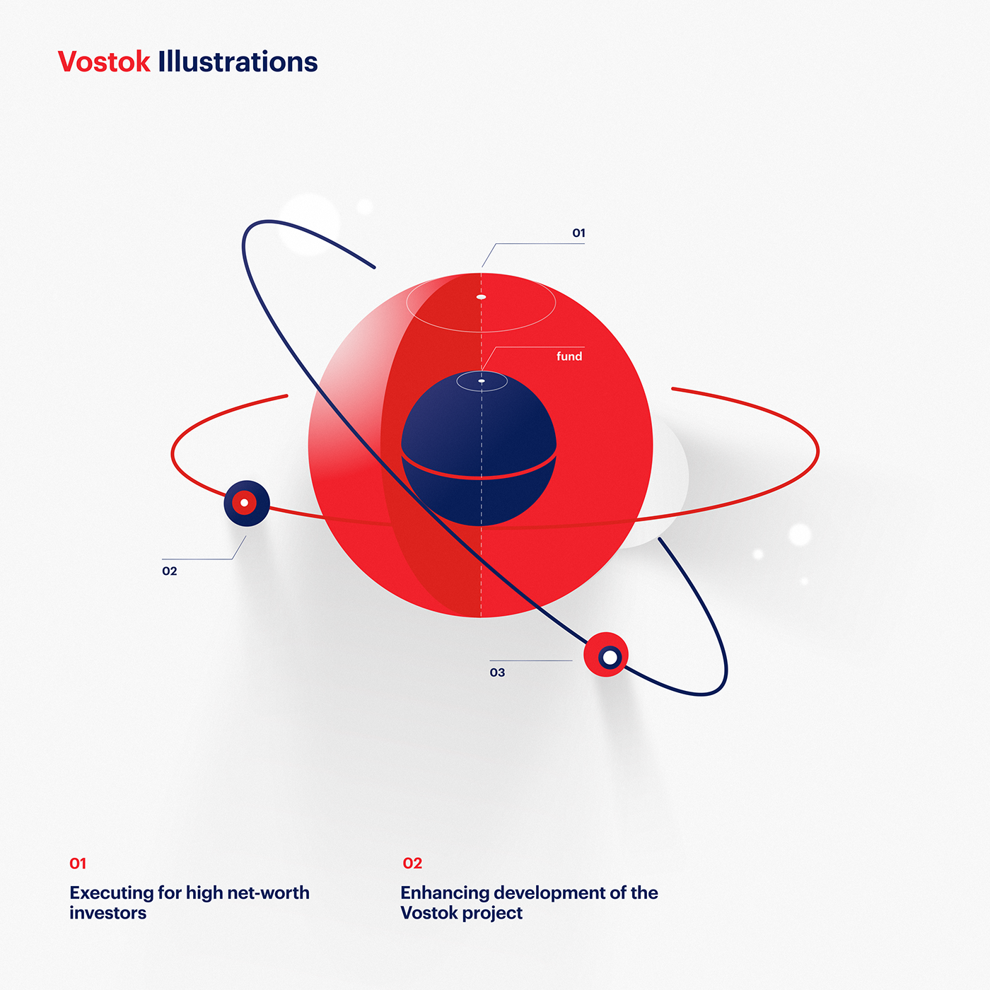
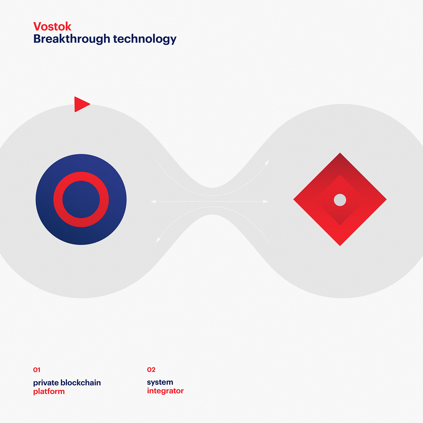
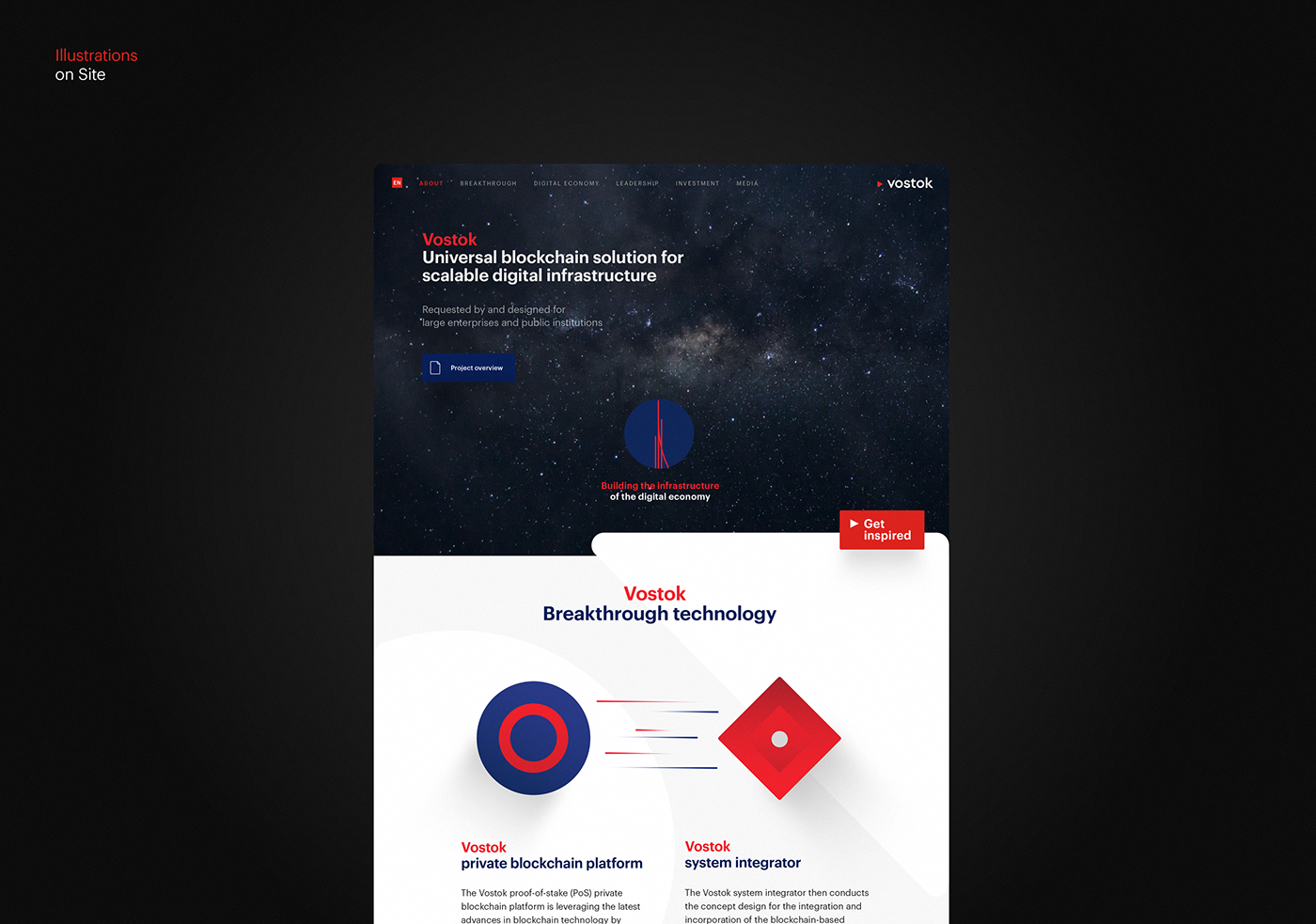
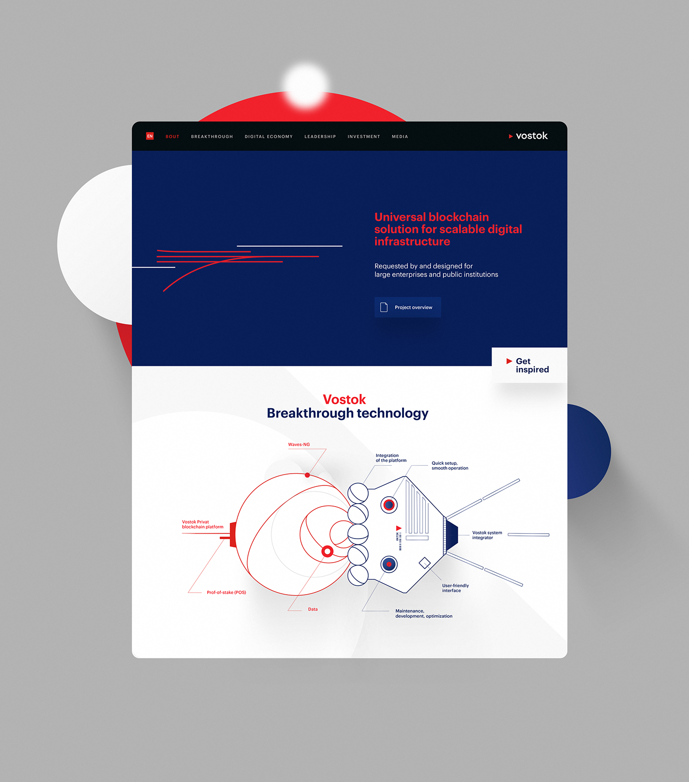
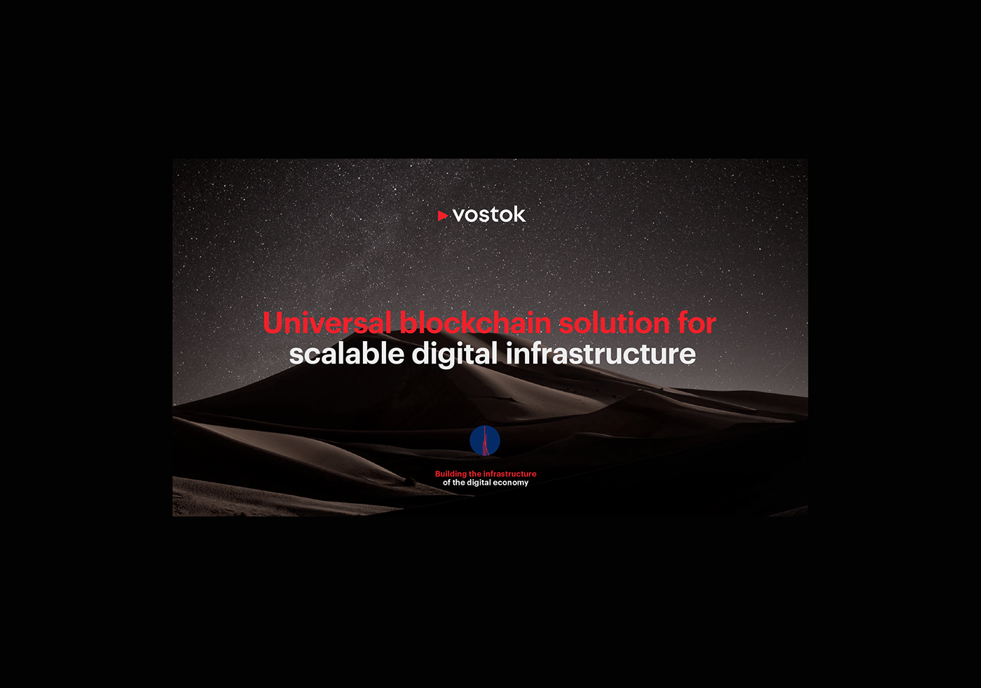
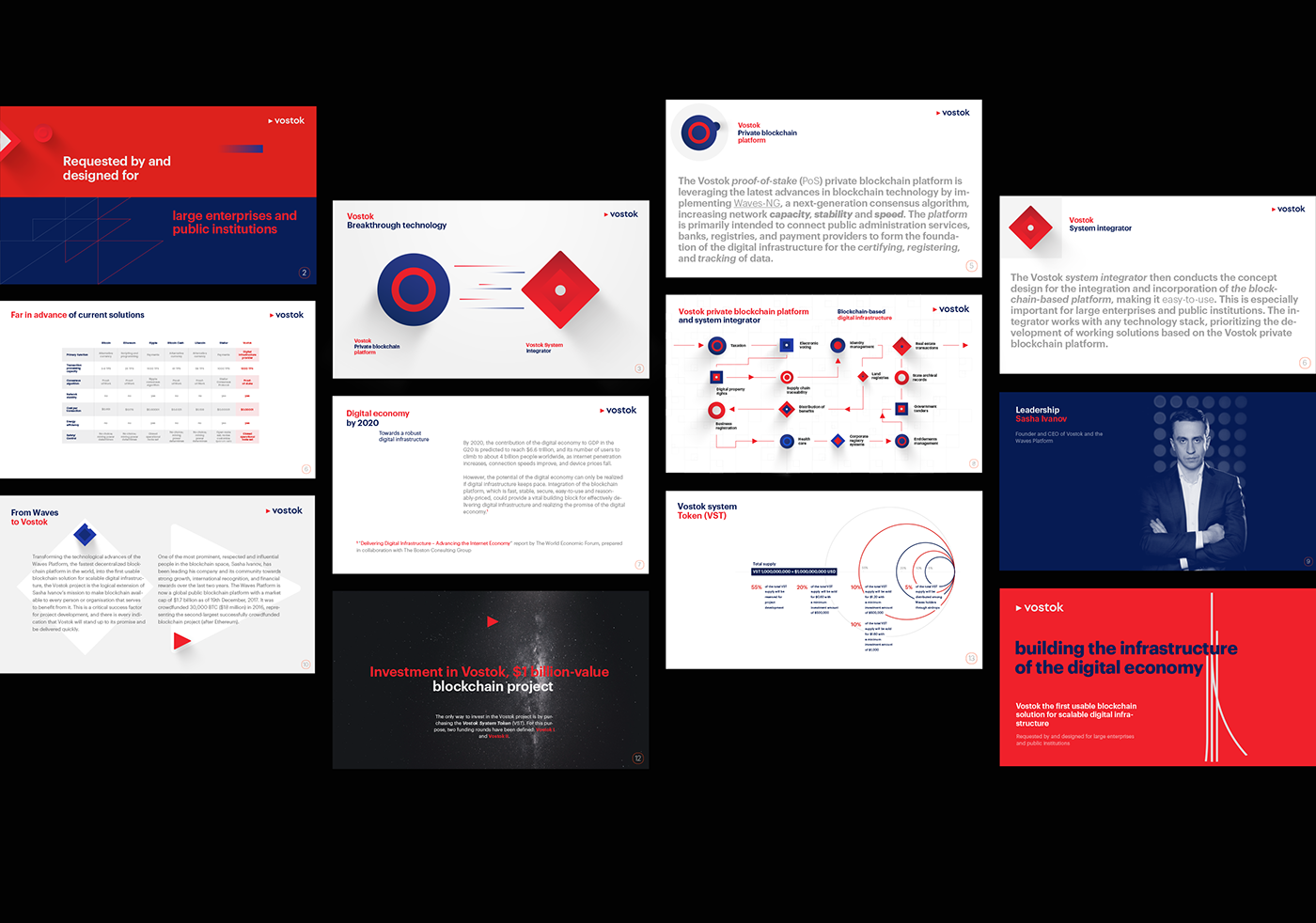
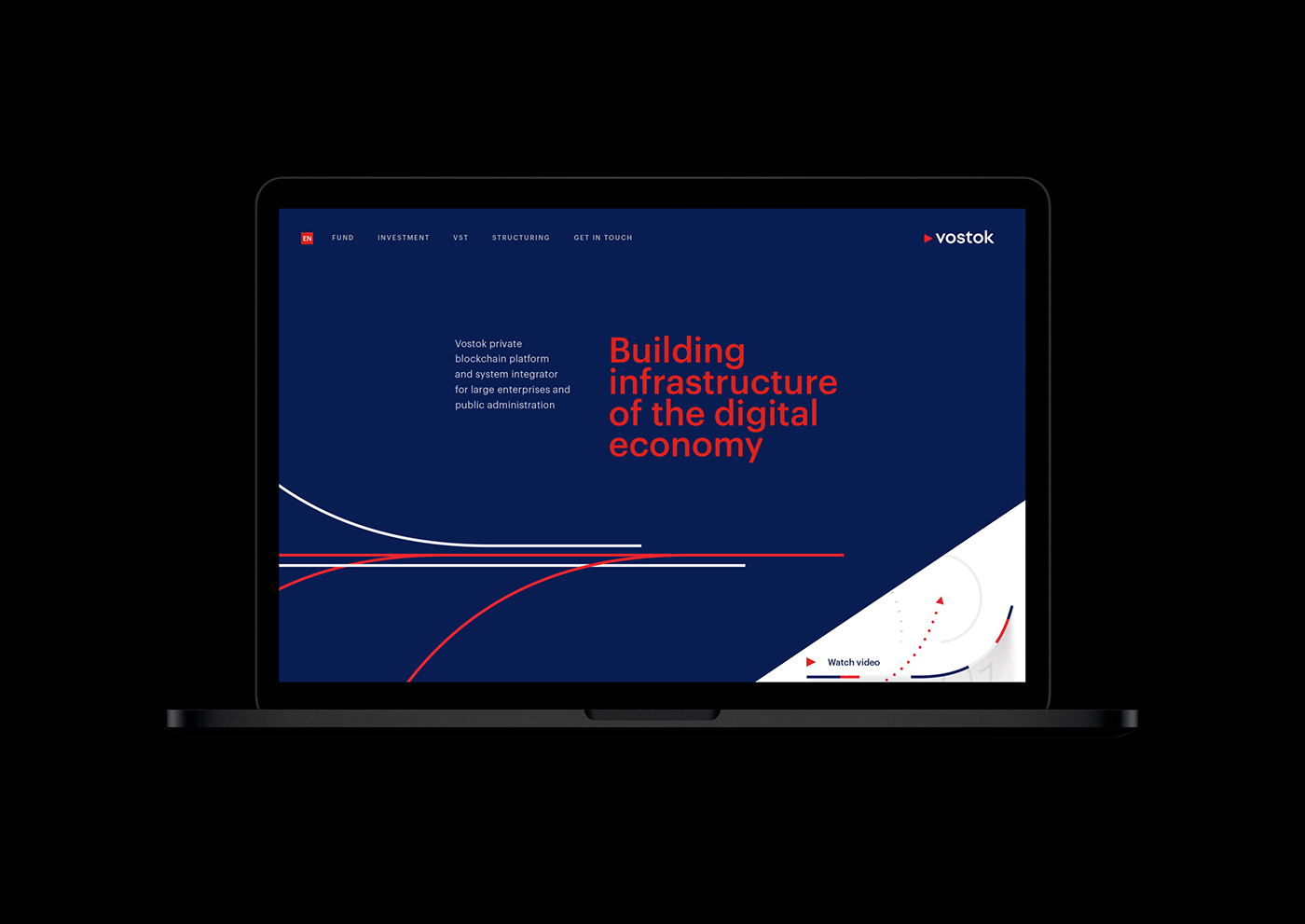
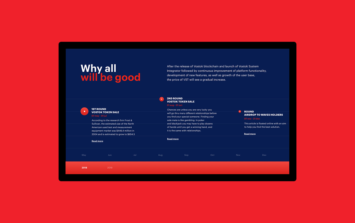
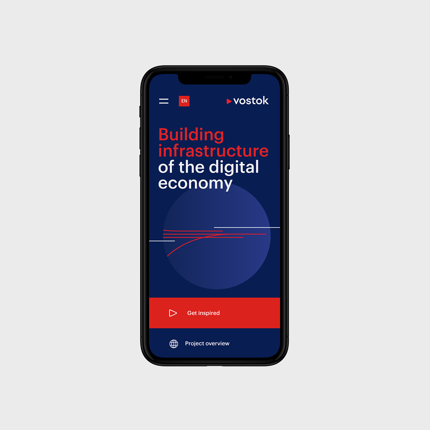
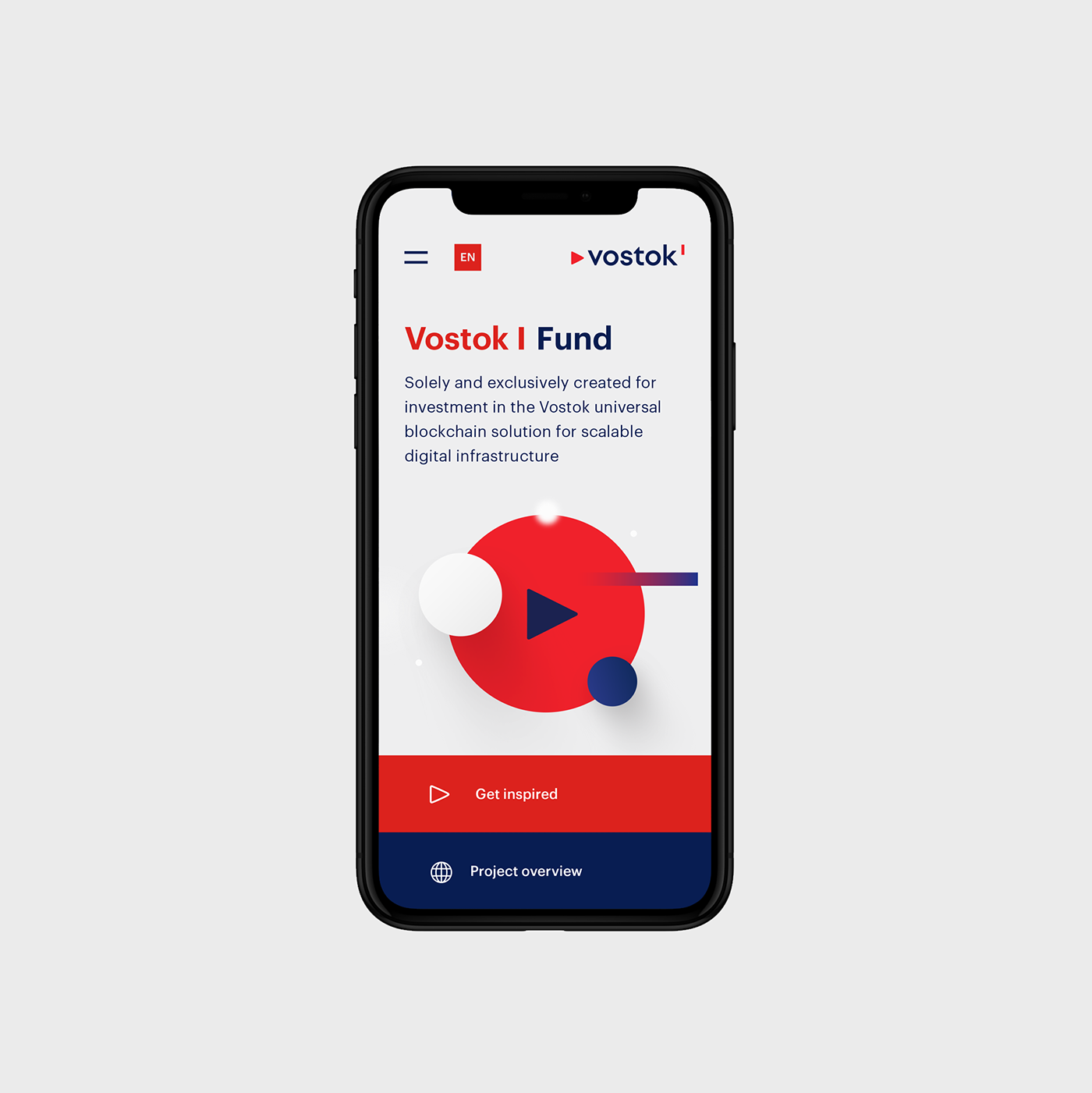
Dima Bertoluchi and Elena Saharova shared a branding and UX project for Vostok (East), a universal blockchain solution for scalable digital infrastructure. Developed on request and for use by large enterprises and government agencies. The key idea for the brand logo Vostok became the arrow from the compass pointing east.
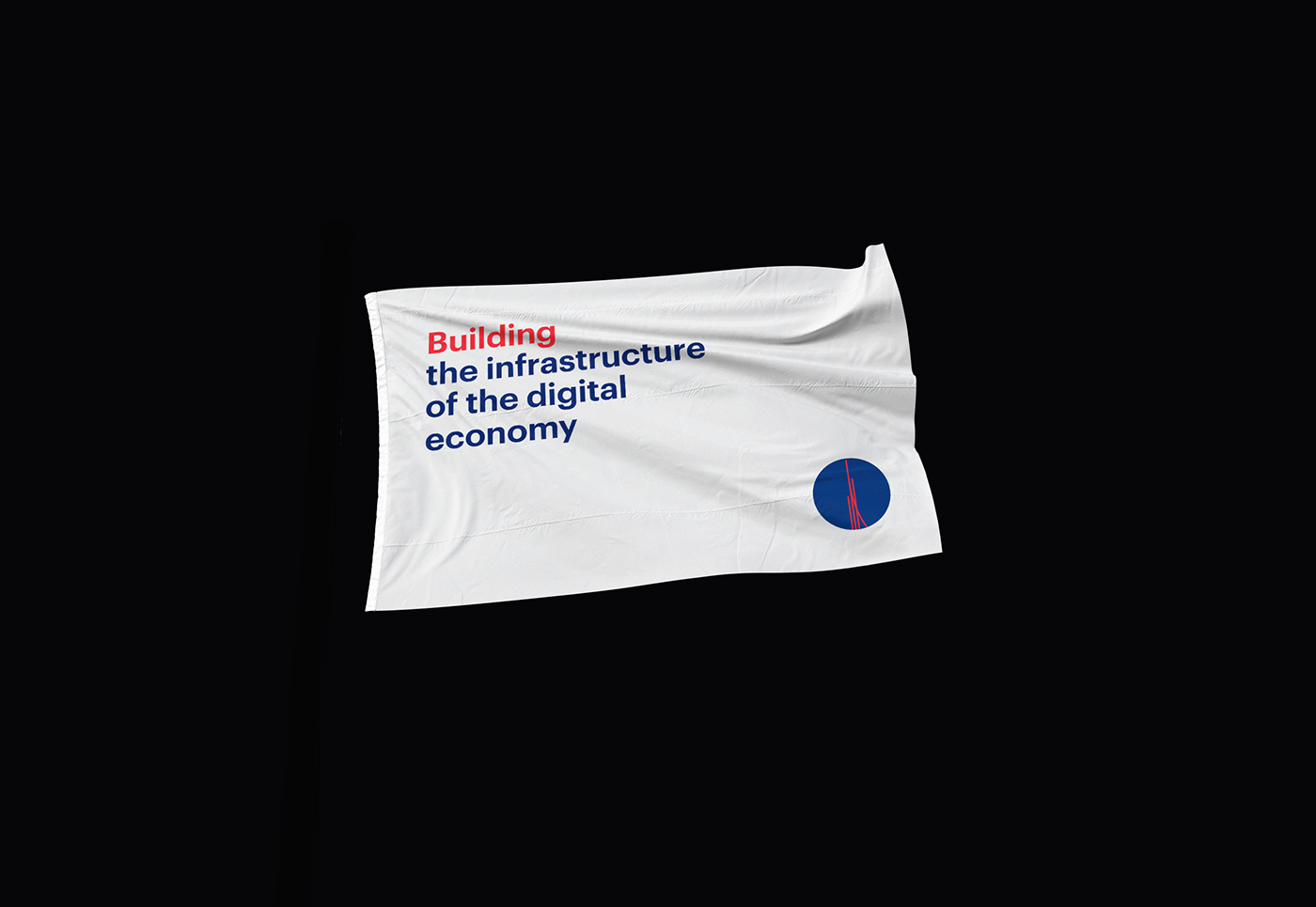
The company is designed to fundamentally change the infrastructure of blockchain solutions within the framework of state scales. A brand identity reflect these qualities and fully comply with them. Moving Vostok! Moving up!
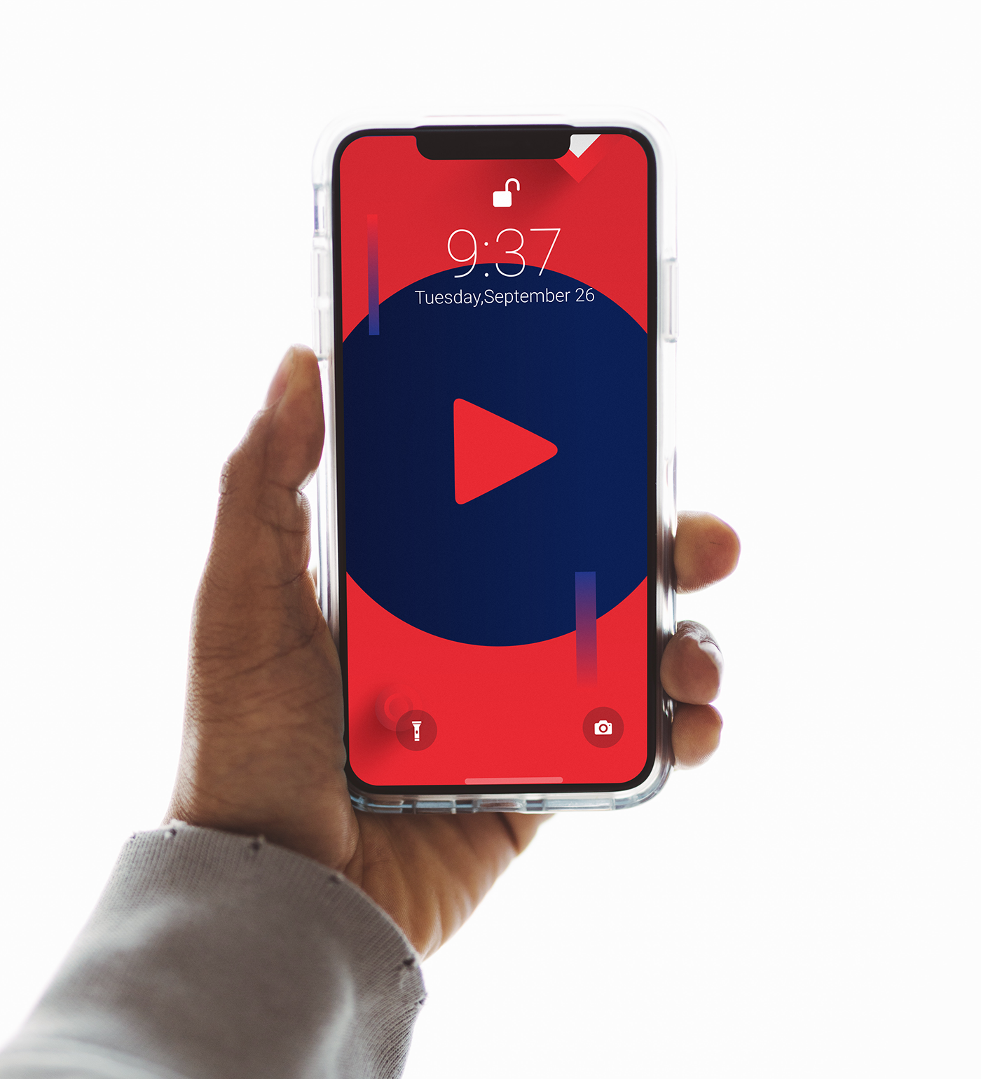
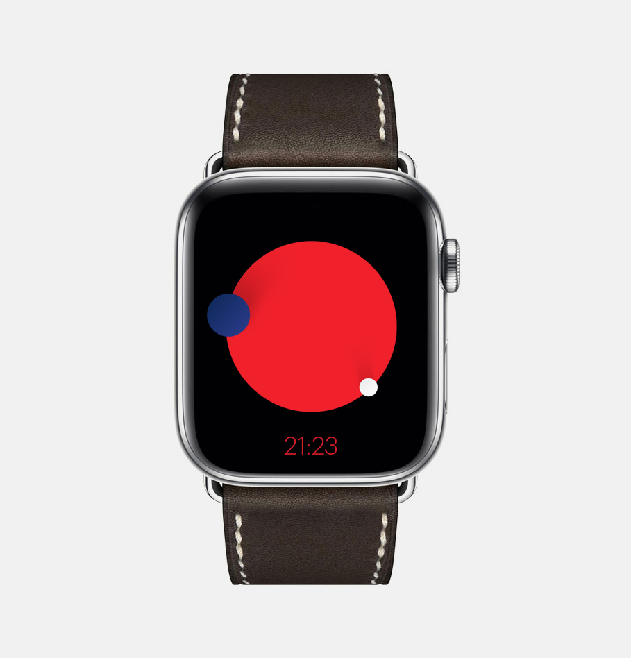
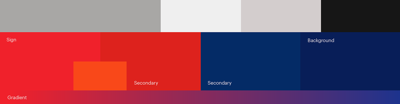
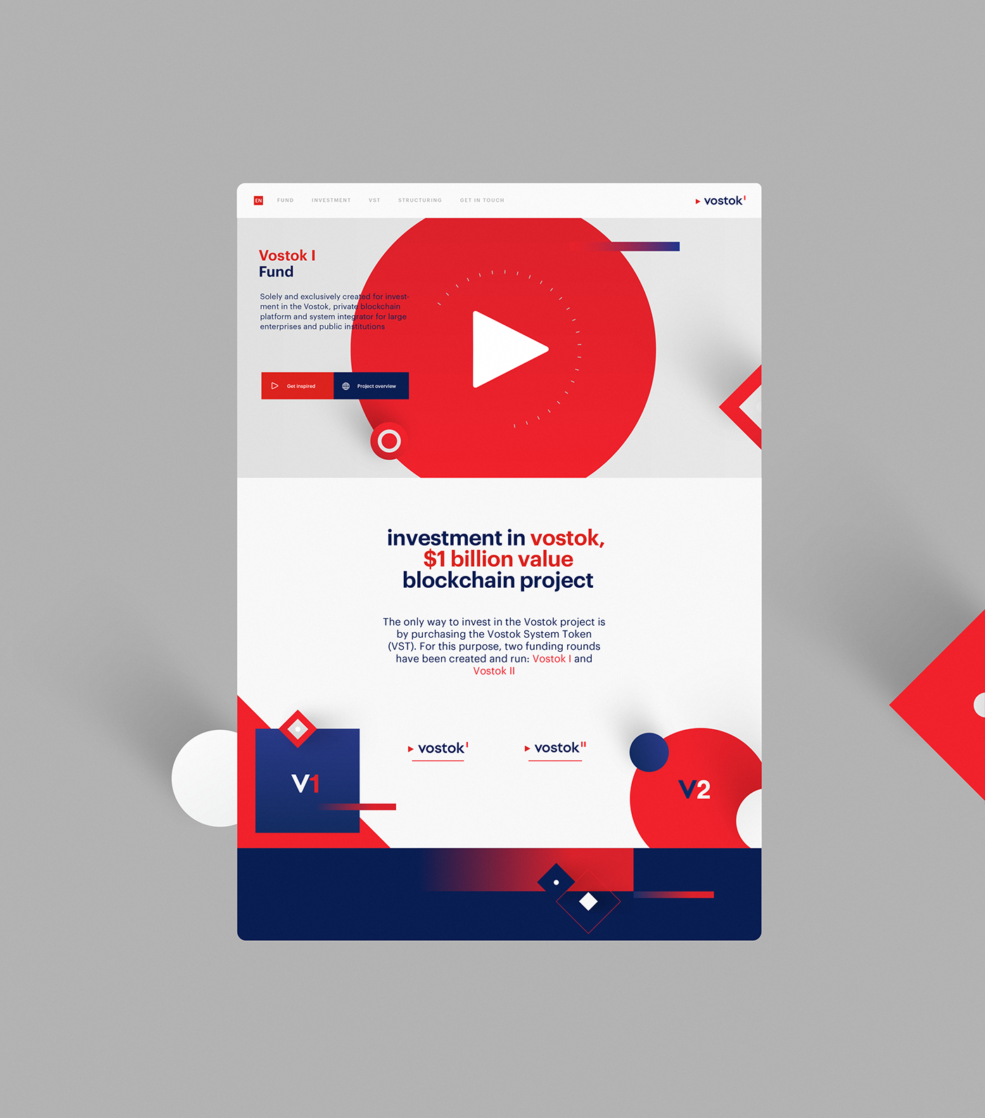
The color palette is selected on the basis of the national flag, but not too obvious to create a unique identity for the brand palette. The arrow points to the east and calls for action — speed, determination, hardness, dynamics.


Credits
- Branding, Illustations: Dima Bertoluchi — FB / INST
- Web Design, Animation: Elena Saharova — FB / SITE
For more information check out vostok.io