by abduzeedo
Discover Wrink's branding and visual identity, designed by Blink, embracing a fresh outlook on senior citizen lifestyle.
Wrink*, a brand designed by Design with Blink, brings a refreshing take on senior citizen lifestyle. This multicultural community aims to create meaningful experiences for elders, proving that aging can be dynamic, social, and full of purpose. The motto, "Age isn't beige," perfectly encapsulates Wrink's ethos.
The branding and visual identity of Wrink* stand out with their minimalist and elegant approach. The black and white color palette gives the brand a timeless and sophisticated look, appealing to both the elderly and those who interact with them. This monochrome scheme symbolizes the simplicity and clarity that Wrink* strives to bring to the lives of senior citizens.
One of the most striking elements of Wrink's branding is the font used for the logo type. It is modern yet classic, conveying both the contemporary relevance and the timeless wisdom of the elderly community. The use of asterisks as a symbol is another clever design choice. It represents the unique stories and diverse experiences of the elders, highlighting that every individual is a star in the Wrink* community.
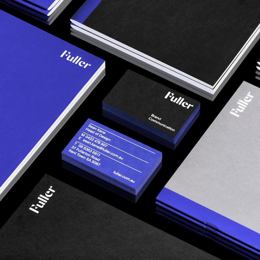
The collaterals for Wrink* are meticulously crafted, embodying the brand's commitment to quality and attention to detail. From business cards to brochures, every piece reflects the elegance and thoughtfulness of the brand. This cohesive visual identity ensures that Wrink* is instantly recognizable and memorable.
Design with Blink has successfully created a brand that not only serves a practical purpose but also uplifts and redefines the perception of aging. The focus on fashion, lifestyle, and community positions Wrink* as more than just a service – it's a movement. By challenging stereotypes and promoting an active, exciting, and unexpected view of aging, Wrink* inspires a new generation of seniors to embrace their golden years with vigor and style.
In conclusion, Wrink's branding and visual identity by Design with Blink exemplify how thoughtful design can transform perceptions and create impactful experiences. The use of a black and white palette, a distinctive logo font, and the asterisk symbol all contribute to a sophisticated and meaningful brand presence. Wrink* is a testament to the power of design in fostering community and reimagining the possibilities of aging.
Branding and visual identity artifacts
For more information make sure to check out Design with Blink*, Yunicorn Studio and Victor Weiss
