by abduzeedo
Dive into the art of branding and visual identity with the Wanderly case study. Discover how creative design shapes the travel and tourism sector.
In a landscape crowded with travel services, Wanderly's visual identity stands out with an eloquent simplicity that captures the essence of exploration. Designed by Nikolson Geky, the logo is a testament to the power of intelligent design in branding, demonstrating how a single symbol can embody a brand’s mission.
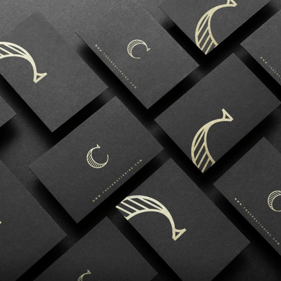
At the center of Wanderly’s identity is a stylized bird, crafted to double as the letter 'W'. This choice is far from aesthetic alone; it's symbolic. The bird represents freedom and the lightweight joy of travel, resonating with the wanderlust in its audience. It’s not just a bird, nor merely a letter, but a promise of adventure and discovery that Wanderly offers.
The logo's effectiveness lies in its simplicity, proving that minimalism can convey complex ideas. It breaks away from traditional textual logos, employing imagery to narrate the brand's story. This strategy ensures that the logo is memorable, easily recognizable, and versatile across various mediums, an essential quality in the digital age where brand touchpoints are numerous.
Geky’s approach aligns with the modern traveler's expectations: a clear, uncluttered, and meaningful brand identity that they can associate with their travel aspirations. Wanderly's branding succeeds by interweaving the brand's core values and services with a logo that speaks to globetrotters.
In a sector as dynamic as travel and tourism, branding is the compass that directs to success. Wanderly's visual identity is a beacon for others in the industry, showing that with thoughtful design, a brand can communicate more than just a name—it can evoke feelings and experiences.
For designers and brand strategists aiming to make a mark, Wanderly's case is a clear example of how branding extends beyond the visual. It's about creating a connection, an immediate recognition that transcends cultural and linguistic barriers—essential for a global presence.
The simplicity of Wanderly’s logo encapsulates the brand's essence, a visual shorthand for the freedom and joy of travel. Geky’s design not only aligns with Wanderly's vision but sets a benchmark in the travel and tourism industry, proving that in branding, sometimes less speaks volumes more.
Branding and visual identity artifacts
For more information make sure to check out Nikolson Geky on Behance.


