by AoiroStudio
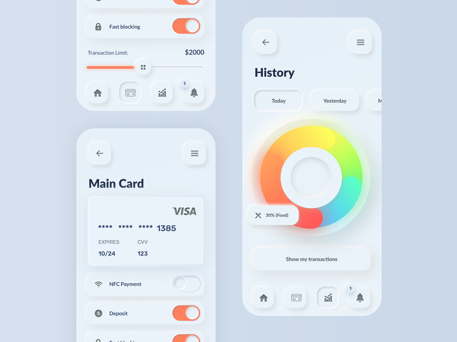
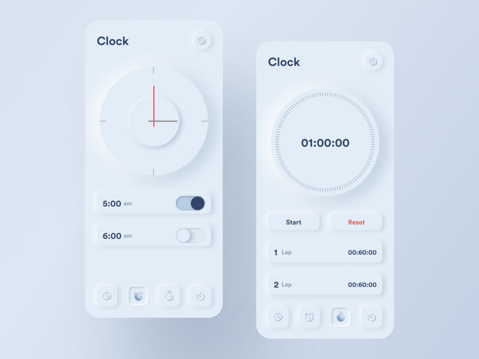
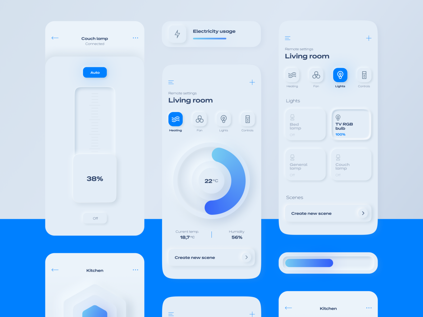
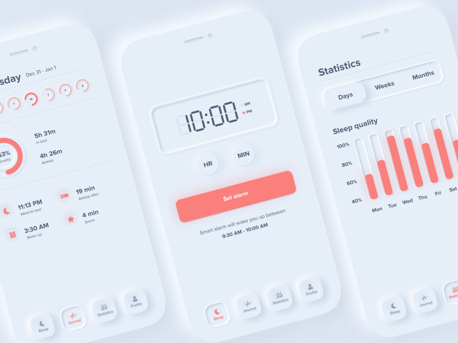
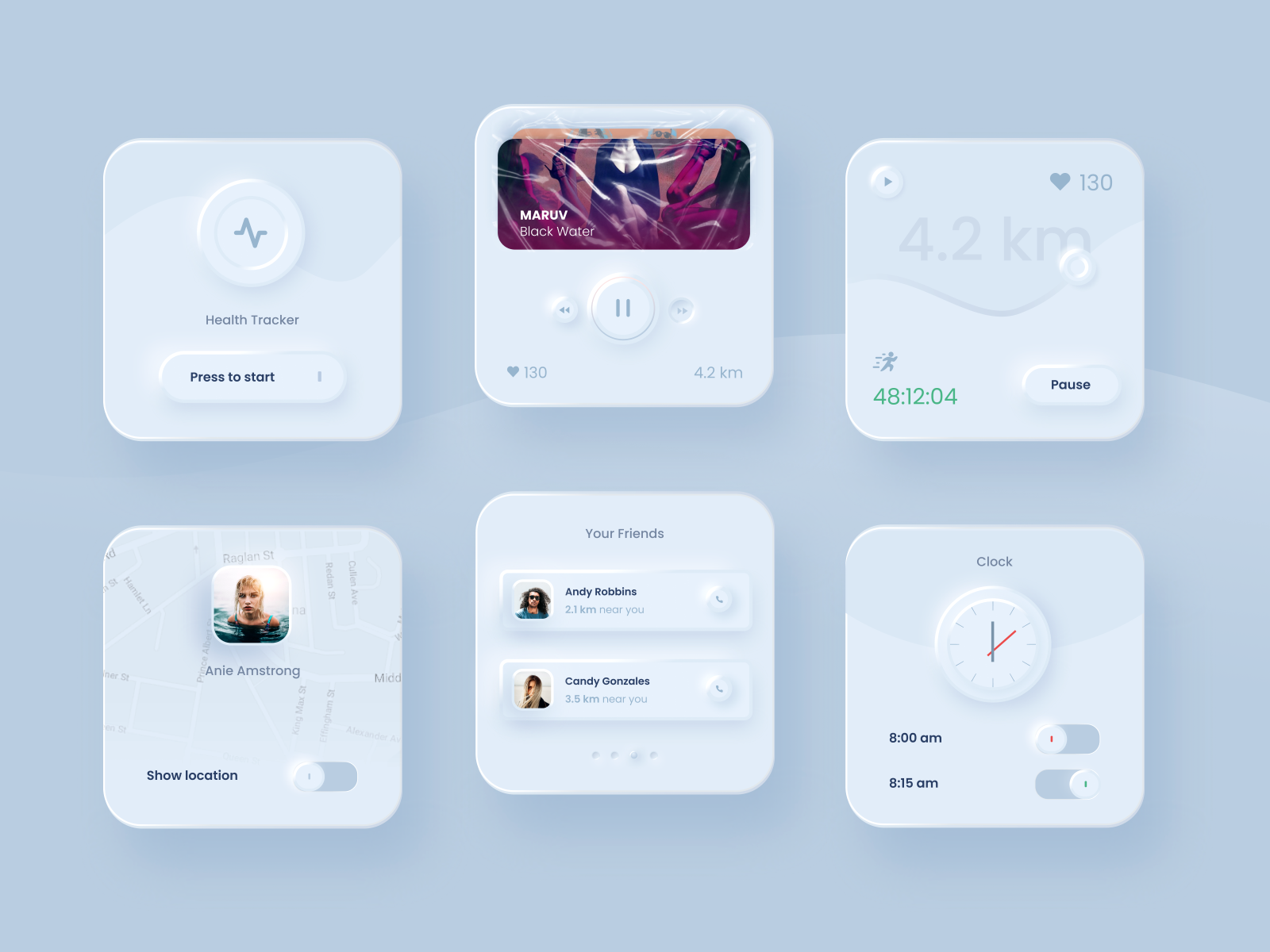
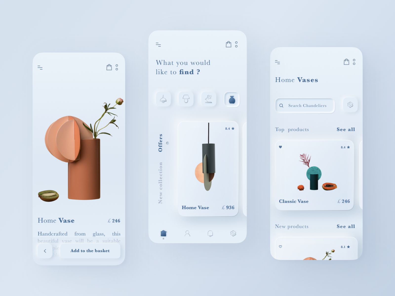
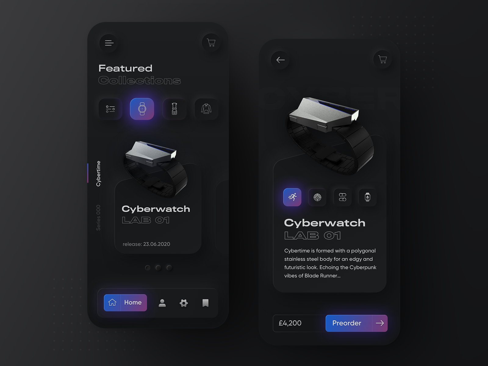
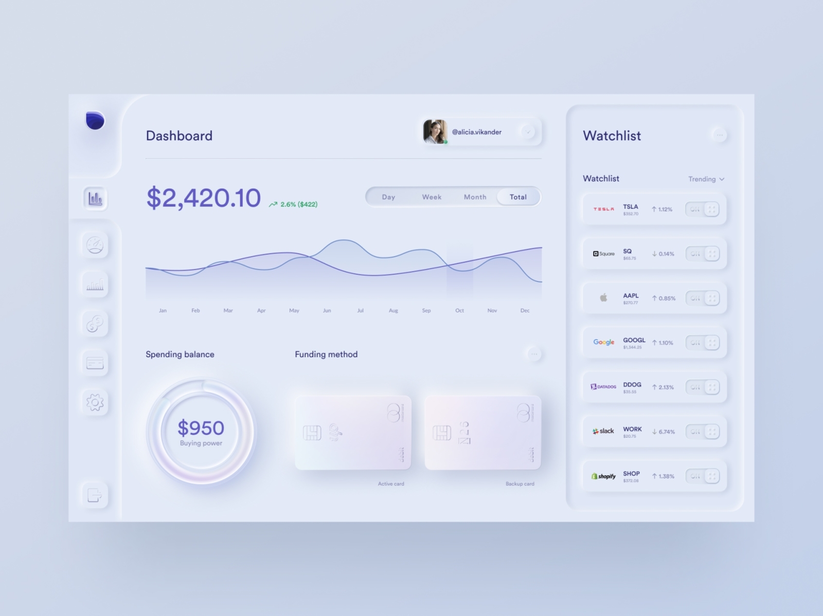
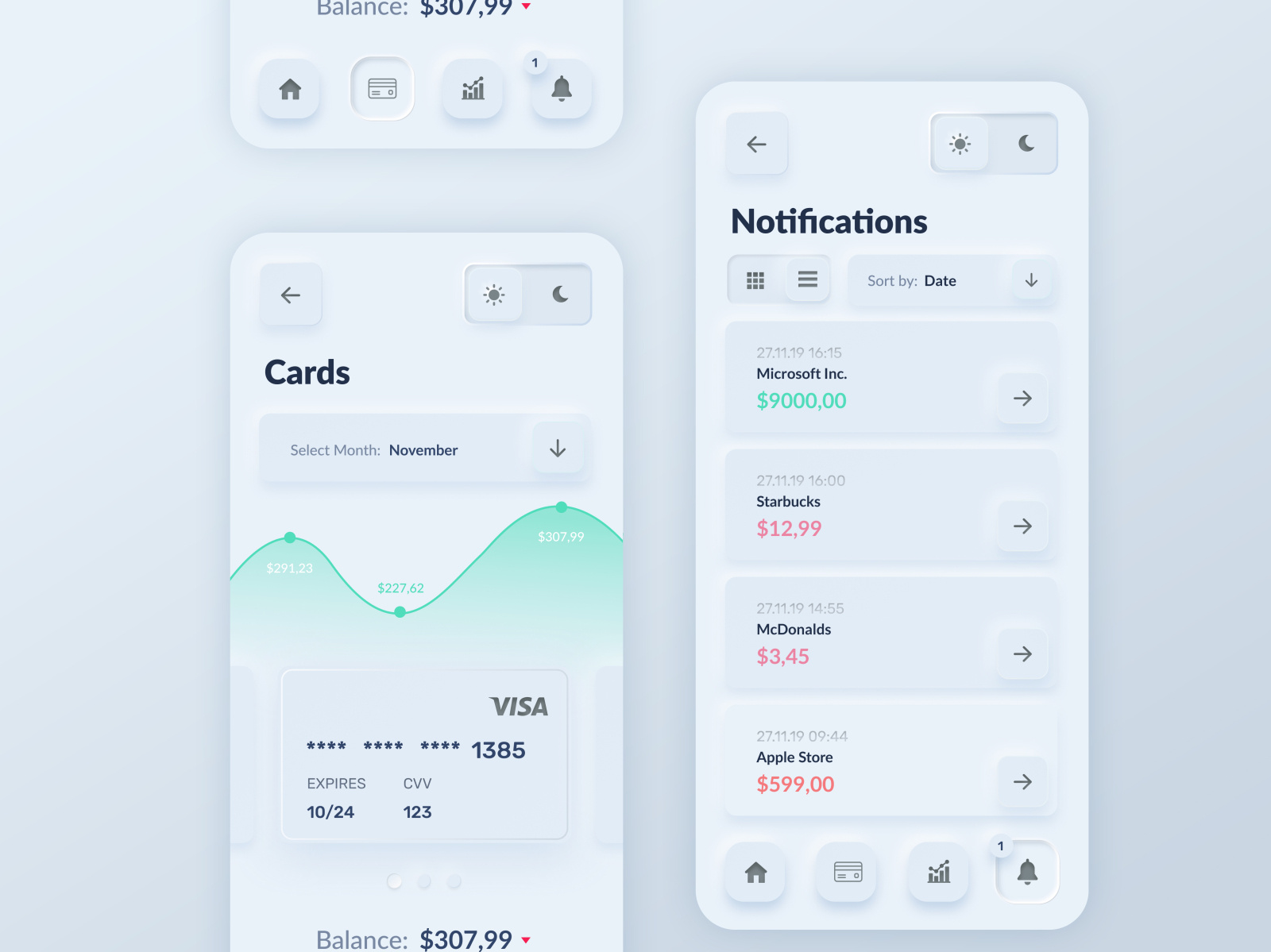
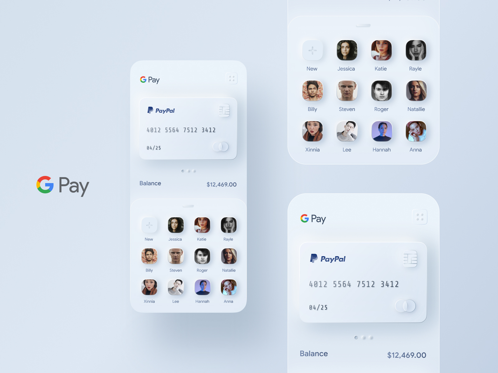
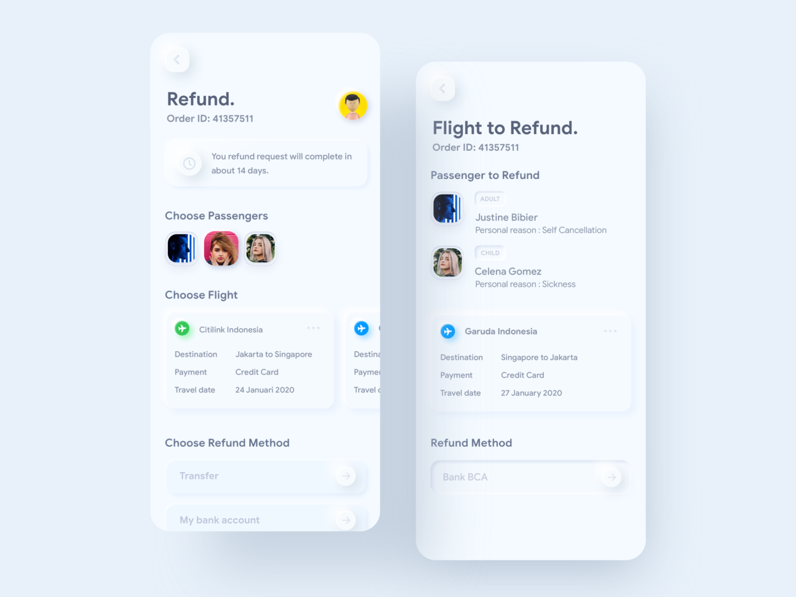
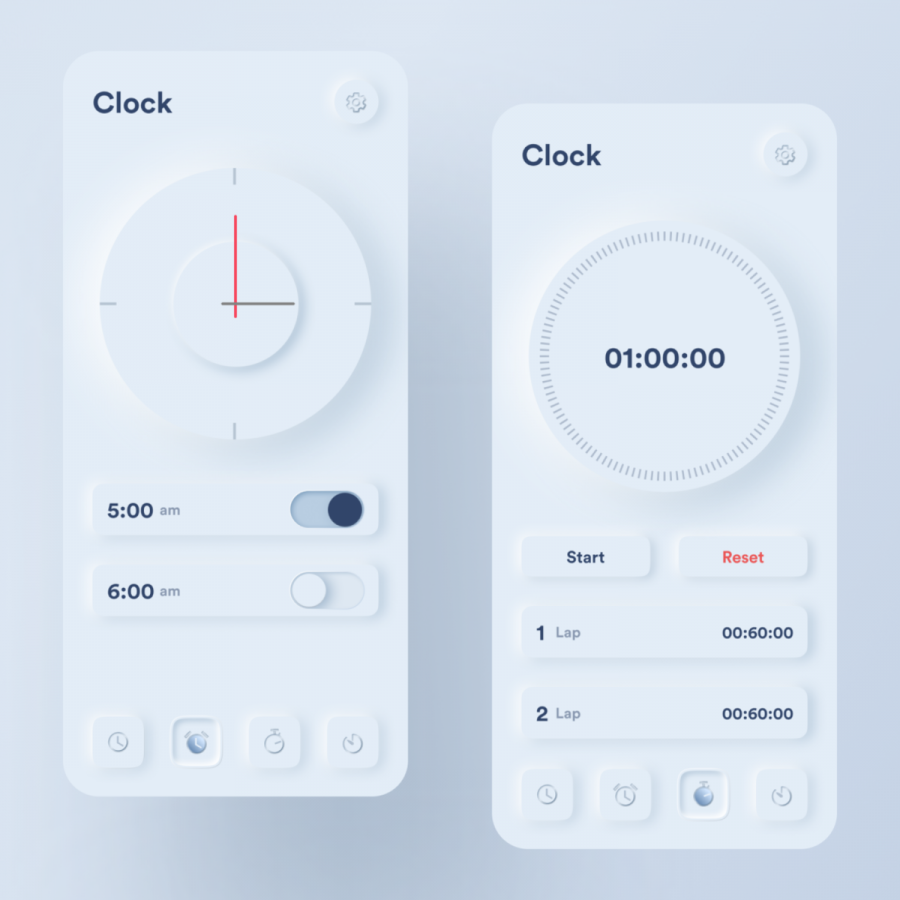
A couple of minutes ago, a good friend of mine living across the Atlantic sea. Sent me a 'designer meme' to laugh about. It was a joke about designer/developer handoff supported by a beautiful UI inspired by Skeuomorphism design from the old days, circa around the 2000s. It reminded me how this is making a comeback somehow, is it? It's kind of being inspired all together with recent 'chef d'oeuvre' related to 'Retrofuturism' mixed with spacial stuff. Since all UIs nowadays are designed to be flat, boring but integrated through systems. I think it's an upgrade to what's currently available and much simpler in terms of usability and a more graphical way. What do you think? Let's take a dive into 'Skeuomorphism' through hand-picked designs from Dribbble as you may pleased.
In this collection we are featuring the work from Mikołaj Gałęziowski, Jatin Lathiya, Dominik Nowakowski>, Devanta Ebison and more.
More Links
- For more, check out Dribbble
