by AoiroStudio
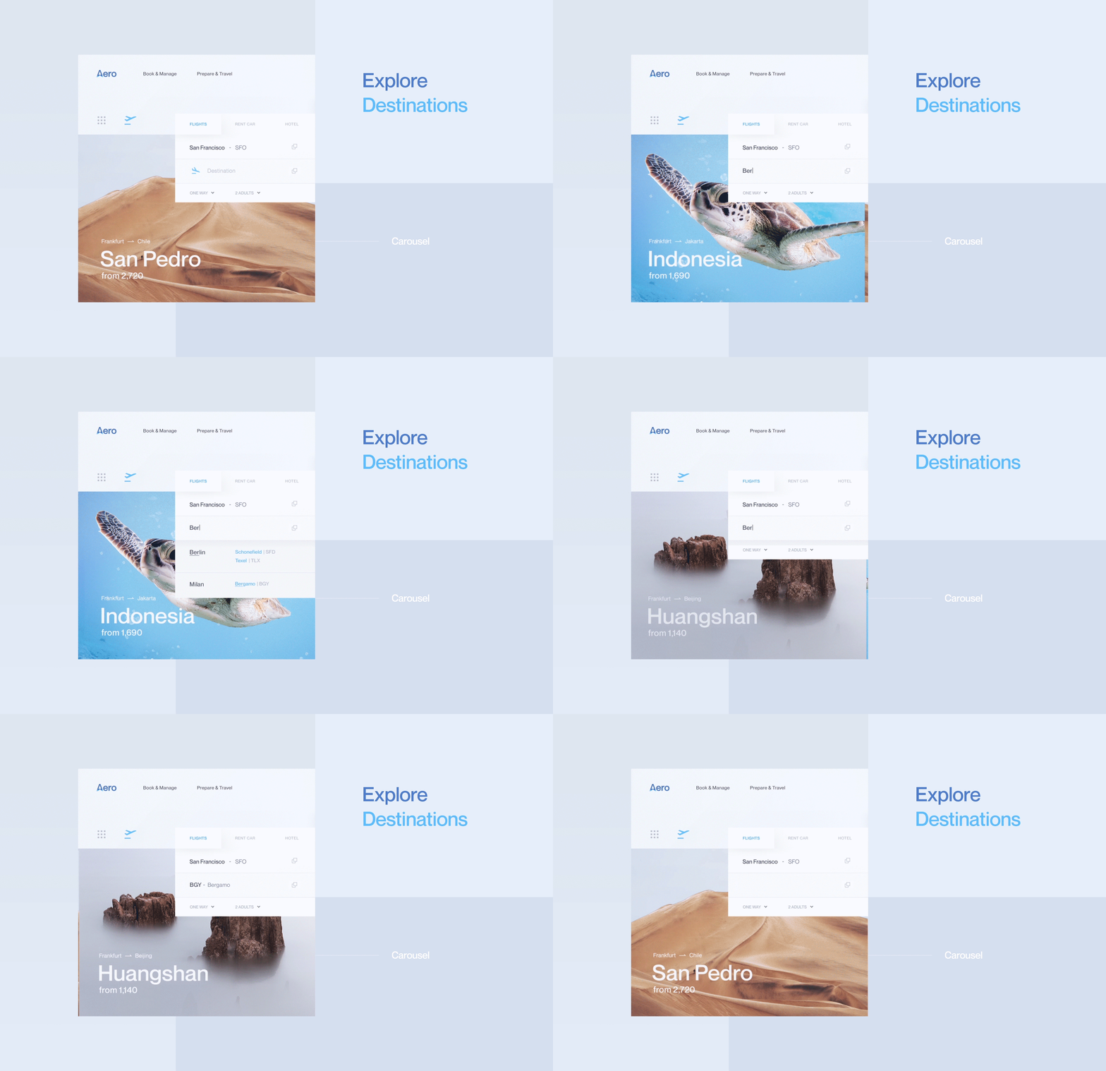
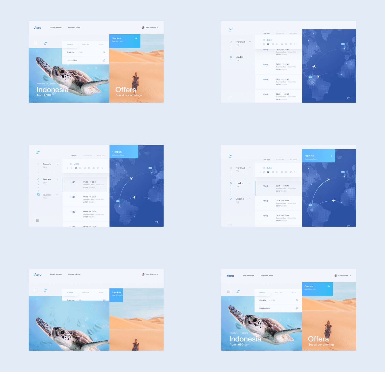
We are sharing the work from creative director Daniel Tan from Tofu Design based in Kuala Lumpur, Malaysia. Say hello to his concept entitled: Aero, a flight booking experience for the Web. At first glance, it's definitely an updated UI with "less clutter" that would just fill the experience with legal information and ad placements. There are cool ideas like the one-click access but I particularly like the "See your journey" feature, that's pretty neat and totally enhance the booking expectations. I wish we could have seen more of the responsive design or maybe this could have been just a desktop experience?! Nevertheless, it's an overall cool design.
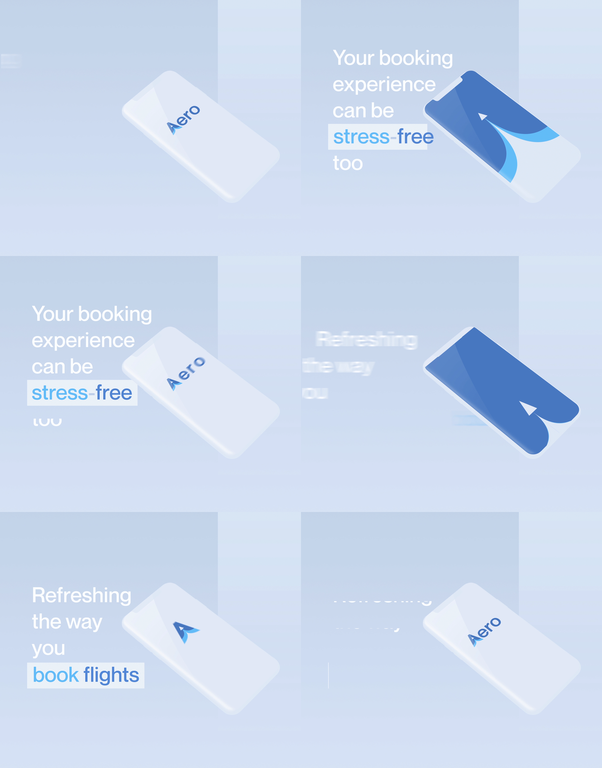
Aero - UI/UX and Website Design Booking flights and flying in general can be a completely stressful experience. Most sites bombard a ton of info to users - relevant or otherwise. What if there was a way to use the same processes but without the stress? Here’s my interpretation of what it could be - smoother, calmer, and easier.
