by abduzeedo
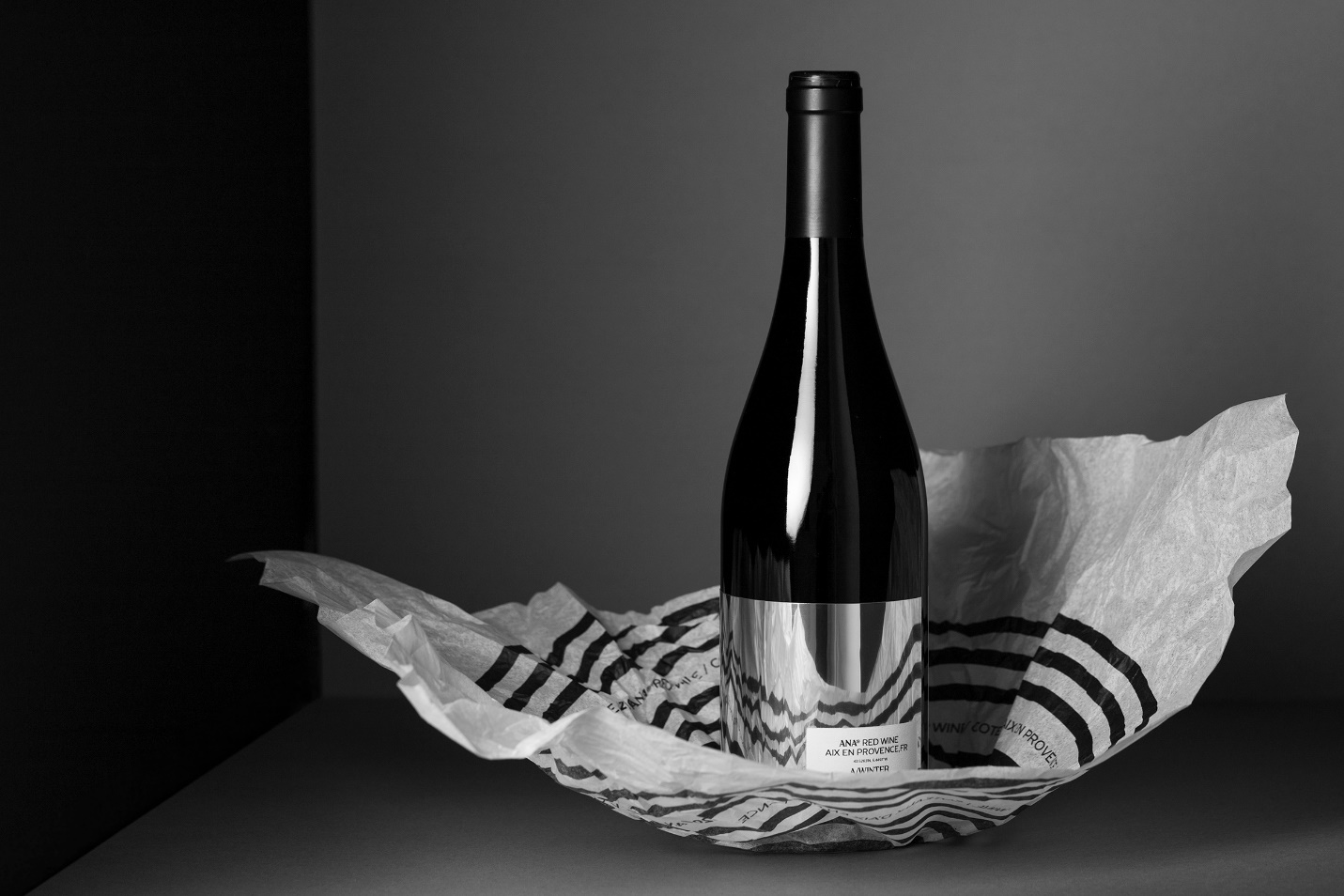
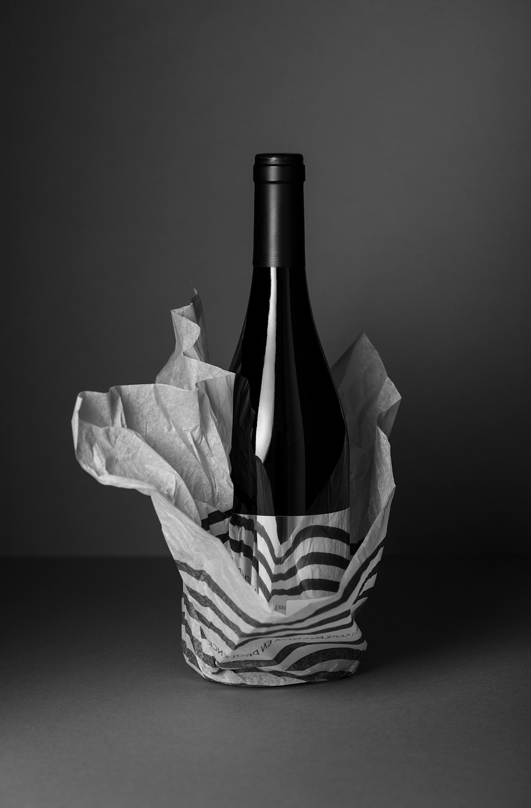
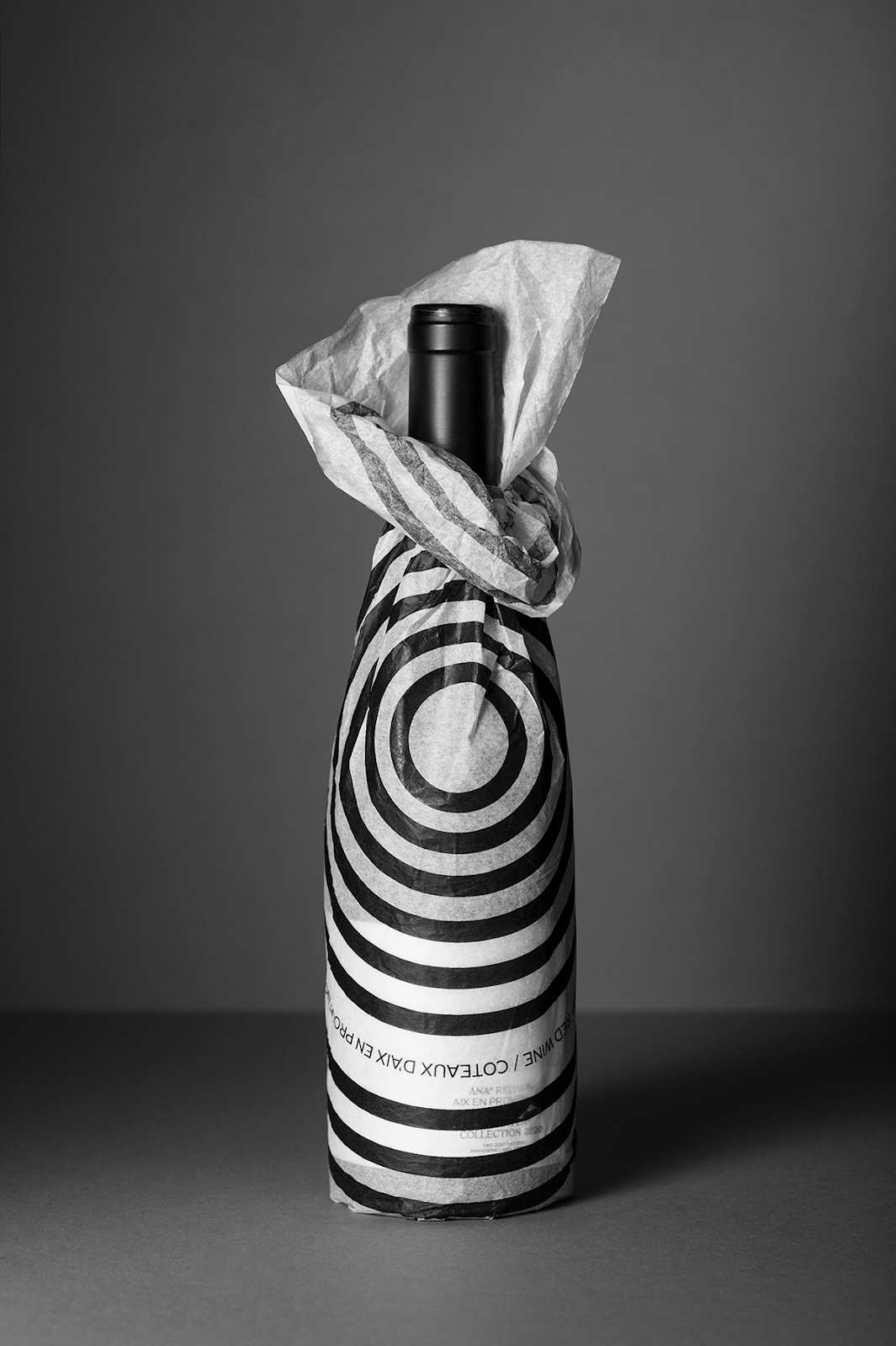
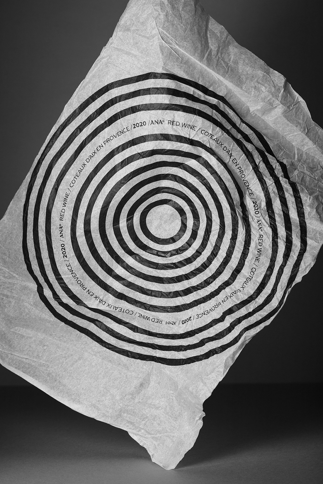
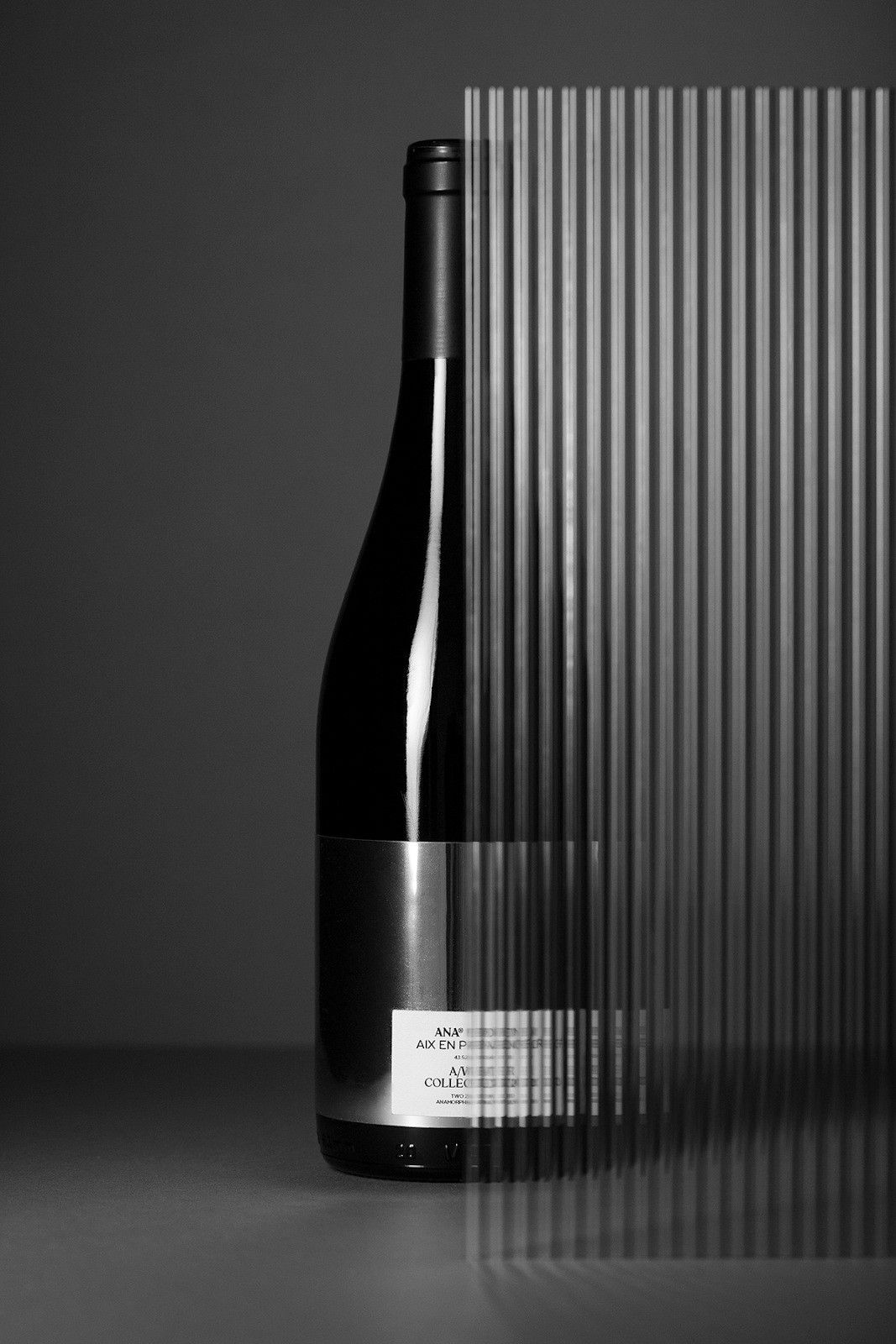
Studio Format shared a beautiful branding and packaging design for ANA RED WINE. A mirror can twist or distort our perception. It can cheat the eye, enhancing or fading some traits. More often than not, a mirror arises interest in the eyes of the viewer. Therefore, Studio format has chosen this perspective to design the ANA® project: a new red wine brand.
The idea developed here is to create an experience based on the fine line between perception and reality, a visual parallelism with alcohol. This experience will disrupt our senses by creating an anamorphosis using the packaging’s volume, shape and print against the mirror of the tag.
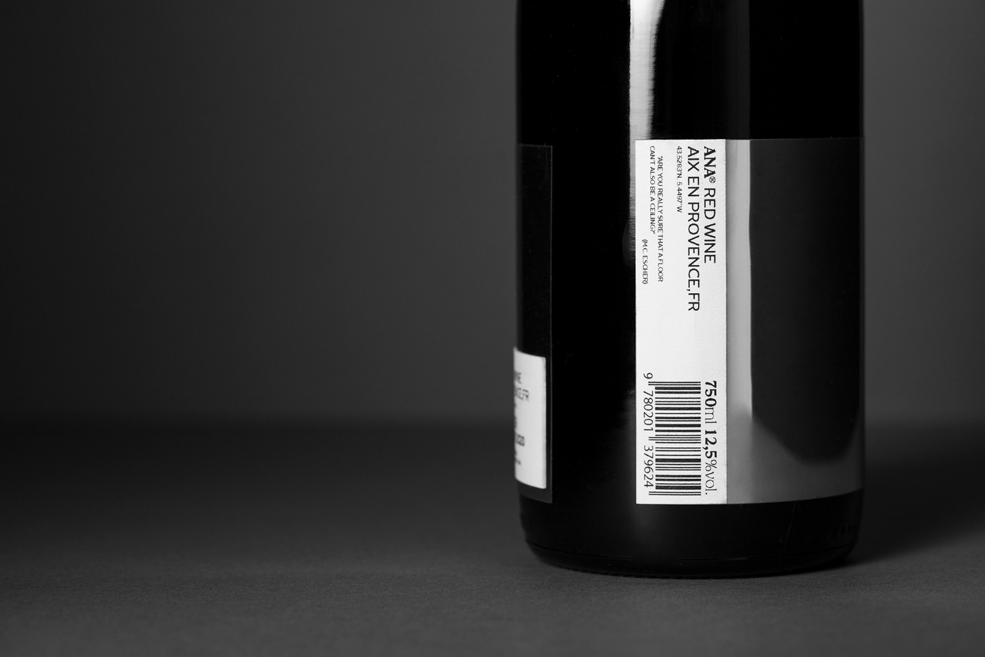
"Are you really sure that a floor can't also be a ceiling?" Maurits Cornelis Escher
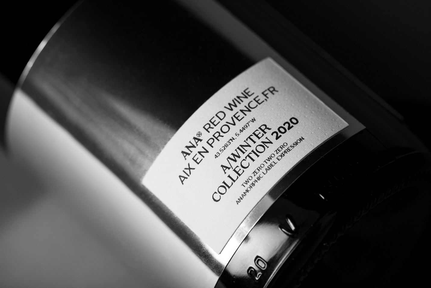
The consumer will be able to play with the graphic systems, the typography and the brand’s pattern. It will enable everyone to create their own tag using the world surrounding them.