TEDx Brescia - Branding and Visual Identity
OSMO DESIGN shared a branding and visual identity for TED. Having a role in organizing a TED event is simply a rewarding experience. We are big supporters of what TED is all about so with this type of project, there is a lot of pleasure in just being part of the team. In 2020 our friends from Basilico organized the TEDx event in our city for the second time and asked us to take care of the art direction and visual design. The challenge? Organizing such a crucial event during the Covid pandemic’s first lockdown.
THE LANDSCAPE
REPRESENTING A
UNIQUE MOMENT
IN HISTORY
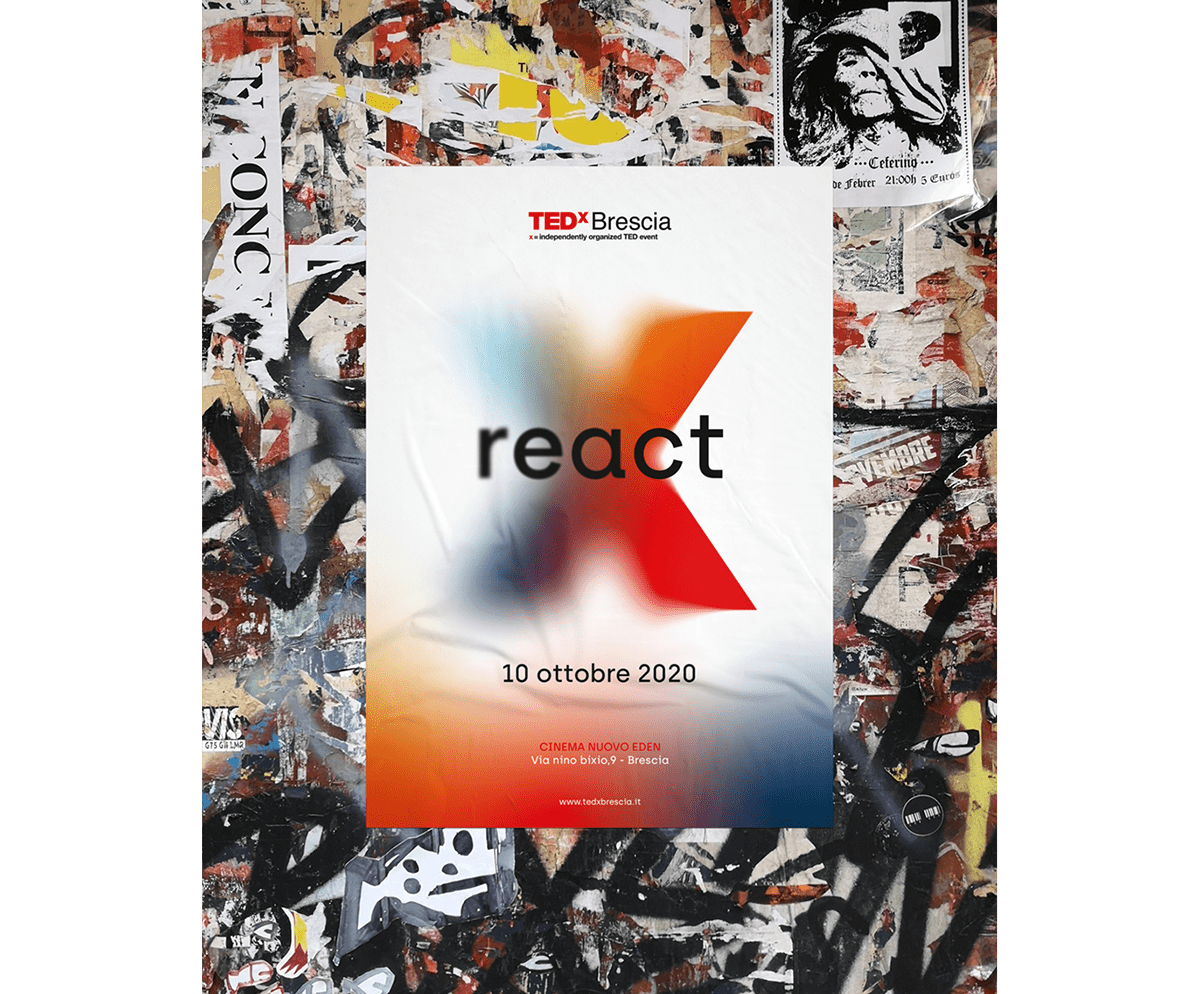
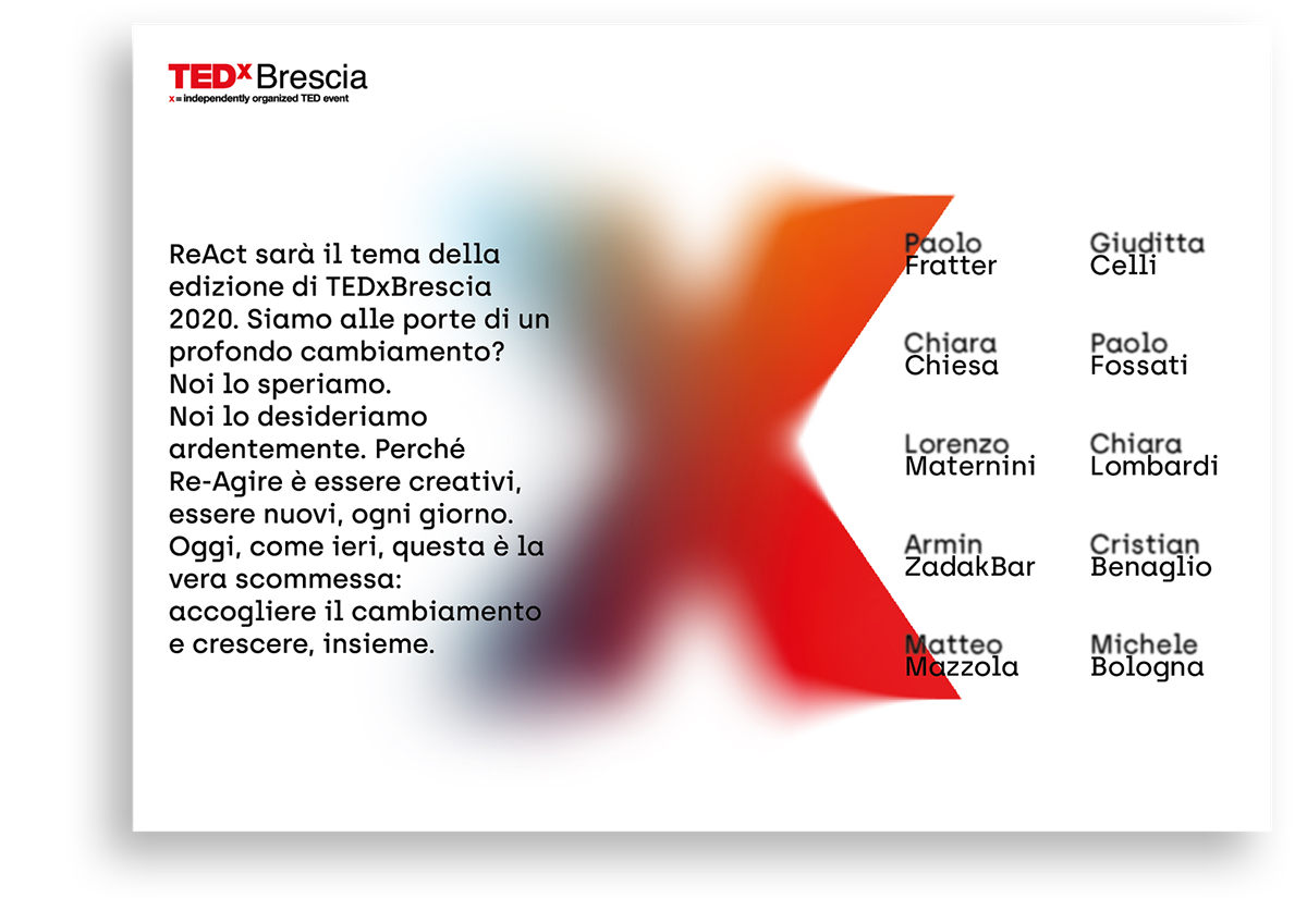
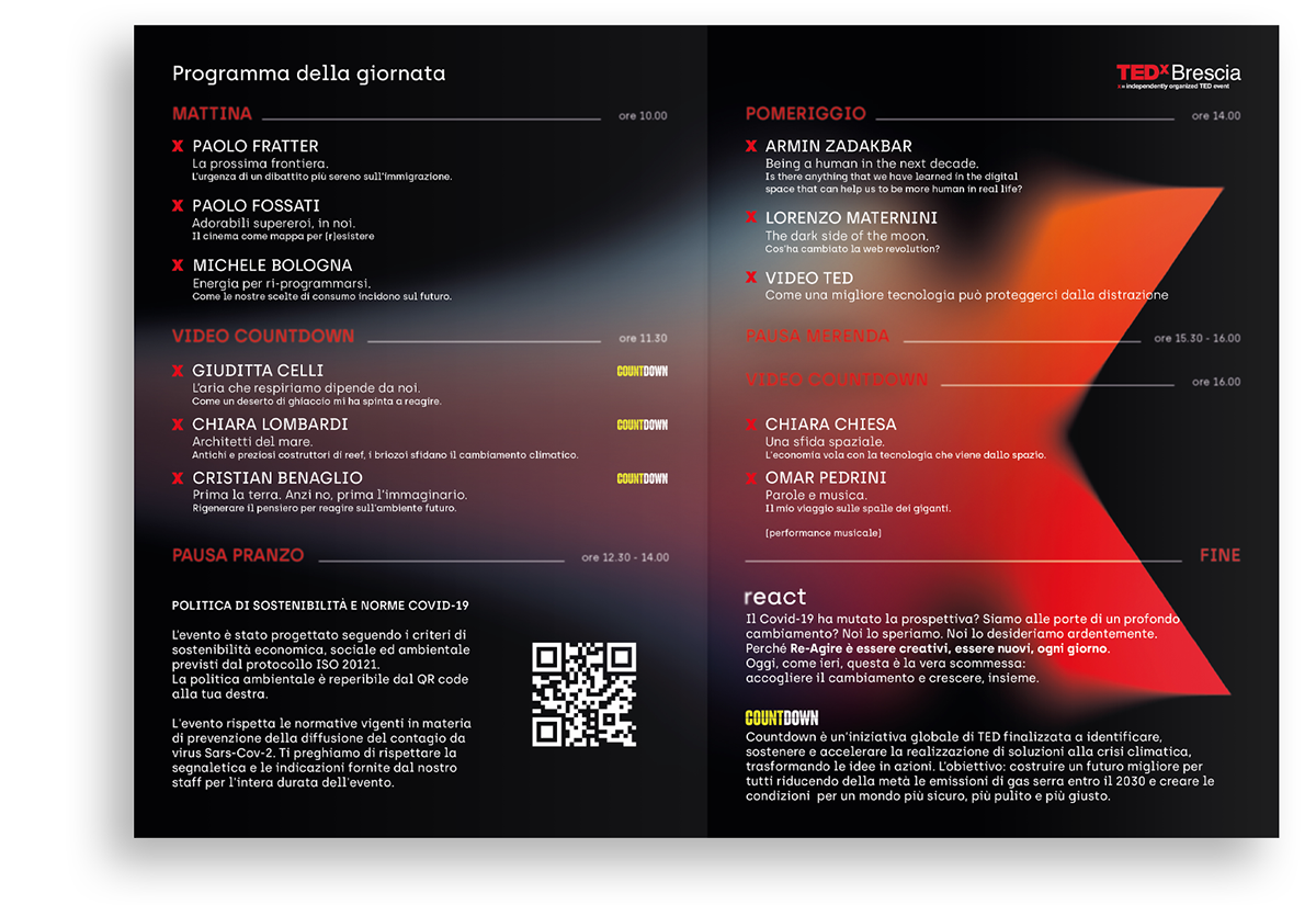
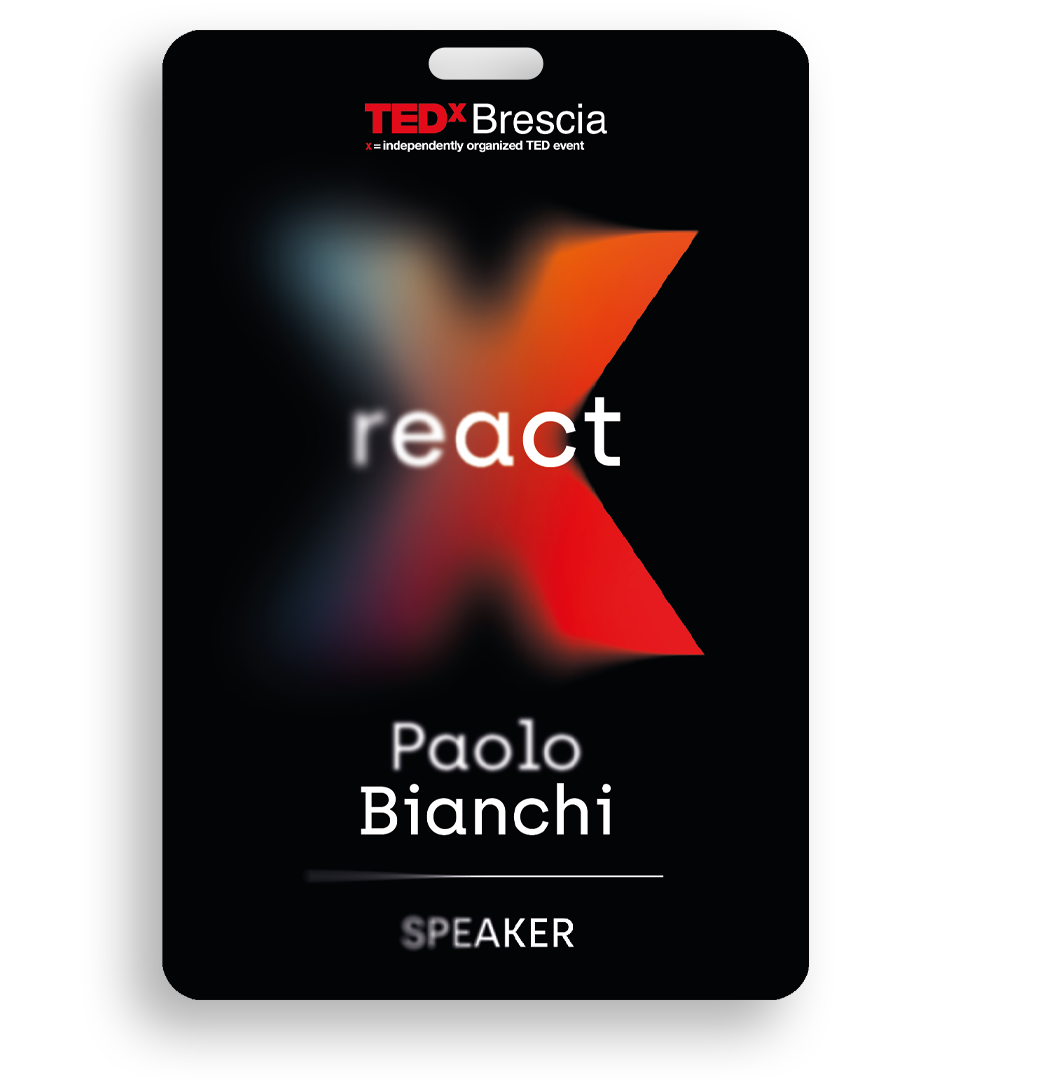
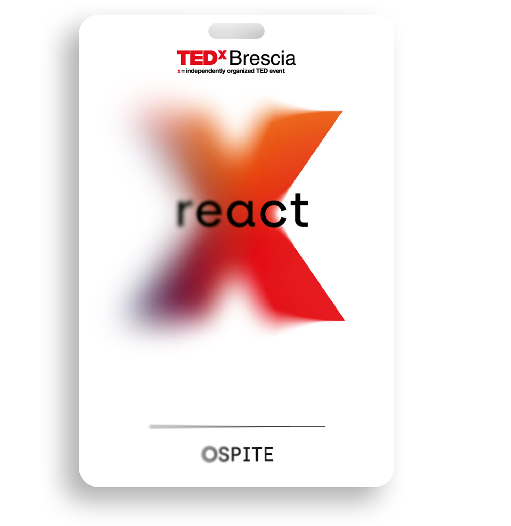
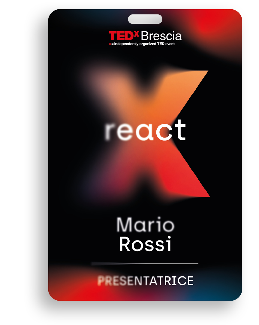
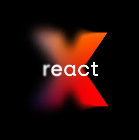
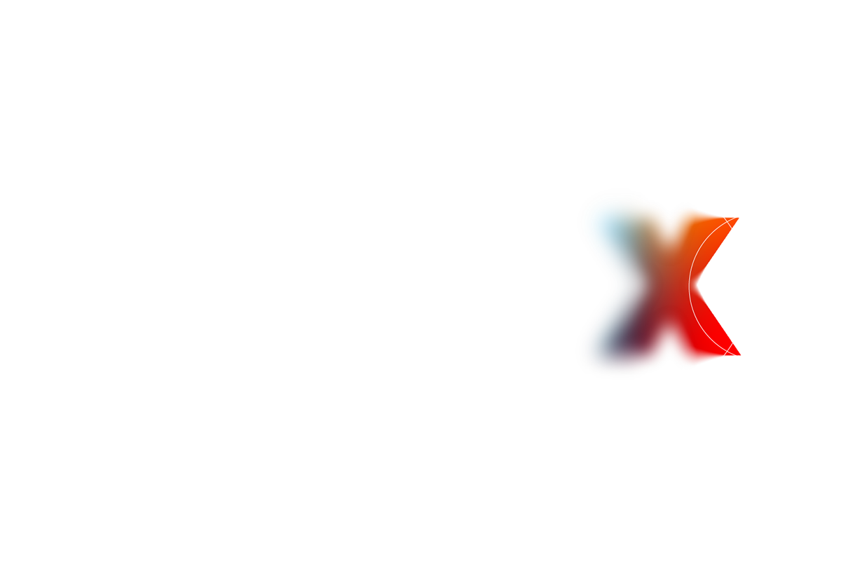
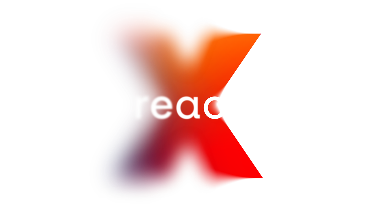
The theme of the event was REACT, a nod to the challenging period the globe was currently facing.
The changes, or ‘reactions’, that individuals and organizations have put in place during this particular moment in history have assumed their own unique value. Every one of us has found ourselves having to make decisions in different ways - with less information or operating within new parameters. We have had to adapt to rules that just months before would have seemed unimaginable.
Never before had we worked on a project that would invite us to think so deeply about our own experience, and we instantly recognized the value that could be created through sharing experiences.
Brand
REACTING TO
THE PANDEMIC:
3 PHASES
As soon as we started the project we began paying close attention to what was happening to us, our colleagues and our family. We identified three phases that made up the reaction to the situation we were experiencing.
The first phase is one of confusion, fueled by an overabundance of often contradictory news and an increasingly difficult situation to manage. This hazy feeling begins to evolve into a yearning for focus on possible solutions - phase 2. In the third phase we see ourselves more as protagonists, making clear choices and trying to create some sort of comfort and pleasure in the new experience of lockdown.

DESIGNING
CLARIFICATION
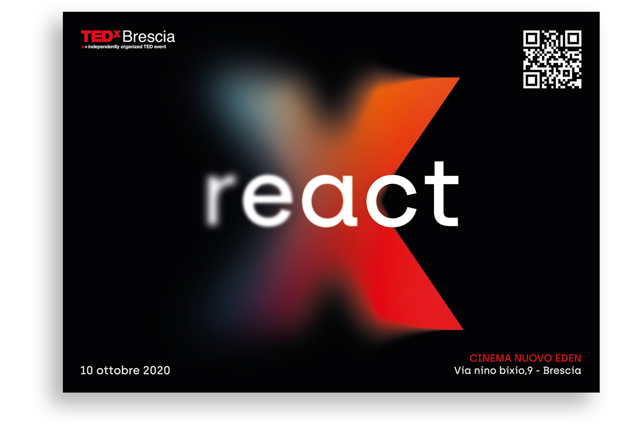
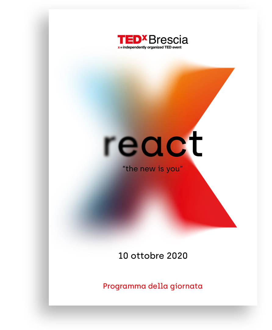
— "We looked for a language to visualize these phases while working on a REACT-themed typography and design. We decided to depict the REACT word as an evolutionary timeline of the pandemic experience, with the first part blurred through graphic rendering and the rest of the word becoming progressively more clear."
The graphic blur pattern became the foundation of the visual image and has been applied to the copy, graphic motifs and images.

Typography
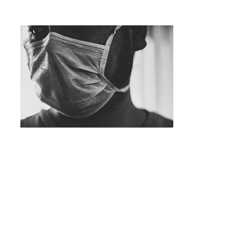
The Covid emergency accelerated the increased digitization of our day to day lives. When difficulties arose, technology was there to assist, protect and entertain us all. 3D-printed respirators, virtual family lunches, smart working - what seemed to be the future such a short time ago has undoubtedly become the present.
— We wanted our visual image to pay tribute to how technology has helped humankind to ‘react’ to this almighty challenge. For that reason we chose the Archia font, a sans serif typeface based on geometric shapes with a "technological" approach.
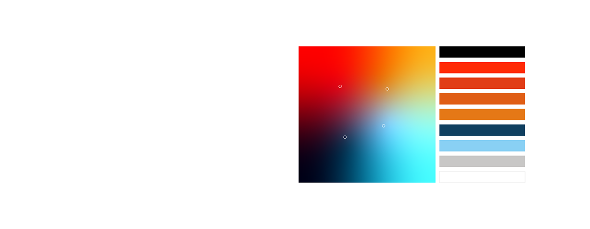
Color
The colors symbolize diversity, encapsulating the technological, scientific and cultural elements that came together during lockdown for the benefit of all. We started with the corporate colors of TED and enriched them with bright basic colors. We decided to use them in a gradient way to have a color spectrum that emerges and intensifies, representing the power and value of the community involved.
ONE VISUAL
DESIGN,
MULTIPLE
FORMATS
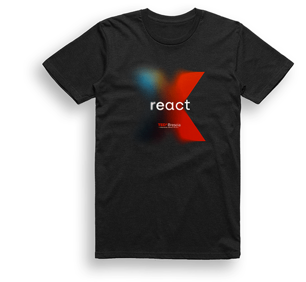
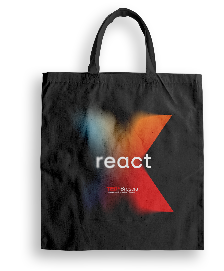
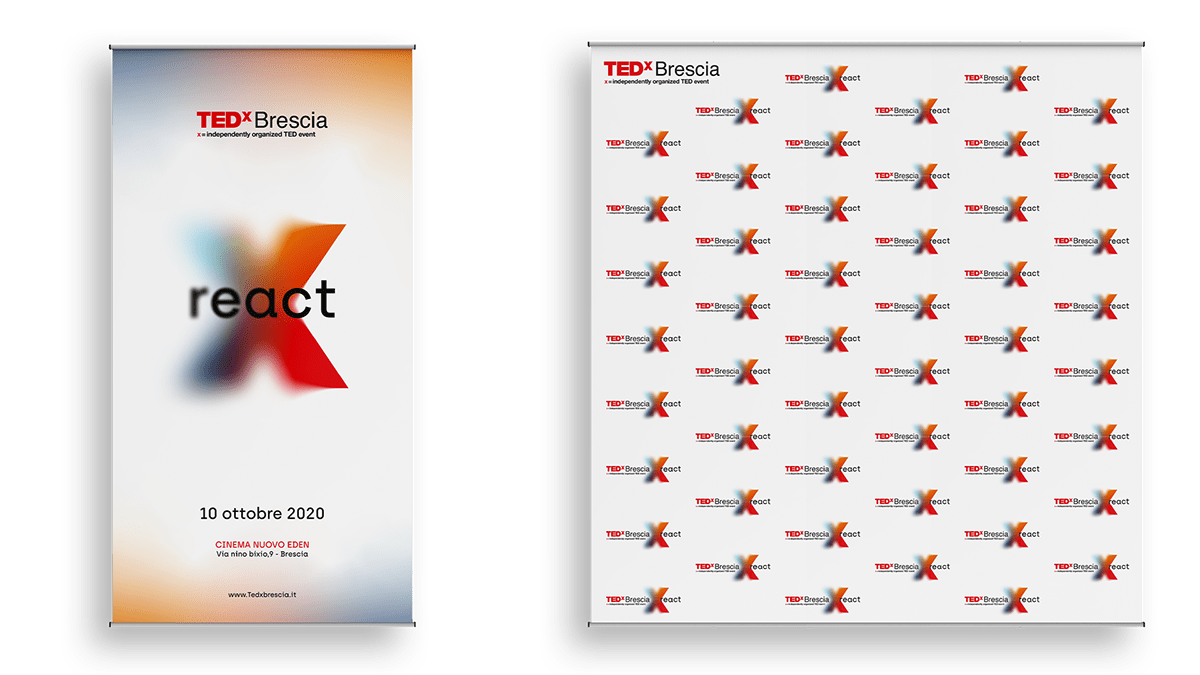
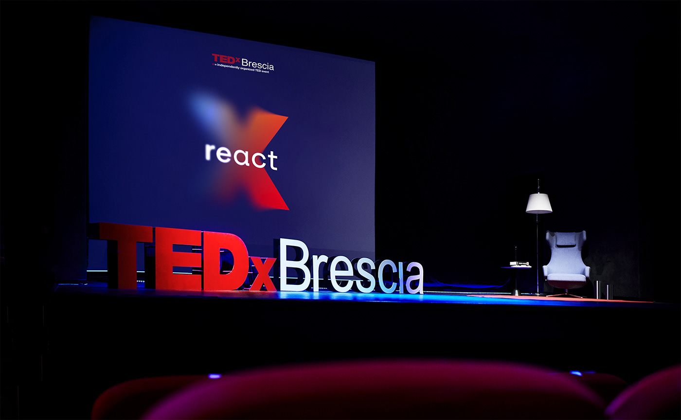
An event needs the production of material for both promotion and the event itself. We worked on the design and preparation of the imagery for billboards, roll ups, flyers, posters as well as merchandise such as t-shirts and canvas bags.