Barrel Riot: Crafting a Wine Branding and Visual Identity
Explore how MiresBall crafted Barrel Riot's unique visual identity, blending tradition with a rule-breaking spirit. Discover innovative branding.
Hey creative peers! Let's dive into a case study that really pops: the branding for Barrel Riot. This isn't your typical wine brand. It's about an unconventional approach to winemaking, using spirit-barrel aging to create an intense, complex character. The team at MiresBall really nailed the visual identity for this one.
The Spark: A Name Born from Process
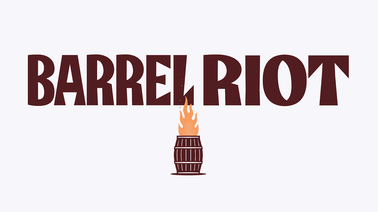
MiresBall understood that this wine needed a name and look that screamed "rule-breaker." Their inspiration? The spirit barrel-making process itself. That's how "Barrel Riot" came to be. It's a name that instantly communicates the brand's adventurous spirit.
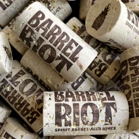
Visual Identity: Scorched Cork and Bold Colors
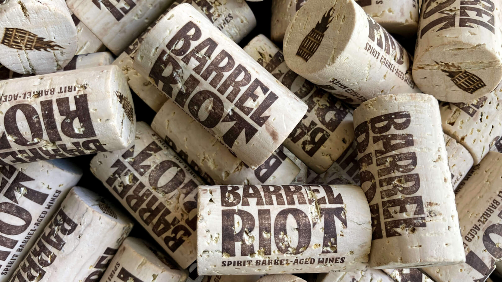
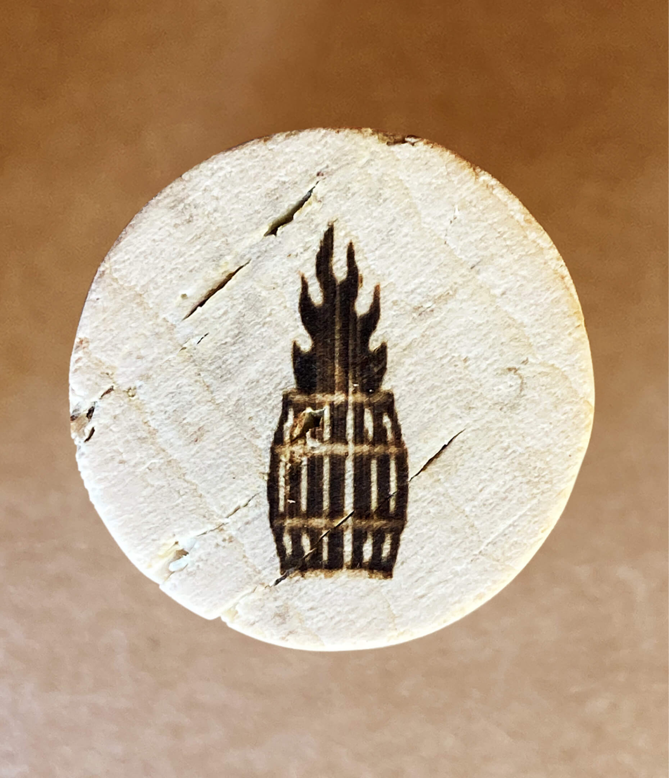
The visual elements are key to Barrel Riot's identity. Take the scorched cork emblem. It's a smart piece of design. It signals a wine bursting with flavor, but also acts as a consistent identifier across all product variations. You can see this emblem clearly on the corks themselves (Image 1, page 2; Image 2, page 3). It’s a subtle yet powerful detail.
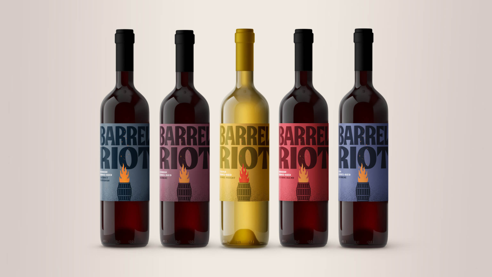
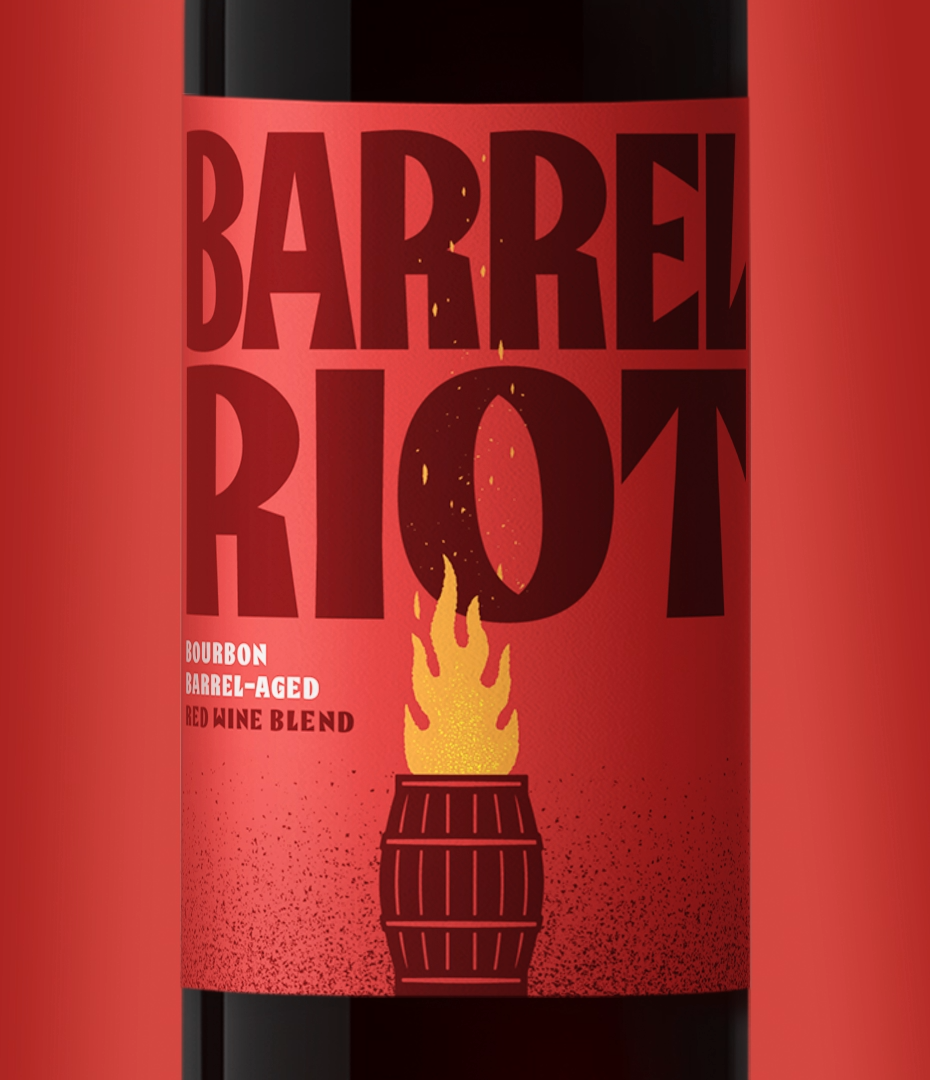
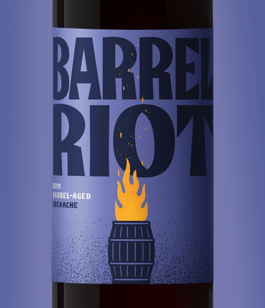
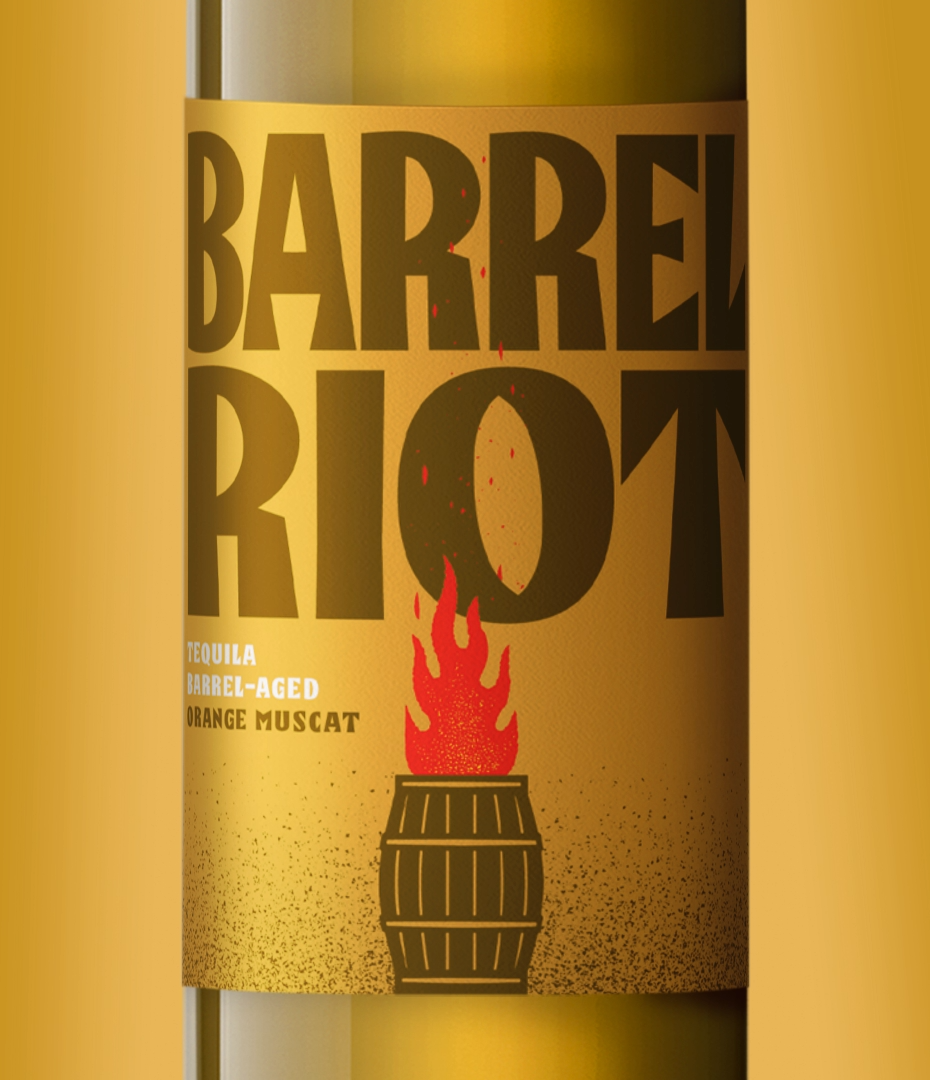
The labels use strong color reads to identify wine varietals. This also amplifies taste appeal. Look at the lineup of bottles (Image 3, page 4). Each color instantly tells you something about the wine inside. For instance, the Bourbon Barrel-Aged Red Wine Blend uses a vibrant red (Image 4, page 5), while the Rum Barrel-Aged Grenache features a deep purple (Image 5, page 6). The Tequila Barrel-Aged Orange Muscat gets a rich gold (Image 6, page 7). This system is flexible, ready to grow as Barrel Riot introduces new wine and spirit barrel combinations.
The Story: A Triumph Over Typical
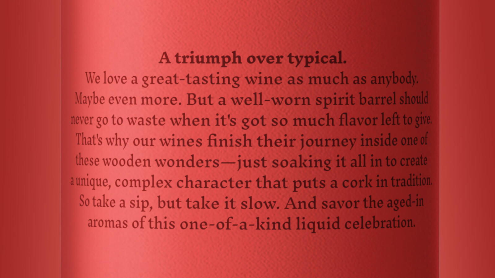
The brand story is just as compelling as the visuals. It celebrates an adventurous, "try-anything" attitude. The back of the bottle reads, "A triumph over typical. We love a great-tasting wine as much as anybody. Maybe even more. But a well-worn spirit barrel should never go to waste when it's got so much flavor left to give. That's why our wines finish their journey inside one of these wooden wonders—just soaking it all in to create a unique, complex character that puts a cork in tradition. So take a sip, but take it slow. And savor the aged-in aromas of this one-of-a-kind liquid celebration."
Dan Lipsky, owner of Barrel Riot, sums it up perfectly: "Our brand is defined by the dramatic difference between us and other wines. MiresBall understood our message and infused it into a name, logo, and image that set us apart from the competition. I couldn't be happier." This partnership highlights the power of a design studio truly understanding a client's vision.
This project is a fantastic example of how strong branding and visual identity can elevate a product. MiresBall didn't just design labels; they crafted a whole personality for Barrel Riot. It shows that even in traditional industries, there's always room to break the mold with smart, impactful design.
Want to see more of their work? Check out MiresBall's portfolio: https://miresball.com/work/barrel-riot/
Branding and visual identity artifacts