by abduzeedo
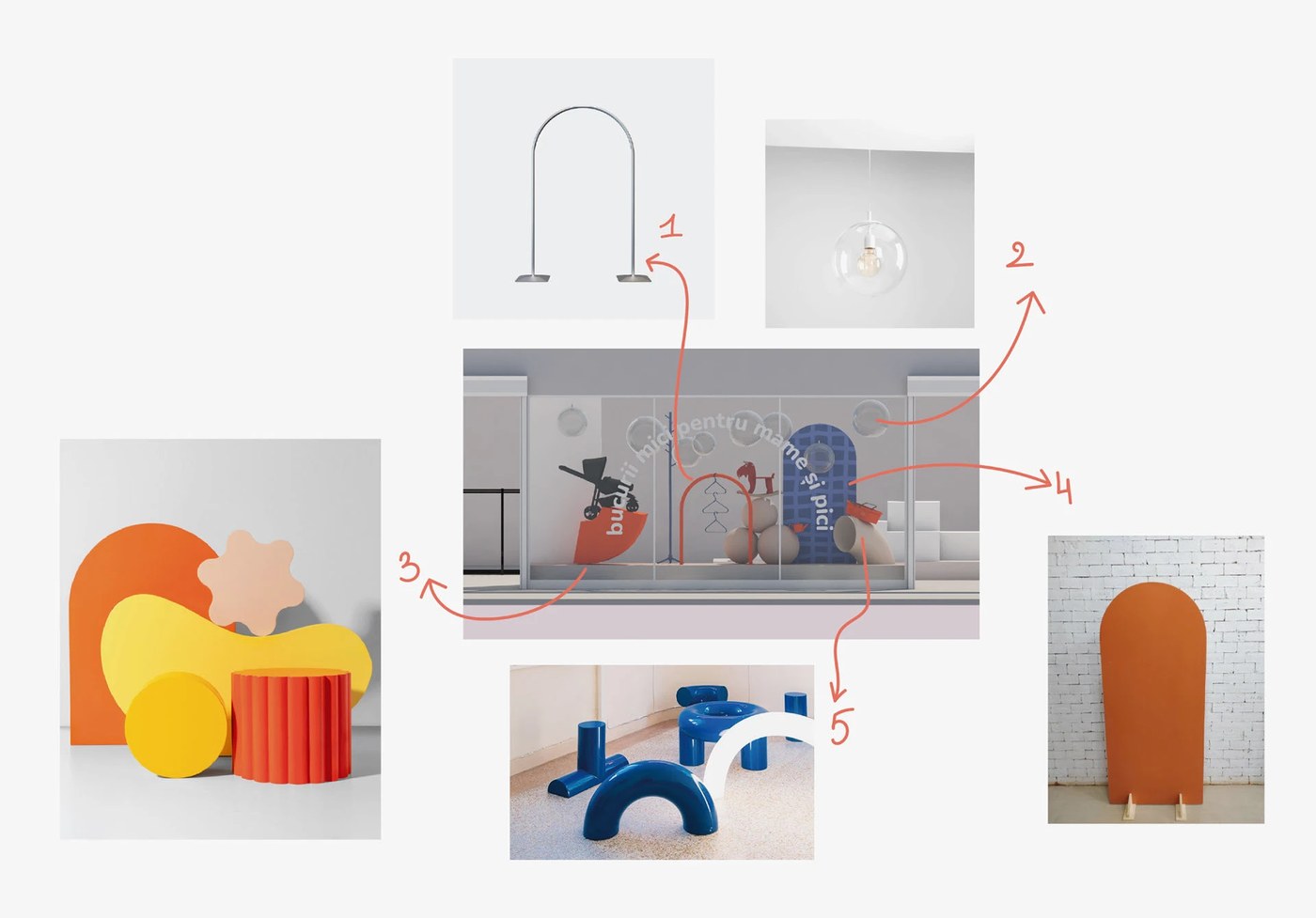
TRUE AGENCY's Mamico kids store branding covers 1,700 m² — isometric zoning maps, coral-orange play structures, and a double-heart M mark at every scale.
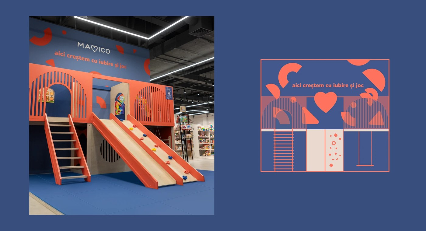
The palette is three values: deep navy (#3B4A7A), coral-orange (#E8573A), and off-white. No exceptions across the kids store branding — signage, bags, and architecture. TRUE AGENCY used isometric 3D room cutaways on a navy field to map childhood-stage zones. Each cutaway shows a furnished nursery with the coral accent ladder and brand copy at 18pt on the walls. The M is a double heart — two arched forms that read as both the letter and a heart, scaling from wall mural to bag handle without losing shape.
Mamico Kids Store Branding: When the Space Is the Identity
The birch plywood and coral-orange steel play structure makes the kids store branding physical. TRUE AGENCY drew a flat illustration of the same structure for print, placing object and graphic twin side by side. Two bag variants on warm sand — navy with an oversized heart-M, white grid with a small navy mark — are shot as matched specimens, not lifestyle props. This is kids store branding where the architecture is a touchpoint.
See the full project by TRUE AGENCY on Behance.