by jeff
QUENTO is a Didone display typeface by Kimmy Lee and Petros Afshar. Extreme stroke contrast, true vertical axis, and 550+ glyphs for editorial headlines.
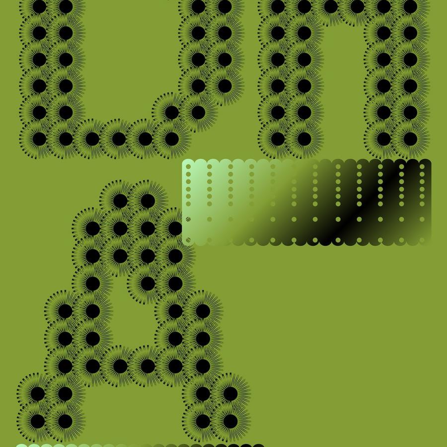
QUENTO is a Didone display typeface built on one structural commitment. Hairline horizontals at 1–2pt optical weight against verticals near 90pt — the stroke contrast is absolute, not approximated. Ball terminals on a, c, f, r, and y land as optically centered teardrops. At headline scale, they read as punctuation marks, not ornament. The stress angle sits at true vertical, 0°. That rigid upright axis is what separates QUENTO from sloped oldstyle serifs. Kimmy Lee and Petros Afshar present the design in pure monochrome — black letterforms on white, white on black. No color to distract from the anatomy.
QUENTO Didone Display Typeface: Stroke Contrast for Editorial Headlines
The Didone tradition runs from Bodoni and Didot to decades of magazine mastheads and luxury brand marks. QUENTO recalibrates it for screen resolutions the originals were never cut for. The 550+ glyph set covers extended Latin, ligatures, and accents — a working display typeface design, not a decorative novelty. A free demo makes it testable before any commitment. The full commercial release handles multilingual typesetting.
See the full project by Kimmy Lee & Petros Afshar on Behance.