by abduzeedo
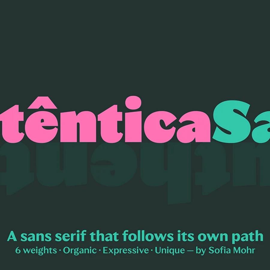
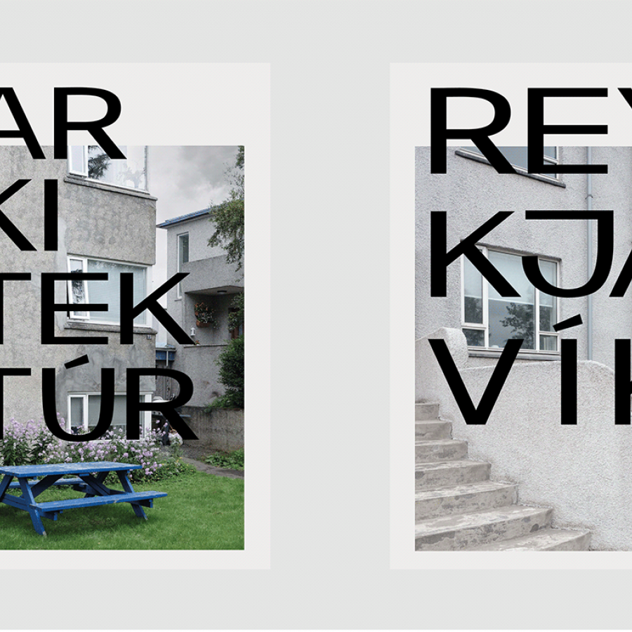
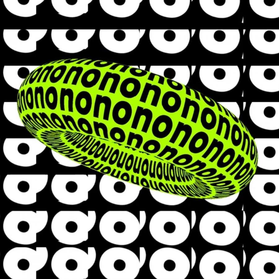
Martin Aleith and the amazing type designers from PFA Typefaces shared their new creating: Haben Grotesk, a contemporary more constructed low contrast sans serif typeface. Its geometric approach is influenced by some of the classic Grotesk typefaces like Helvetica or Neue Haas. But unlike these traditional ones Haben Grotesk really shows humor. It draws attention through one characteristic refinement that runs throughout the glyph set. While the outer edges of almost all glyphs are rectangular, the inner edges are rounded. This makes Haben an unmistakably confident typeface and will add a casual elegance to your work.
The family is available in six weights ranging from Light to Extra (Black) with matching Italics. In rejection of the ordinary the Haben Grotesk is a uniwidth typeface, where each glyph doesn’t change its width between all styles which means the text layouts remain the same in the event of changing the font style. The typeface covers all Latin Extended-A languages, includes a character set of +950 glyphs and offers a wide range of Opentype features. There is a huge selection of functional and unexpected shapes to discover.
For more information make sure to check out PFA Typefaces

