by ibby
RE:CHEMISTRY gets a bold new brand design and visua identity by NOT Wieden+Kennedy—featuring flipped visuals, vibrant pink, and creative design
What do you get when a former Premier League footballer teams up with a creative agency that dares to call itself “NOT” Wieden+Kennedy? You get RE:CHEMISTRY—a science-backed, planet-loving branding and brand identity that’s as bold as it is brilliant.
The Basics
RE:CHEMISTRY is the flagship innovation from GFBiochemicals, a company co-founded by ex-Arsenal player Mathieu Flamini (yes, really). Their mission? To replace fossil-based chemicals in everyday products—think detergents, paint, shampoo—with safe, sustainable, natural alternatives.
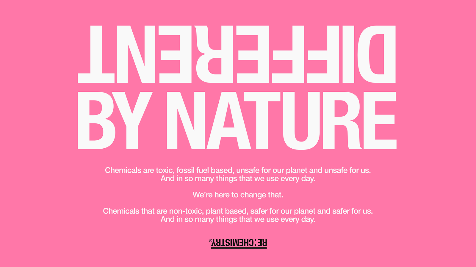
Enter the Flip
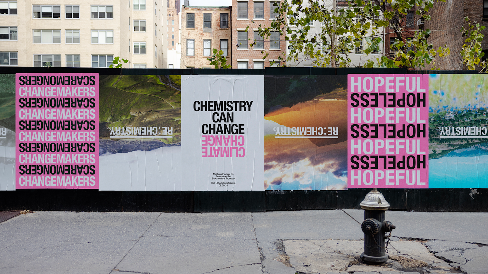
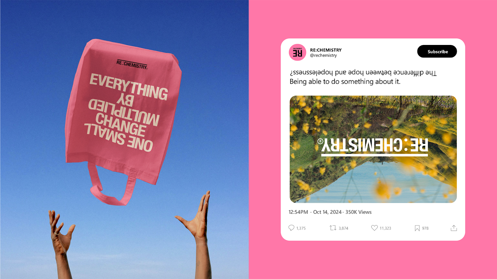
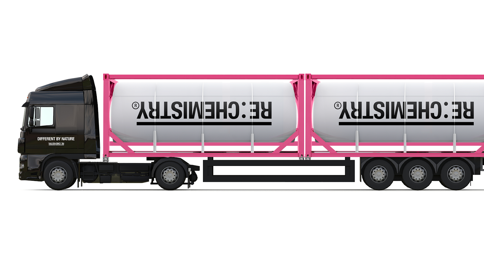
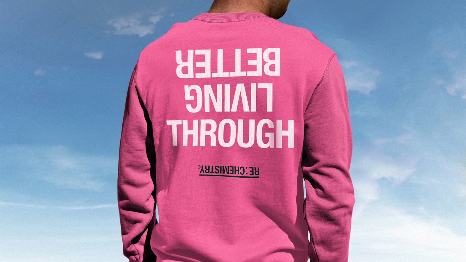
To communicate just how game-changing RE:CHEMISTRY really is, NOT Wieden+Kennedy (based in London and clearly having fun with naming conventions) introduced “the flip” as the center of the visual identity. Why? Because this technology quite literally flips the script on the chemicals we use every day.
The brand is full of delightful design twists:
- A logo that’s upside down (yes, on purpose)
- Typography and language that play with opposites
- Flipped images of nature and products that challenge the norm
- A loud-and-proud vibrant pink palette that breaks from the predictable blues and greens of “clean” branding
Why It Works
We’ve always believed chemistry can change our lives for the better. This new identity reflects that radical optimism.
The identity doesn’t just look good—it feels like change. It’s rebellious, smart, and unexpected. It reminds us that innovation doesn’t need to whisper—it can shout in hot pink and inverted logos. Mathieu Flamini puts it best:
Brand Design Takeaway
When your mission is to reinvent the chemical makeup of everyday life, you need a brand system that’s just as transformative. This one flips expectations—literally. Check out the full look at re-chemistry.com and learn more about the minds behind the magic at notwk.london.