by abduzeedo
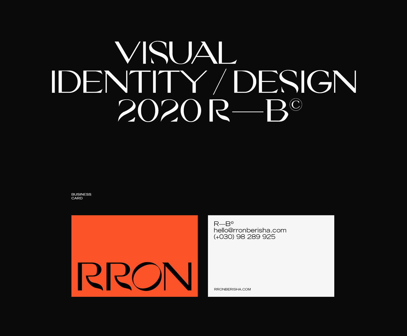
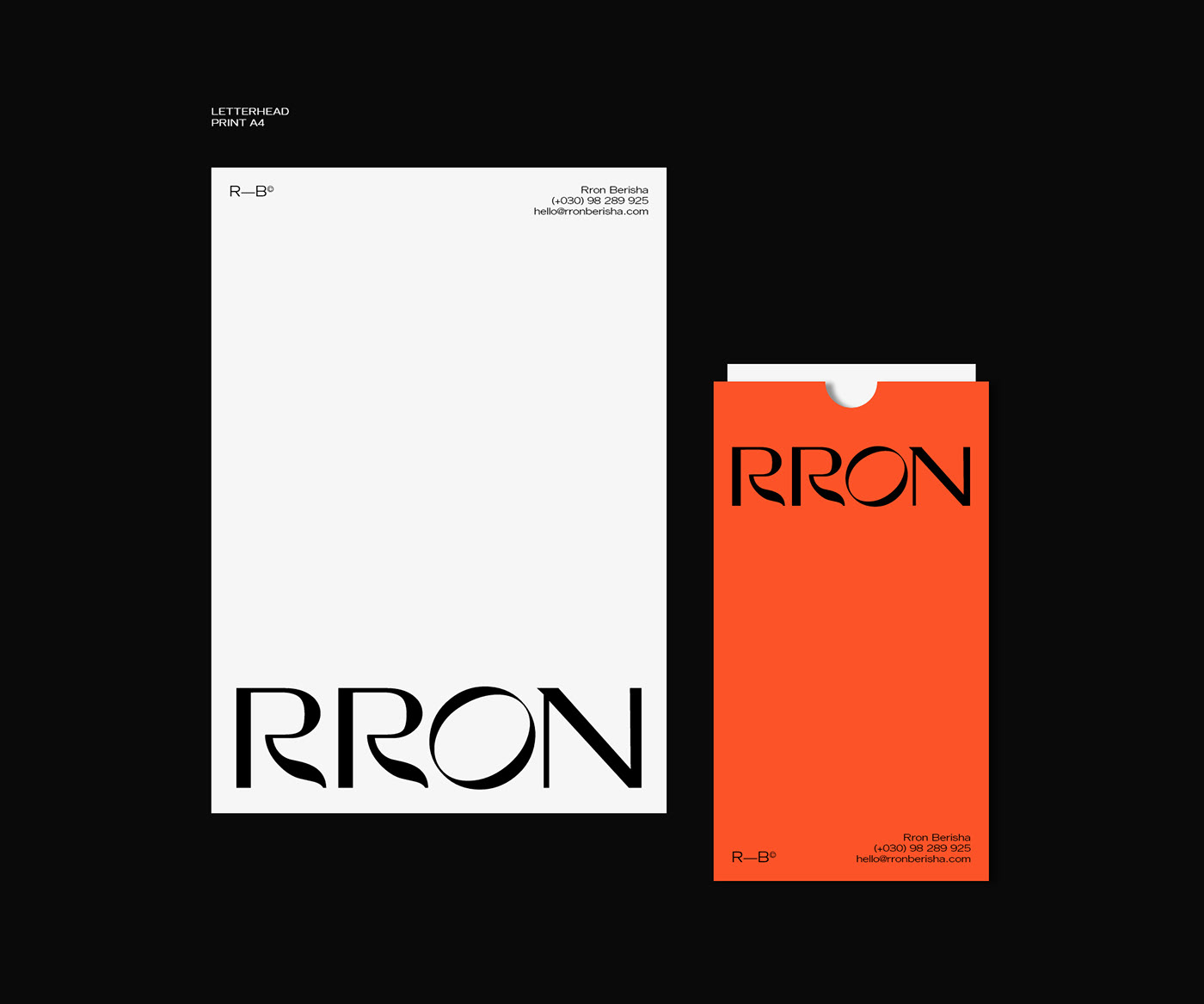
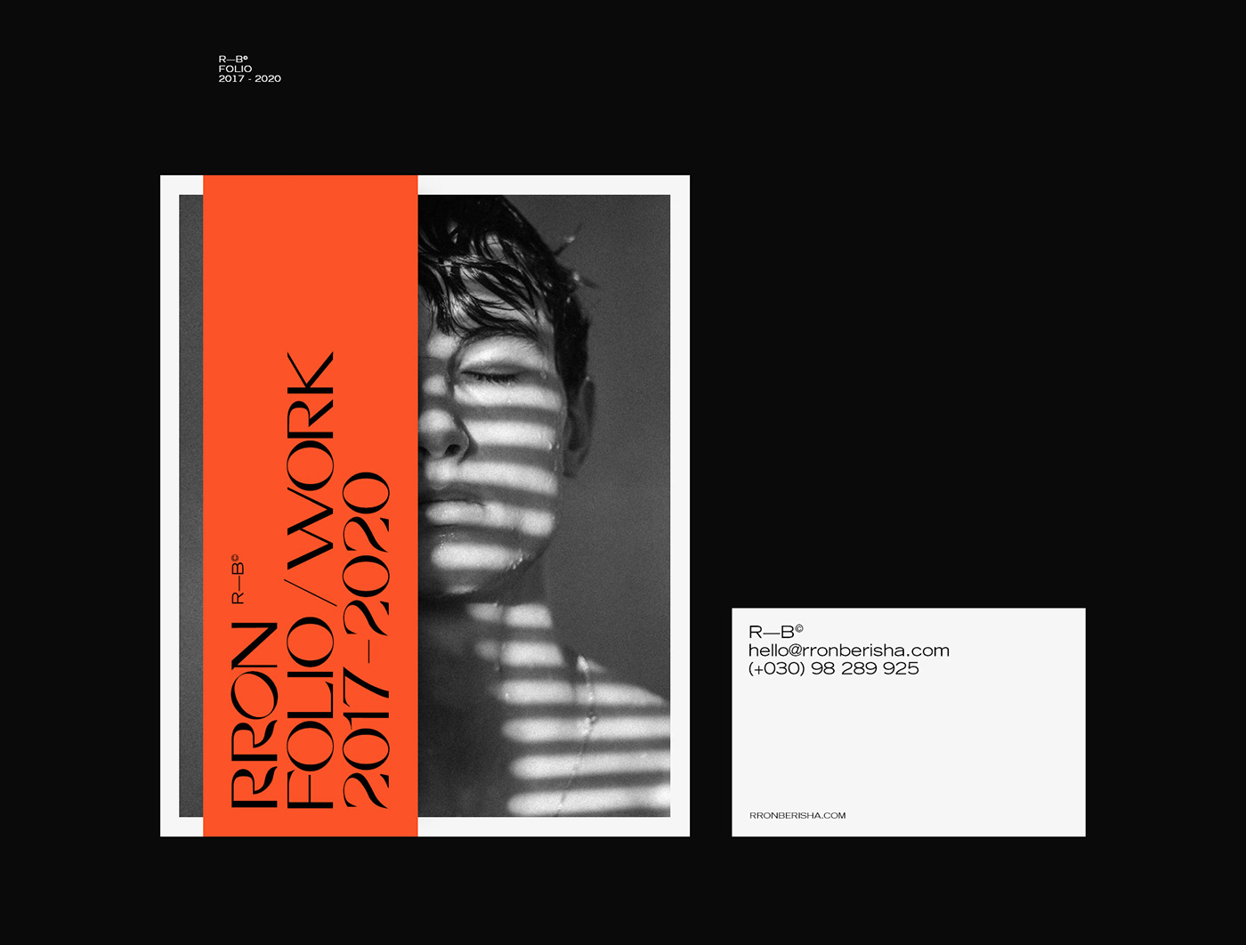
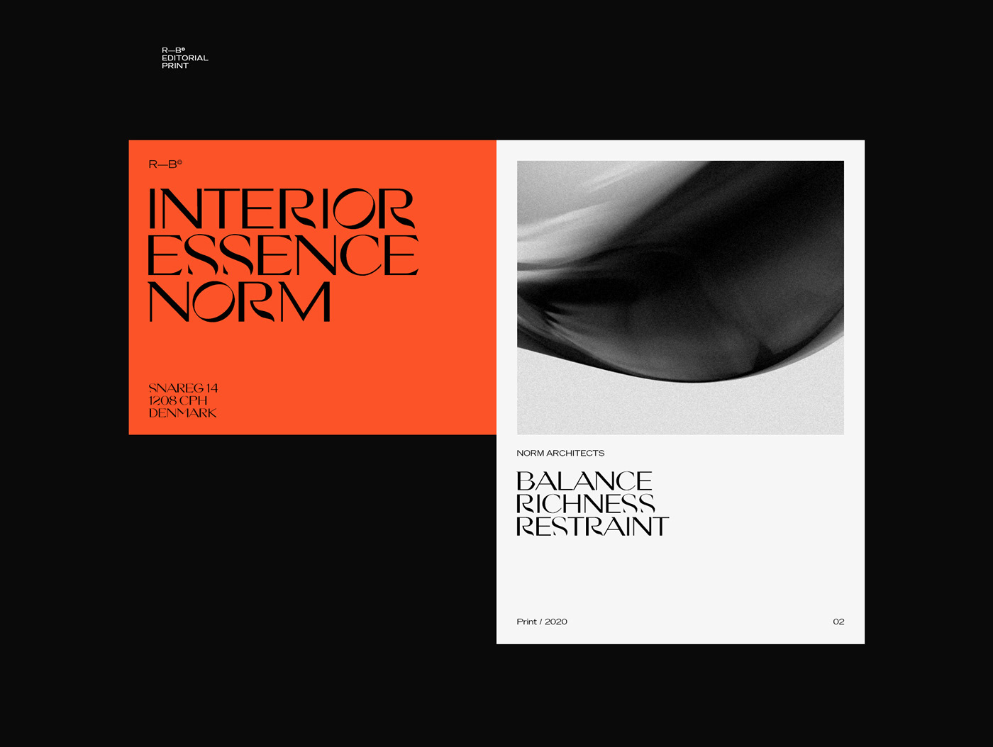
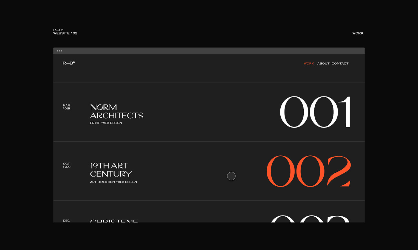
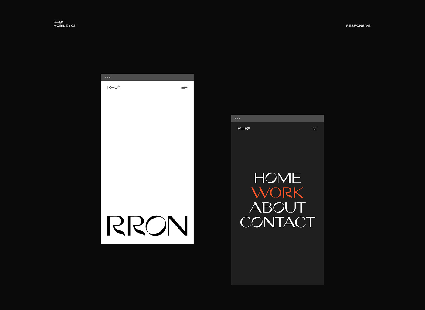
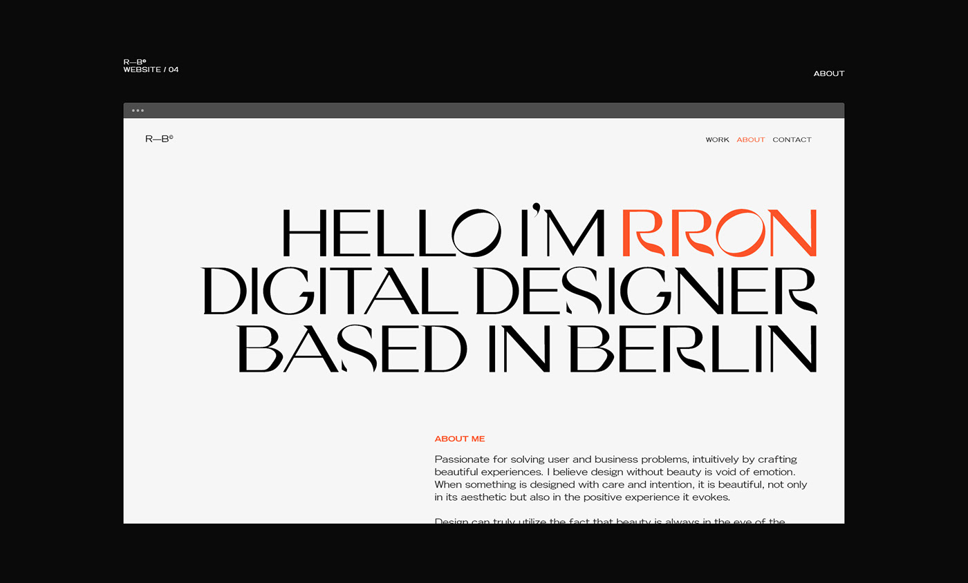
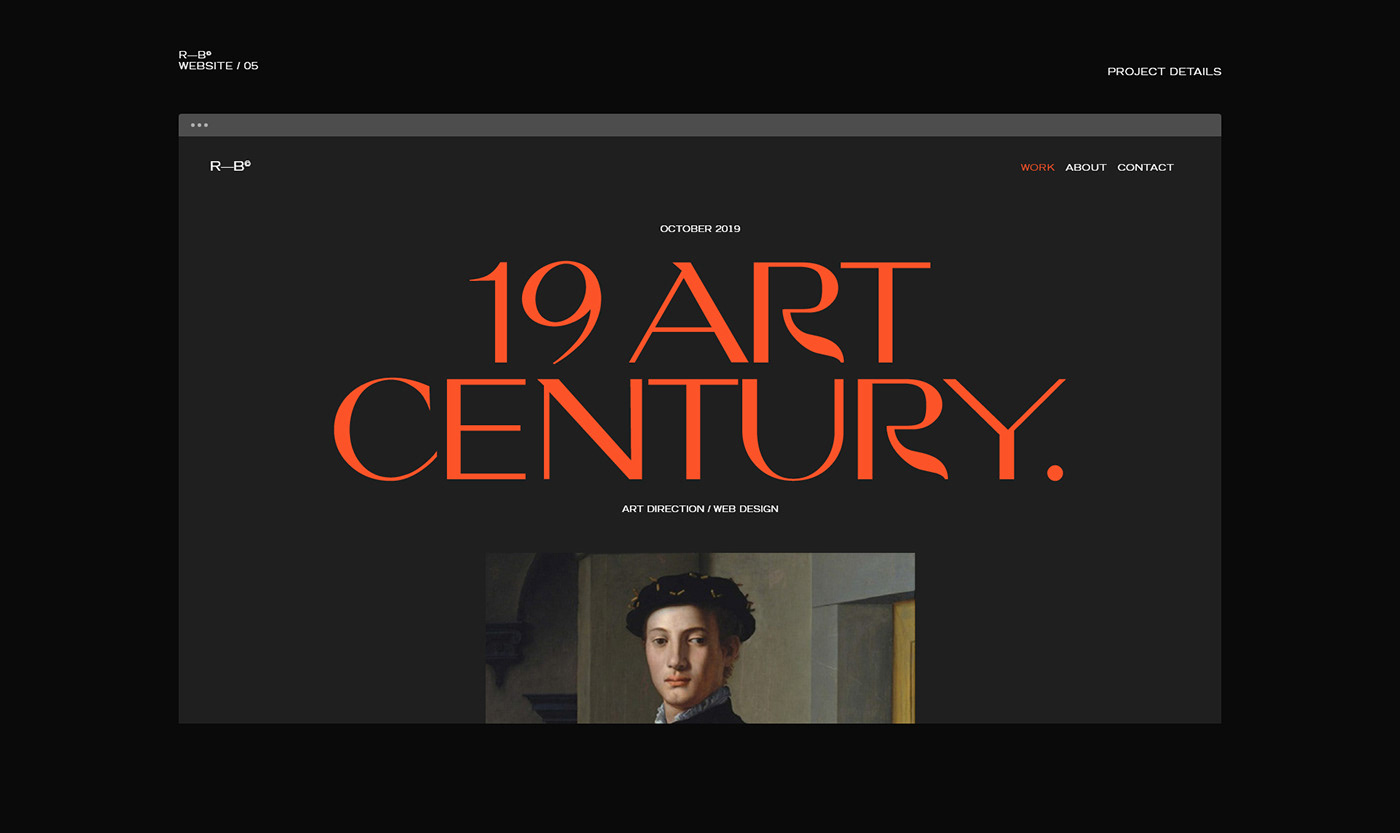
Rron Berisha shared the branding and visual identity project he created for himself. The redesign of his personal brand had the main goal of reflecting the values he stands for.
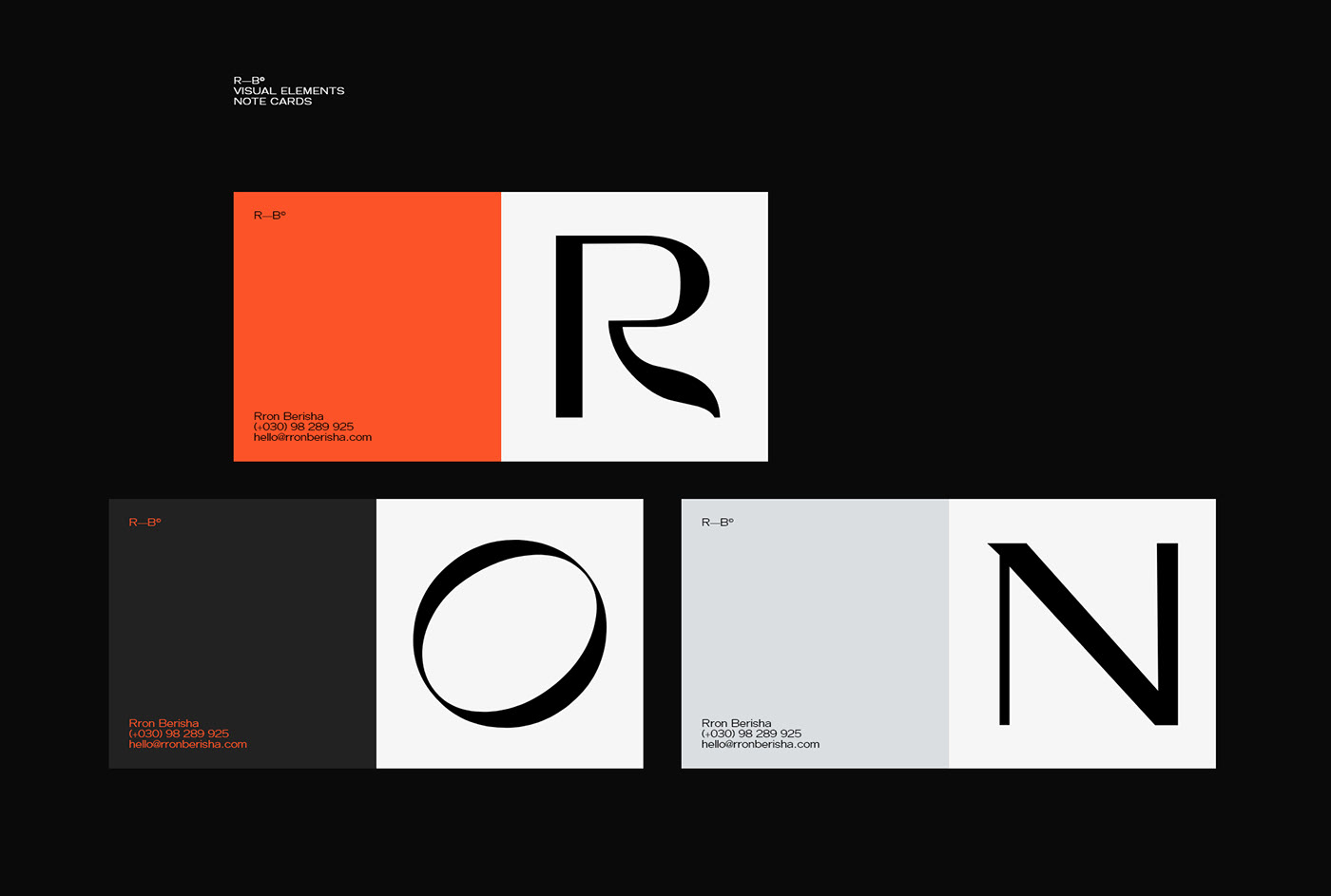
The significance of the rotating letter “O’’ Is to show that he’s daily evolving and growing in every direction. - “The pressure to innovate and constantly discover more is what makes me love the work I do” adds Rron.


For more information make sure to check out Rron Berisha on:


