by abduzeedo
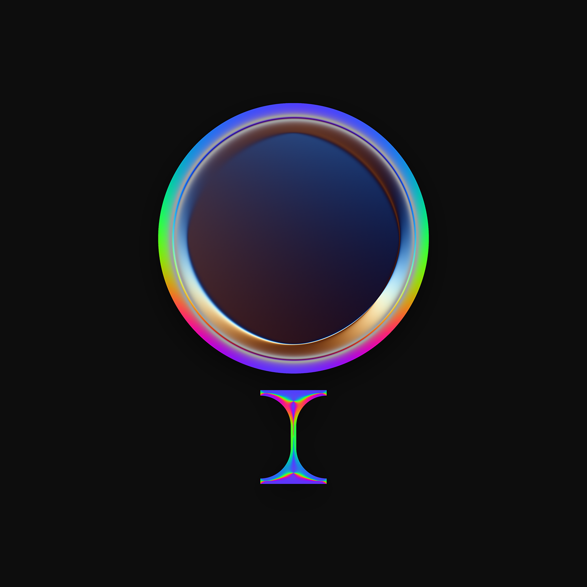
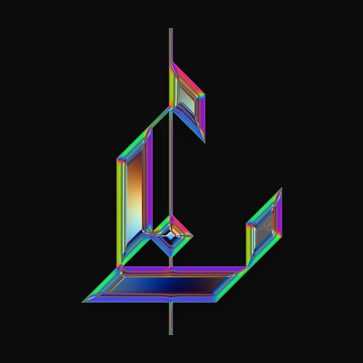
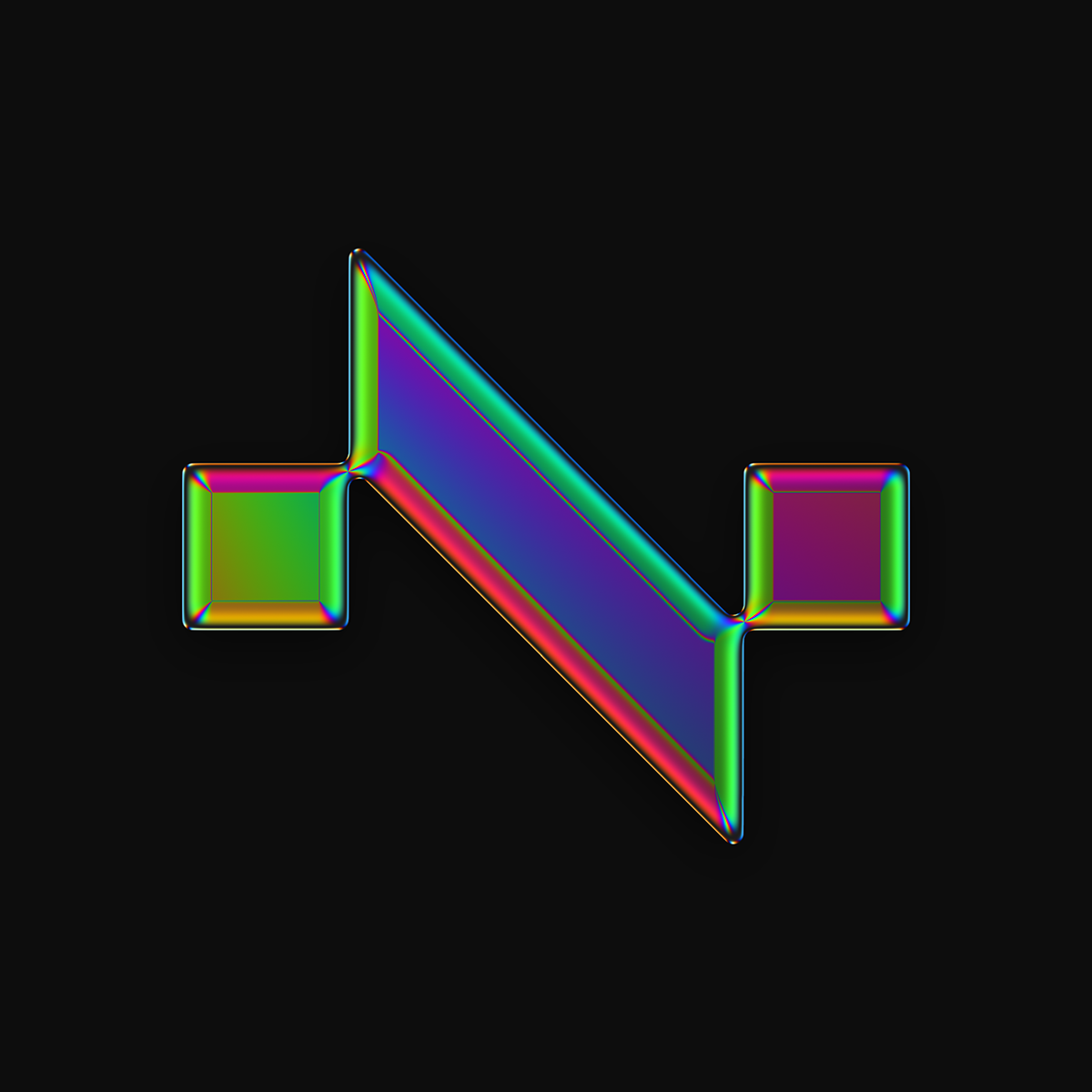
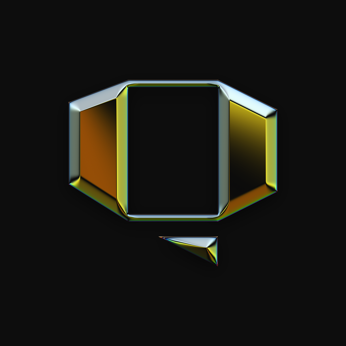
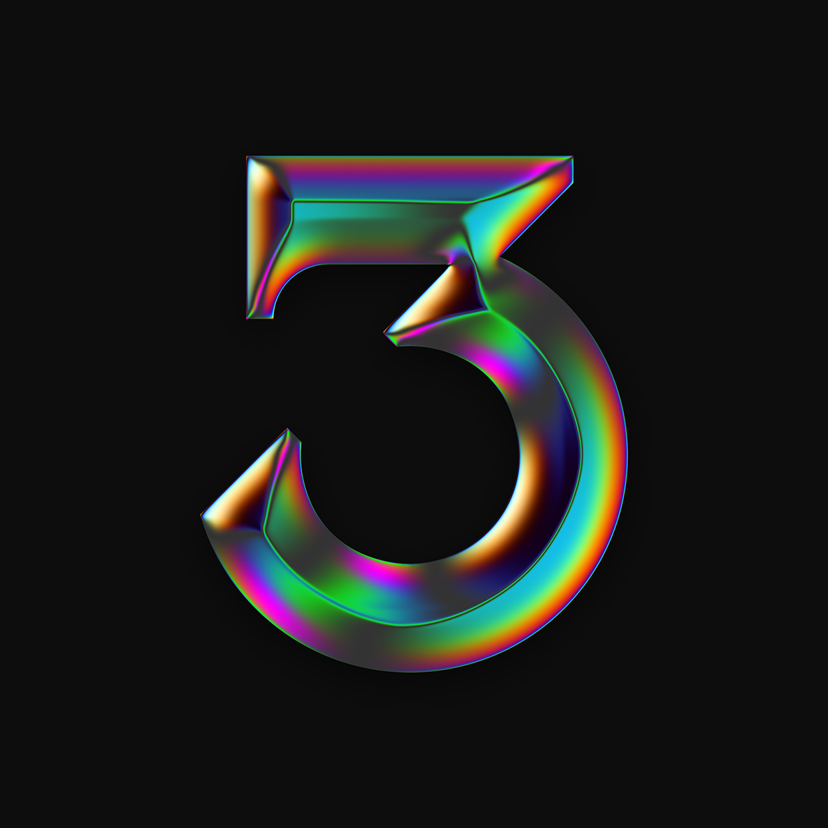
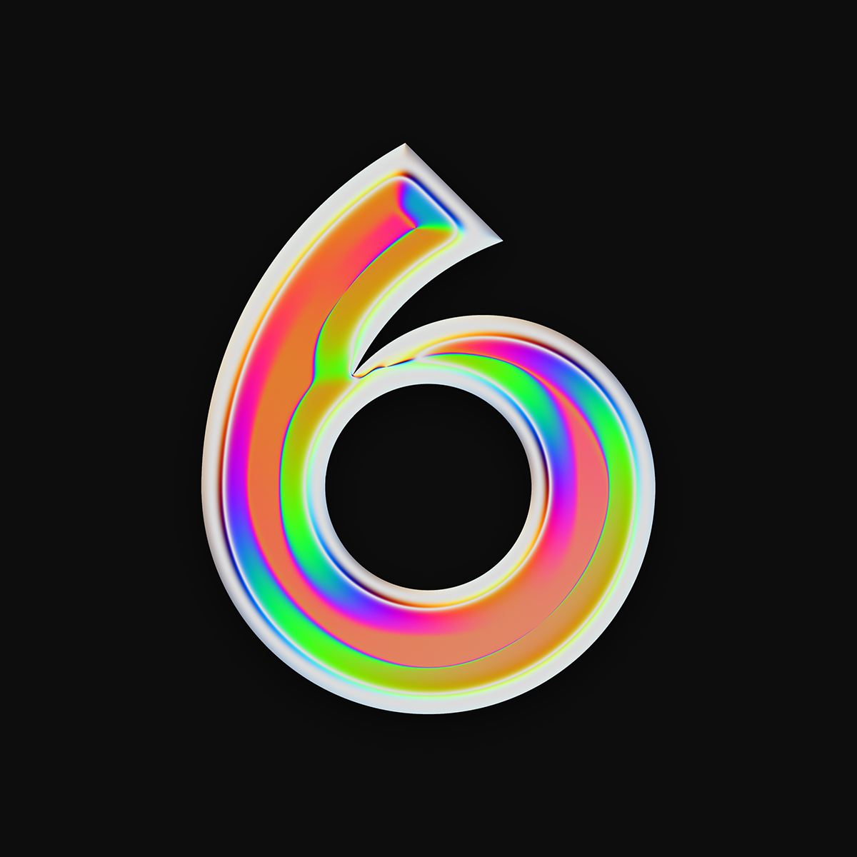
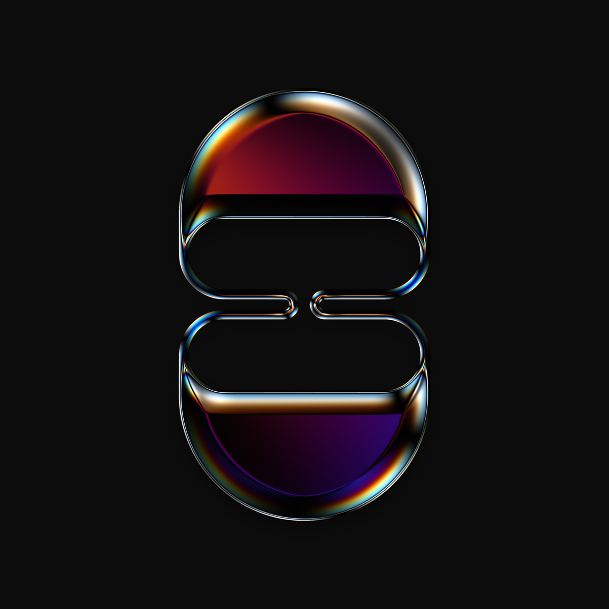
We are all familiar with the “36 days of type” typography challenge we always feature some of the entries that really get our attention and despite the willingness to post all of them, it’s quite hard to keep track of the amazing work people share. However, Martin Naumann really pushed it hard with his version and produce a truly amazing set. The reason I say that, well, it has to do with the theme, or at least, the resemblance with the style of my favorite decade, the 80s. It has the RGB color scheme, the ultra chrome effect all over it and some blocky forms. All translated 36 characters. You have to check it out.
Typography