by abduzeedo
Operating for more than 20 years in the agriculture market and a reference in its region, Mafra (SC), Brazil, Alvor is a company that specialized in increasing soil productivity through services such as Topography and Precision Farming. The company that until then used another name needed to reposition itself, and invited me to create its new name, brand and visual identity.
"We understood that it would be ideal to respect the tradition and good perception already created about the company in the last 20 years, but we needed to modernize the language through a more welcoming and friendly tone. The name had to be short and objective, and the brand had to be able to convey the ideas of precision. Although being fully inserted in the rural environment, it could not fail to be technological and modern."
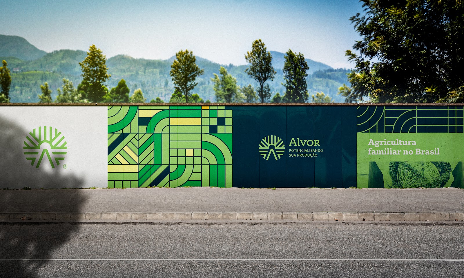
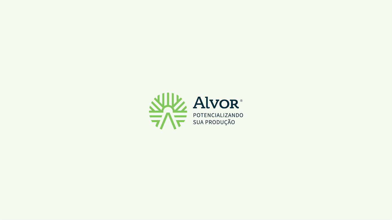
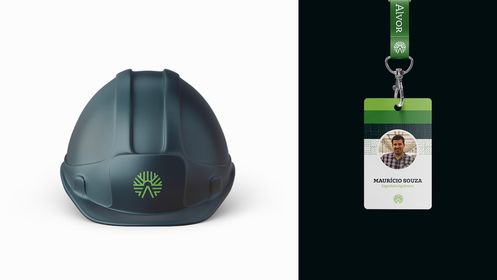
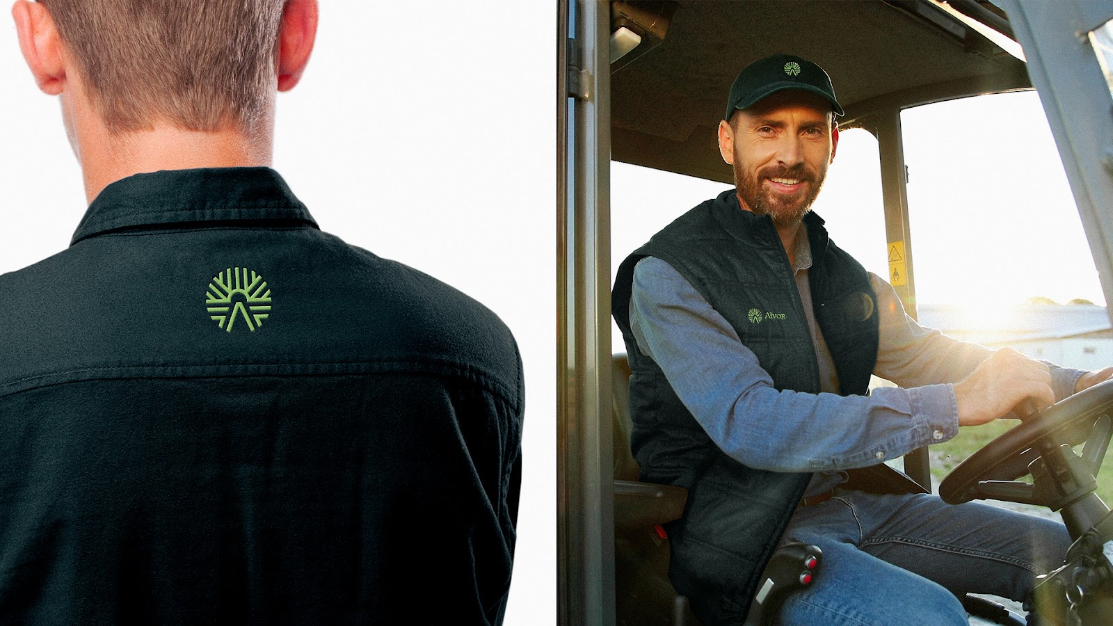
The logo represents the perspective of a field with the sun on the horizon, something that connects directly with the name, Alvor, synonymous with dawn, the first light of the day. Also, it represents the fields, organic fibers and the letter A, from Alvor.
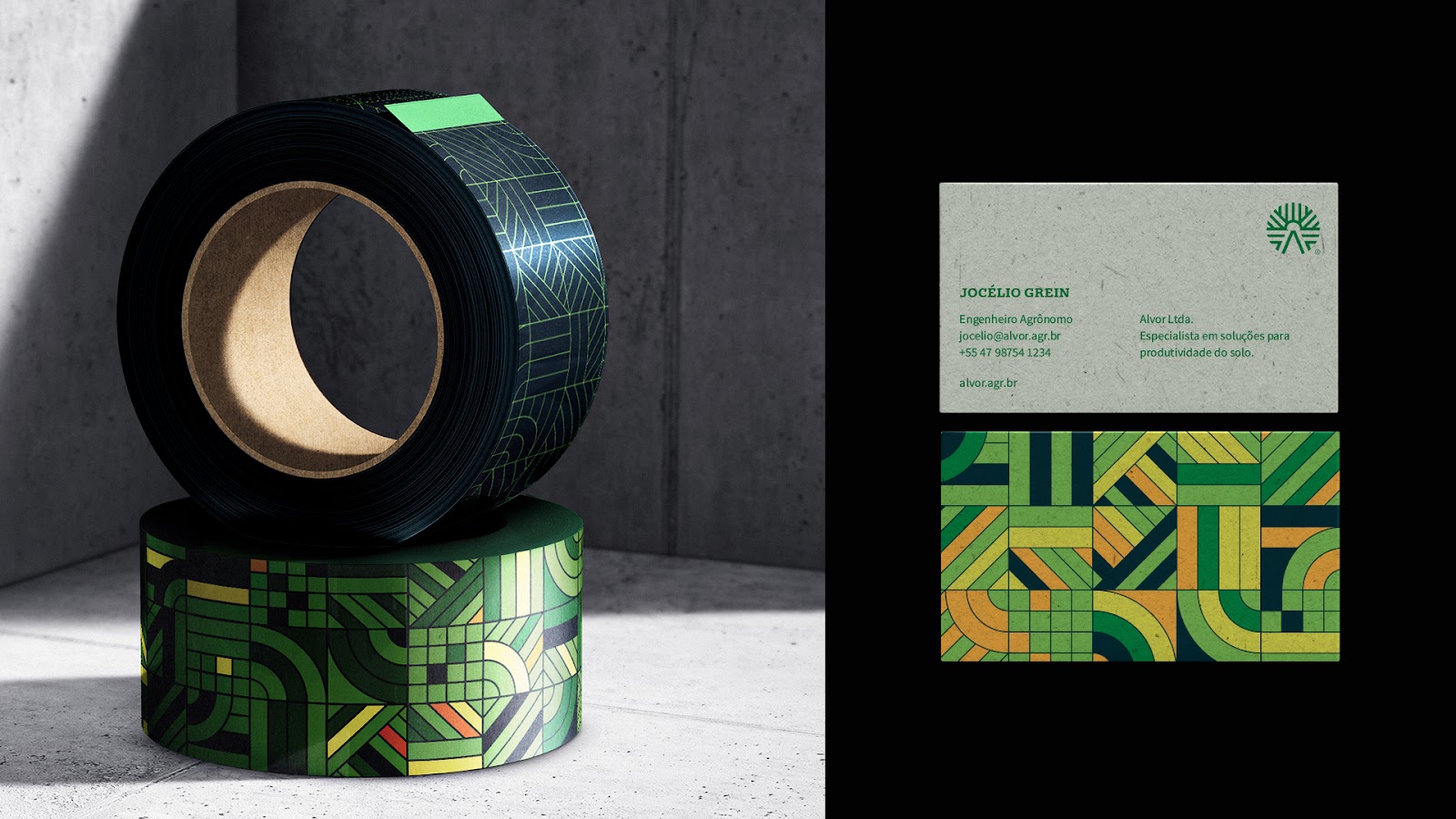
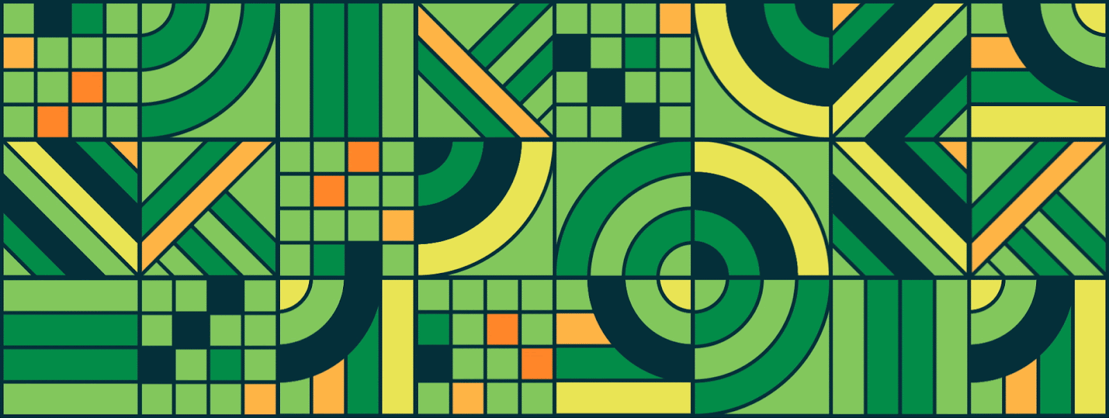
The patterns represents the fields divisions seen from the sky. All of this together manages to convey the feeling of a friendly environment, a fundamental concept for the brand. And, in addition, it is a brand whose universe is easily distinguishable. It's easy to look at the elements of the identity and understand what it's about.
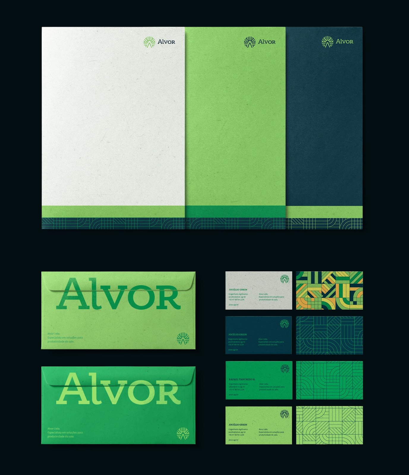
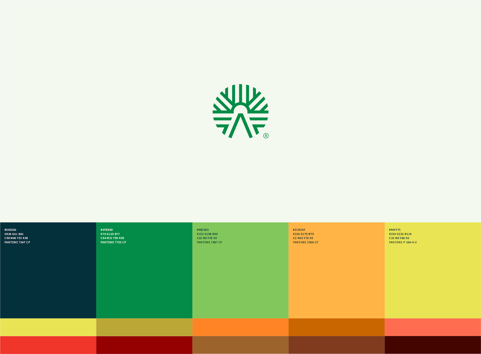
In the end we have a strong and striking brand, with a consistent and consolidated identity system for easy maintenance and reproduction of the brand.
Credits
- Design Direction: Walter Mattos
- Graphic Design: Walter Mattos, Iure Figueira
- Naming: Batiza Naming
For more information check out Walter Mattos on:


