by AoiroStudio
Google I/O is fully kicking right now and they have announced a couple of exciting announcements including the new line of Pixel 3a and Pixel 3a XL, a "cheaper" version of the current Pixel 3/ 3 XL. Also, Google has shared a couple of cool new features for the Android Q Beta 3, that is what we will be covering for you today. I have personally upgraded my Pixel 3 to the Android Q last night and wanted to highlight my first impressions/experience and some key features that we should put our focus towards.
...at Google I/O we highlighted what’s new in Android Q and unveiled the latest update, Android Q Beta 3. Your feedback continues to be extremely valuable in shaping today’s update as well as our final release to the ecosystem in the fall.
Links
Disclaimer
I am fully aware this is a Beta version and some things will definitely change until its Fall release. But it's really cool to play and have a chance to fiddle with their latest release. I did notice some bugs during my first impressions, some UIs aren't aligned properly and the OS transitions feel slower. BUT this is just a Beta version so my attention won't be focused on these small details.
Dark Mode! Dark Mode! Dark Mode!
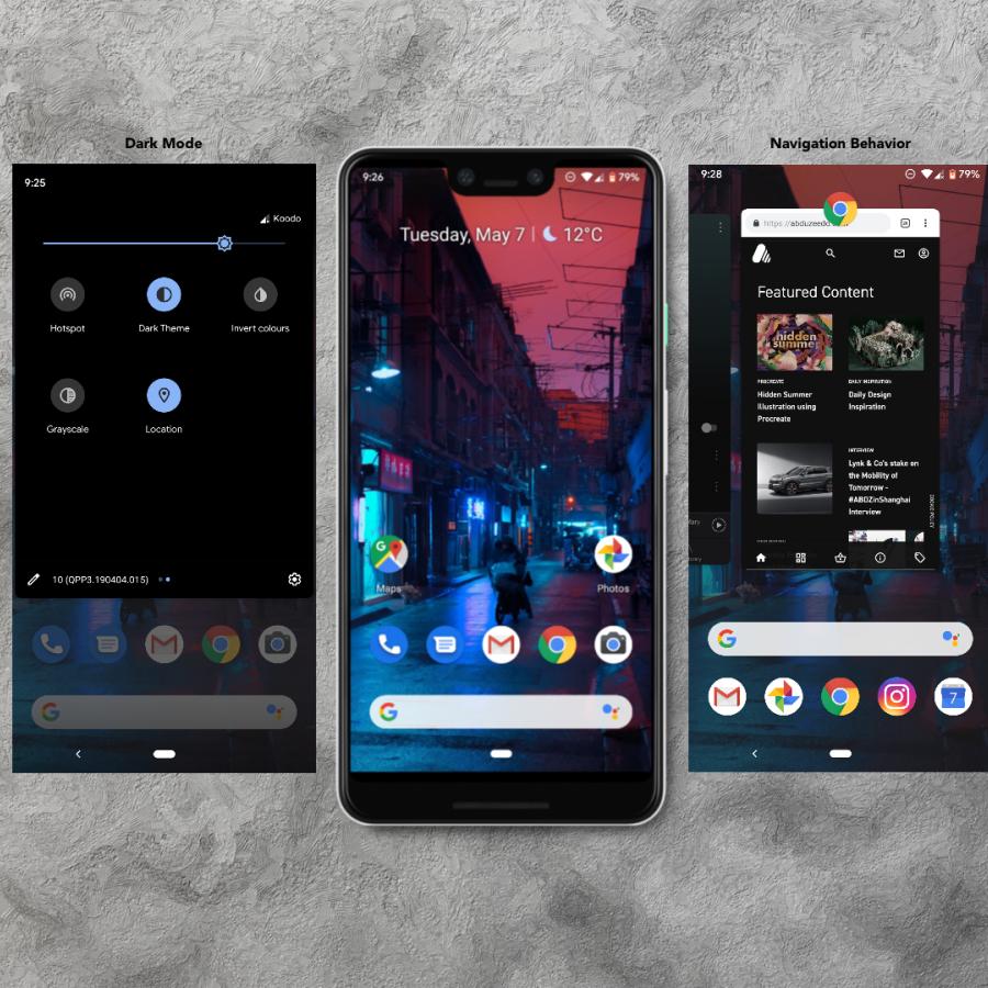
I guess this is the biggest change that most of us designers were waiting for coming on Android. Scoop, it's beautiful! It's super easy to switch from "light to dark theme" and some of the reasons why are probably to reduce eye pressure and eventually save battery. And I quote: "Dark theme has been a popular request for a while, and in Android Q, it’s finally here."
Introducing new gestures!
More specifically new "gestural navigation" and it feels quite "iOS-ey" to be honest. I have been an Android user for 3+ years now and it definitely went through many iterations through the years. I must admit that Android nowadays is at its prime. The entire OS feels intuitive at its best and truly love seeing the subtle UI changes and UX patterns. I noticed the subtle new font change to Product Sans which is a geometric sans-serif typeface created by Google.
The "New" Back Button?
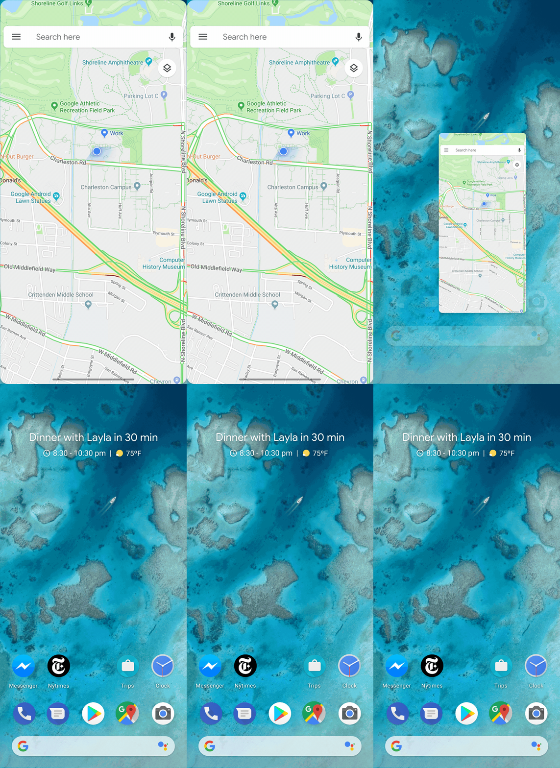
Getting back to the new "gestural navigation", it will some "get-used-to" like there is DEFINITELY a learning curve to be achieved here. In Android Q, this new navigation is shown by this thin line as a visual indicator by getting rid the bar area and allows apps and games to use the full screen at its fullest. To fully customize your experience, you can unquestionably customize them in the Settings > System > Gestures. I went for the "Full Gestural Navigation" where you swipe up from the bottom of the screen takes you right to the "Home screen". And when you swipe up and holding up brings up the "Recent" and swiping the left and/or right edge would trigger the "Back" functionality. Let me be clear, this action is not evidence at all, again this might need some "get-used-to" obviously.

Improved notifications
Notifications have definitely improved in both good and "experimental" ways. But one thing Android does it so well is the "suggested actions" and for this case "smart replies". In fact: "Starting in Beta 3, we’re enabling system-provided smart replies and actions that are inserted directly into notifications by default." It works pretty well and one of my strongholds from Google.
One thing that caught my attention since yesterday and might need some refinement. It's about how they treat the "System UI - Notifications" whenever you wanna "Alert Me" or "Show Silently". I mean it works perfectly BUT I might have triggered this "System UI - Notifications" 20x times accidentally since yesterday. Why? Well, this action is triggered by a simple "finger-press" your notification by a tiny second. It t feels buggy and too sensitive for my opinion. But when this option is selected, the after-experience is so subtle. Love the direction still of this feature so far.
More control and definitely accessible
This might be the most underrated feature from Android Q Beta 3 are the new features from Accessibility. This is honestly ground-breaking and this is one of the reasons why I love Google so much. They took another step forward by making videos universally accessible. They even took a step onwards by making accessible not only for YouTube but also for video messages, social media, podcasts, and audio messages. You should definitely check out the video below. I wasn't able to get it live for this article* but will give it a try again.
We worked with the Deaf community to develop Live Caption. With a single tap, Live Caption will automatically caption media on your phone. As soon as speech is detected, captions will appear, all without opening another app, without ever needing wifi or cell phone data, and without anything leaving your phone.
Live Caption: Making digital media more accessible with a single tap
In Conclusion
As a side-note, you should check out the entire blogspot on Android Developers blog to view the entire novelty and great updates on "Privacy and Security". I truly love the direction Android Q is taking and would love to send my gratitude to the teams working effortlessly. Props to all the teams involved into this huge update. If you have a project or a product that you would like us to give it a go, you can get in touch with me.
Links
Credits
- Image Courtesy from Android Developers


