Branding and Visual Identity: MP2E Solutions' Modern Look
Explore Palantis' sleek branding and visual identity for MP2E Solutions, showcasing thoughtful design and industry-specific color palettes.
In the dynamic world of industrial design, a brand's visual identity must clearly communicate its expertise and innovation. Palantis, a branding, design, and strategy studio based in Nantes, recently tackled this challenge for MP2E Solutions. The result is a sleek, adaptable, and cohesive visual system that truly reflects the company's position and know-how.
MP2E Solutions specializes in distributing Hauschild planetary mixers and equipment, acting as the exclusive distributor of these highly technical machines for nearly a decade. These Speed Mixer™ machines are renowned for their versatility, capable of mixing, pulverizing, and degassing, serving vital functions across the pharmaceutical, food, medical, and electronics sectors. To usher in a new era, MP2E Solutions commissioned Palantis to refresh its entire visual identity.
The Hyphen: A Symbol of Solutions
Palantis built the core of the new visual system around the hyphen in "MP2E-Solutions". This seemingly small detail carries significant weight, symbolizing the connection between "MP2E"—an acronym for Mélangeur Planétaire Emmanuelle Etiemble—and "Solutions," representing the company's comprehensive range of services, products, and client support. This thoughtful integration of the hyphen into the graphic language creates a strong and recognizable visual identity.
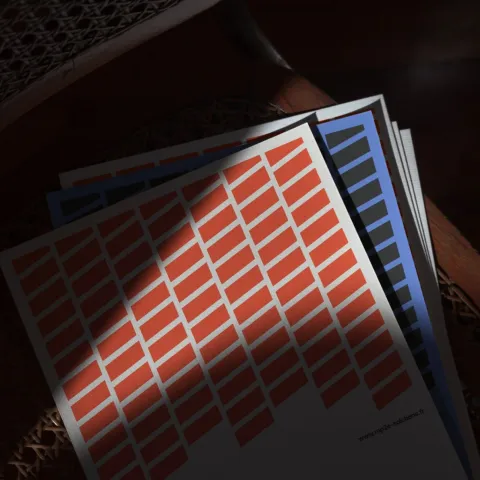
The brand’s new visual identity extends beyond just the logo. Palantis developed a flexible system through the interplay of symbols and a carefully chosen color palette. Each color was intentionally selected to evoke the specific industries MP2E Solutions serves, strengthening the brand's presence within its diverse ecosystem. For example, a vibrant green might represent the pharmaceutical industry, while a deep blue could signify the electronics sector. This allows for endless variations while maintaining clear brand identification and visual consistency.
A Cohesive Visual Language
An integral part of this branding and visual identity overhaul included the development of a dedicated iconographic system. This system helps structure and clarify information across various communication channels, ensuring that MP2E Solutions' message is always clear and organized. From digital platforms to printed materials, the new design elements work in harmony.
Palantis' work on MP2E Solutions is a testament to the power of meaningful design and transformative solutions. They believe in crafting tomorrow's story today, and this project exemplifies that philosophy. The refreshed branding not only accurately reflects MP2E Solutions' expertise but also sets them apart as a forward-thinking industrial leader.
The meticulous attention to detail, from the symbolic hyphen to the industry-evoking color schemes, showcases Palantis' deep understanding of branding and visual identity. Their approach ensures that MP2E Solutions is well-positioned for its new era, with a visual language that speaks volumes about its commitment to building the future by mixing materials.
Discover more of Palantis' inspiring work at www.palantis.fr.
Branding and visual identity artifacts