How Hymn Created the Chillon Castle Brand Identity
Hymn studio excavated 800 years of Chillon Castle history to build a brand identity rooted in medieval pigments, stone engravings, and a custom typeface.
Chillon Castle, Switzerland's most visited historic monument, needed a new brand identity. The 2007 system struggled at smaller sizes and on digital platforms. Lausanne and Zurich-based agency Hymn took the commission with a clear mandate: touch a national jewel with care, grounding every decision in what was already there.
The research process sent the team deep into the site itself. Stone carvings and heraldic coats of arms each offered a different visual grammar. The coats of arms that decorated the castle walls were originally vivid, with reds, greens, and pinks that centuries of erosion had dulled. Hymn restored those hues as the identity palette, giving each color a heraldic name: Sinople for green, Gules for red, Carnation for pink.
Chillon Castle Brand Identity: From Stone to Screen
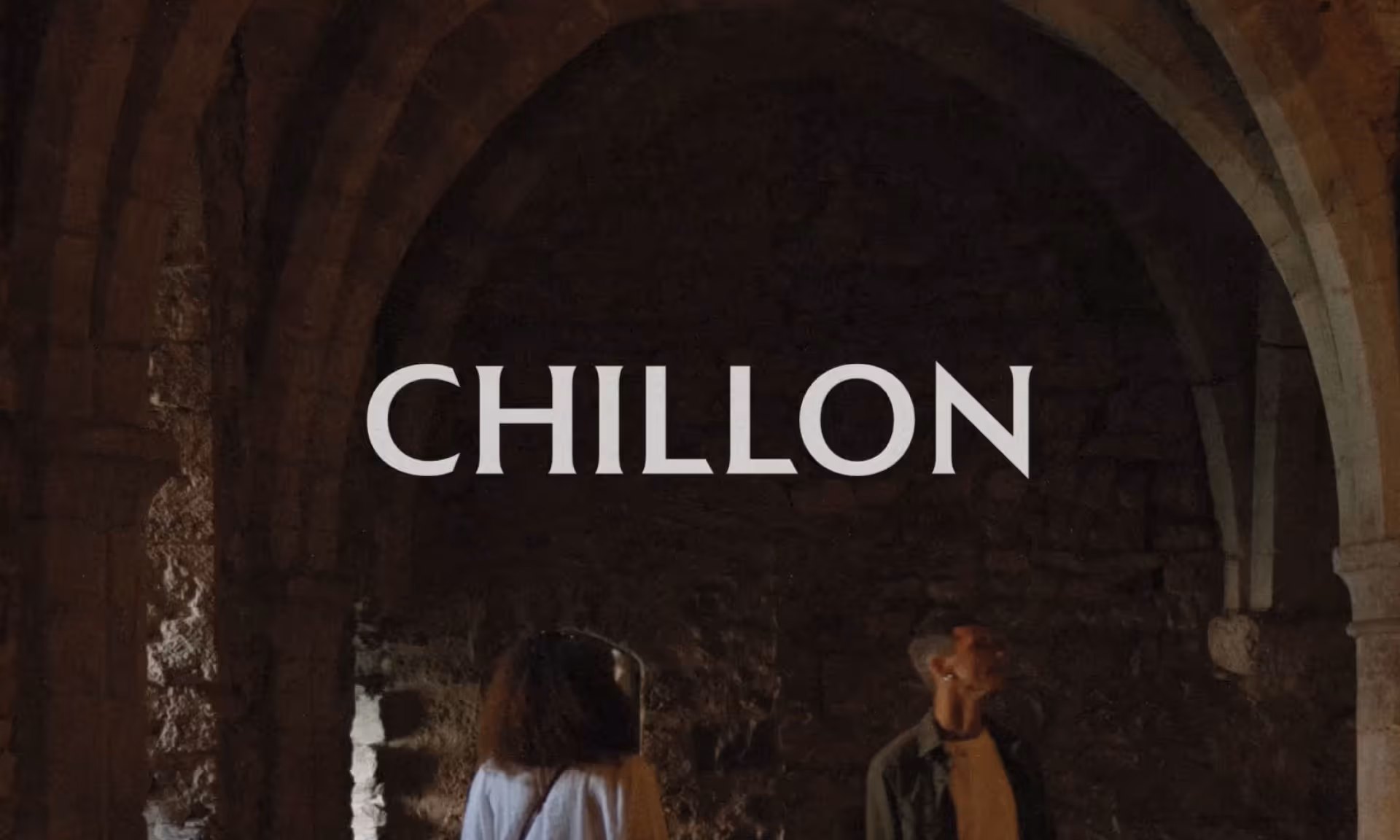
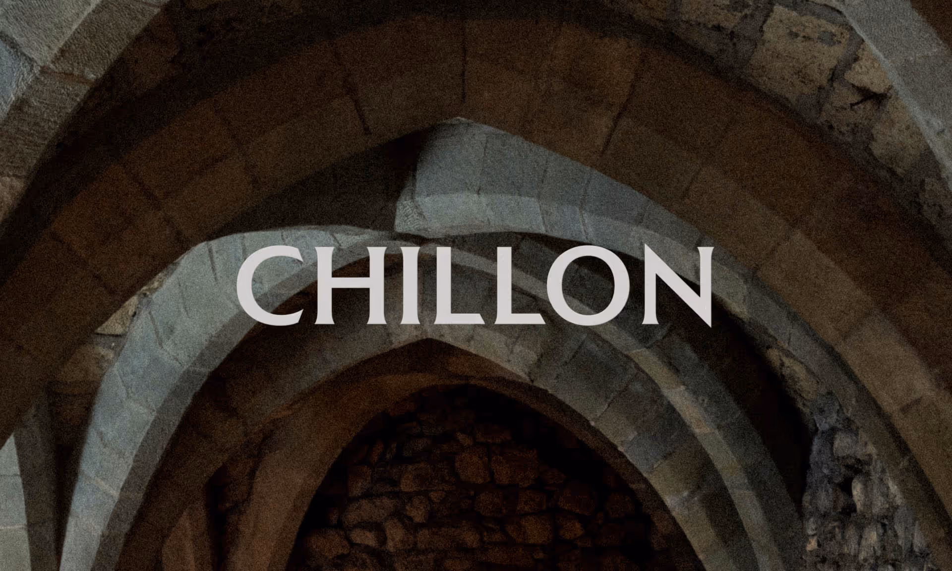
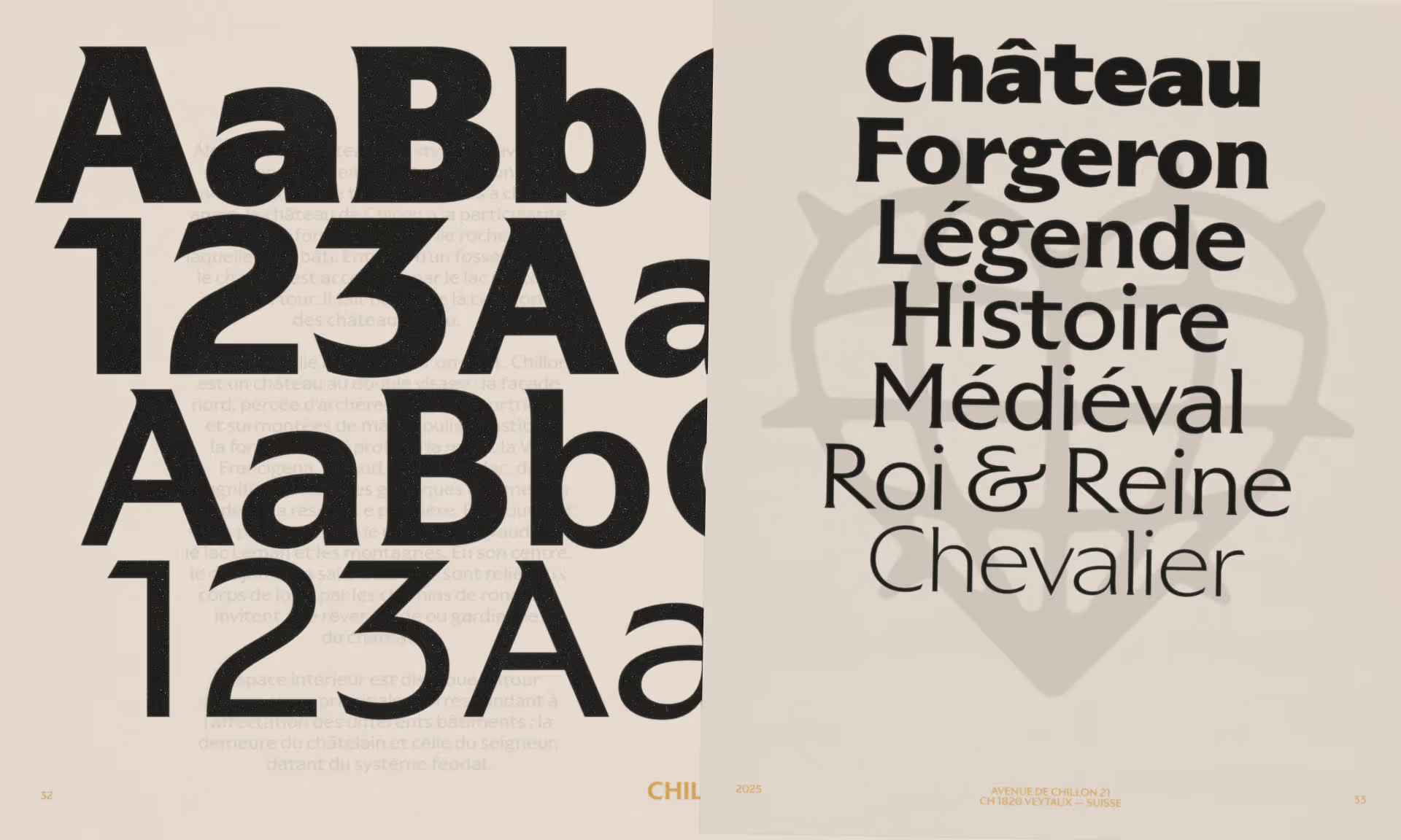
Central to the system is a custom typeface co-developed with NewGlyph. The brief called for something that bridges past and present without falling into nostalgia. The result draws from medieval calligraphy through contrast and slightly angular terminals, evoking letterforms carved into stone. Structural cues come from historical manuscripts: strong hierarchies, emphasised openings, and modular compositions simplified into contemporary grids for digital flexibility.
Among the more unexpected elements are medieval-inspired emojis. Familiar digital icons have been reinterpreted as if carved into the castle walls centuries ago. The gesture collapses time, giving the brand identity a playful register alongside its typographic severity. The castle silhouette from 2007 is retained as a recognition bridge for returning locals and first-time visitors. Every design decision traces back to something found on-site, by Hymn.